Boon bariq
Branding Services / Packaging design
industry
Food, Preserves
client
Ibari Group
year
2019
awards

overview
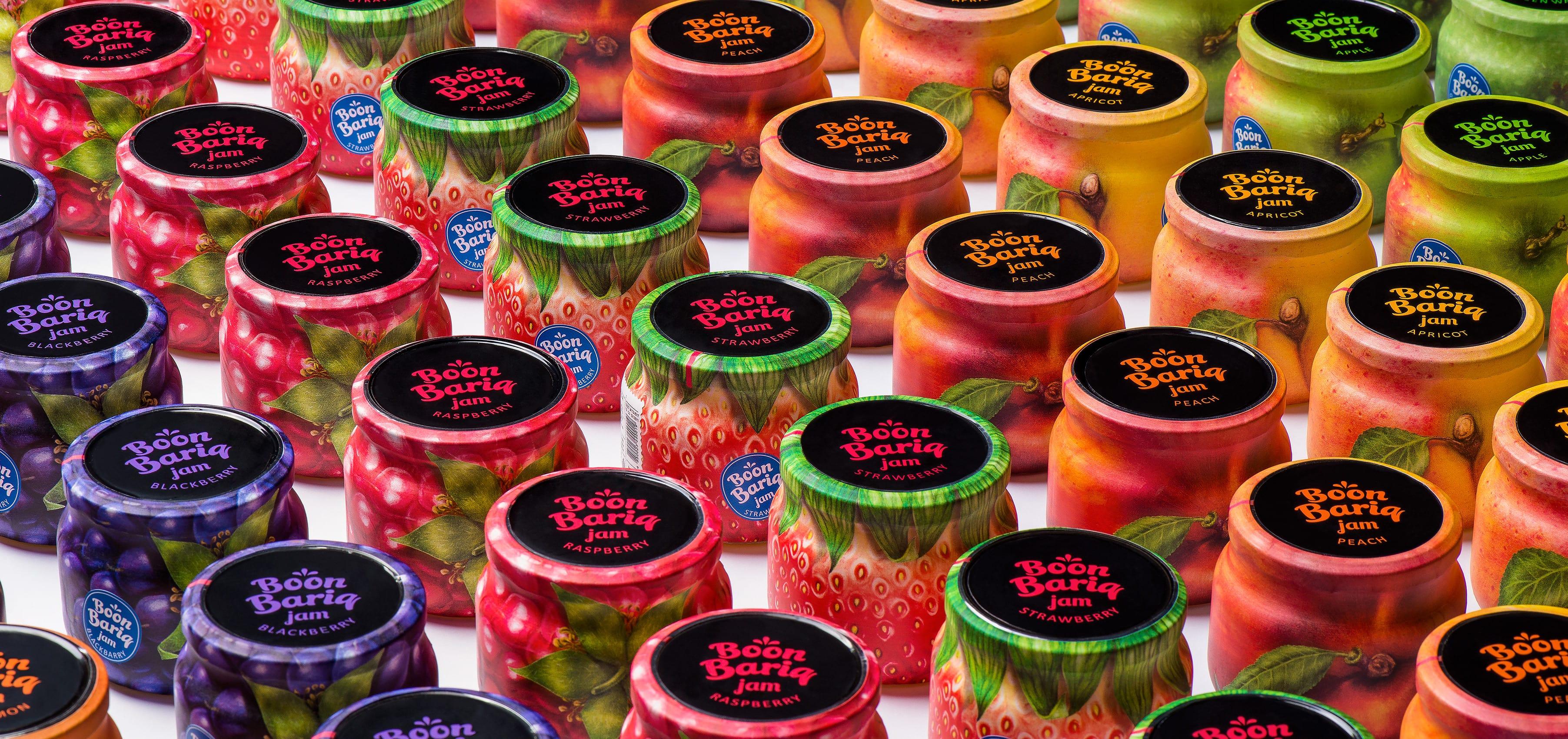
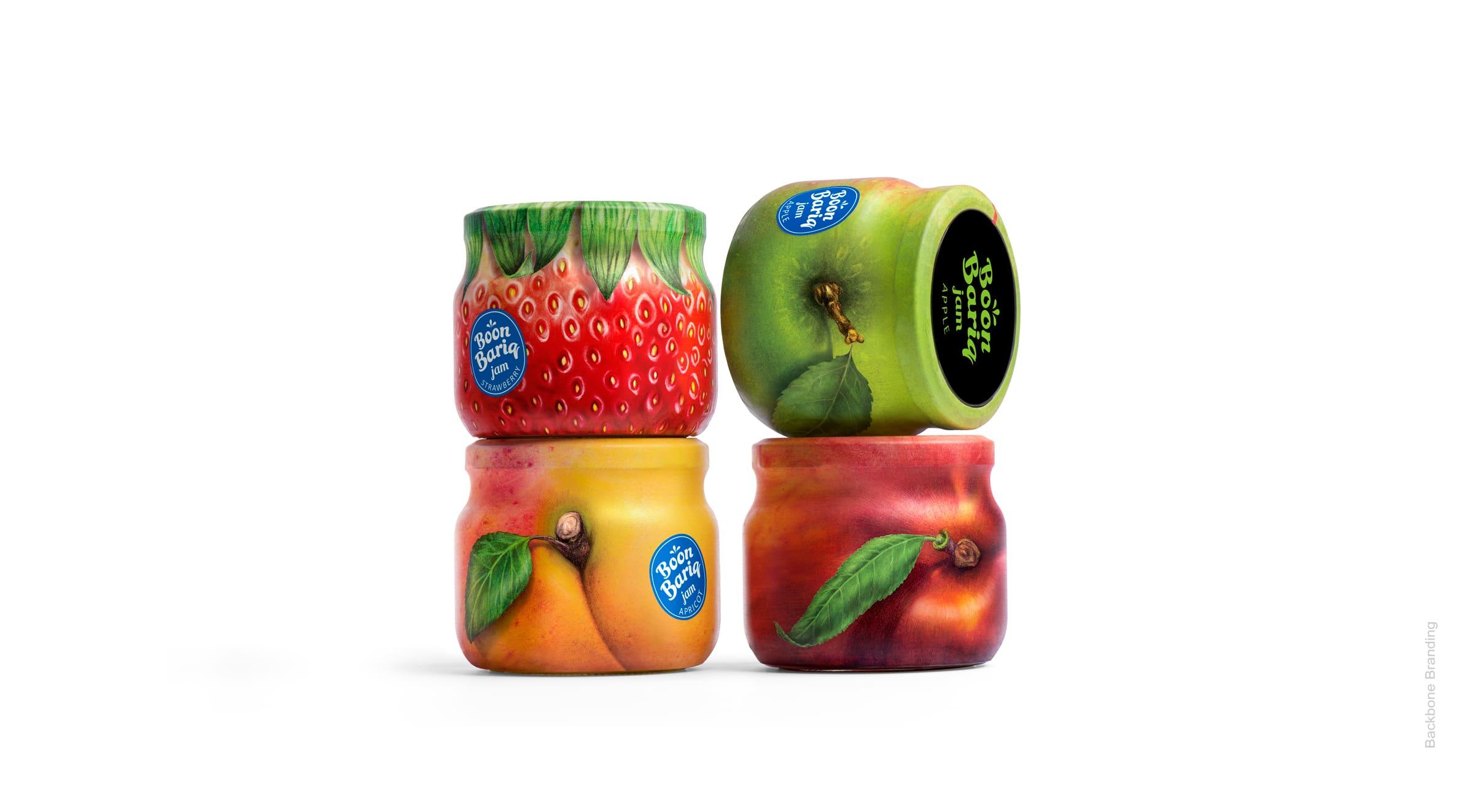
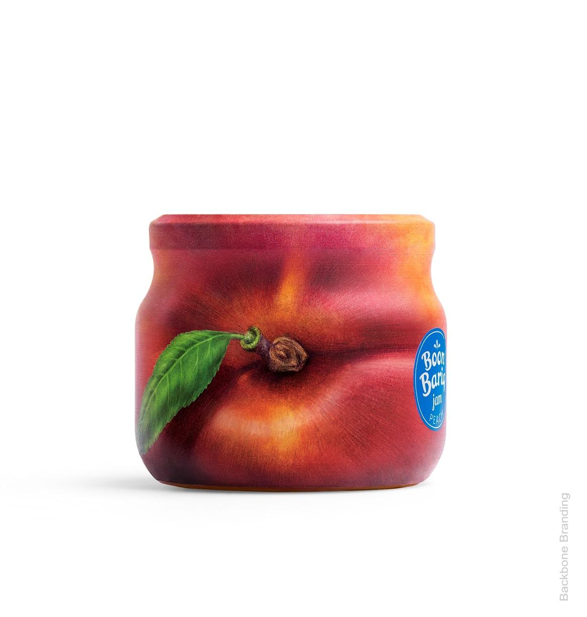
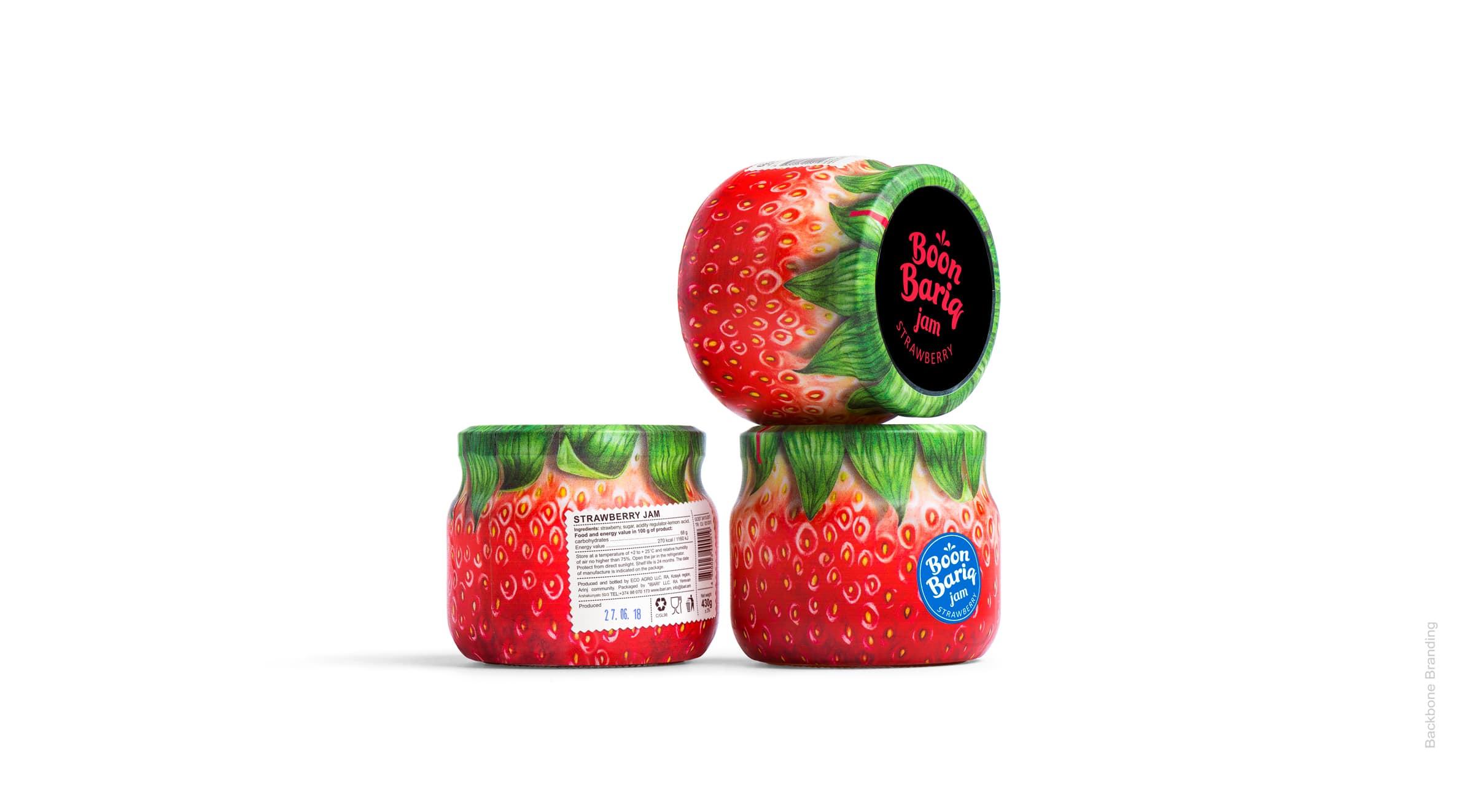
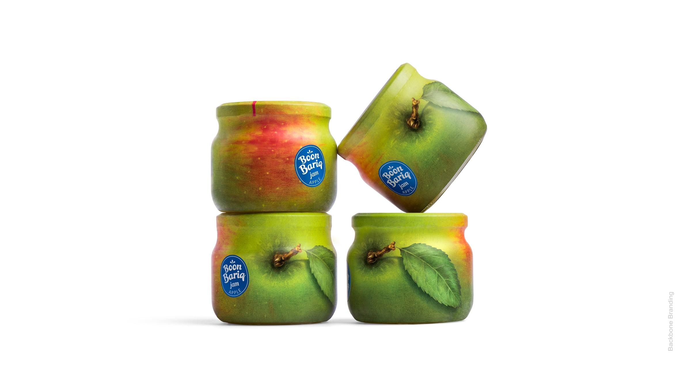
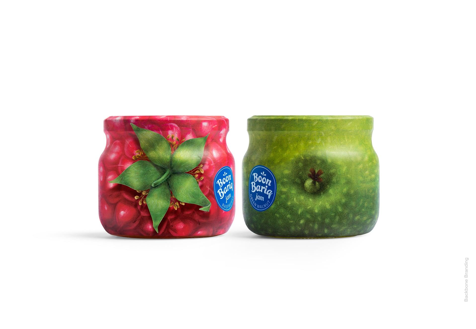
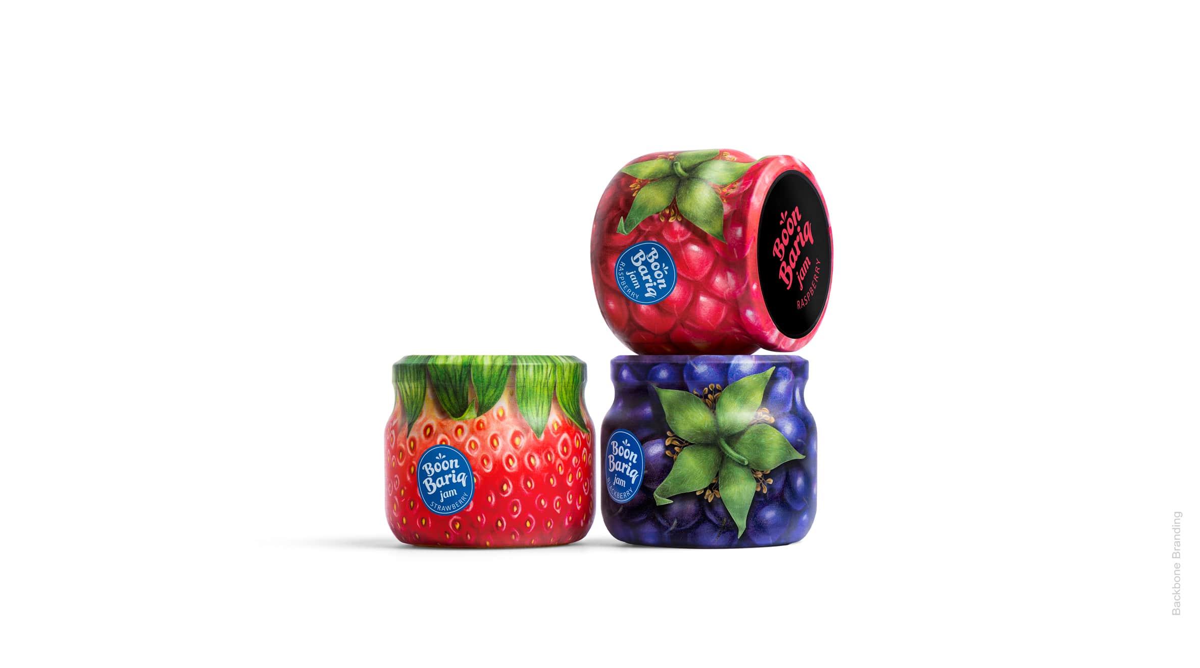
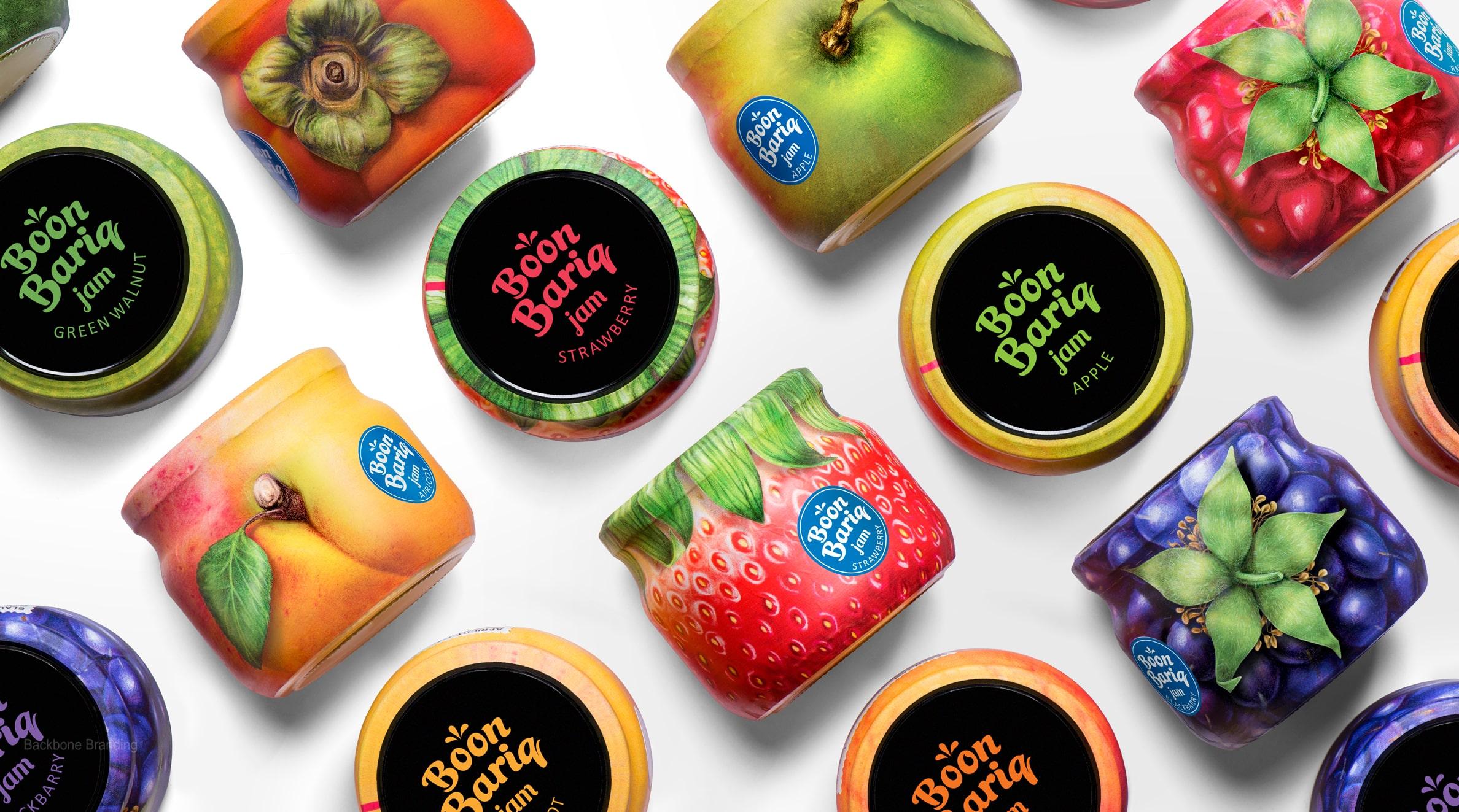
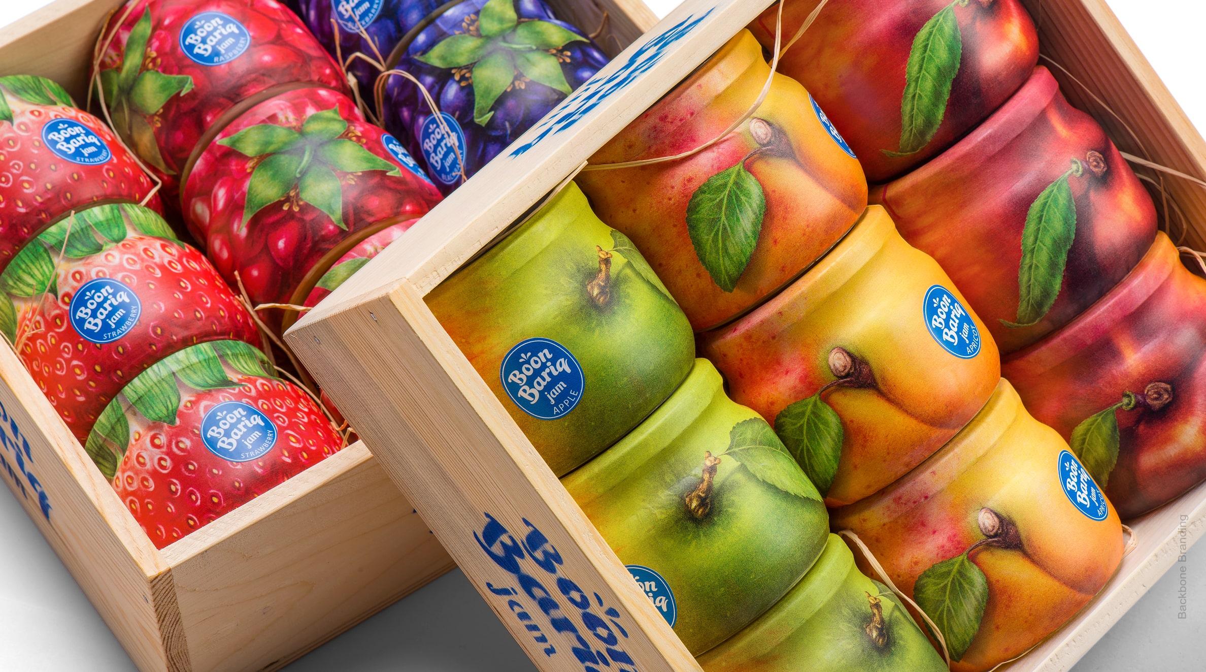
The whole jar wrapped with fruit peel.
challenge
A local manufacturer and farming enthusiast approached us with a project to create a new brand for preserved fruits and berry products. He had developed a new formula of fruit preservation and also had harvested the products from specially selected orchards. To differentiate its products from its competitors, the manufacturer decided to use more natural ingredients in his recipes with a higher ratio of fruits and berries in the jar. Our goal was to express these advantages in the brand concept and design.
solution
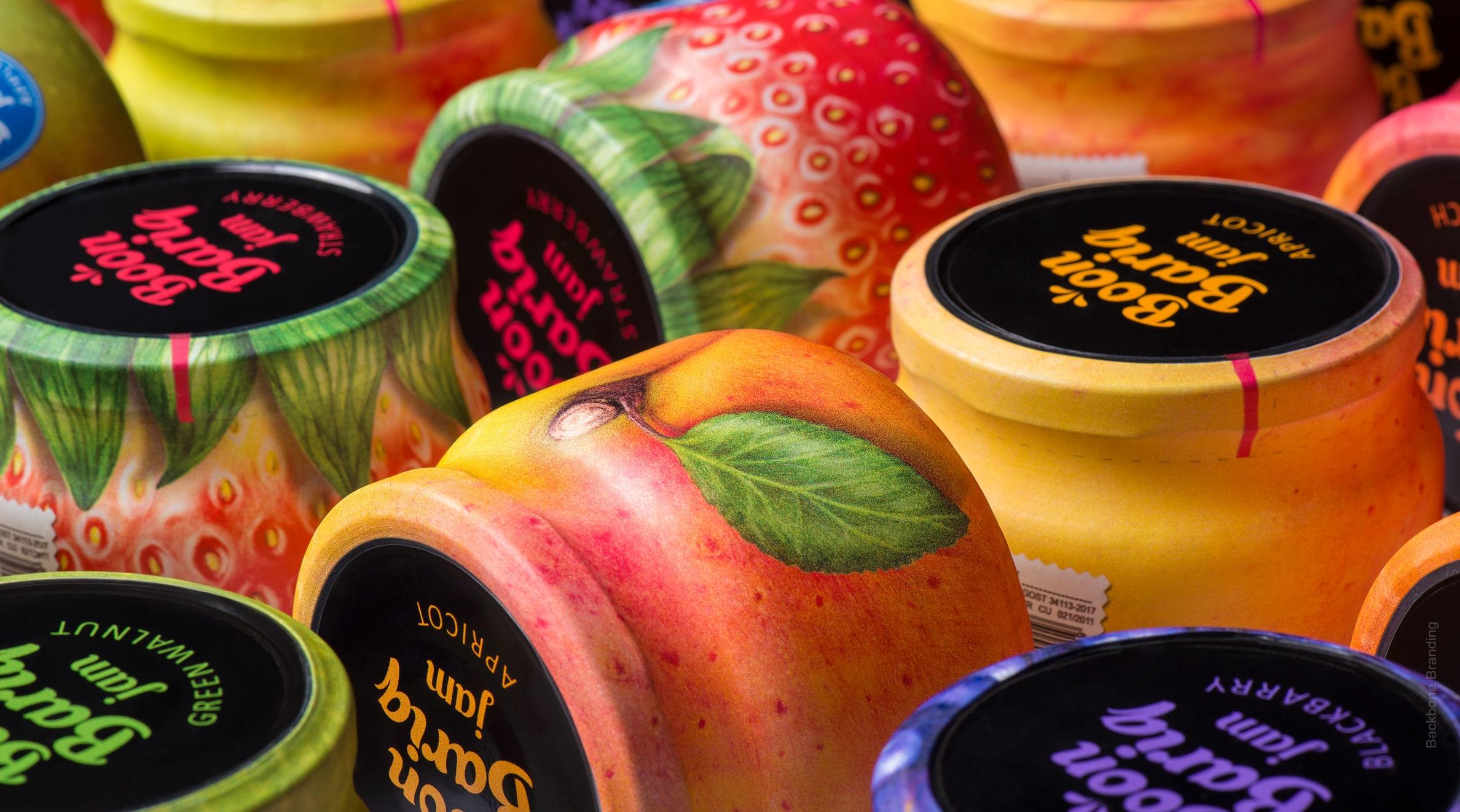
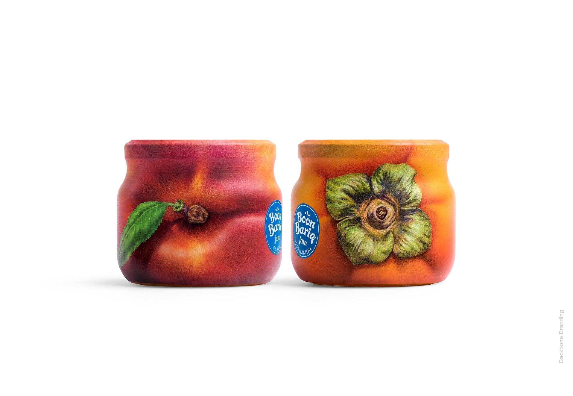
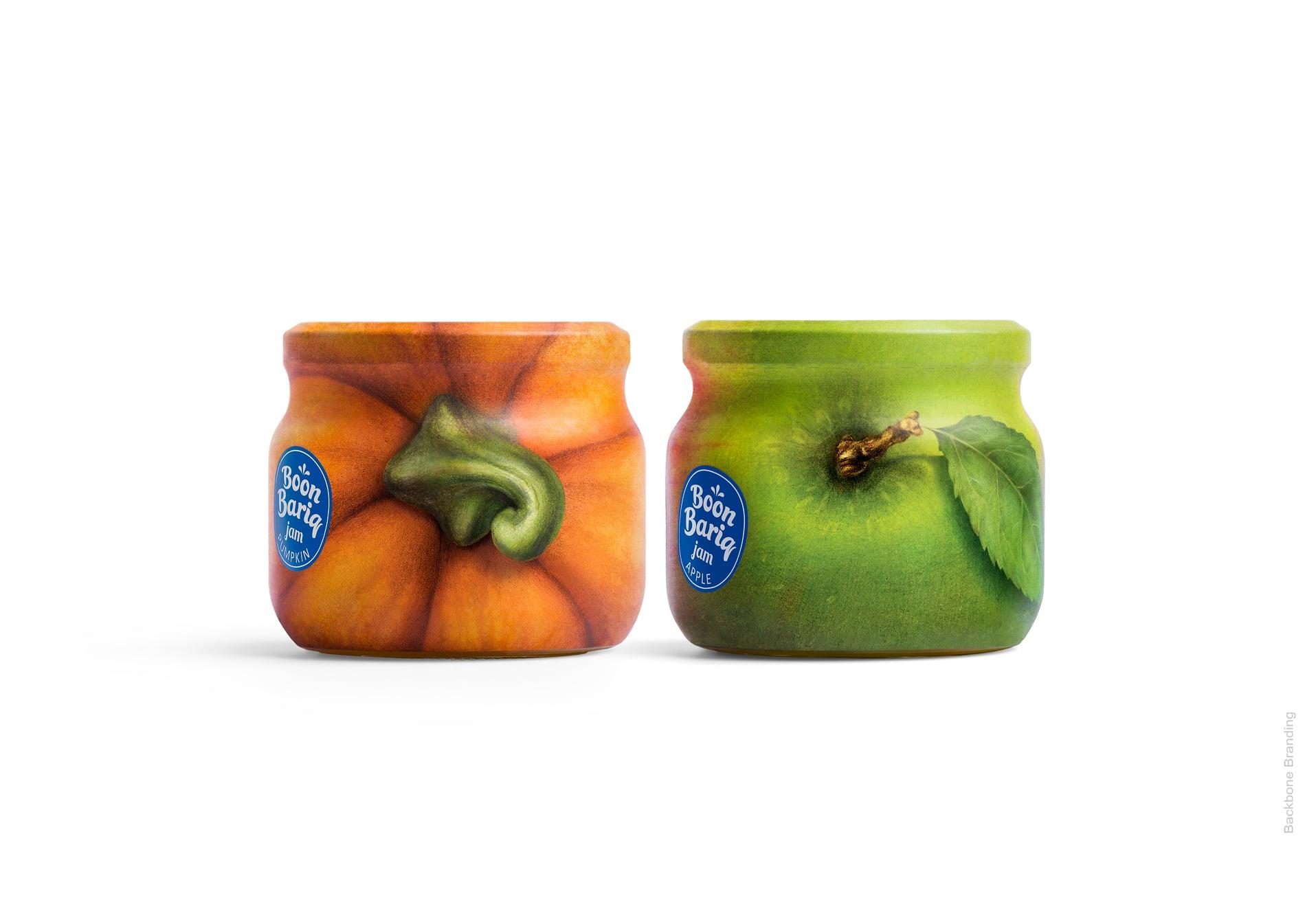
By studying numerous ways of illustrating fruit and label designs, we identified that many brands use a quarter or half of the jar surface to illustrate fruits and present the brand message. Looking at the fruit in the orchard or in a supermarket, we are drawn towards those fruits that are ripe and have an attractive look. It is the best packaging design. So, we came up with a simple solution: wrap the whole jar with fruit peel.
Technically, it was possible to achieve by using a shrink sleeve label. It allowed the design to cover nearly the whole surface of a jar leaving the bottom of the jar transparent to make the product visible. The packaging is significantly different from the popular mass-market packaging designs for preserved food. It guarantees a distinctive visual impact on the shelf and solves two problems that any manufacturer has as a new player in the market. Firstly, with its design and colorful appearance, the product stands out on a shelf of similar products. Secondly, the fruit peel design resonates with the product’s natural essence and perfectly communicates the core of the product. The perforated part on top allows customers to open the jar without destroying the whole packaging. The logo on the black lid is colored with the corresponding flavor of the product in the jar. The logo is placed on the shrink label in the well-known banana sticker style, which is stuck directly on the fruit, just like on Boon Bariq. The name captures the packaging concept as well. In the Armenian language the word Bariq means “gift” and boon means “true” or “exact”, so the brand name is a “True Gift” or, in the agricultural context, “a gift of nature”.
Click for more
Fruit peel design resonates with the product’s natural essence and perfectly communicates the core of the product.
1
/
3
More works