SANTAFE WINE
Branding Services
industry
Alcoholic Beverage
client
Galaxy Group
year
2016
overview
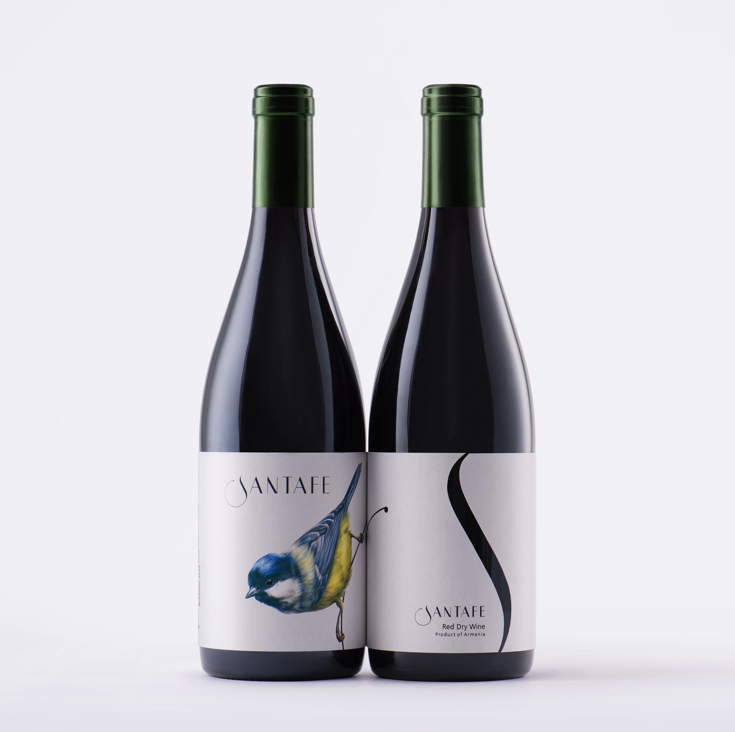
Santafe Wine labeling and packaging is designed to serve as a private label for Santafe café. A seasonal café with a piece of nature in the heart of an urban environment.
challenge
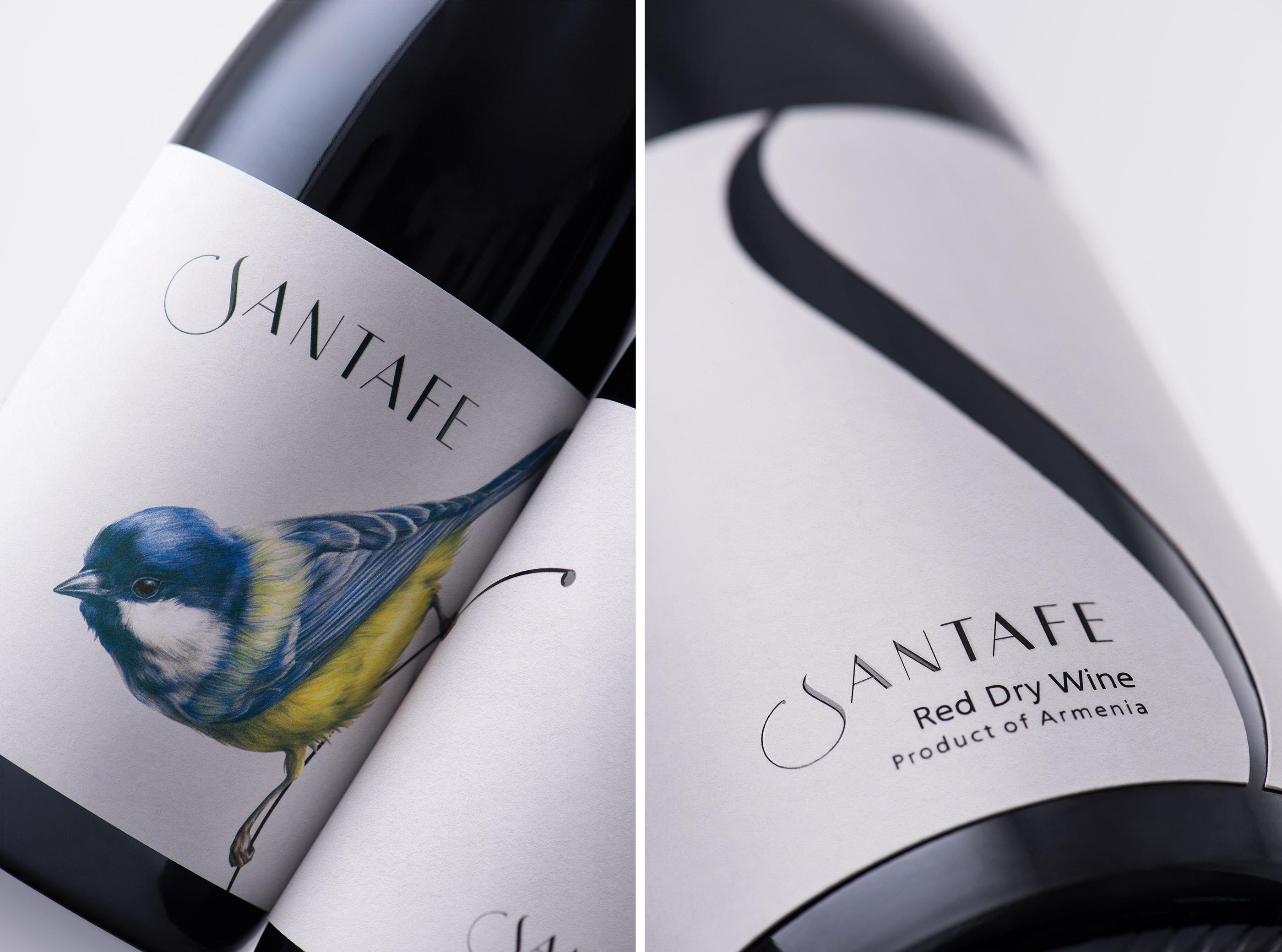
We believe, one of the most precise creatures depicting the freedom and beauty of nature is the birds. With this in mind, we developed this branding concept heralding the Blue Tit as a symbol of nature, a bird that inhabits in Armenia. This non-migrator beautiful garden bird is quite loyal and is famed for clinging to the outermost branches.
solution
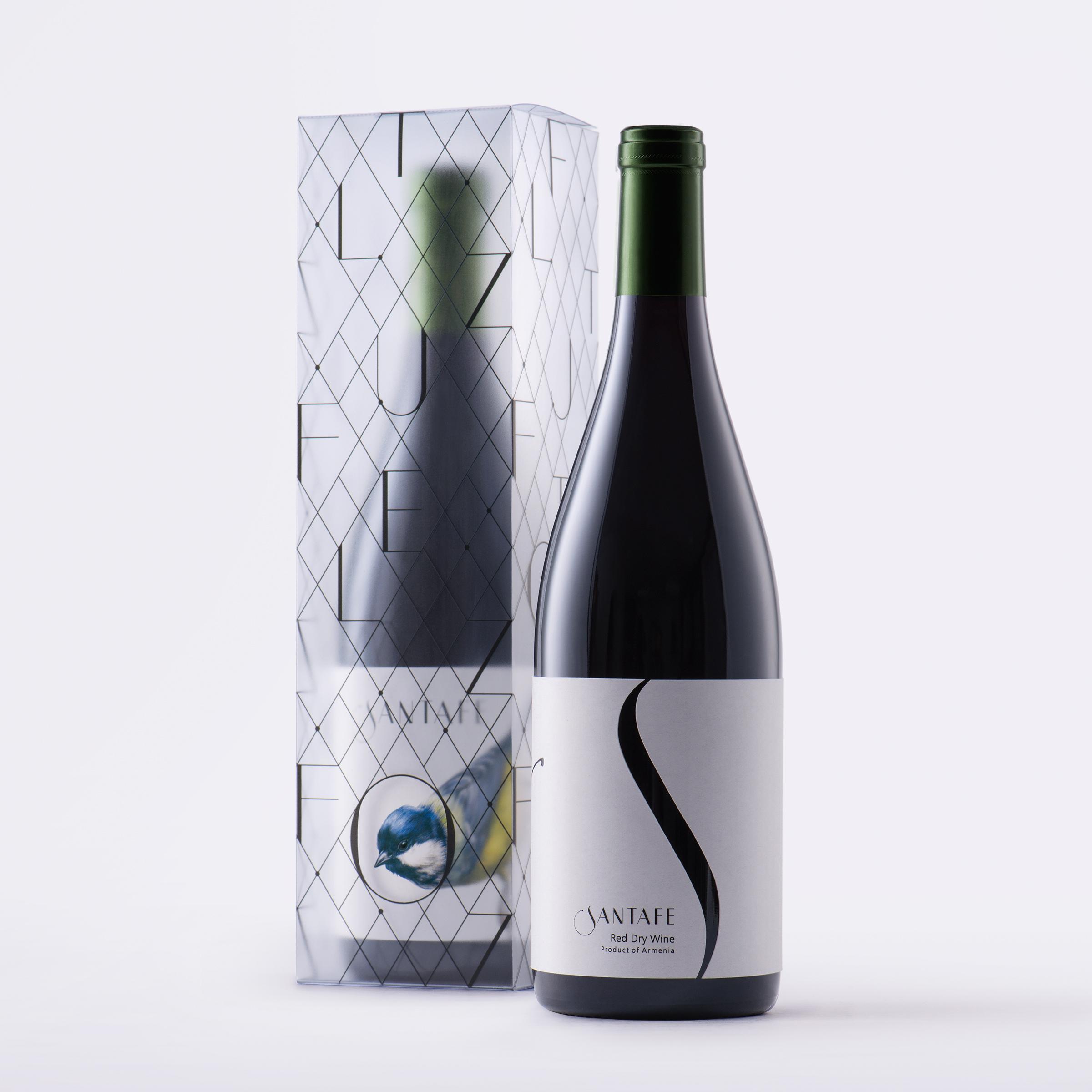
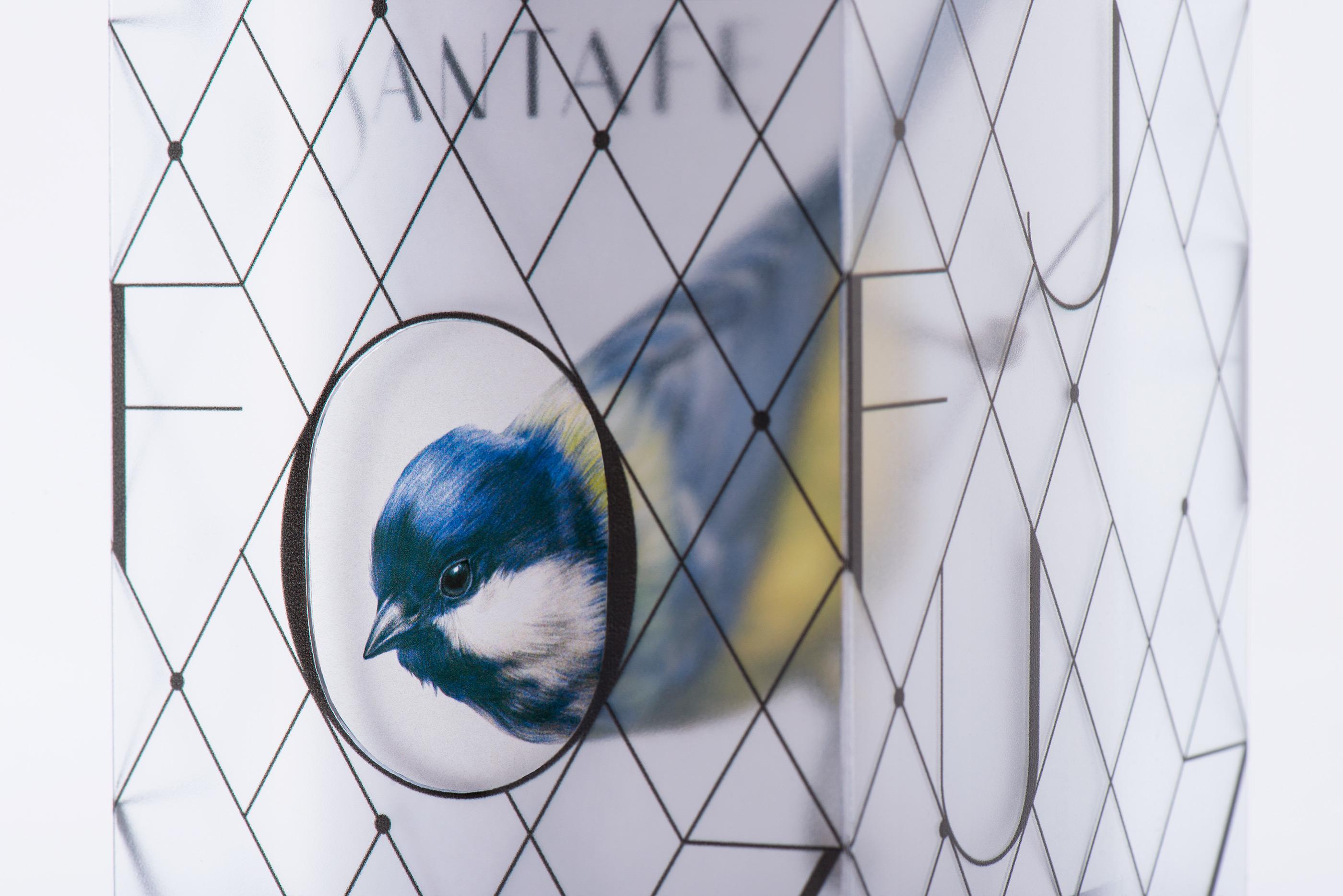
As a rule, these petite birds roost in ivy or evergreens; but in cold weather will shelter in a hole, which will represent the seasonality of the café. Hand-painted blue and yellow Santafe bird, paired with elegant typography make up the branding for this refined wine label. The transparent mate box of the wine designed with letters and lines creates the impression of a “cage” with a “window” on the bottom. The consumers set the bird free by opening the box and this concept completes the circle of nature and freedom associated with the brand.
More works