The Shack
Branding Services / Packaging design
industry
Restaurant Branding
client
Allied Brothers CO.
year
2015
overview
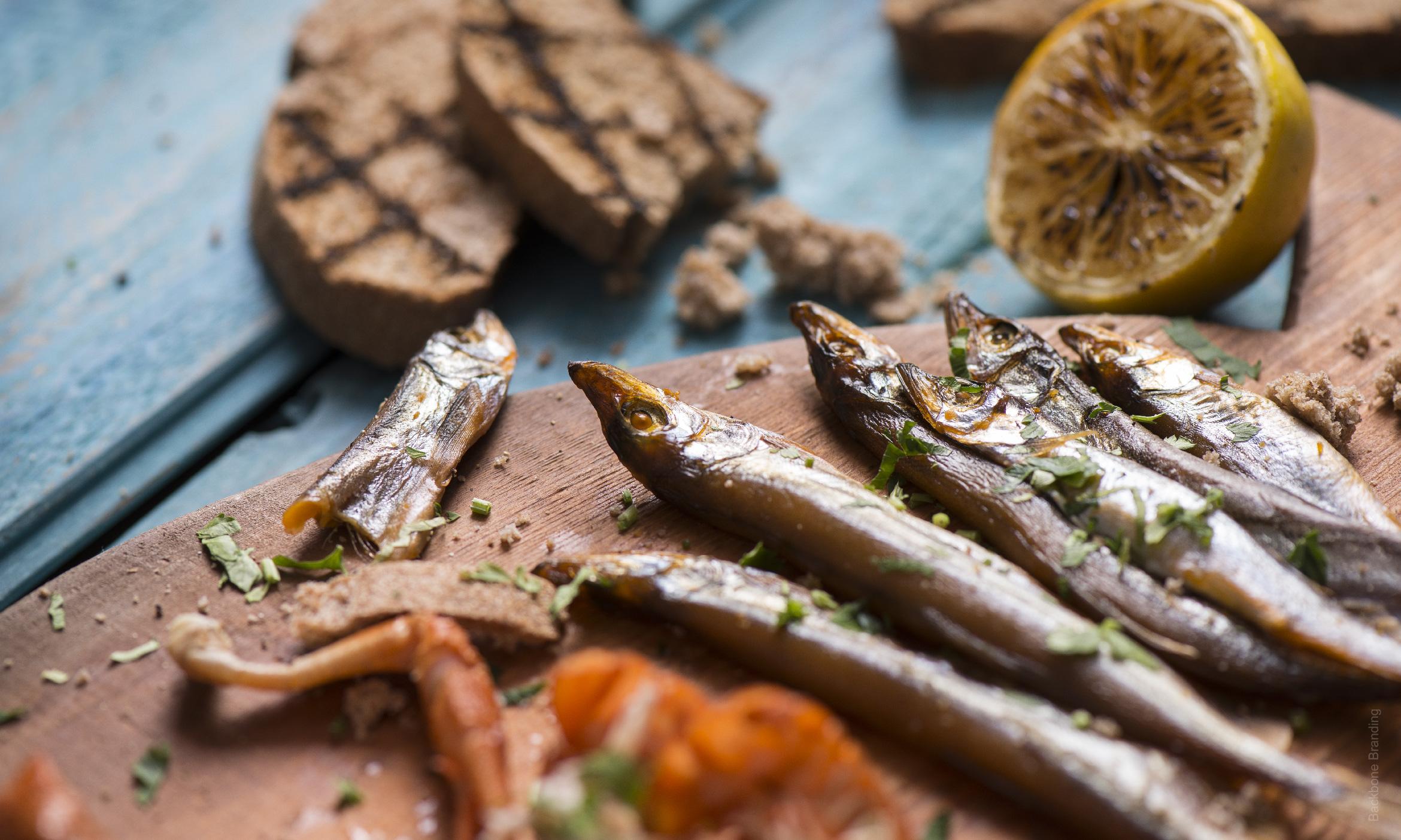
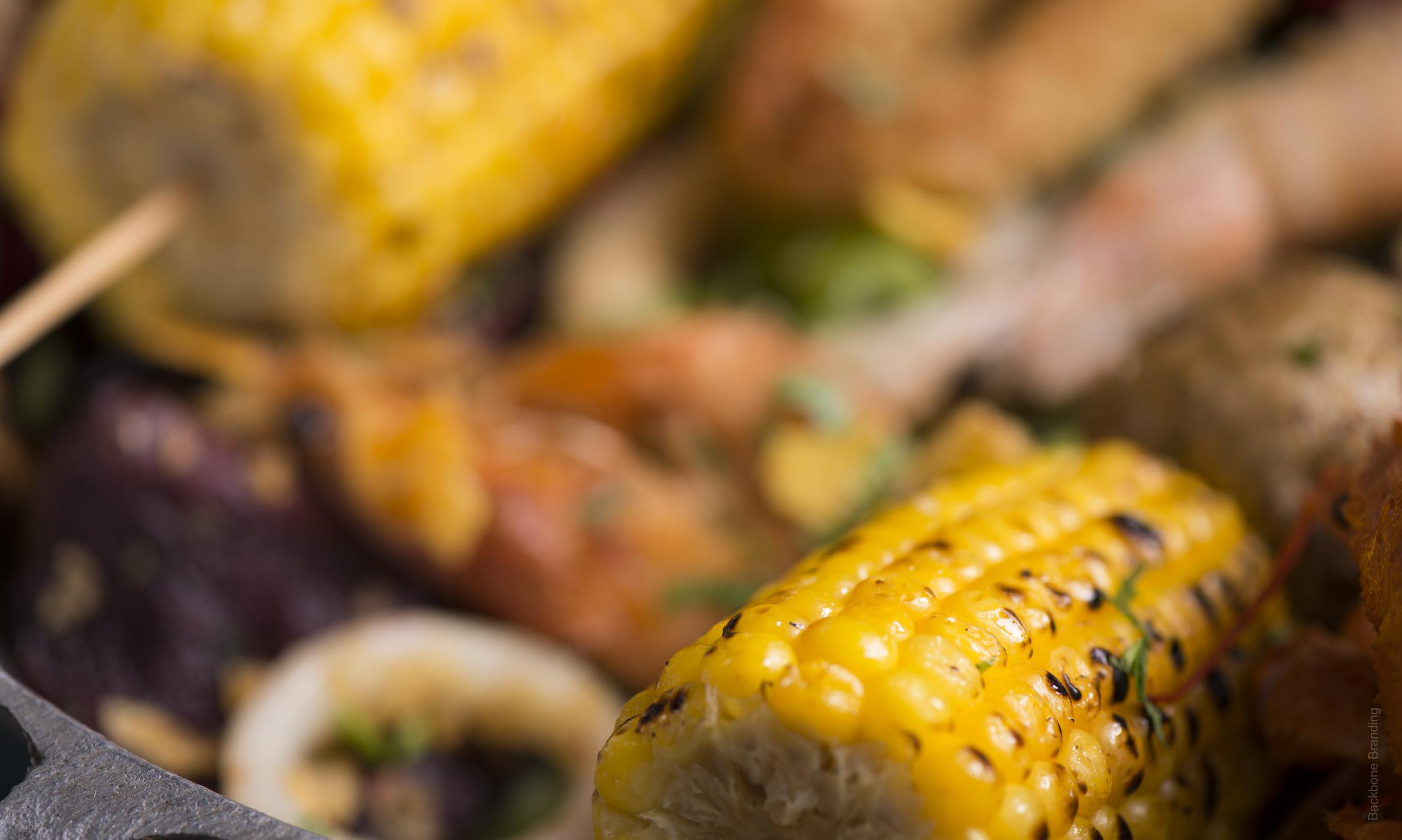
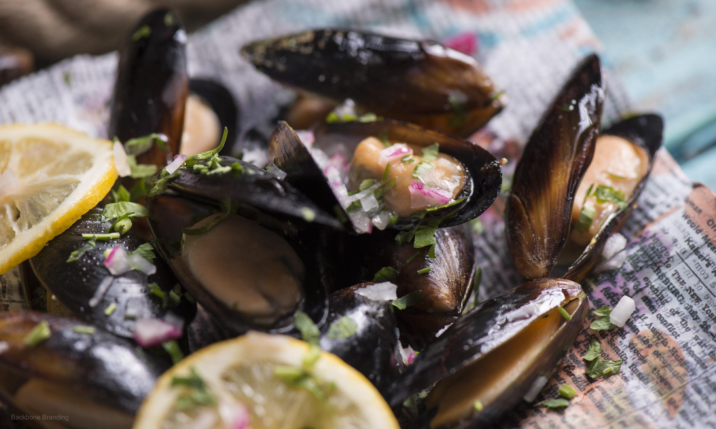
The Shack, a seafood restaurant located in Abu Dhabi.
challenge
We were tasked to develop a branding and packaging for a seafood restaurant with a mood of the spirit of the sea and of freshly fished seafood.
solution
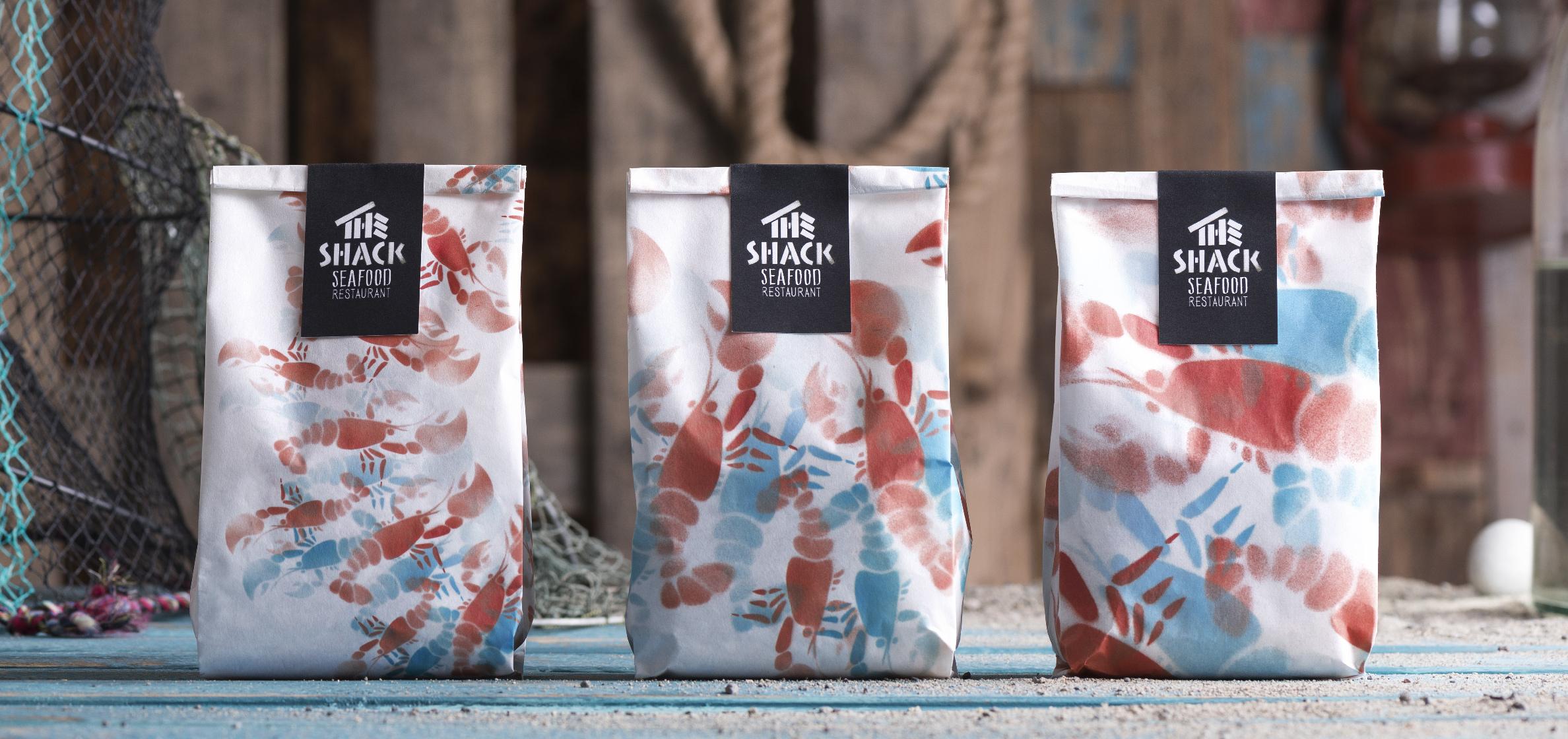
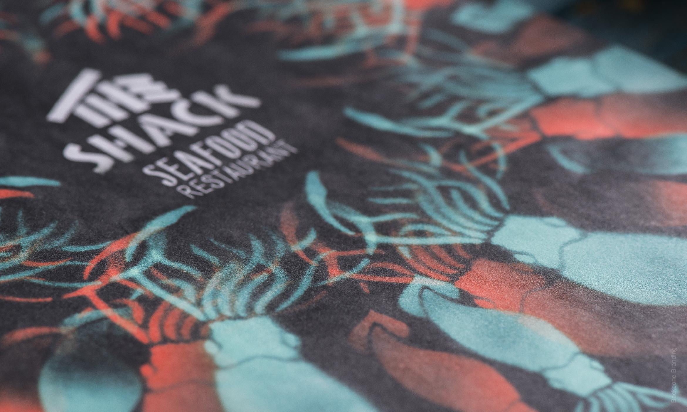
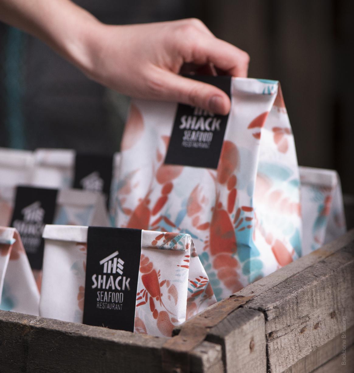
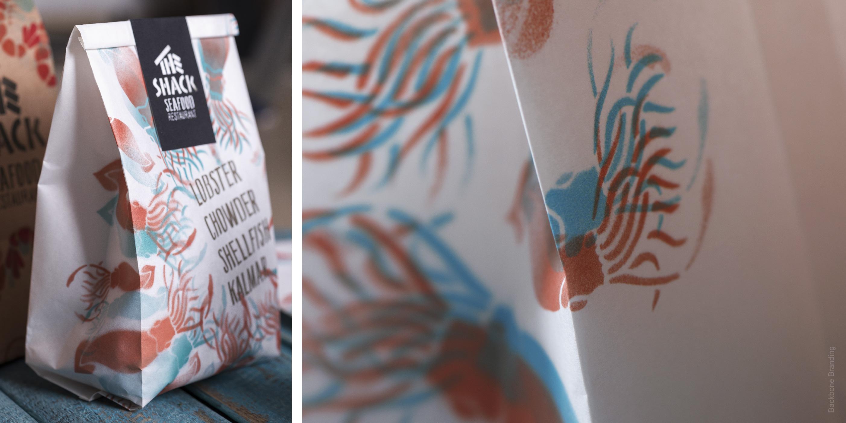
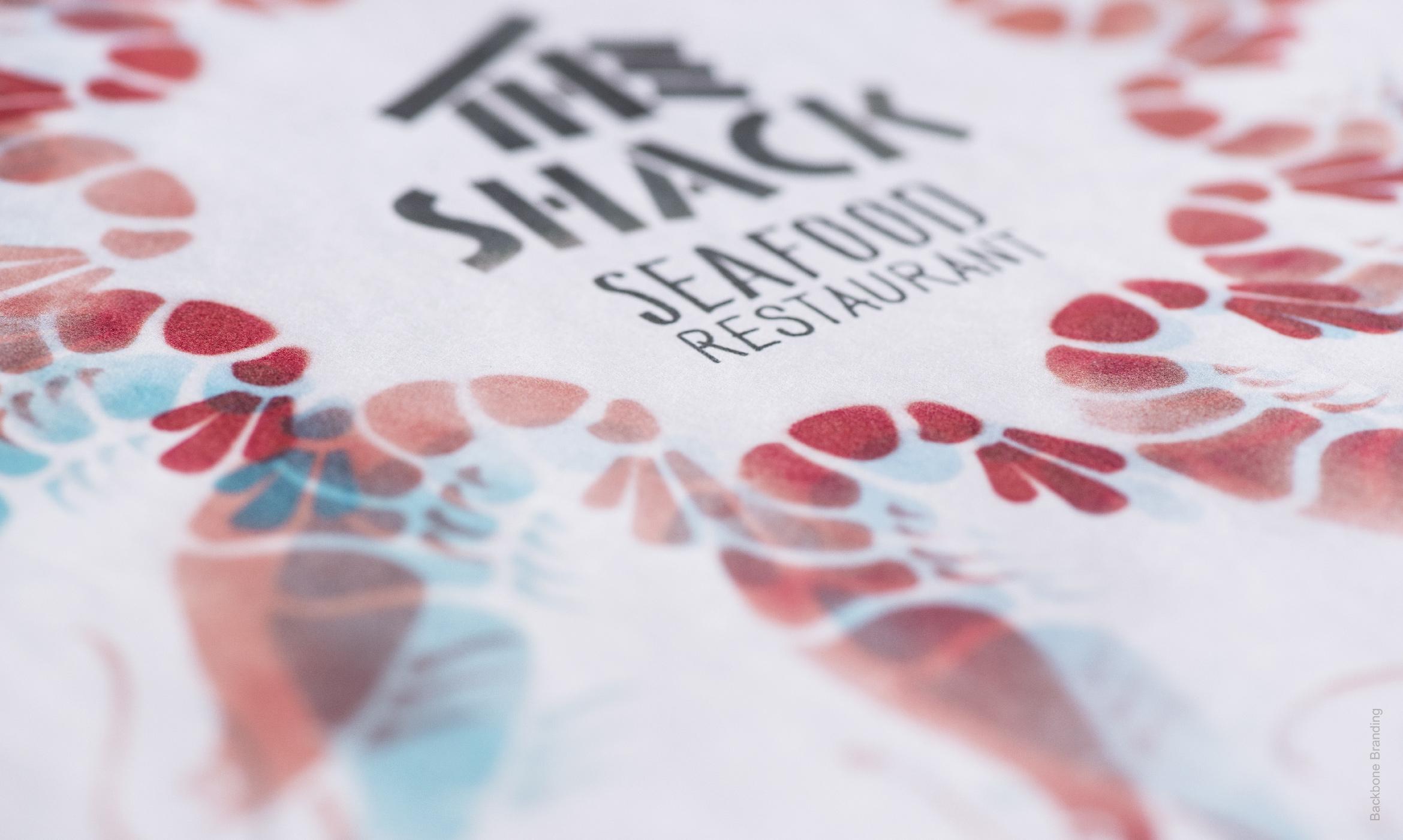
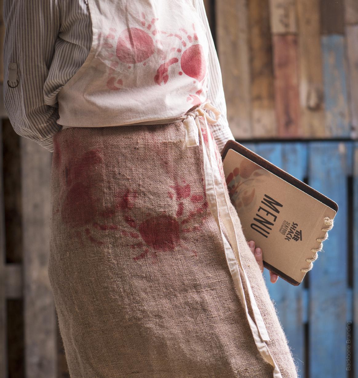
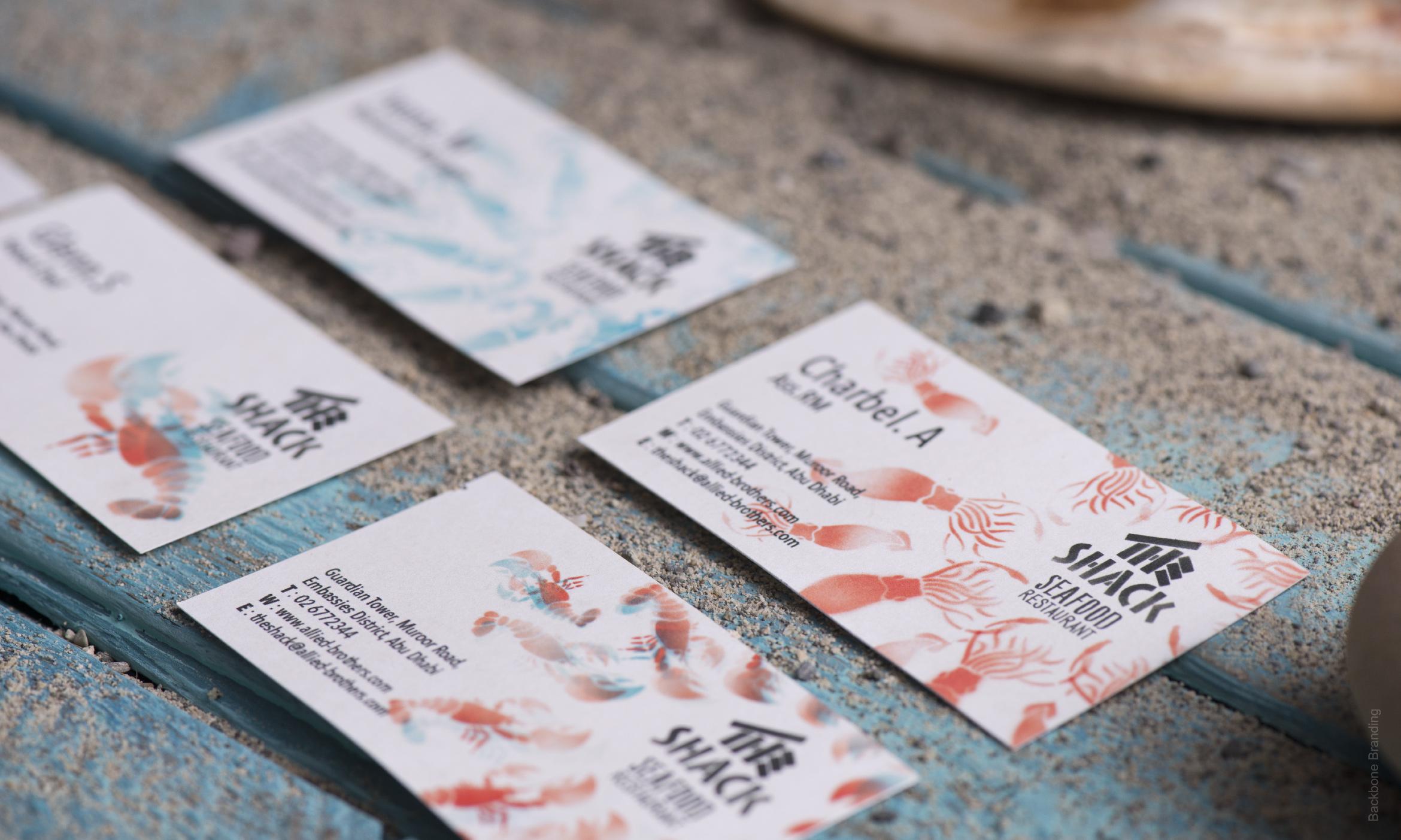
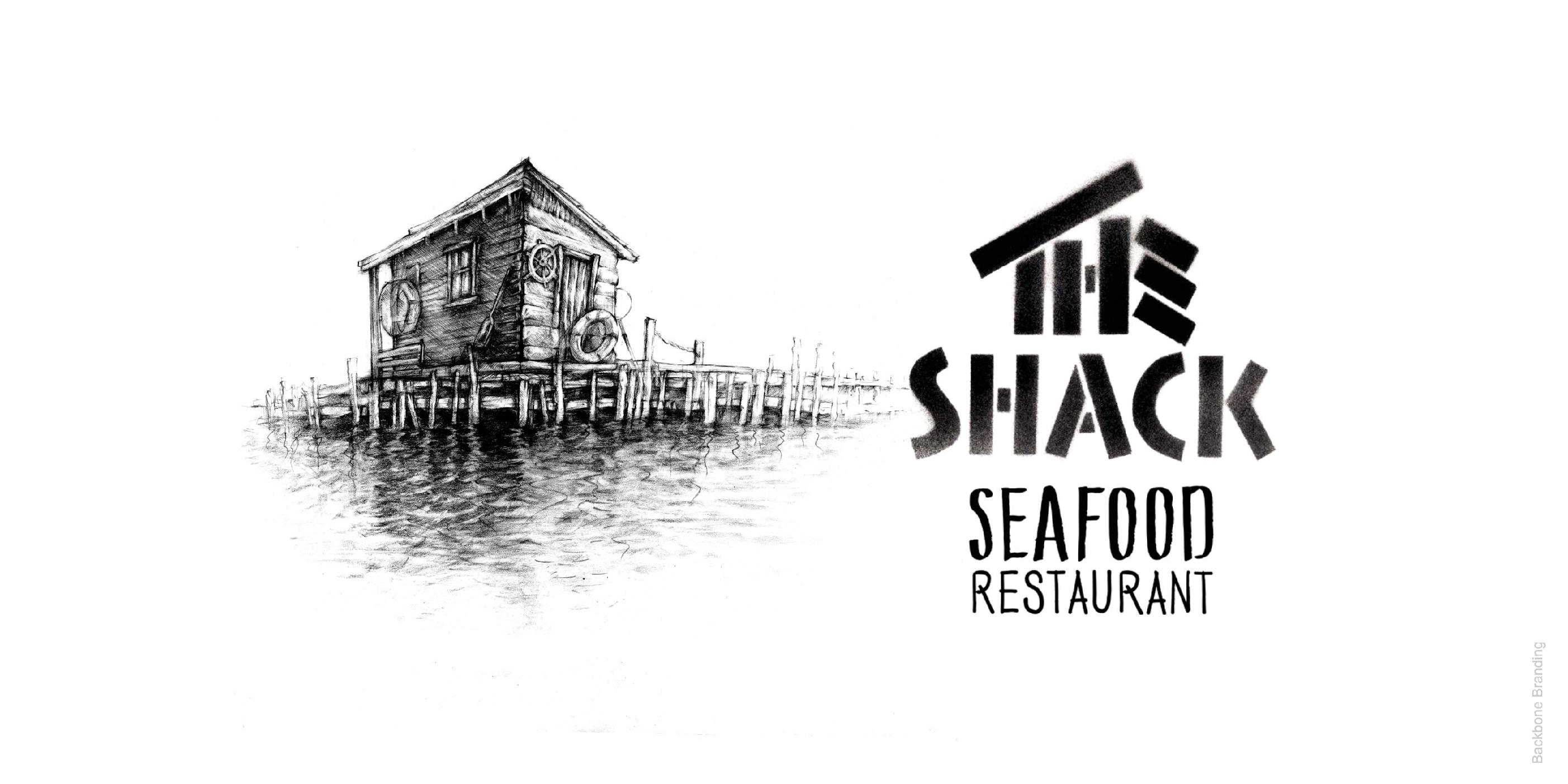
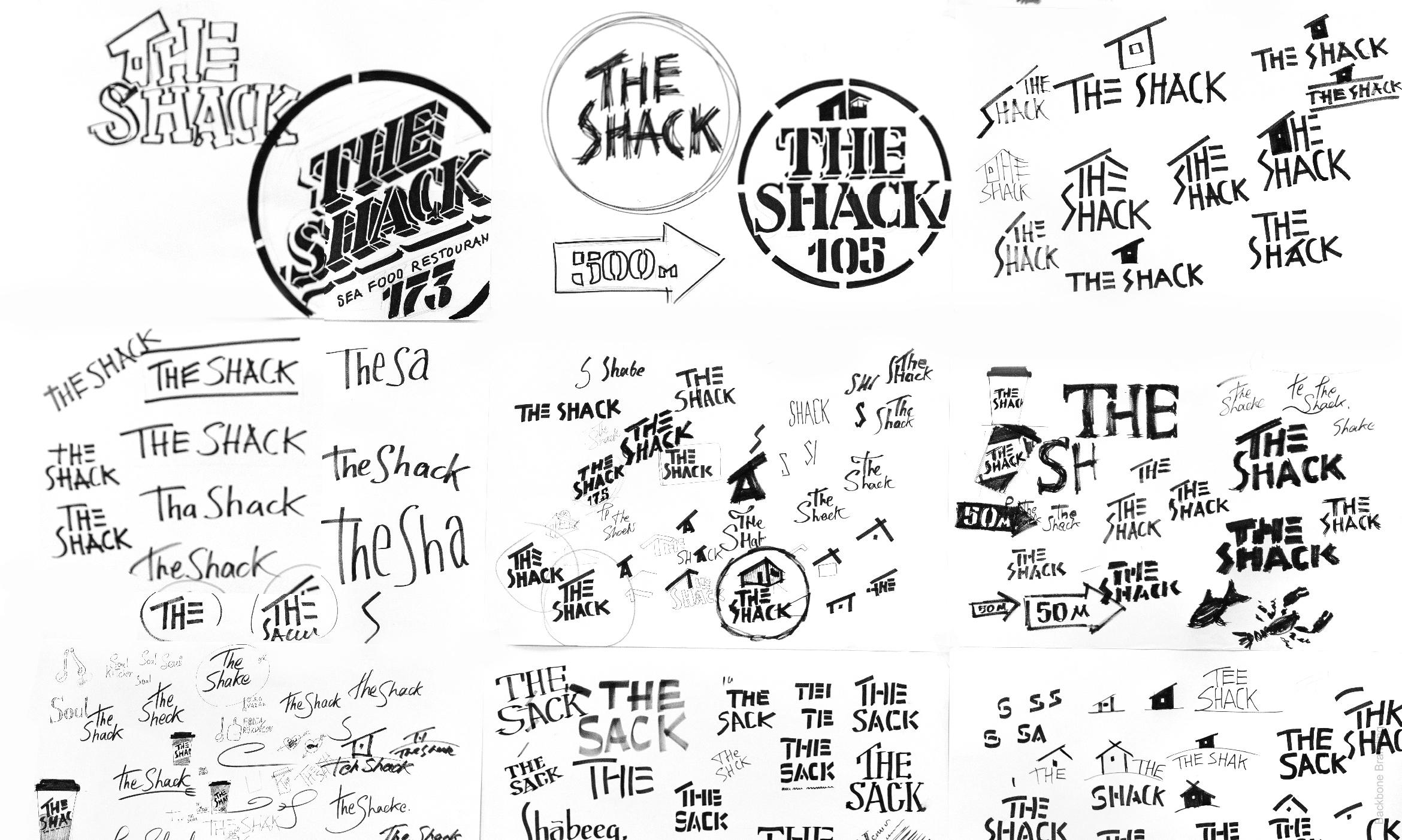
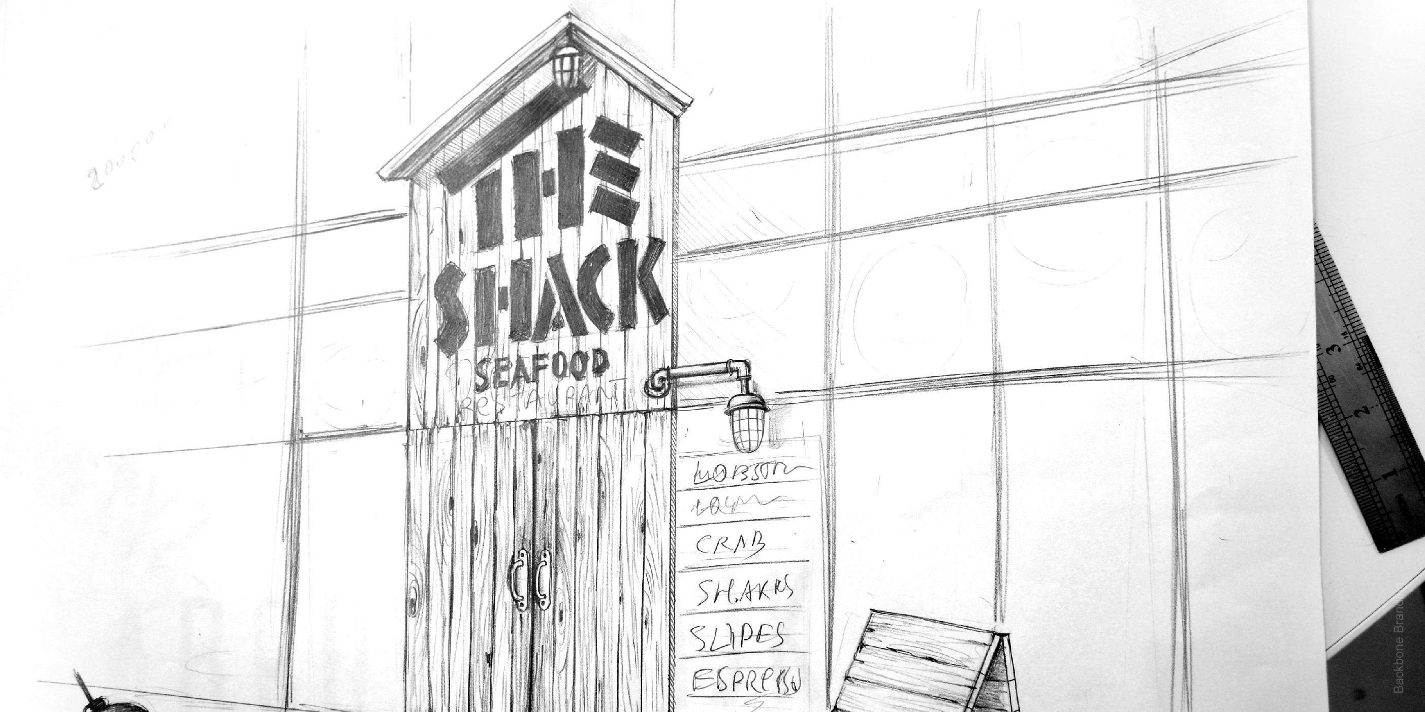
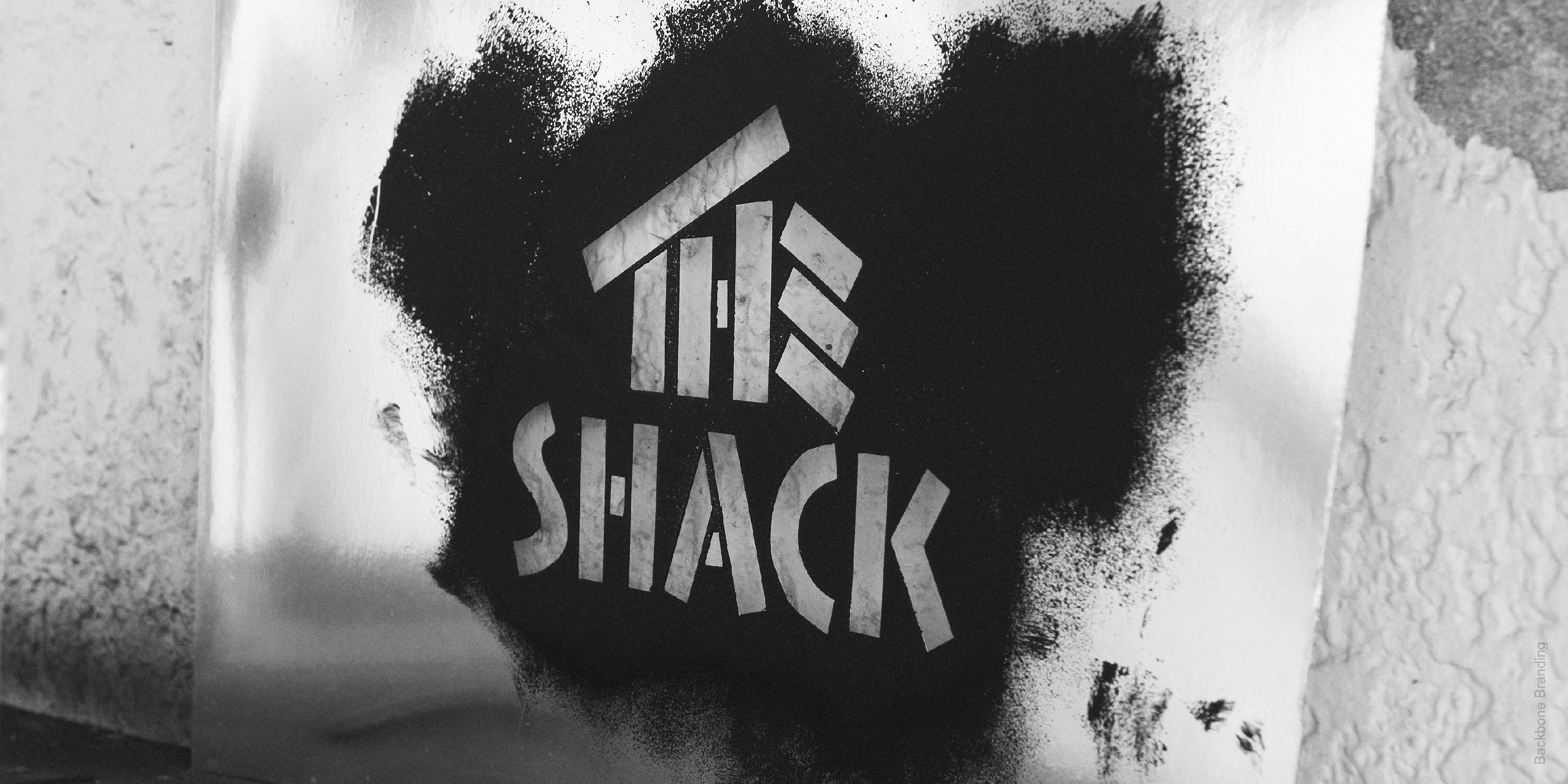
We celebrated the seafood eating culture in the shacks by telling a story about one of them. The Shack means a small wooden fishing house. The logo construction visualizes the naming and its design recalls to a shack. According to the concept, the owner, who is the fisherman, will entertain you to delicious fished wild seafood, wherein having just a small restaurant which is not that rich. He afford expensive design and brand identity.
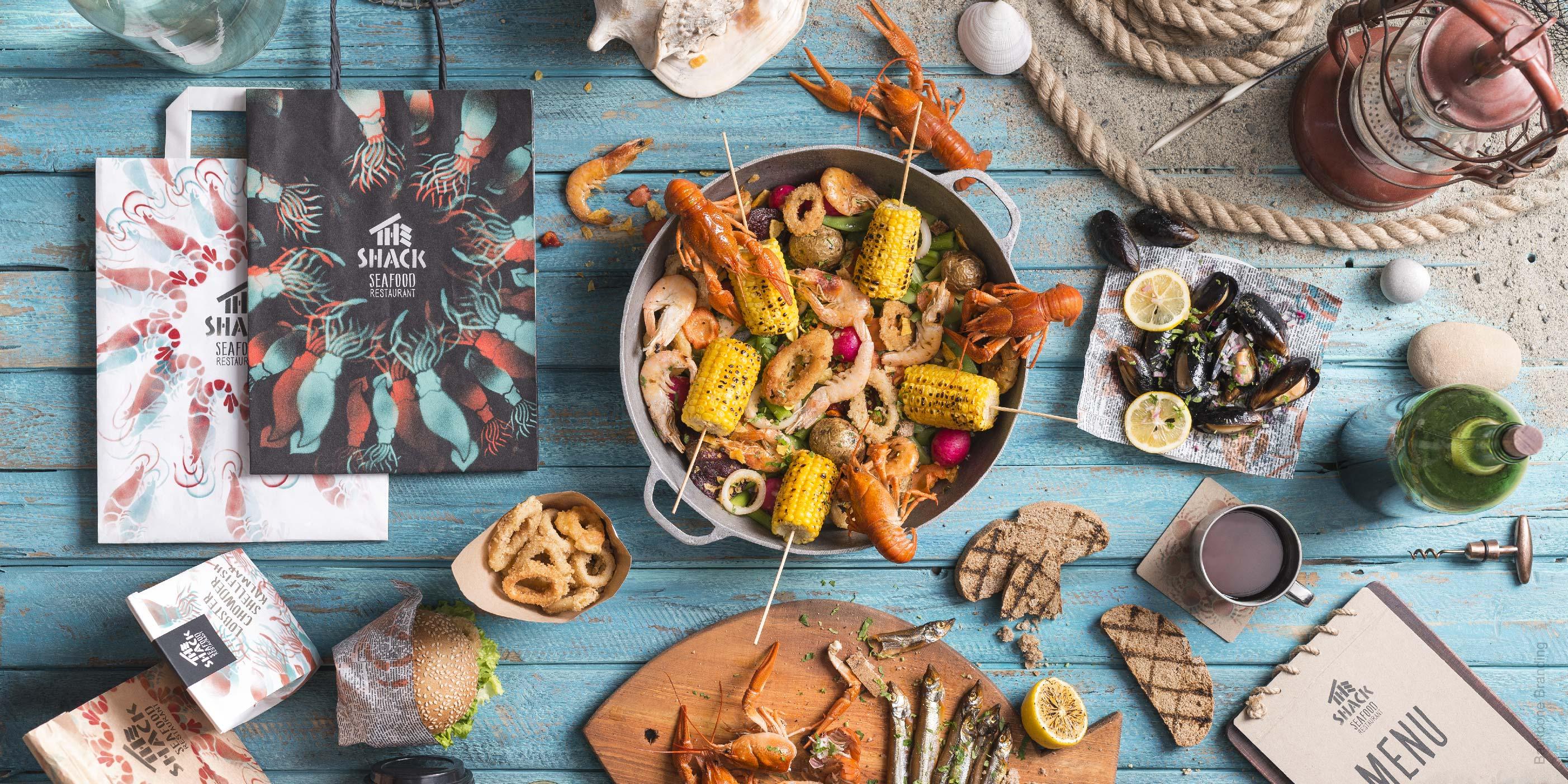
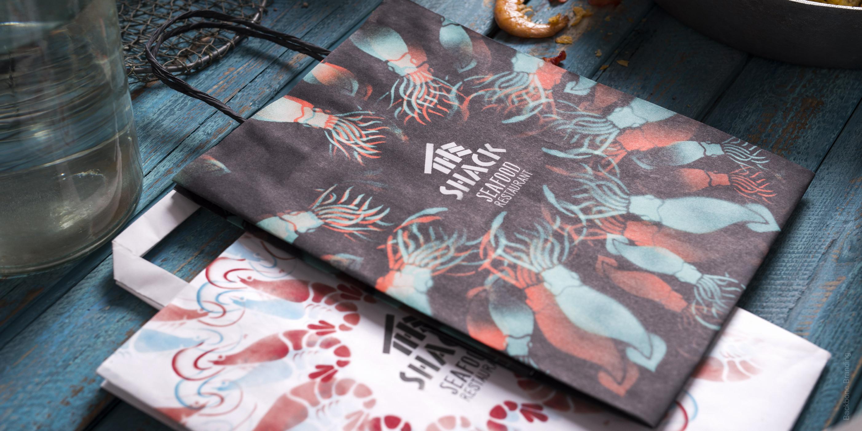
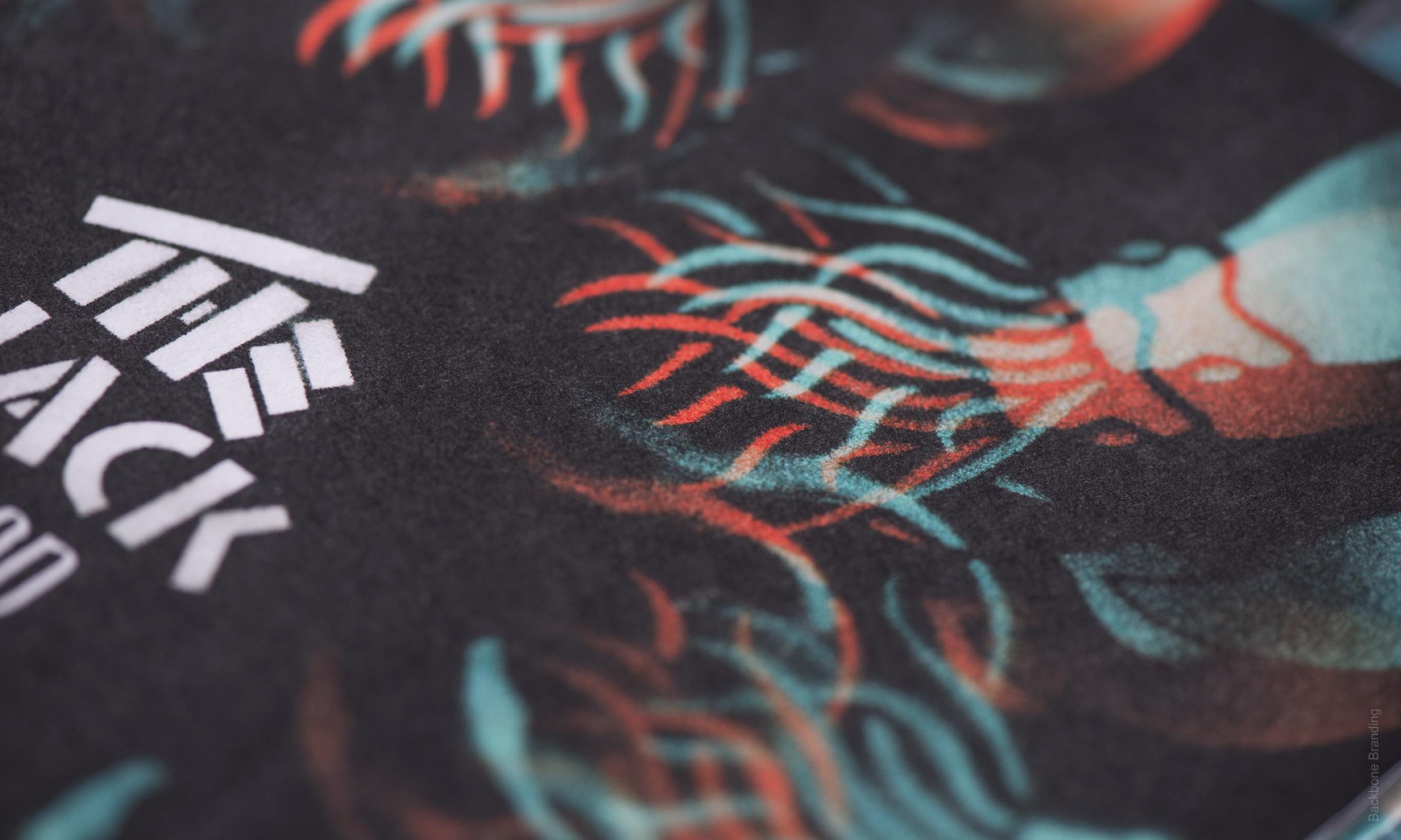
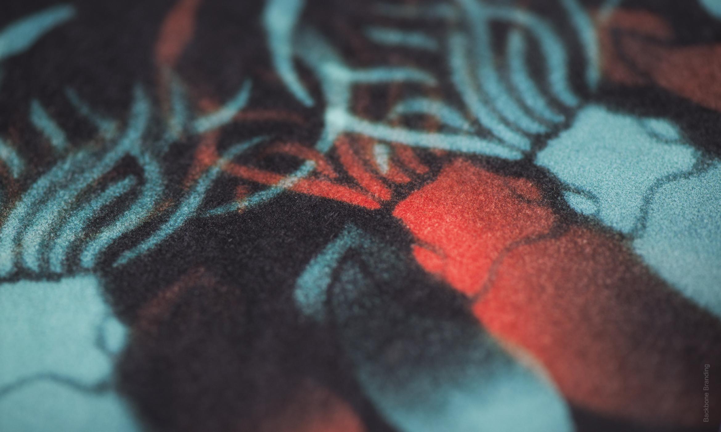
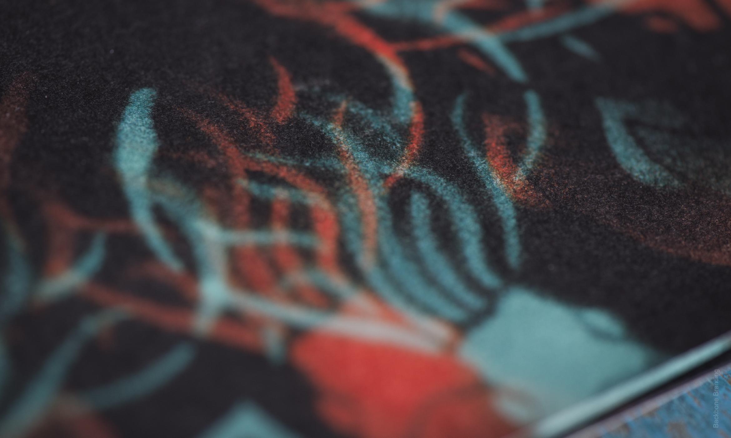
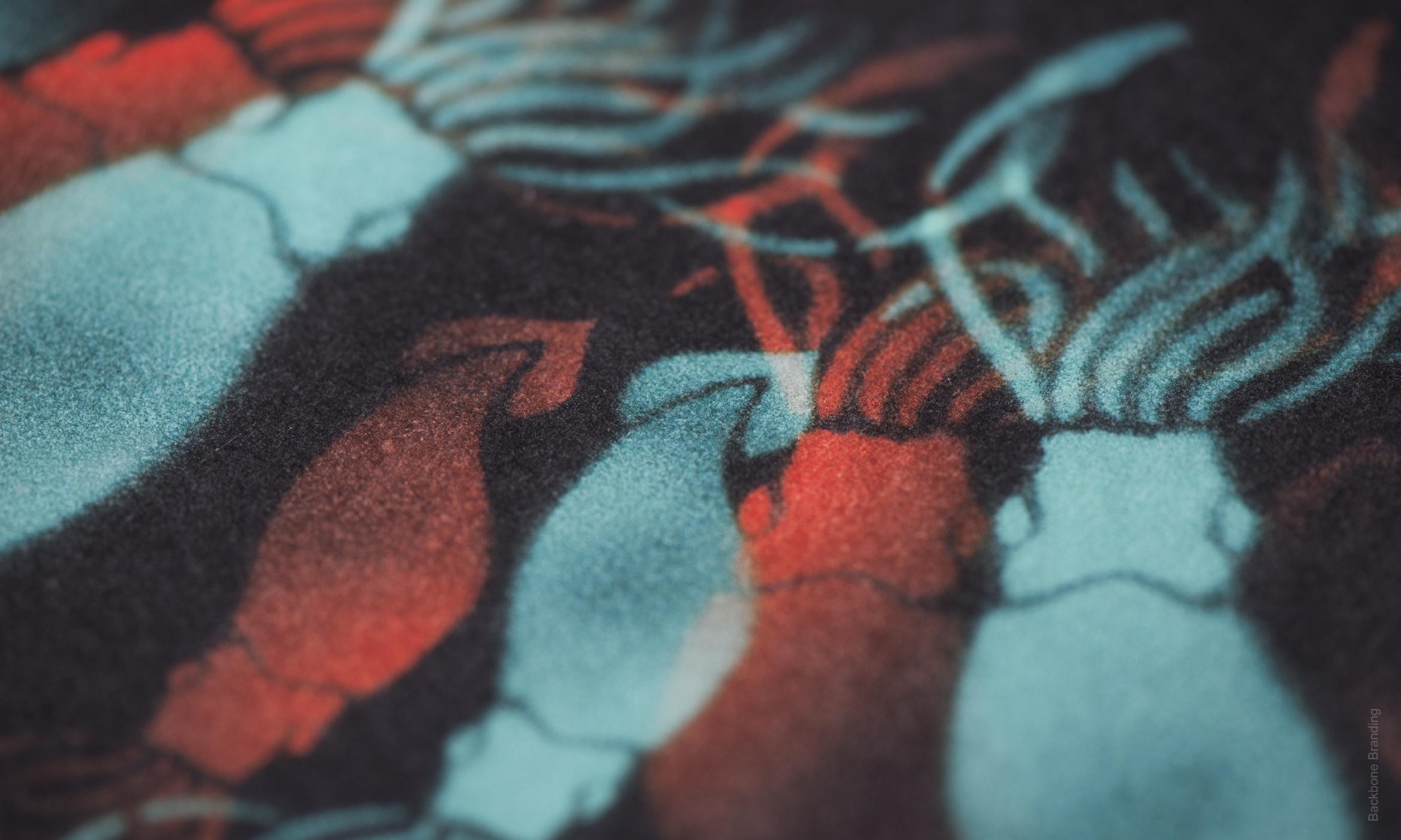
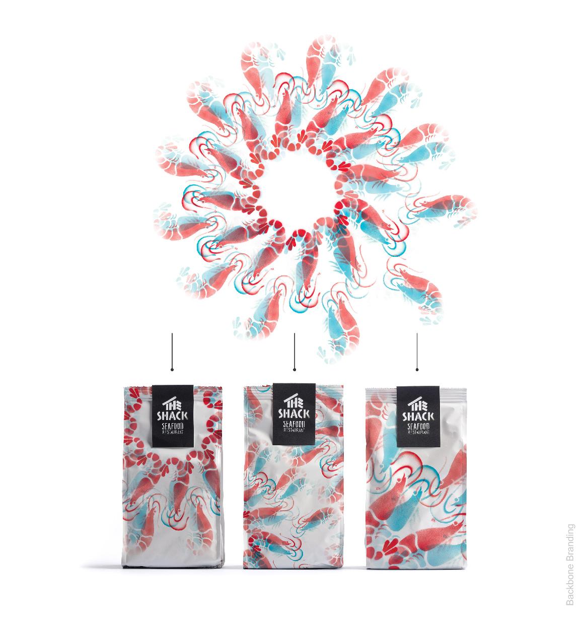
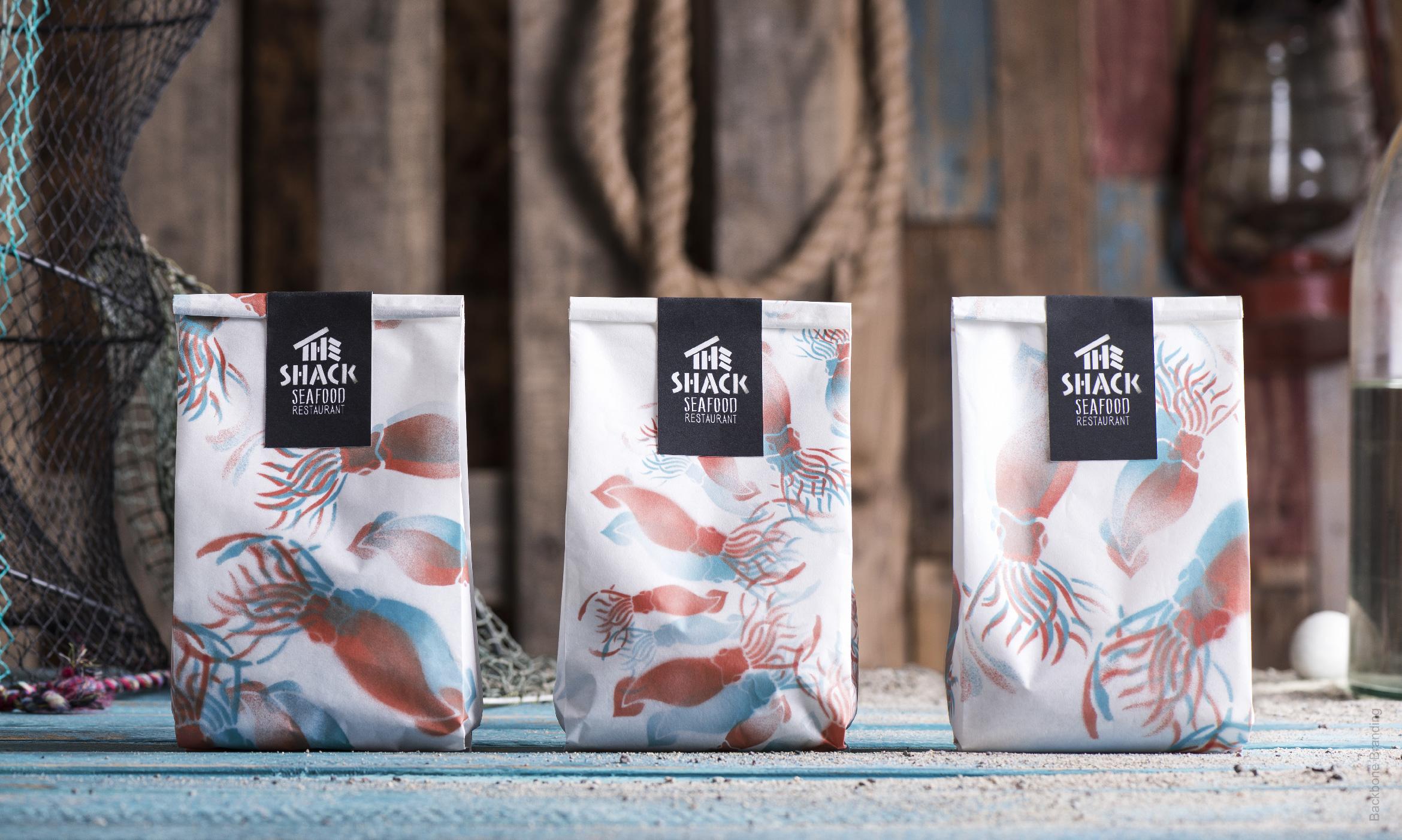
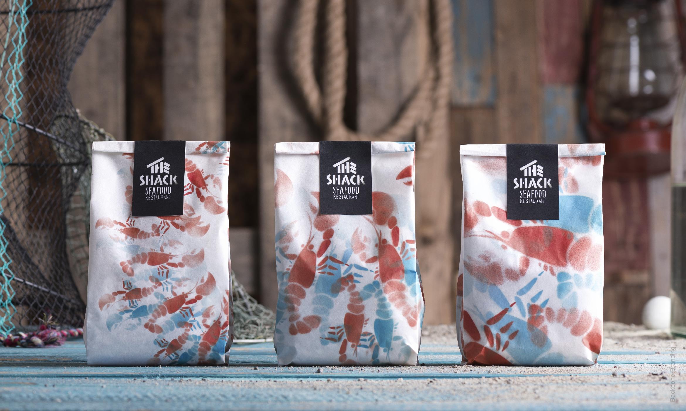
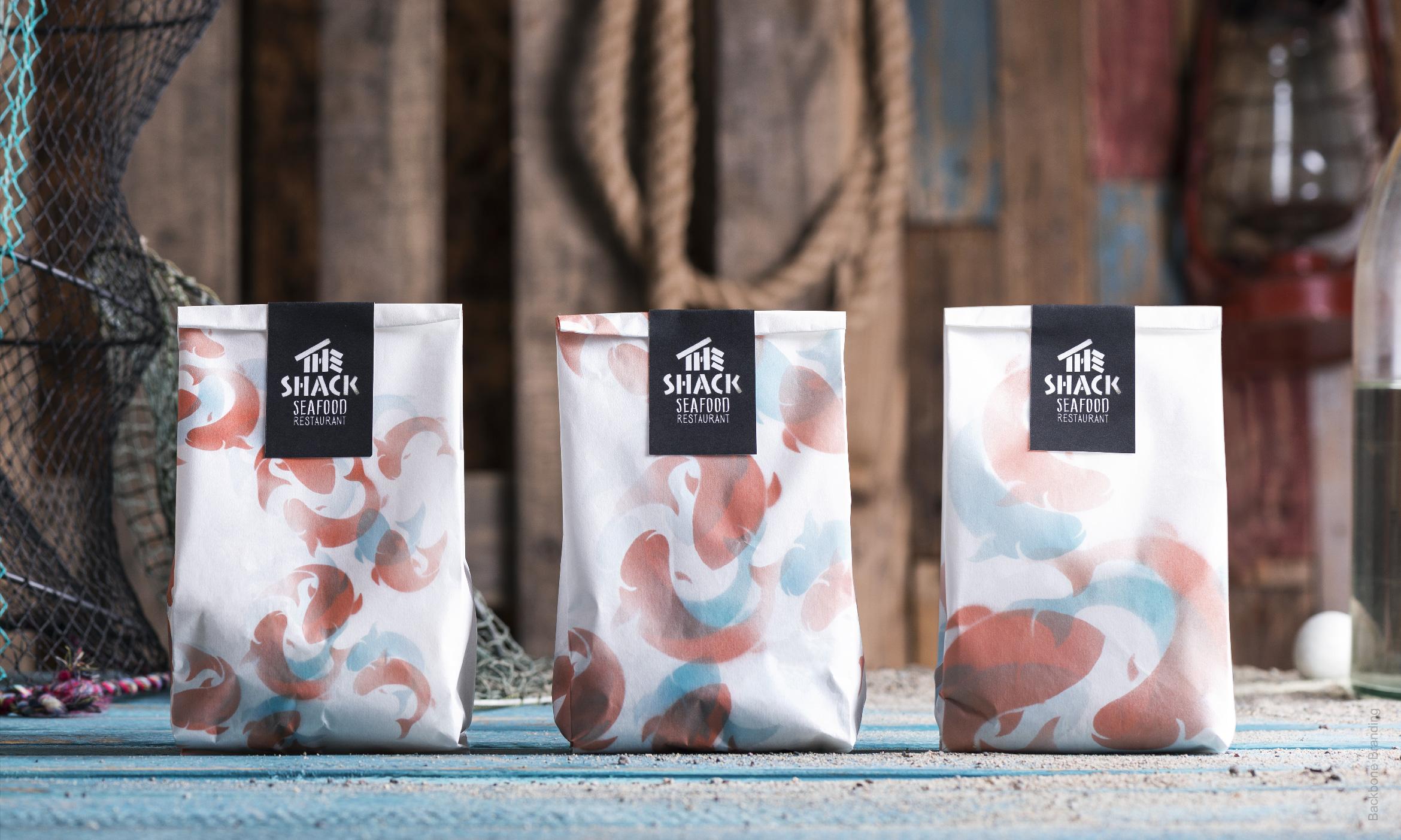
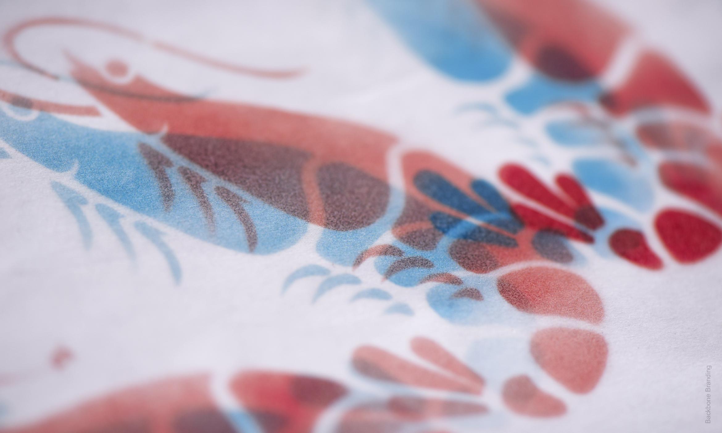
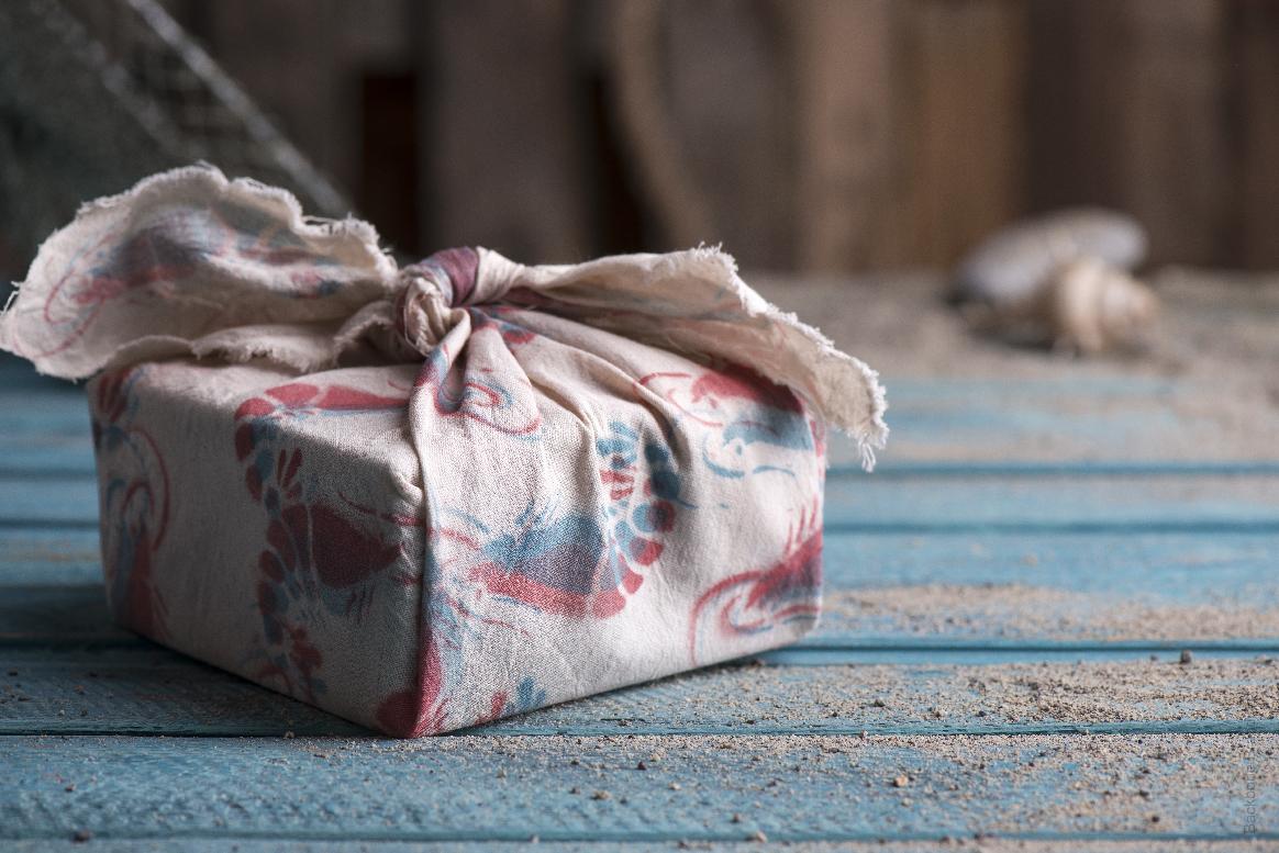
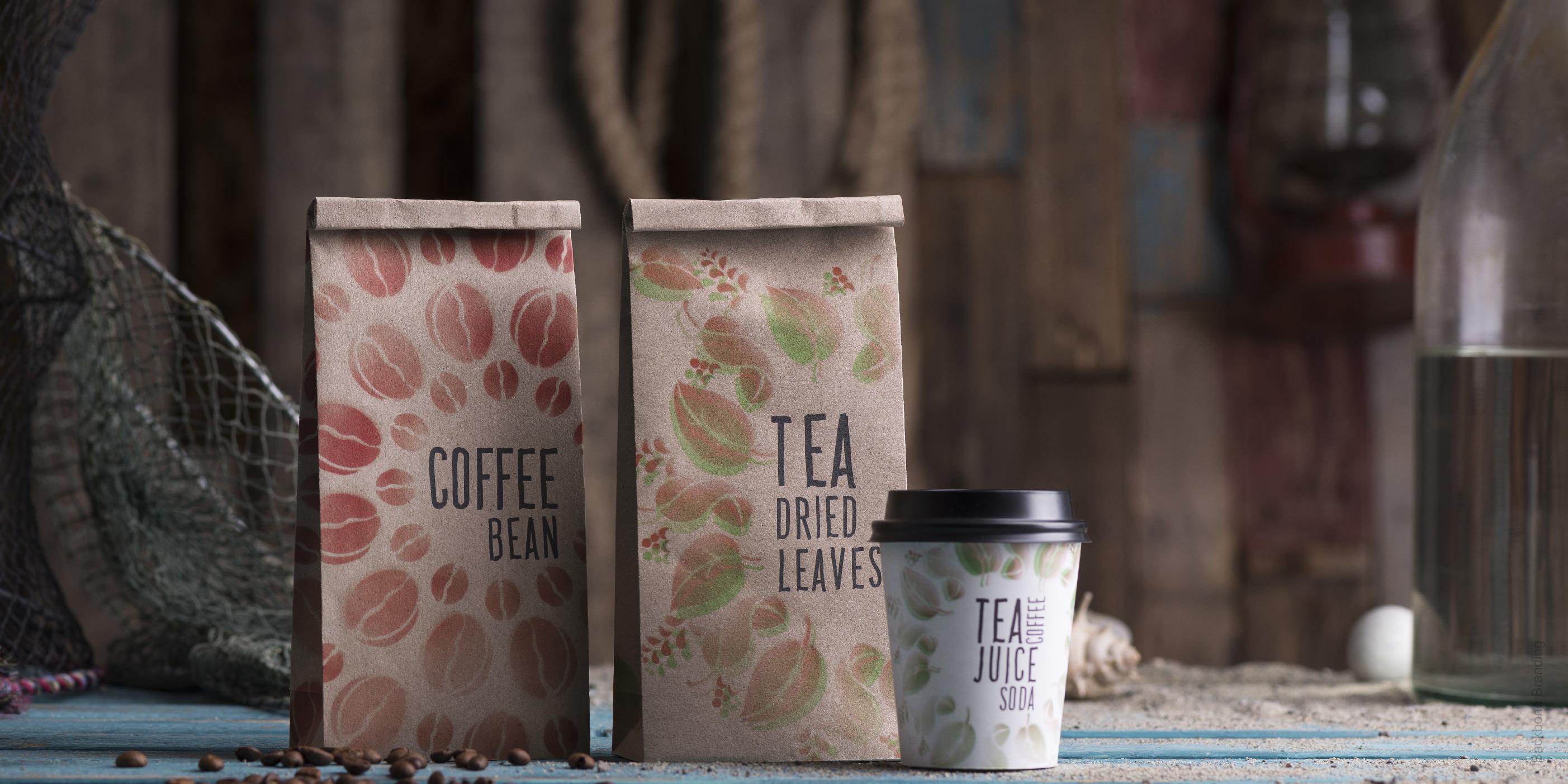
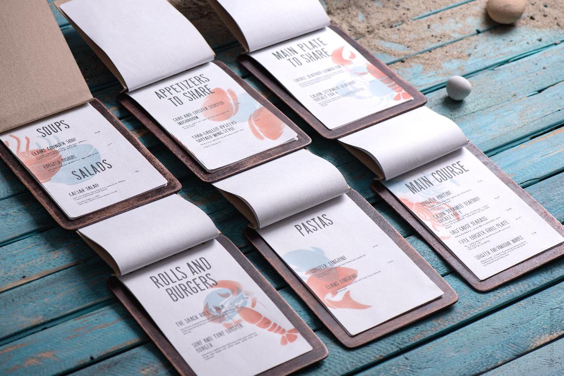
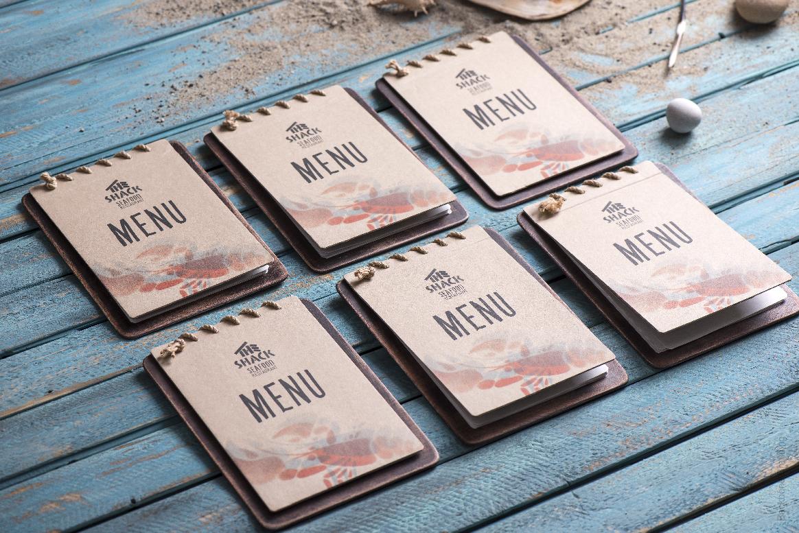
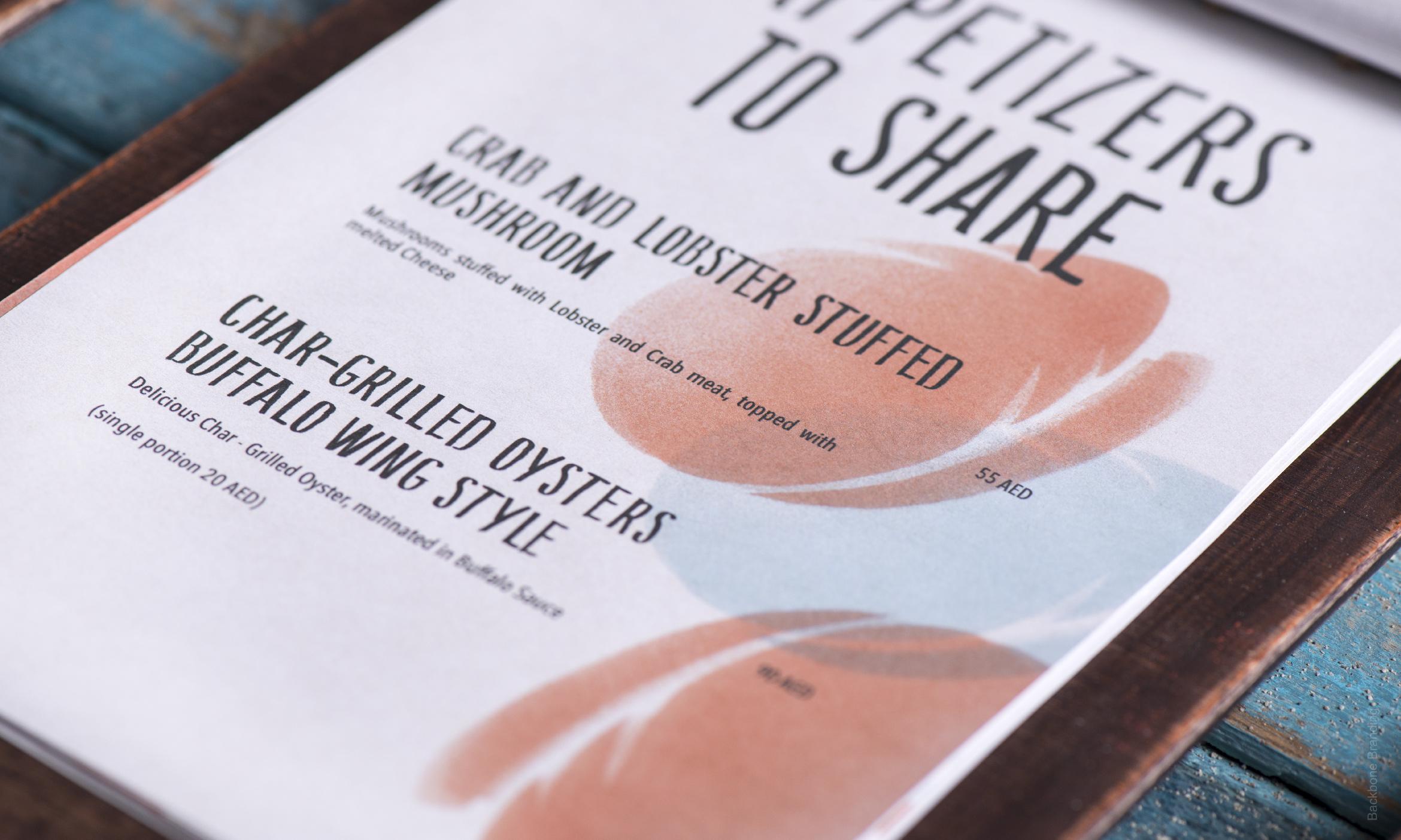
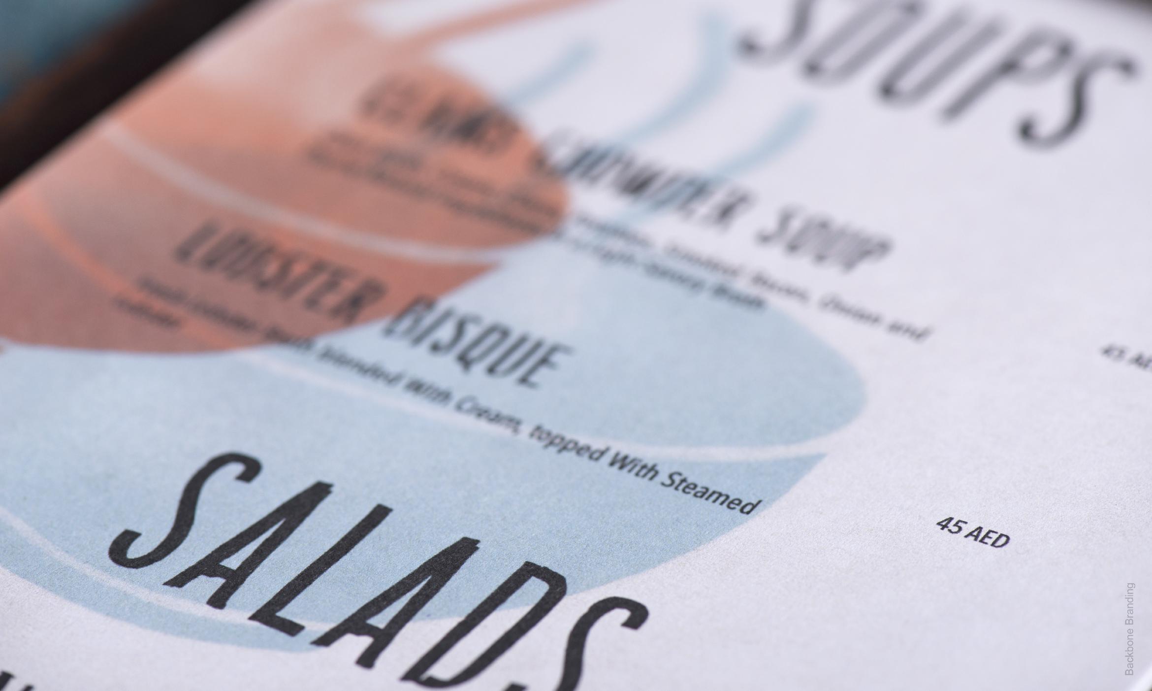
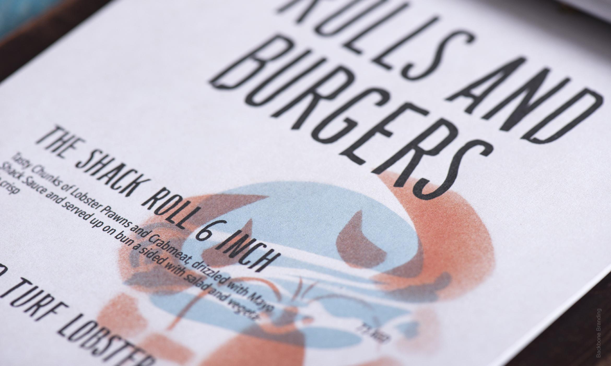
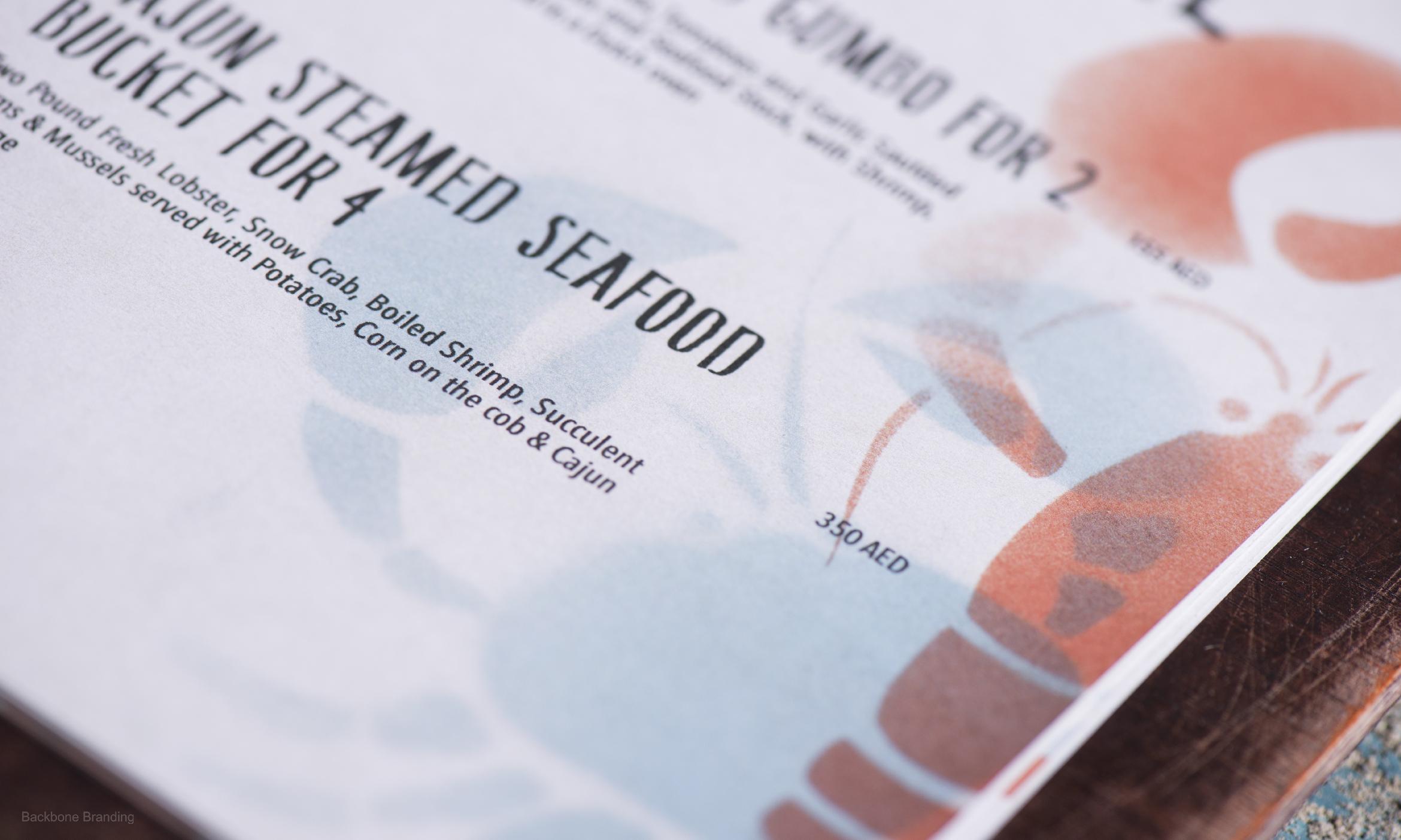
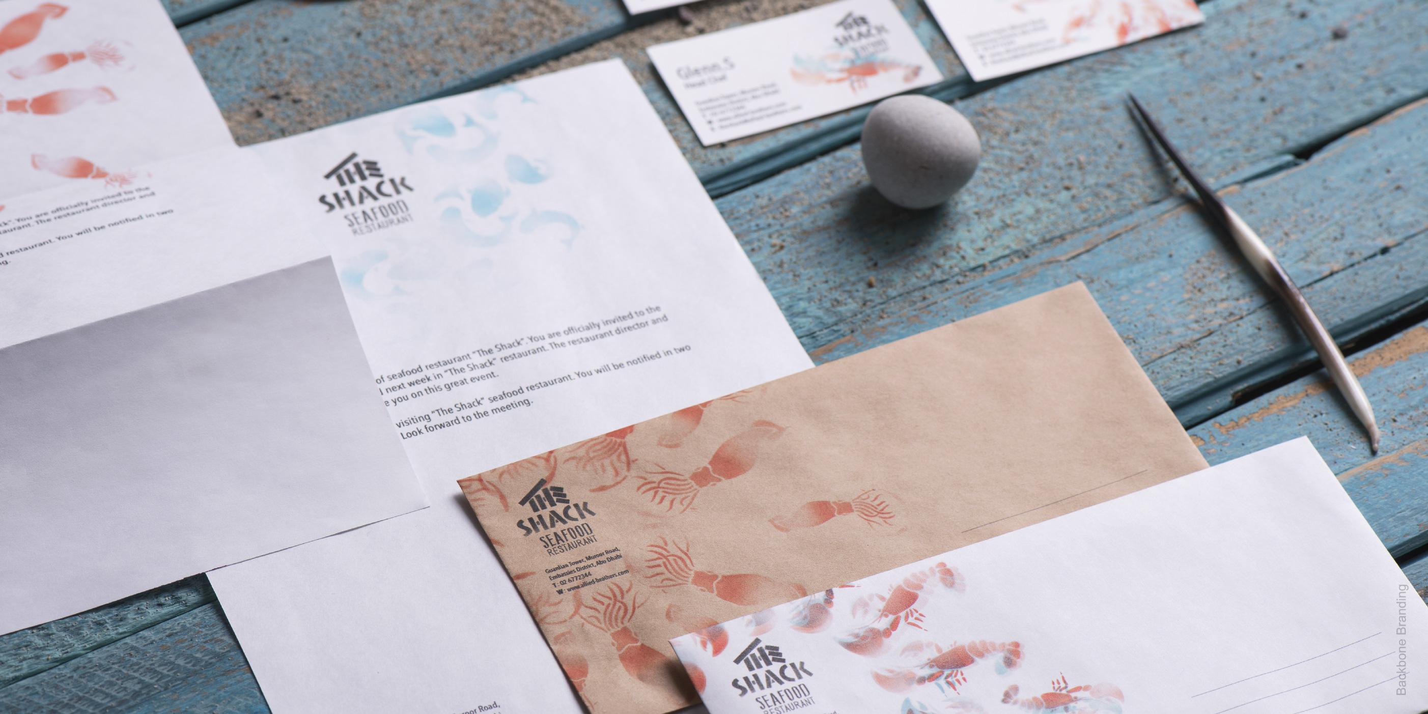
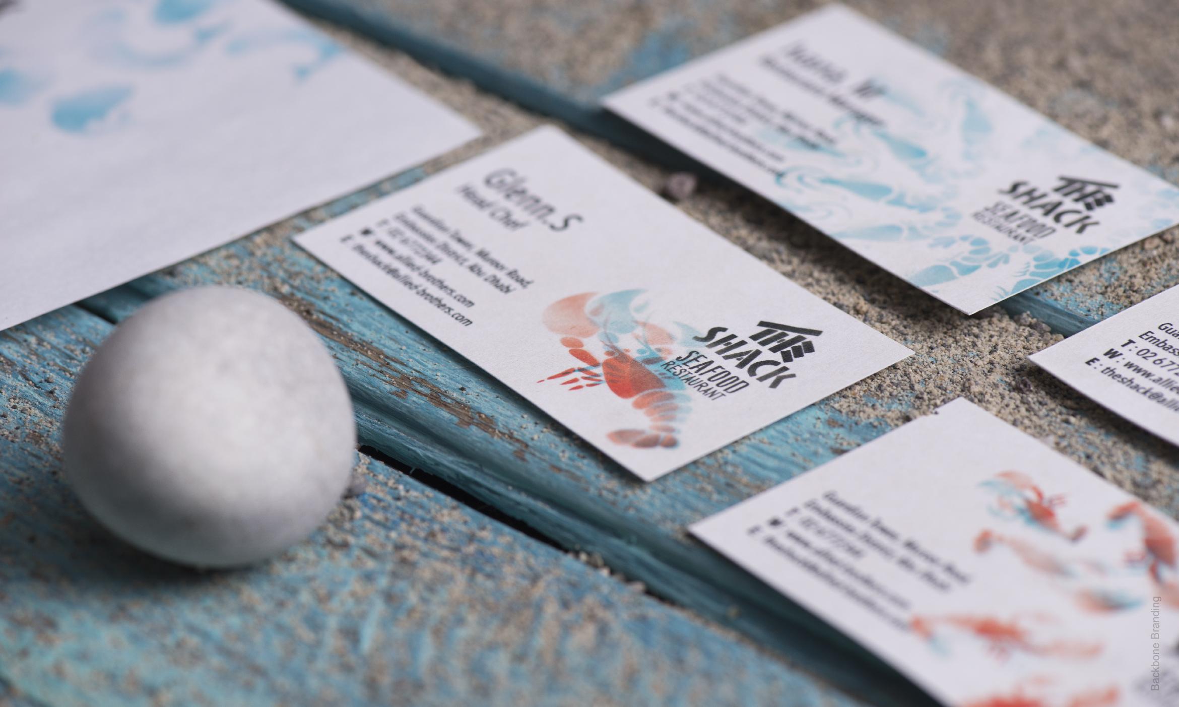
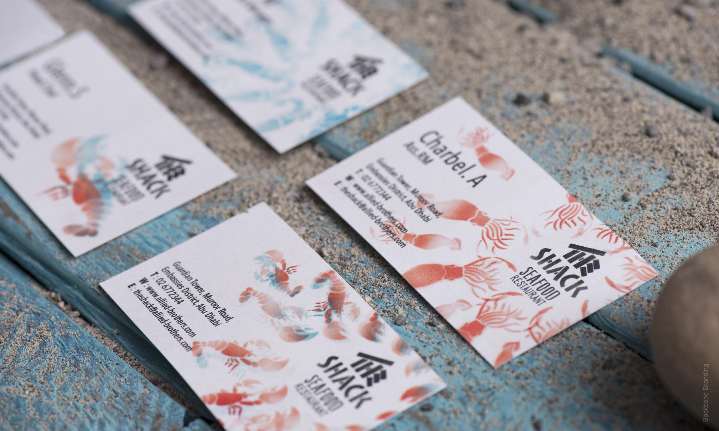
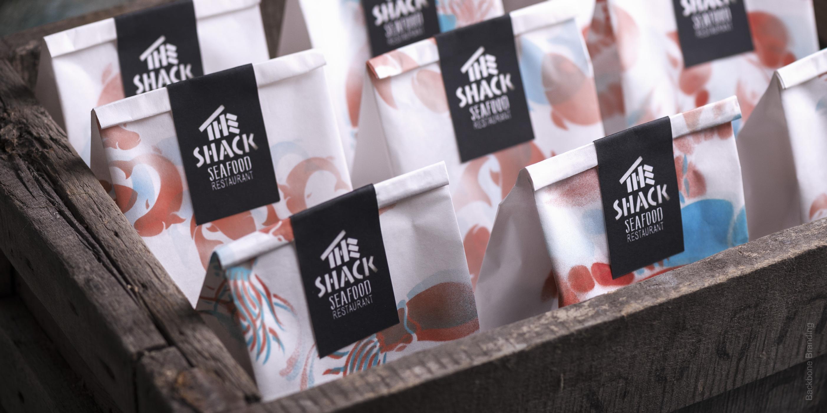
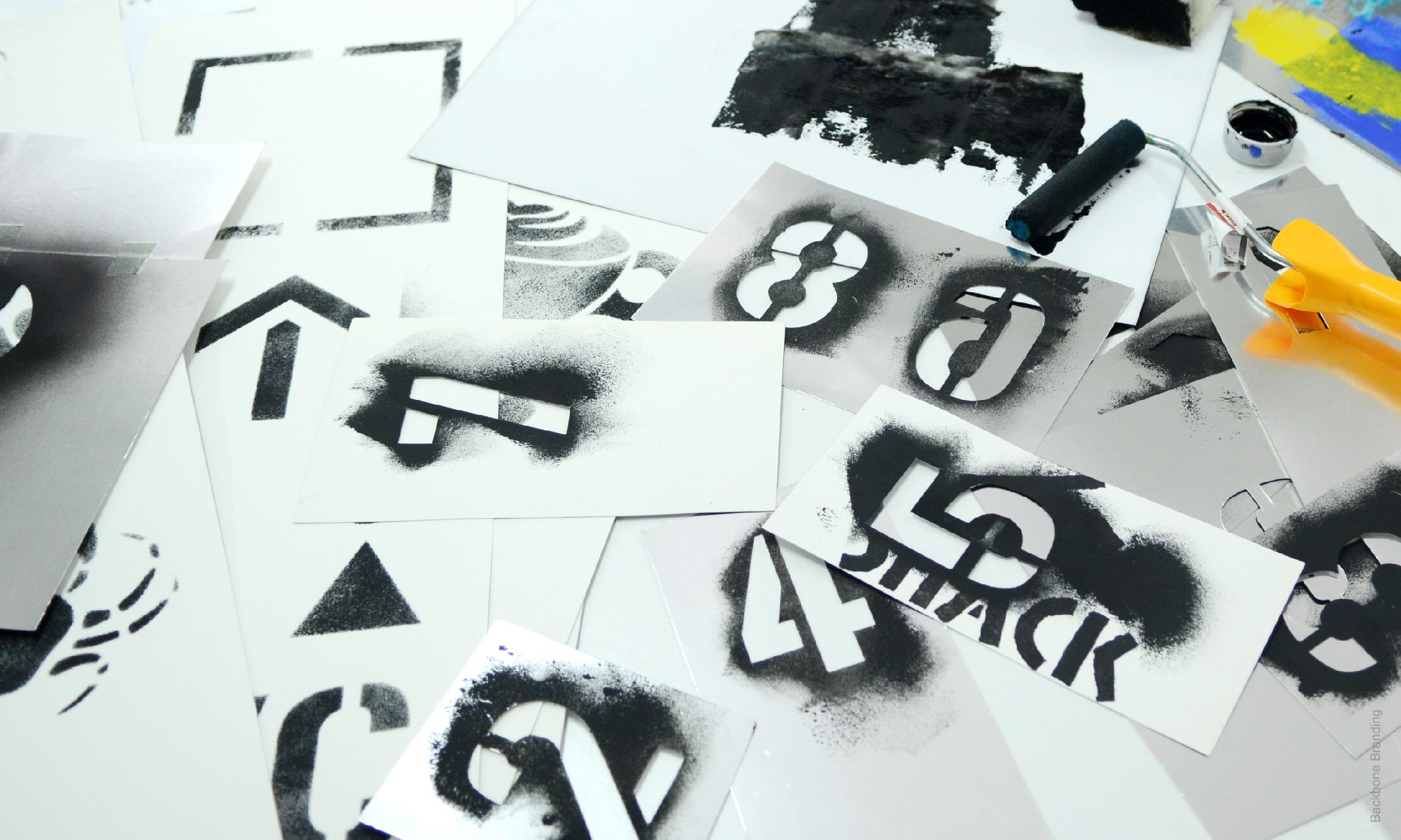
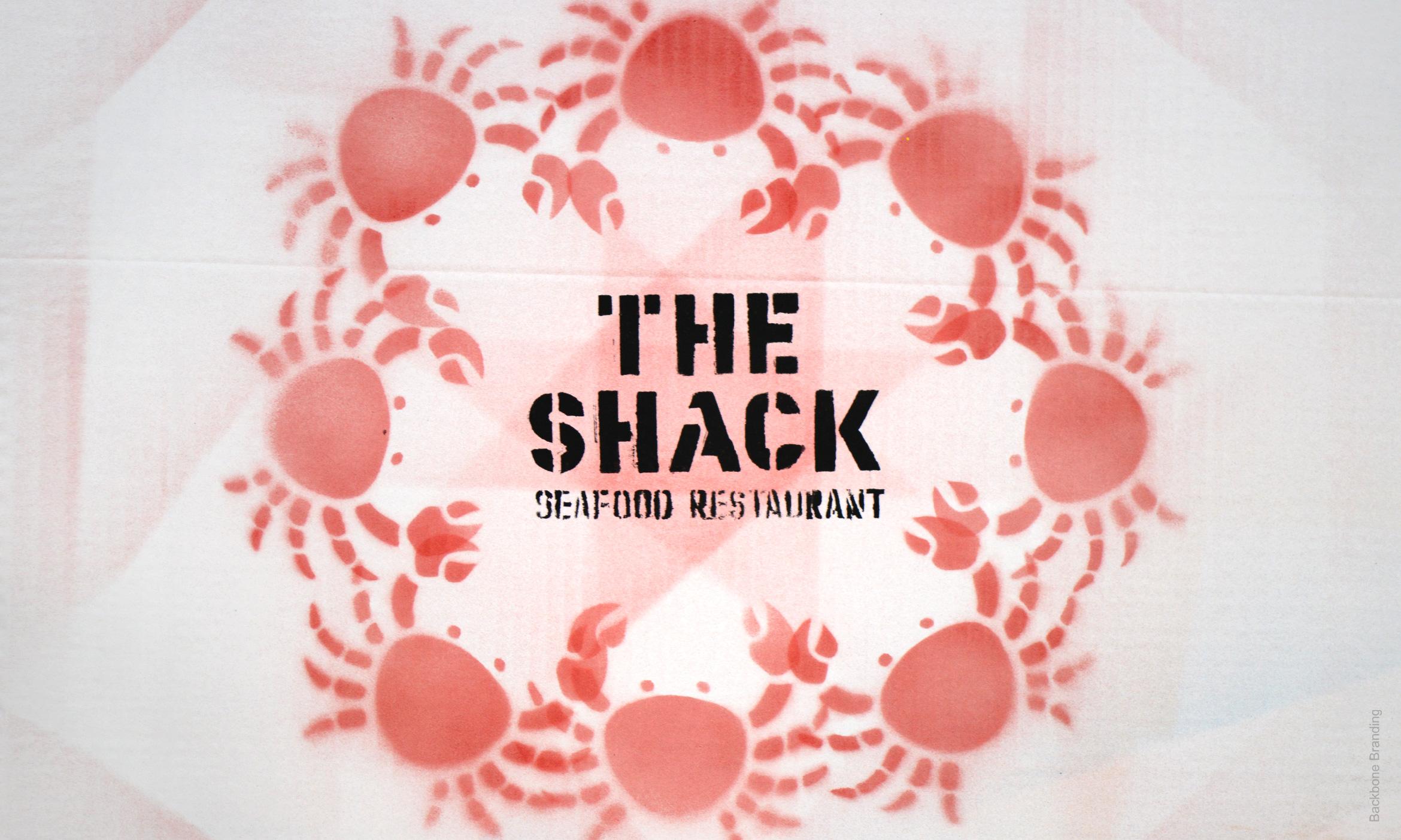
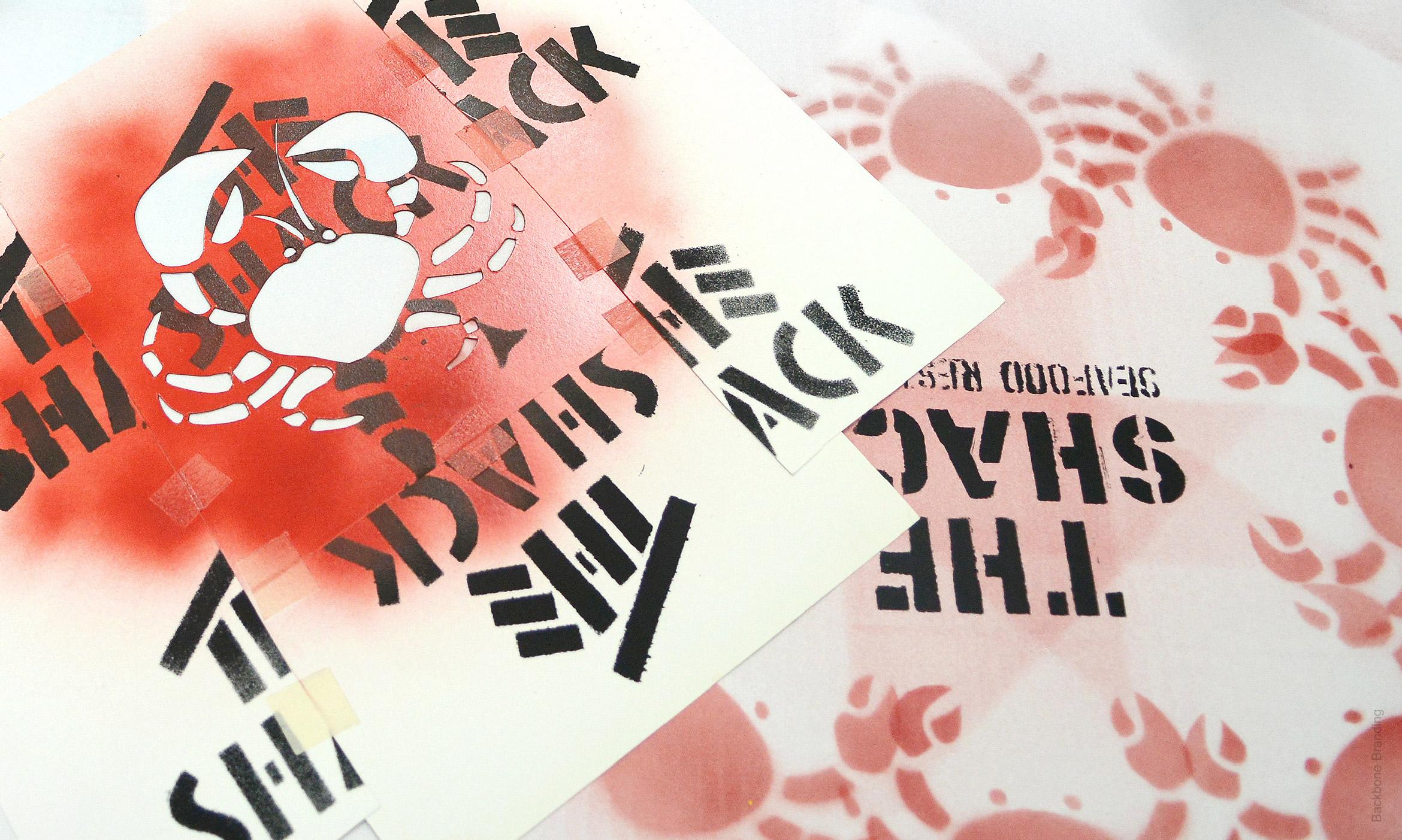
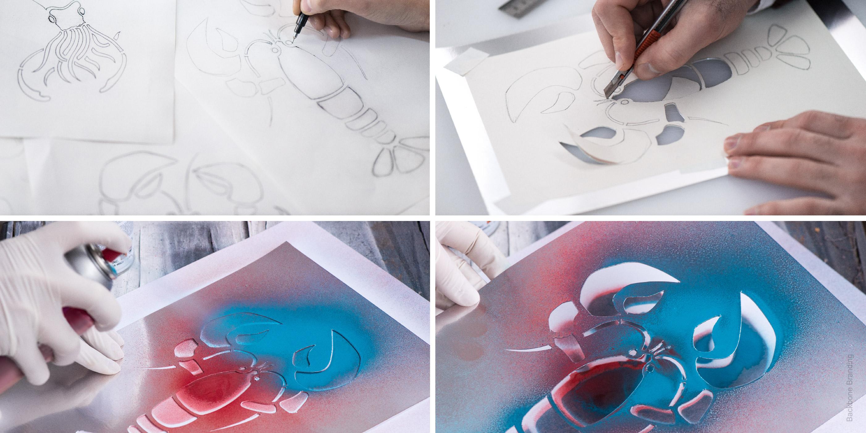
Supposing the fisherman’s limited opportunities, he would have just handy tools for making his restaurant identity. Even the materials used in the design talk about it. He would carve out the stencil shapes of the fish he usually caught and the naming fonts by himself and make stenciled illustrations for his small restaurant design. The zest of The Shack brand are the variations of the design compositions created by twisting the fragments and changing the colors of the illustrations. The packages for the brand identity has two packaging categories: colored, as main and a fluorescent on black, as premium. The premium black package transfers the idea of the night sea. Blue and red were chosen as the main brand colors indicating deep sea and cooked seafood.
Click for more
1
/
5
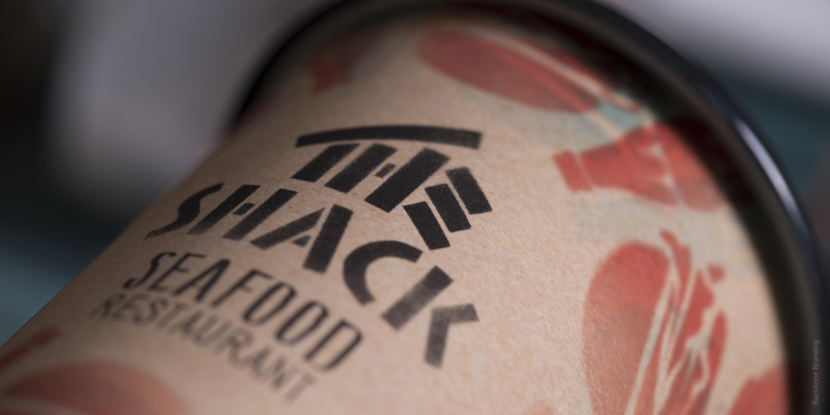
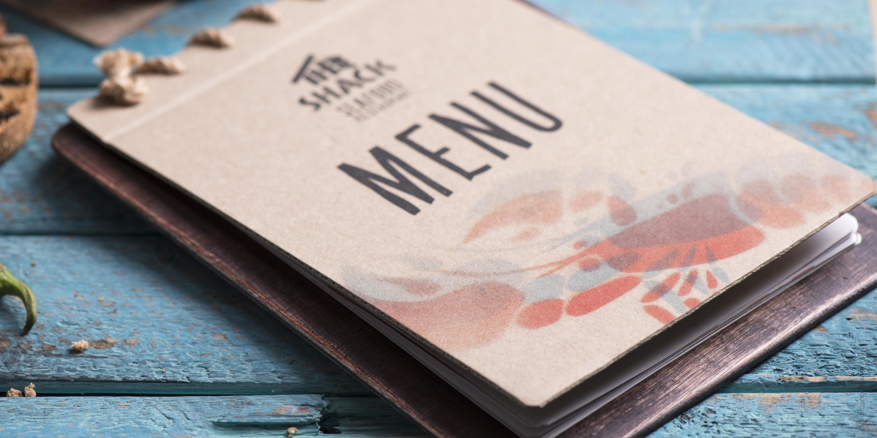
The logo construction visualizes the naming and its design recalls to a shack.
1
/
3
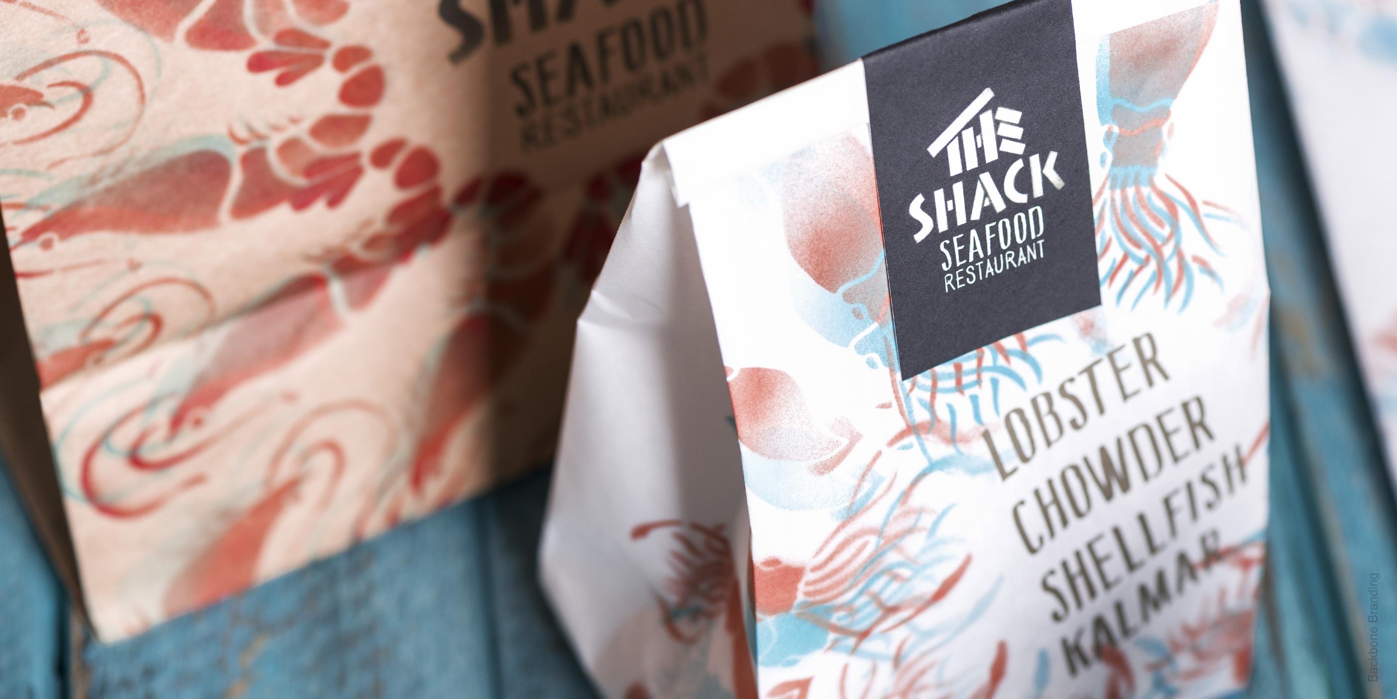
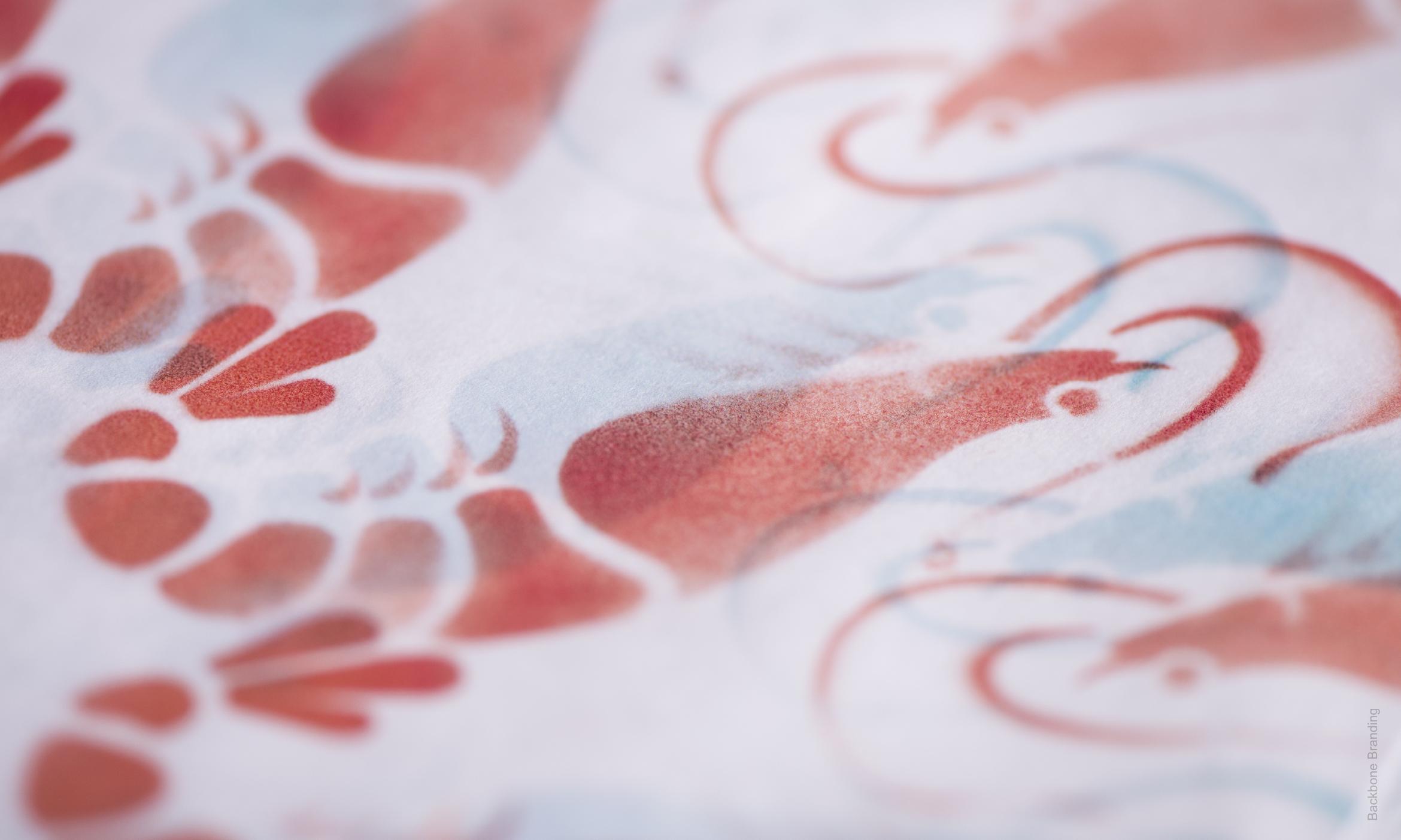
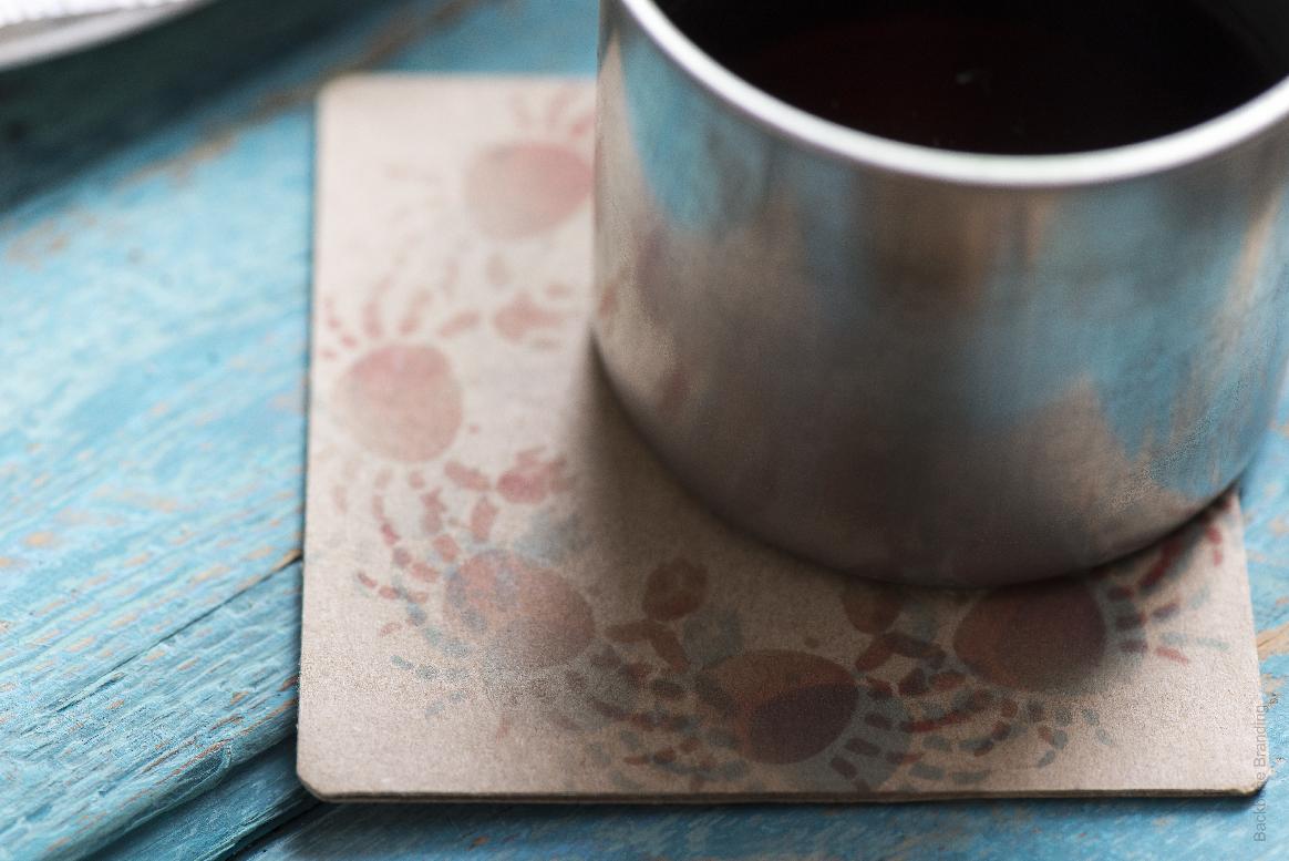
Using red and blue stencils gives this seafood restaurant a sense of motion, indicating the high quality ingredients and fish they use.
1
/
4
1
/
5
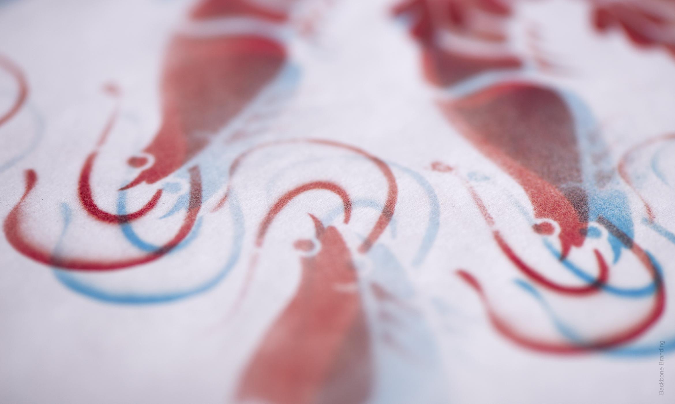
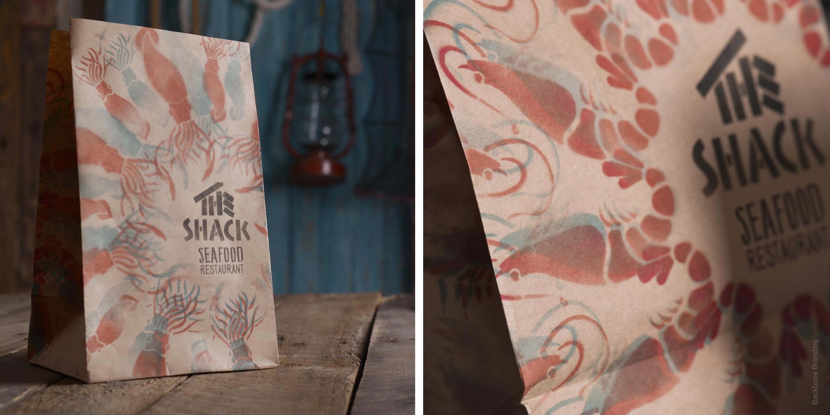
The zest of The Shack brand are the variations of the design compositions created by twisting the fragments and changing the colors of the illustrations.
1
/
3

1
/
4
We were tasked to develop a branding and packaging for a seafood restaurant with a mood of the spirit of the sea and of freshly fished seafood.

1
/
3
1
/
2
More works