Boo
Rebranding & Redesign
overview
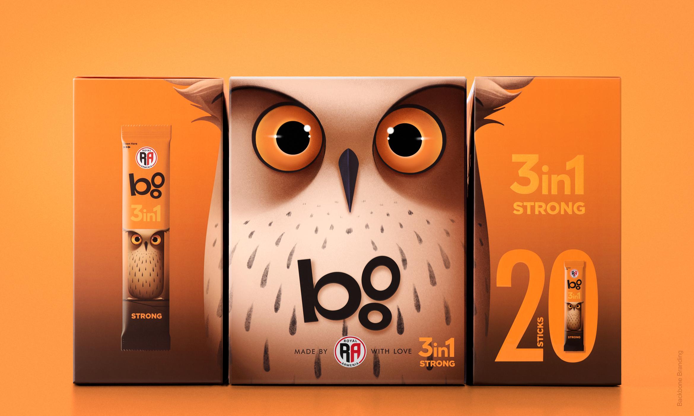
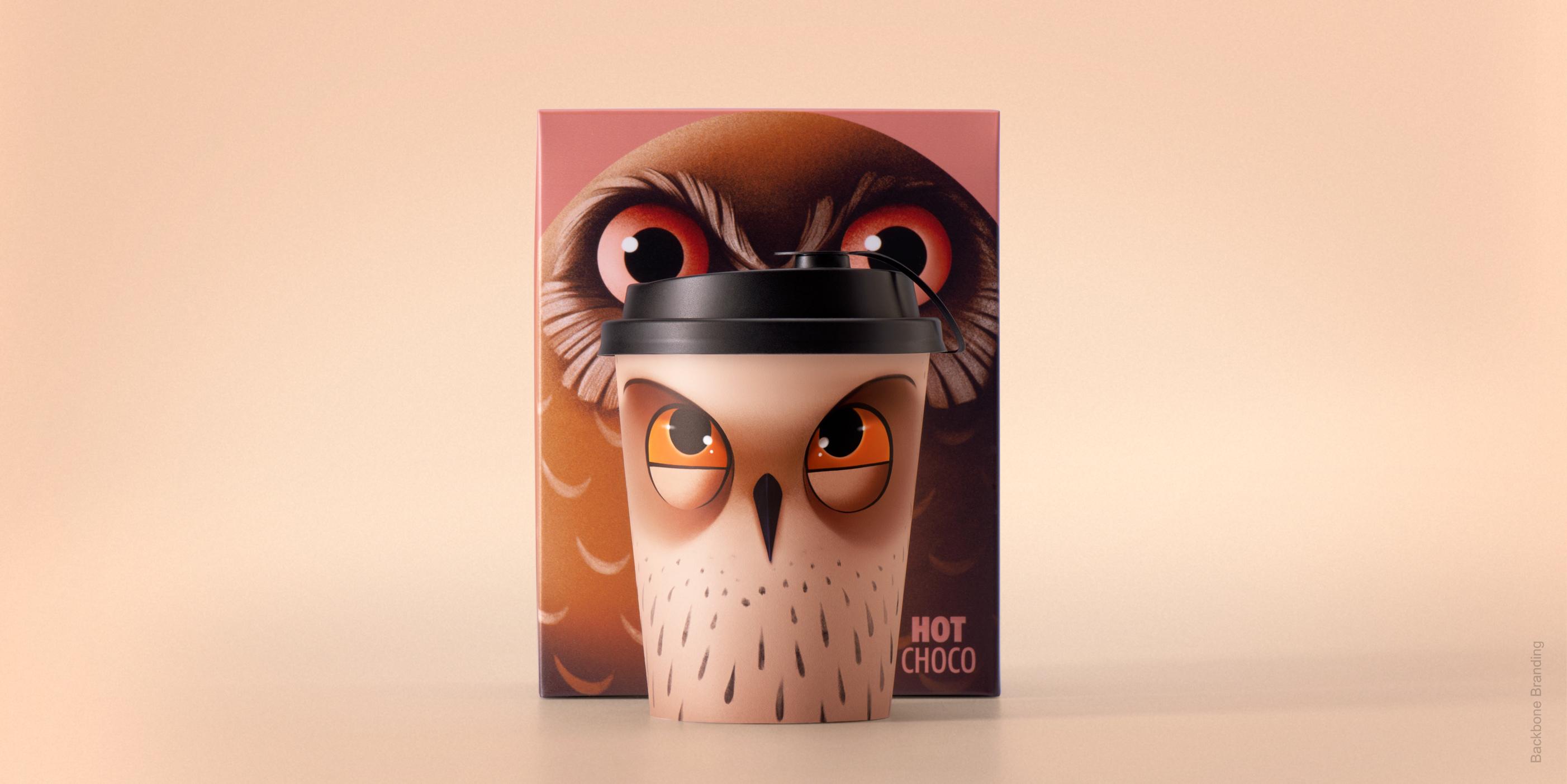
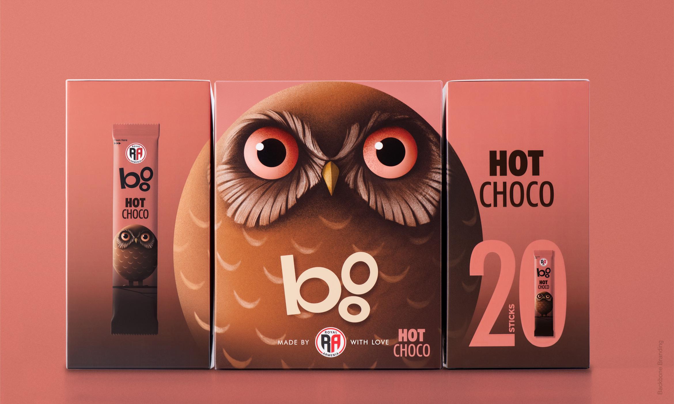
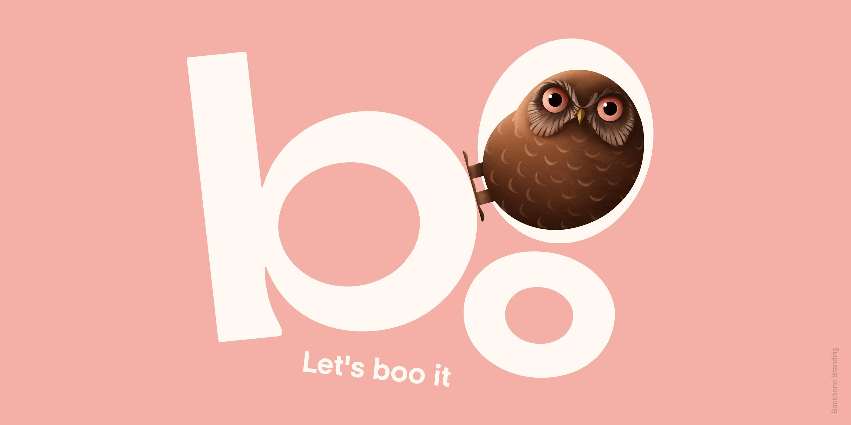
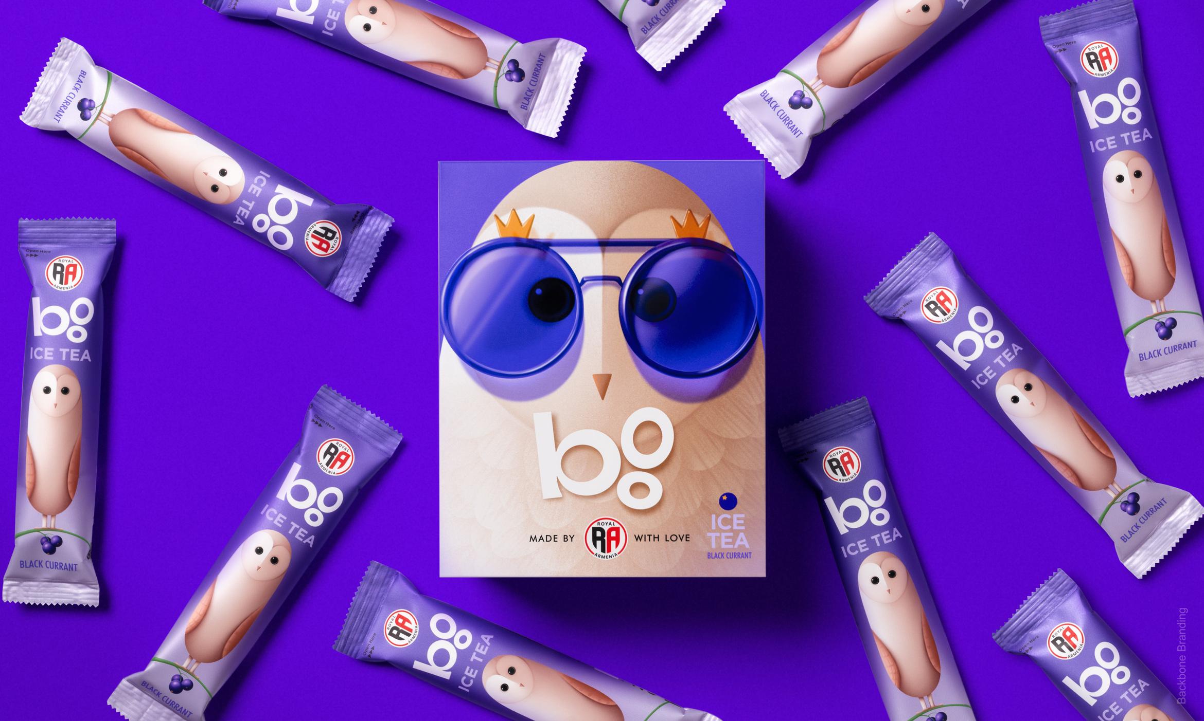
We expanded the coffee brand "Royal Armenia" to introduce a coffee-to-go venture called "Boo" (meaning "owl" in Armenian), leveraging the existing cultural association with the owl illustration on the original coffee packaging.
challenge
Royal Armenia approached us with the task to refresh the packaging of their coffees and iced teas, as they felt it was outdated. However, the real challenge was to redesign the beloved owl while preserving the brand's personality and doing justice to the iconic character.
solution
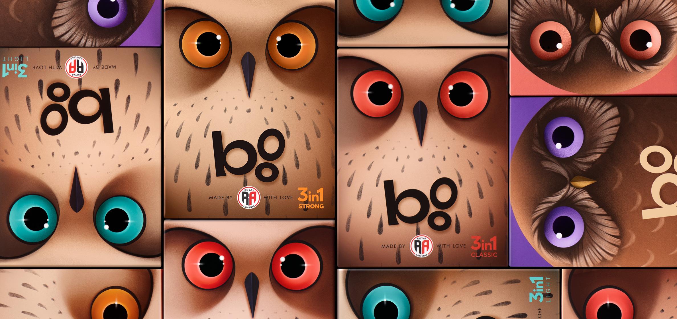
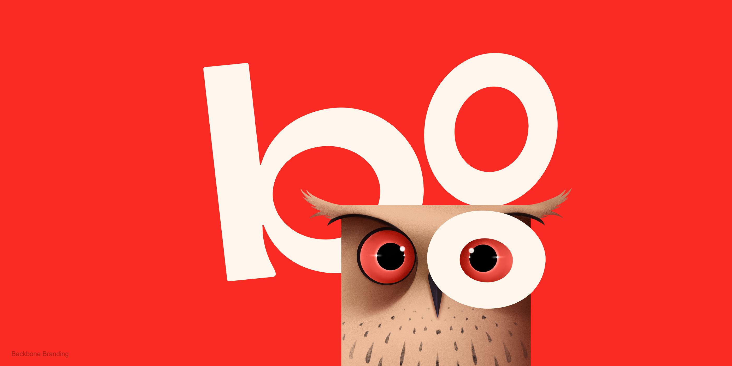
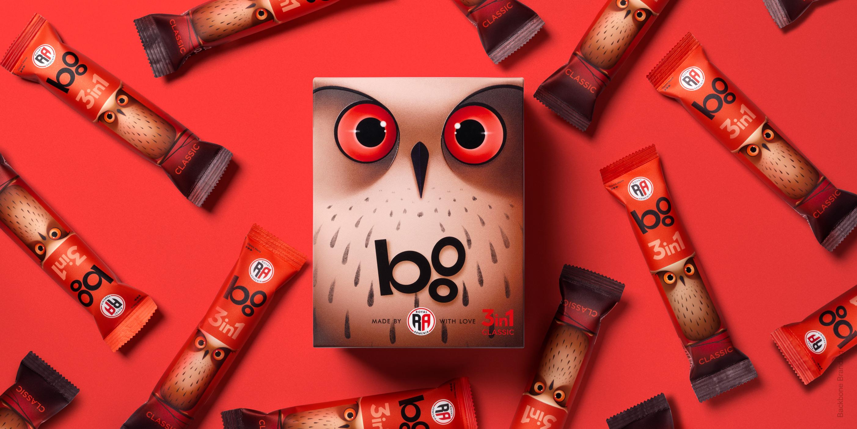
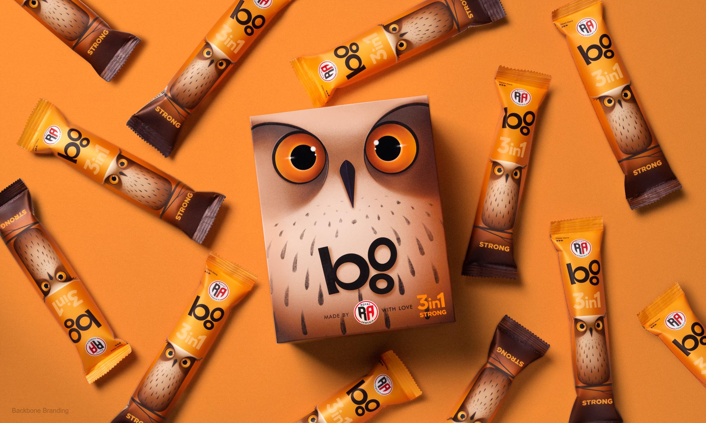
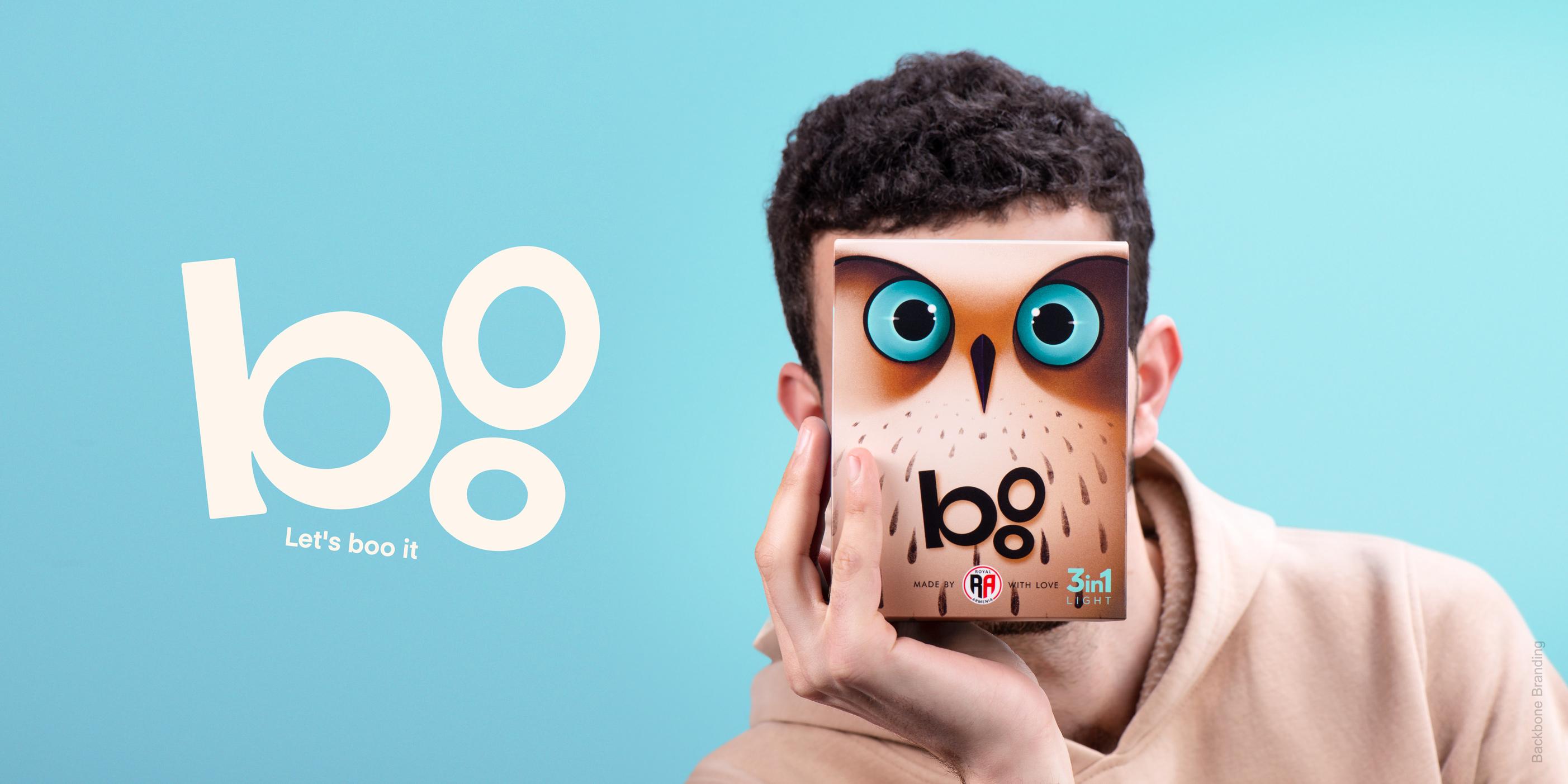
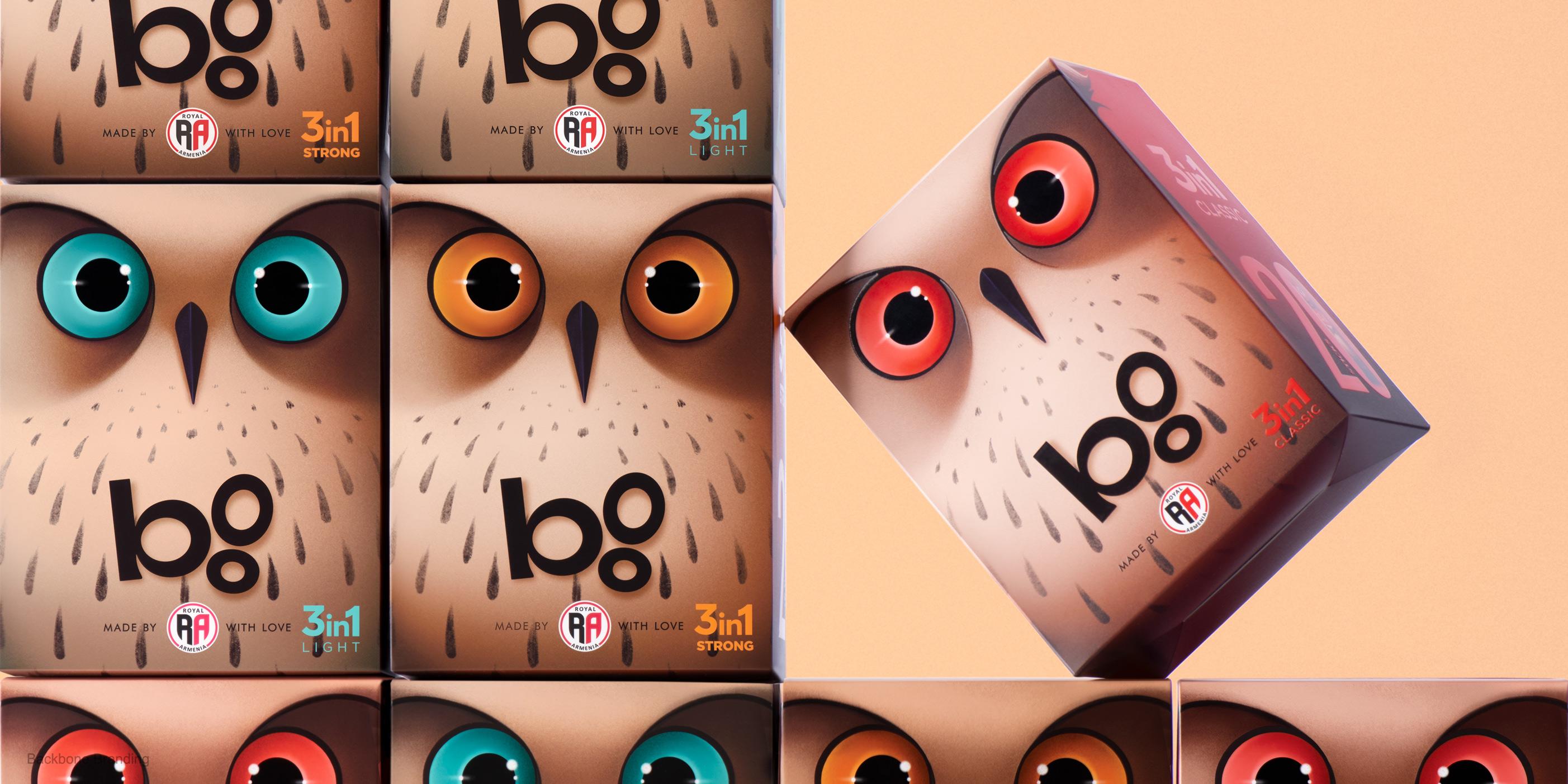
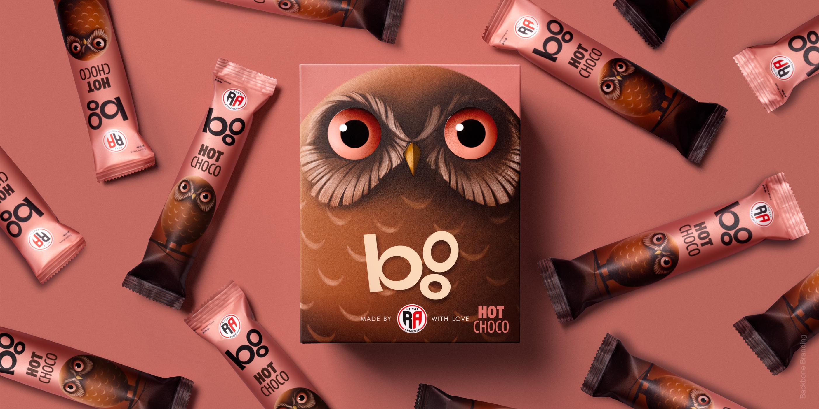
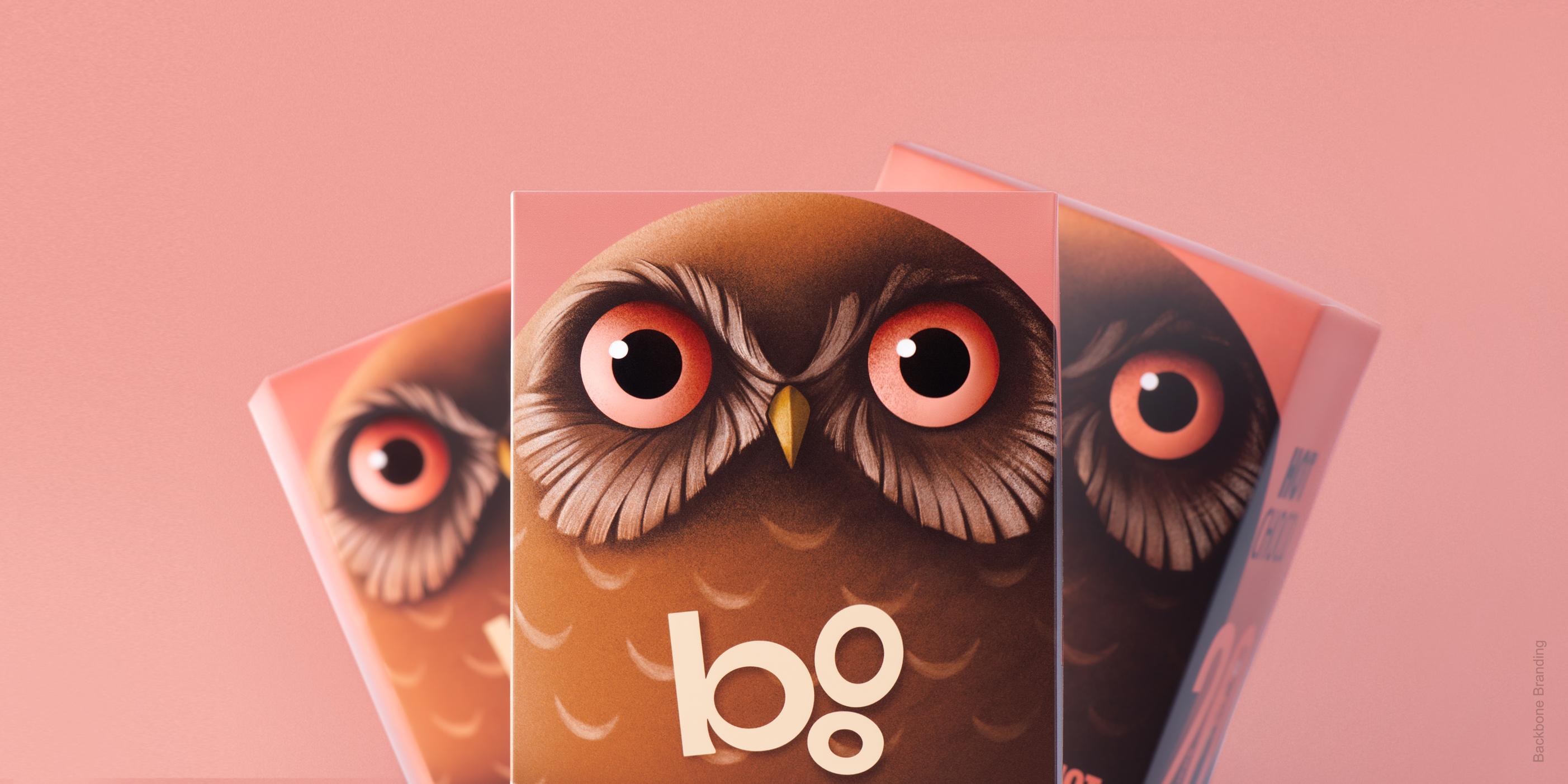
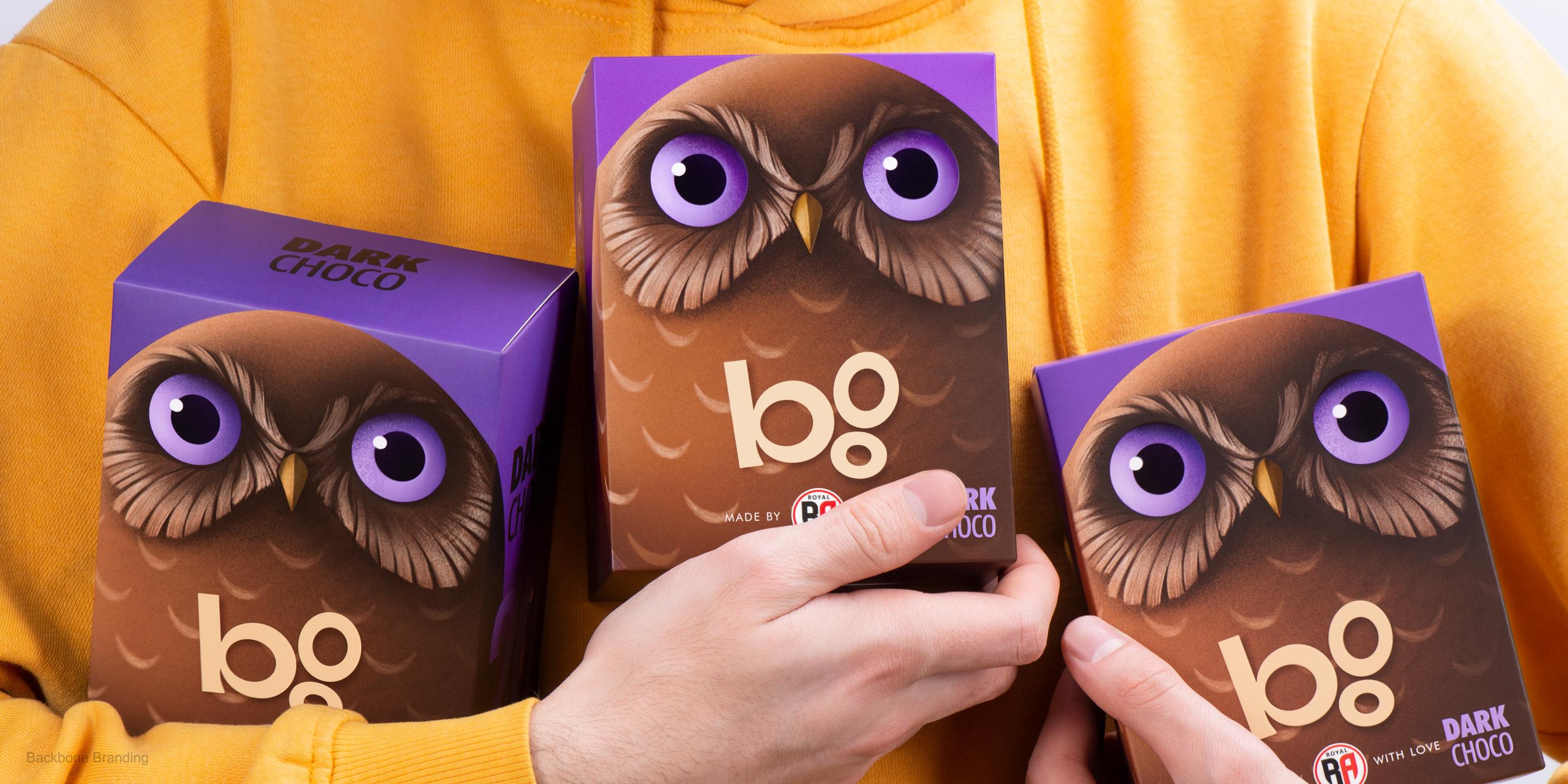
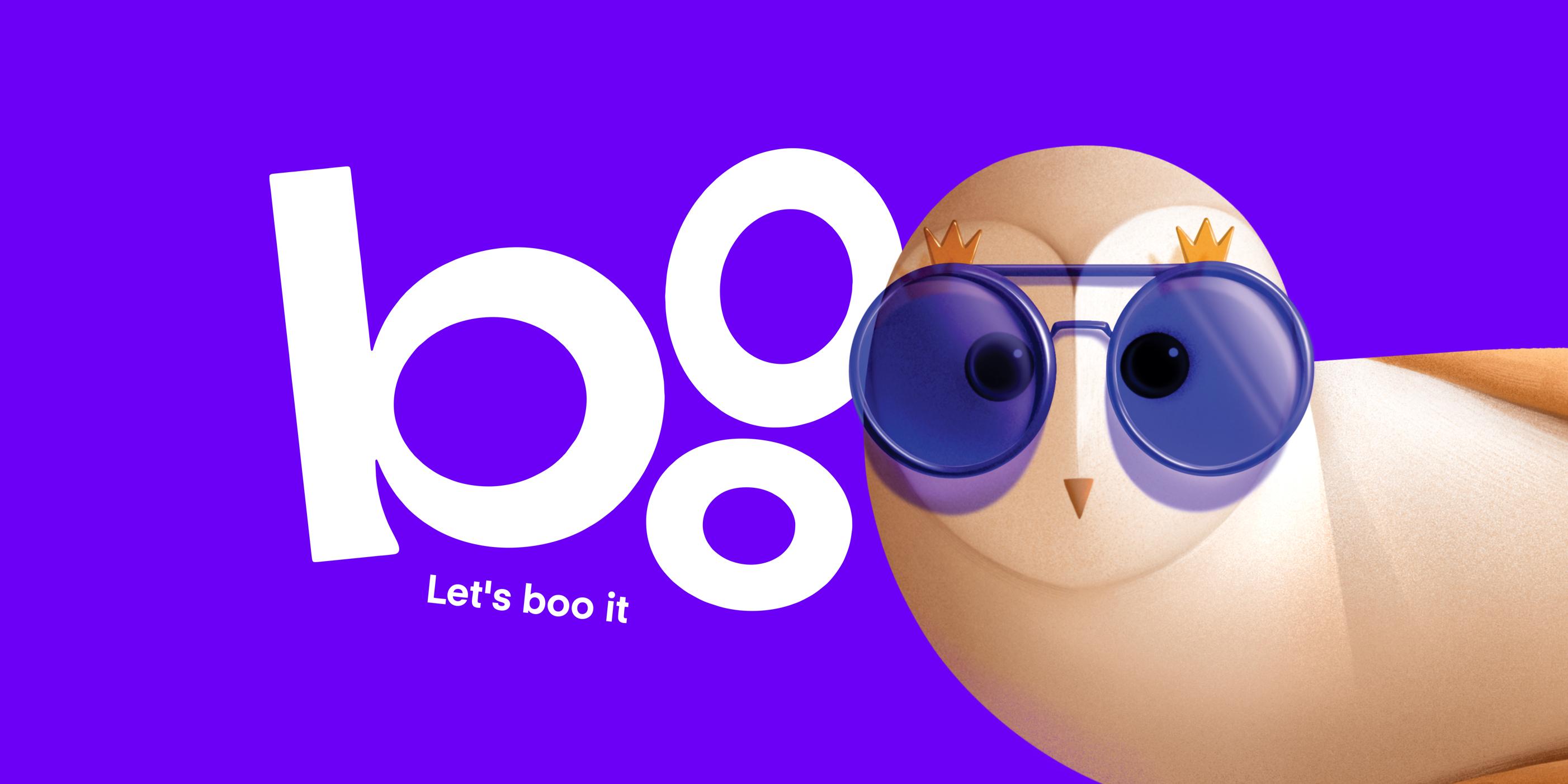
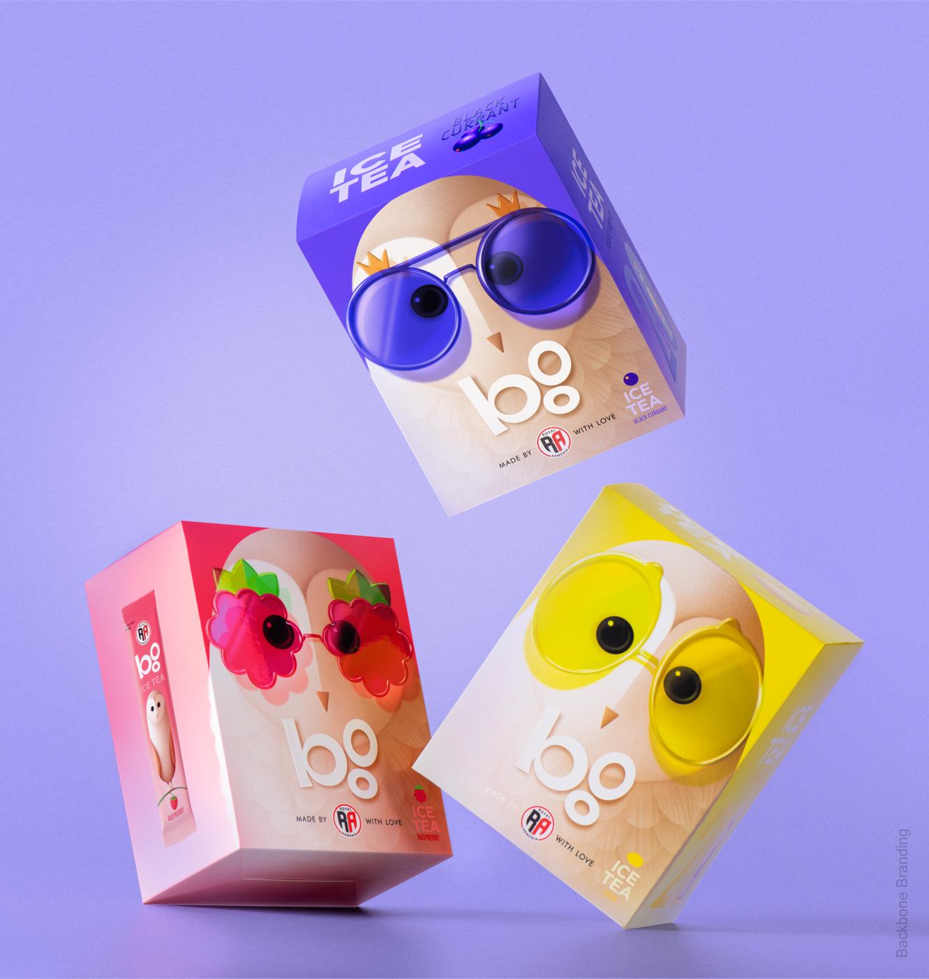
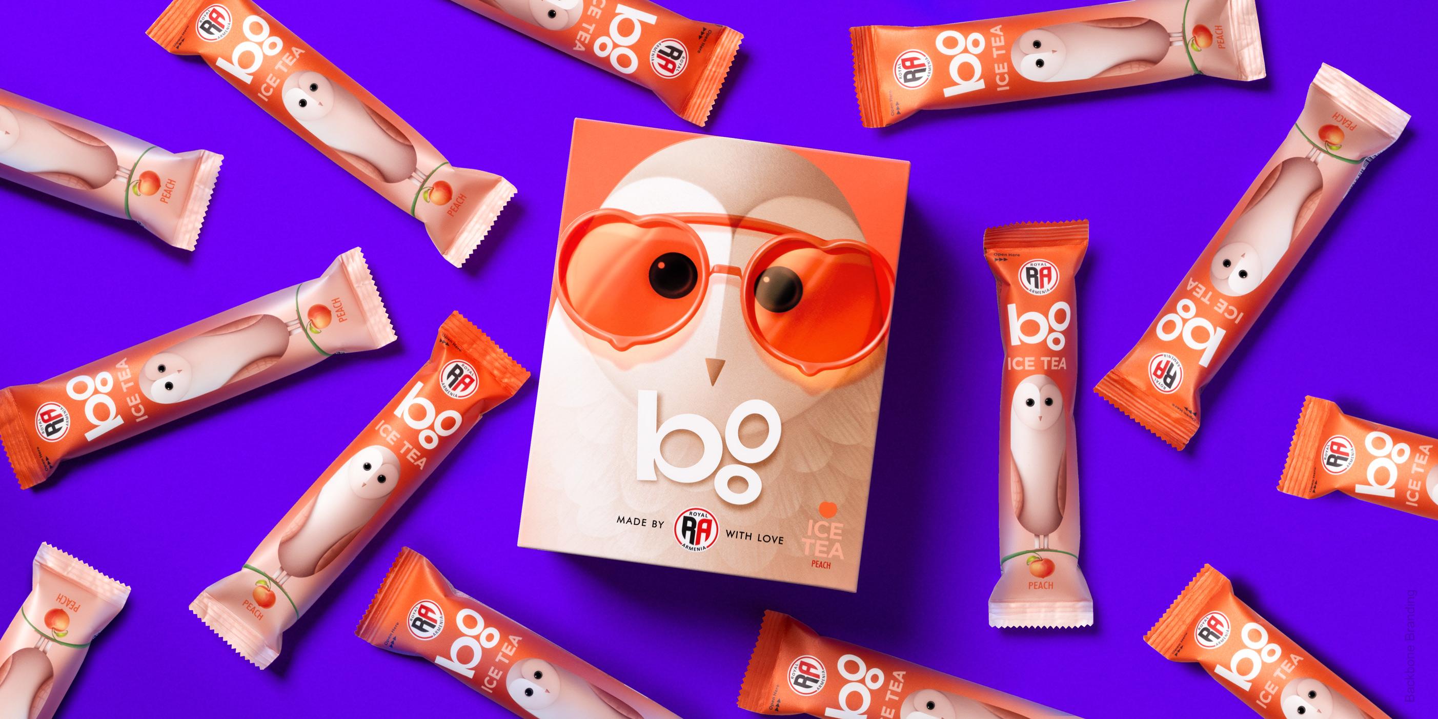
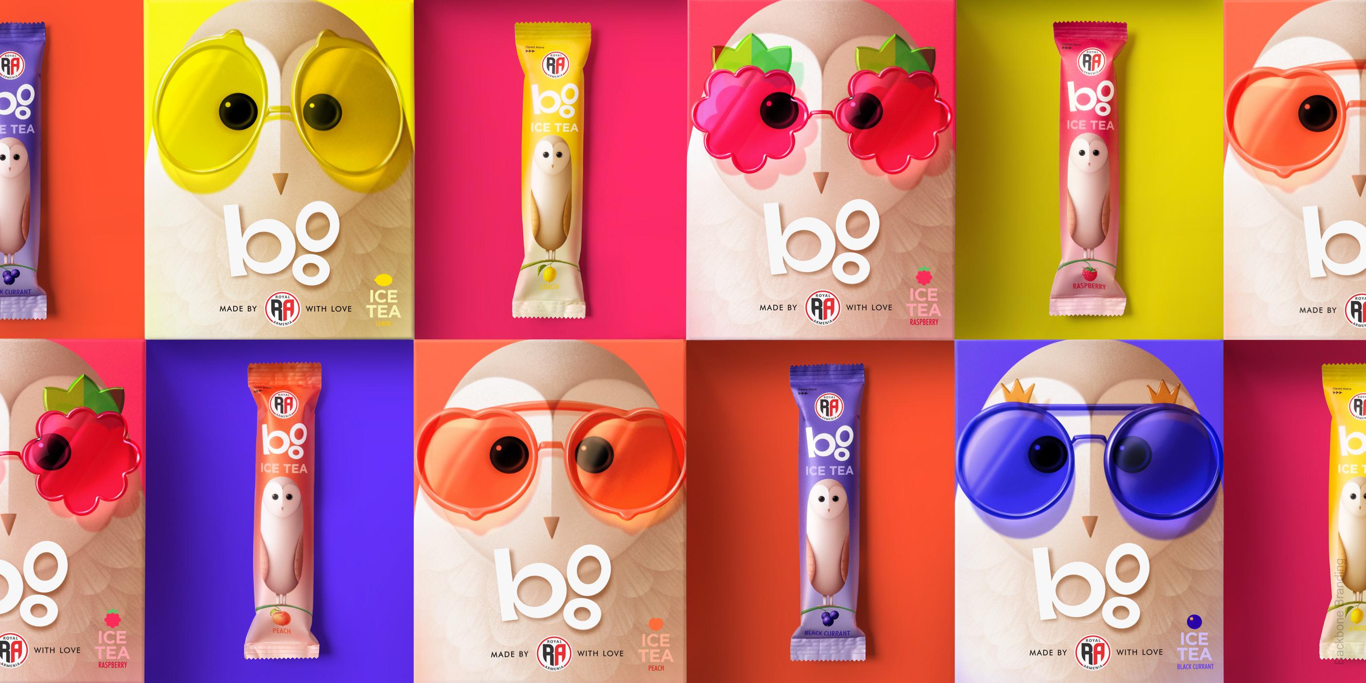
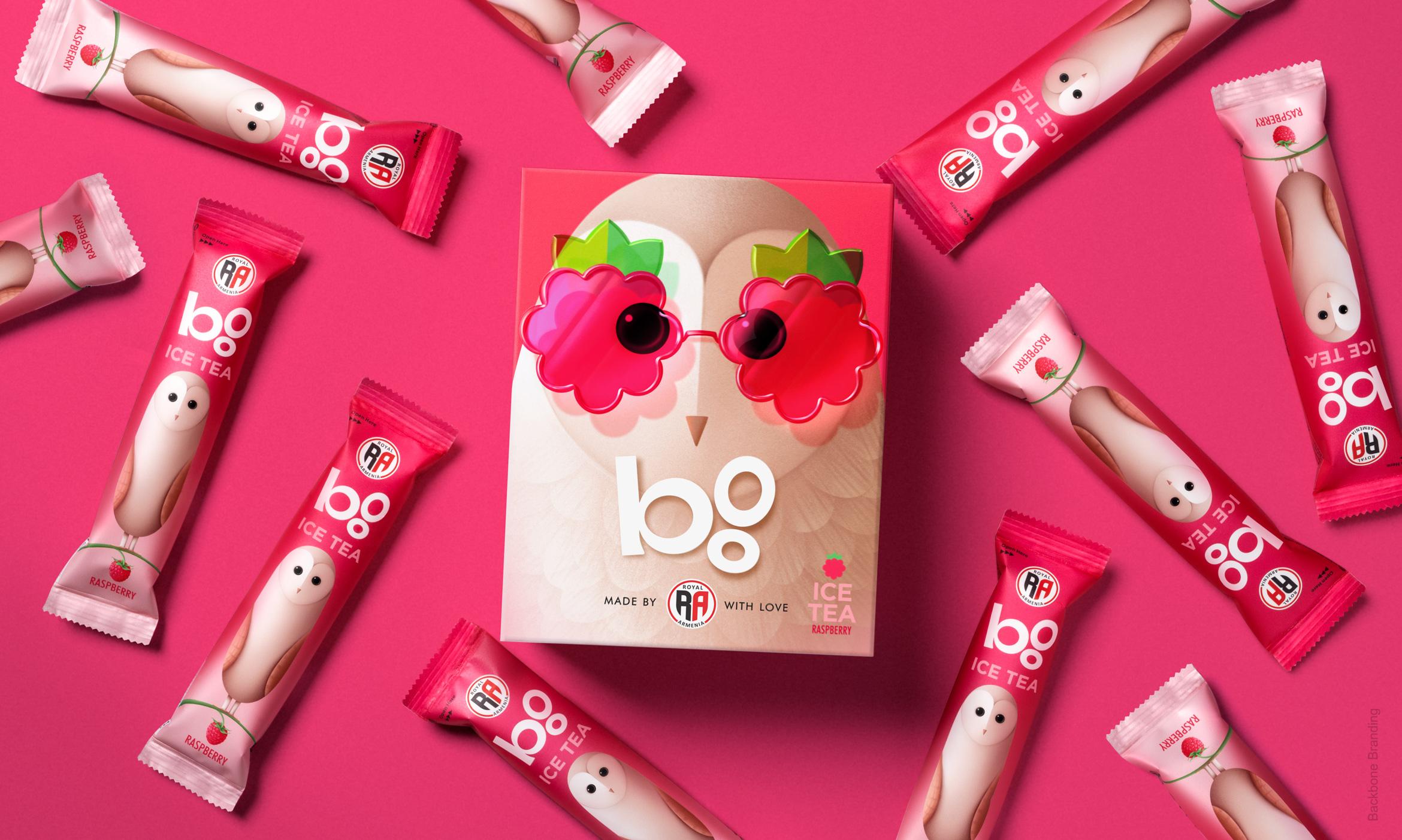
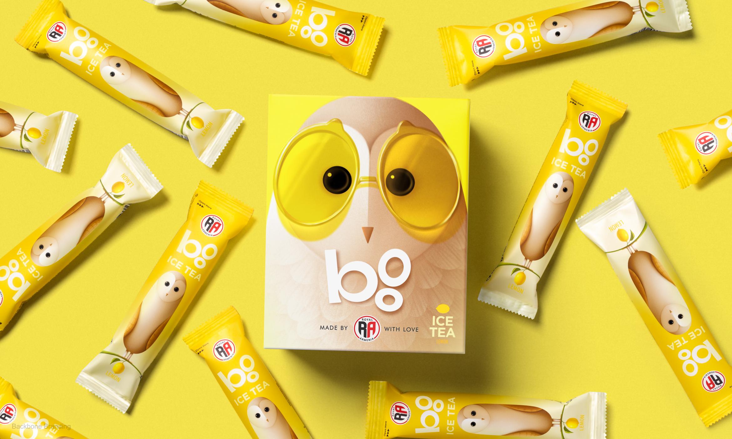
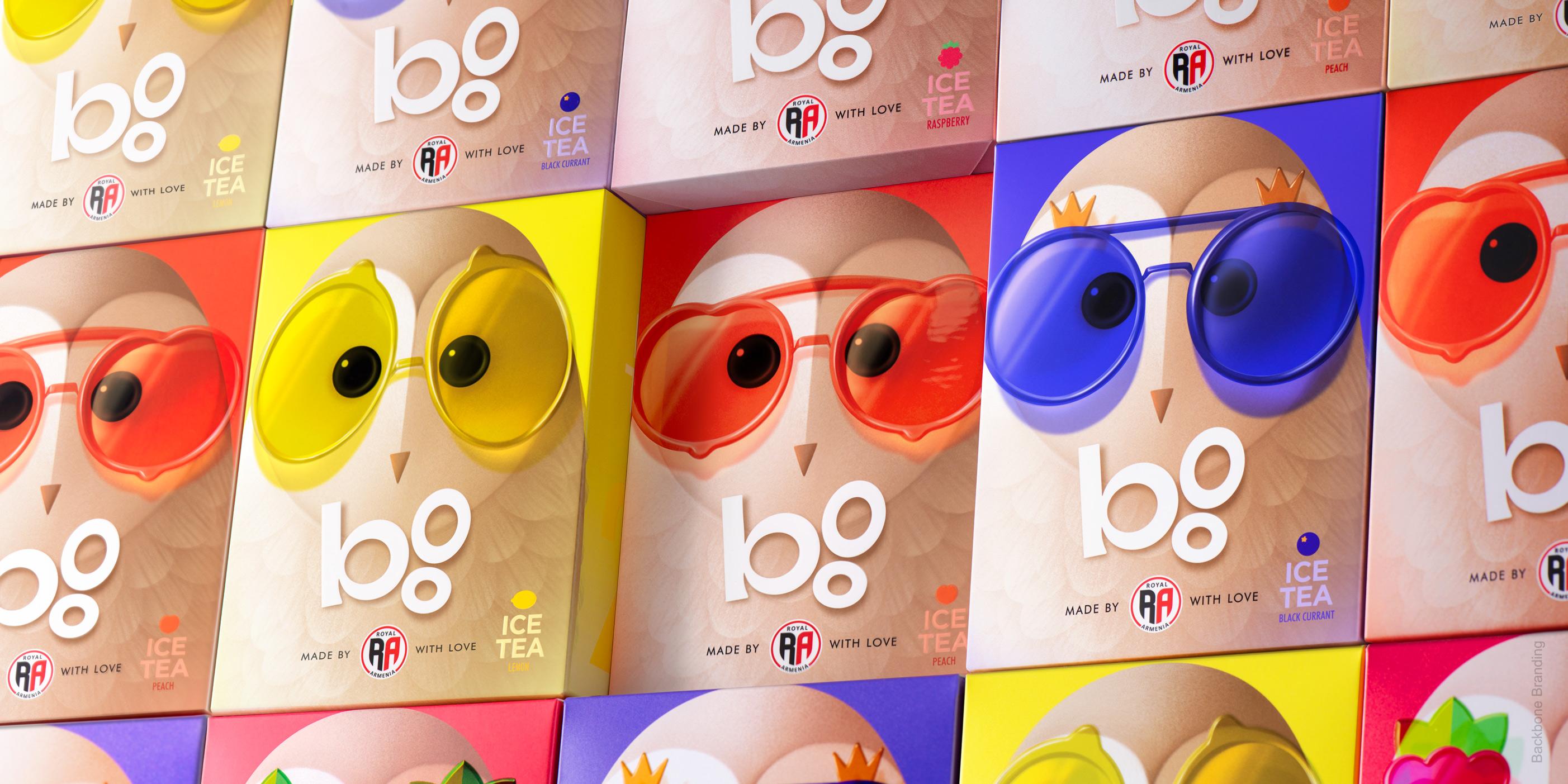
We made a strategic decision to create a sub brand called "Boo" (owl), using the same name people have been calling it for years. "Boo" was also turned into a typographic logo. We completely redesigned the owl, making it the hero of the packaging concept. The new owl is more playful, bigger, and fresher. We also created two new owl characters for other product lines. We used the color logic from the old packaging to differentiate the types of coffee and applied it respectfully to the eyes of the owl characters. Additionally, the owl characters representing our ice tea line wear glasses in different colors and frames, which symbolize the respective fruits and flavors of the tea.
1
/
2
The characters’ color indicates the flavor - the darker the owl the stronger coffee.
1
/
2
Redesigning the beloved owl, all while keeping the brand's personality intact, was the ultimate challenge!
The owl wears stylish glasses, each pair represents fruit tea flavor.
1
/
3
More works
