Day & Night
Branding Services
overview
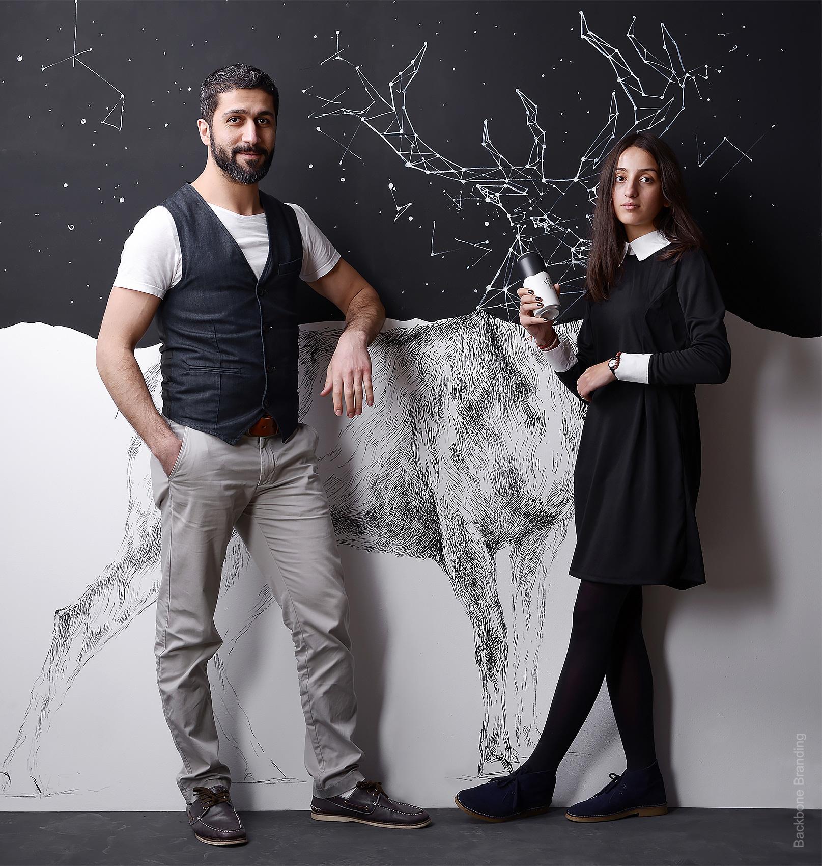
This time we decided to make a full restaurant branding project without a customer to receive it once it was done. Day & Night is a concept project with a bifacial nature that is injected in each of its design elements.
challenge
We were thrilled to give life to the idea where two opposites form a perfectly harmonious combination that not only looks good but also is very functional.
solution
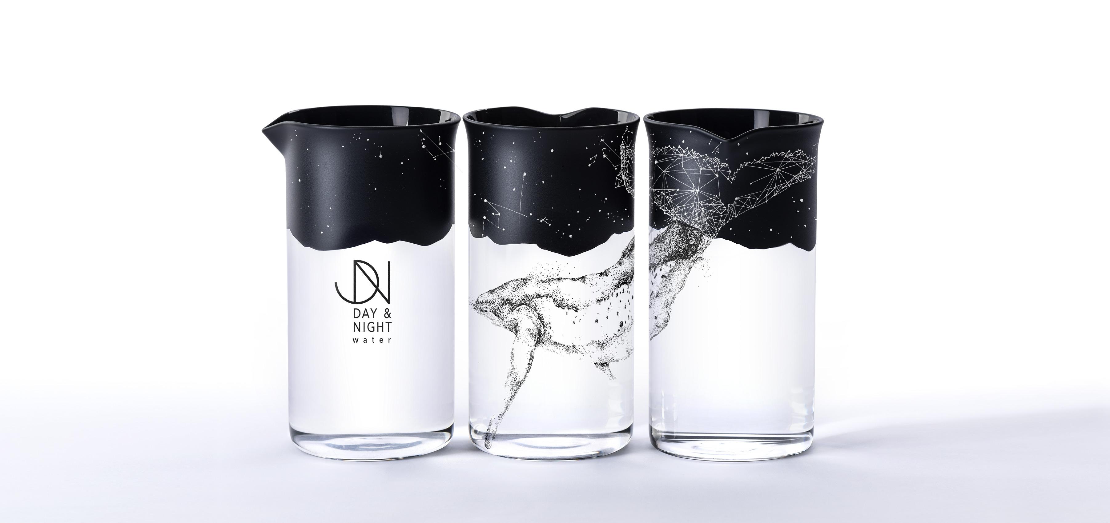
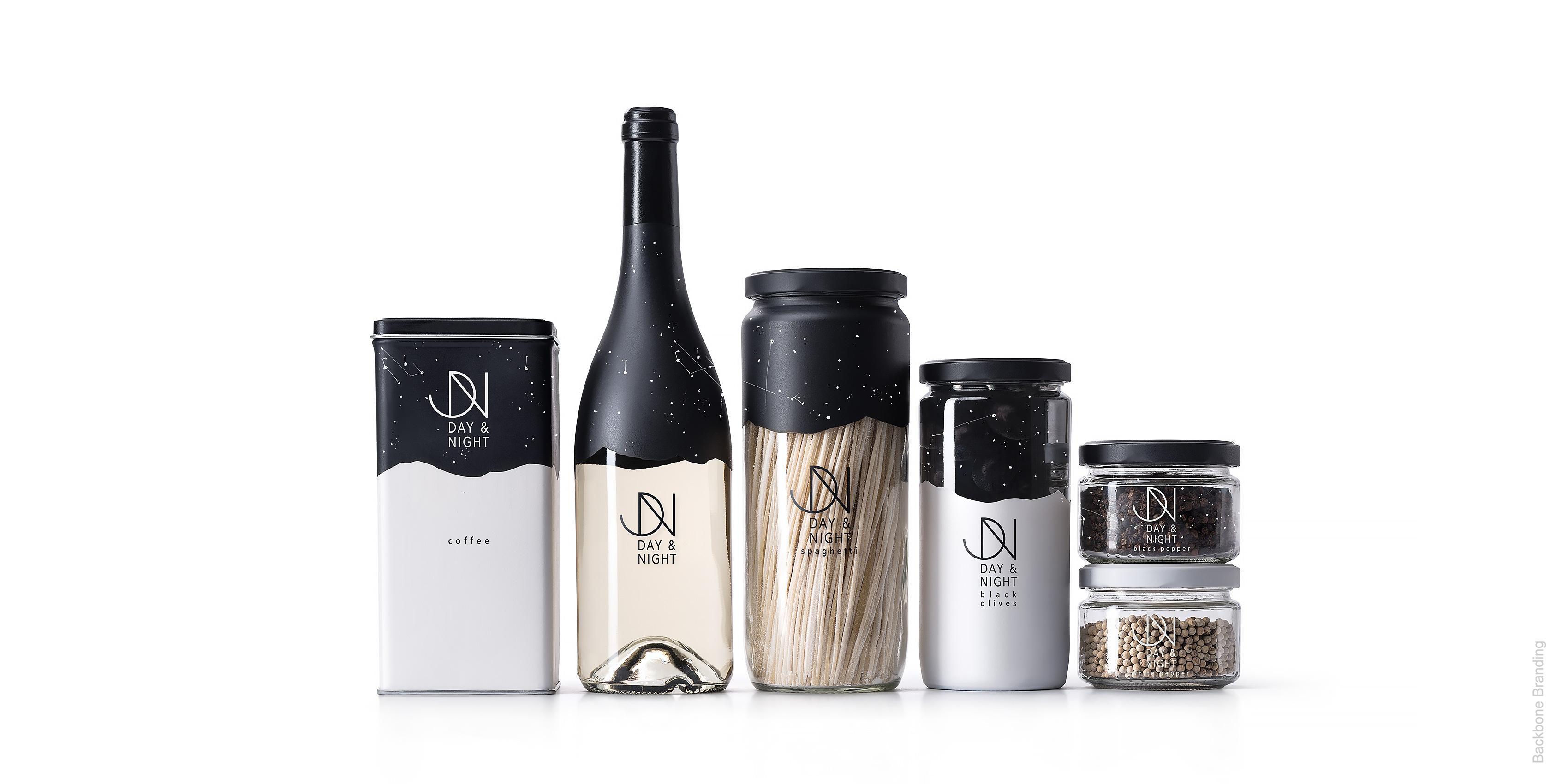
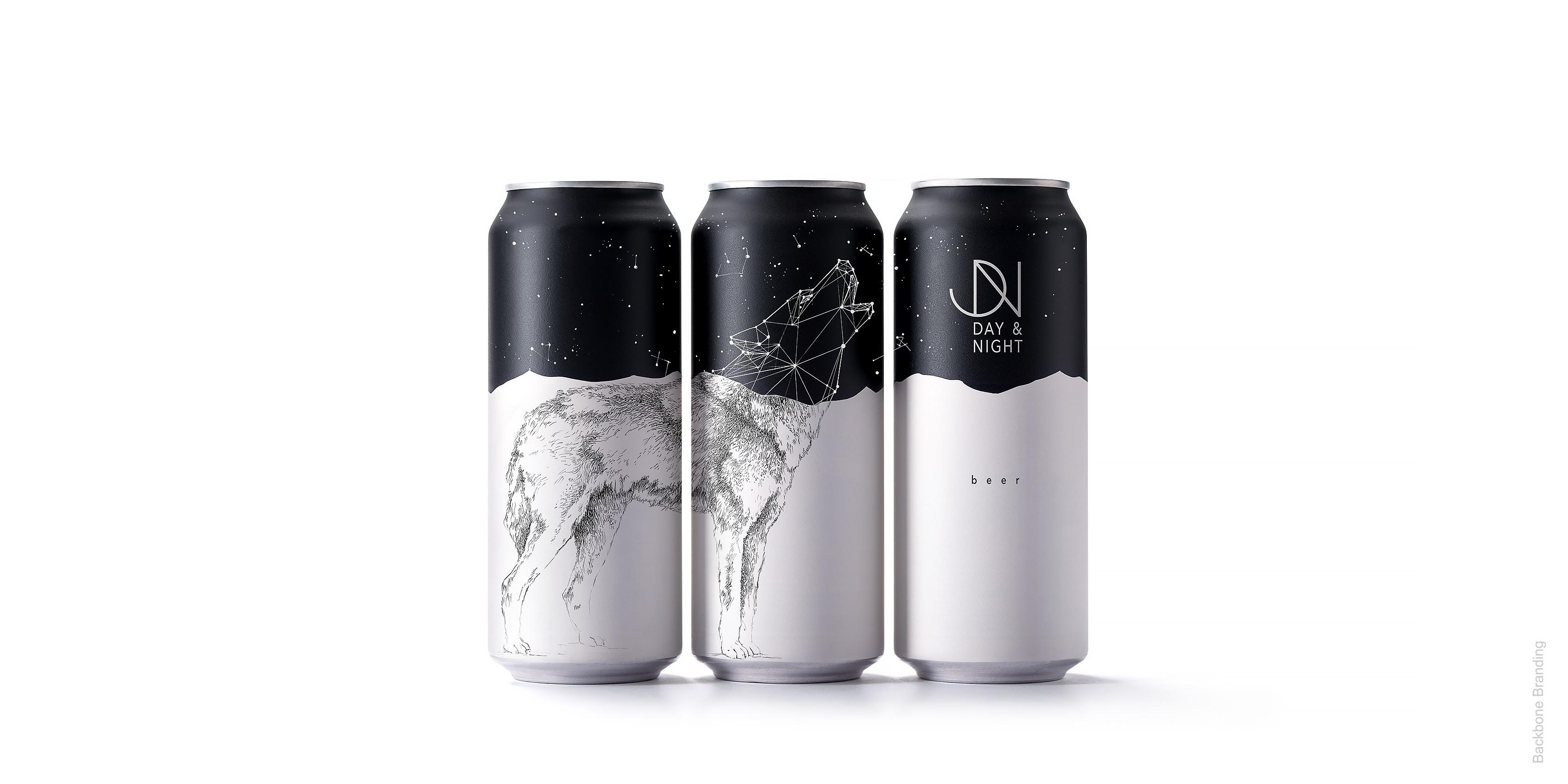
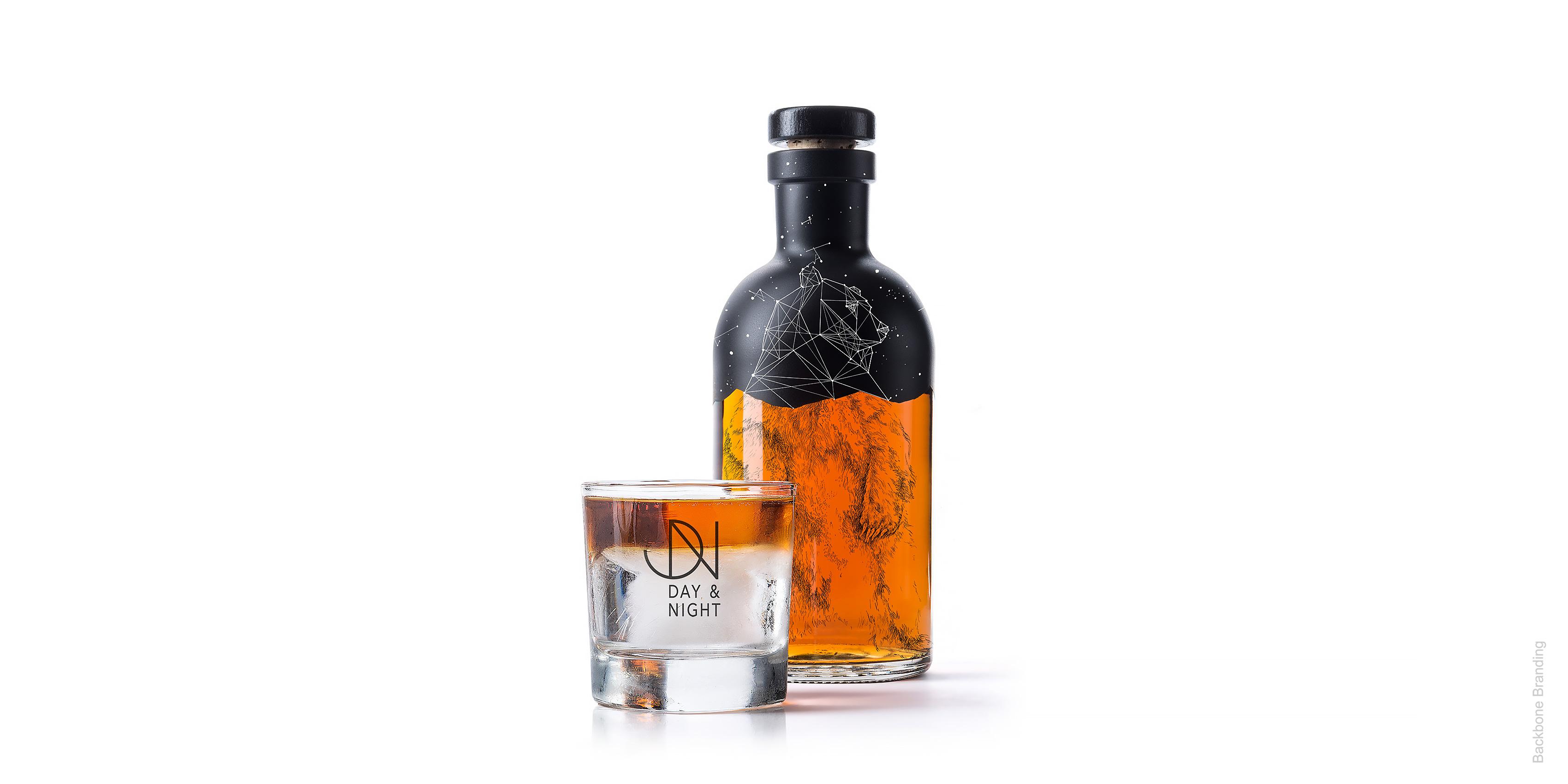
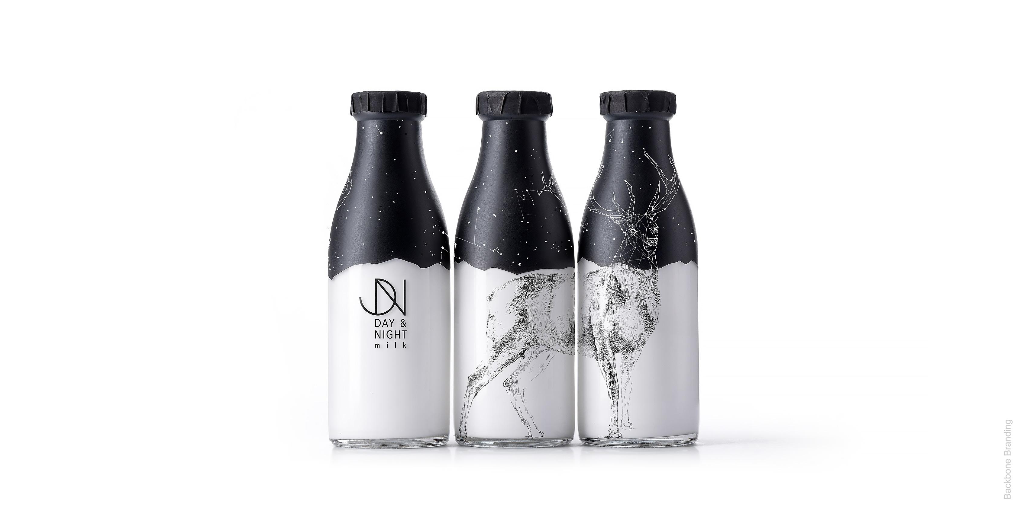
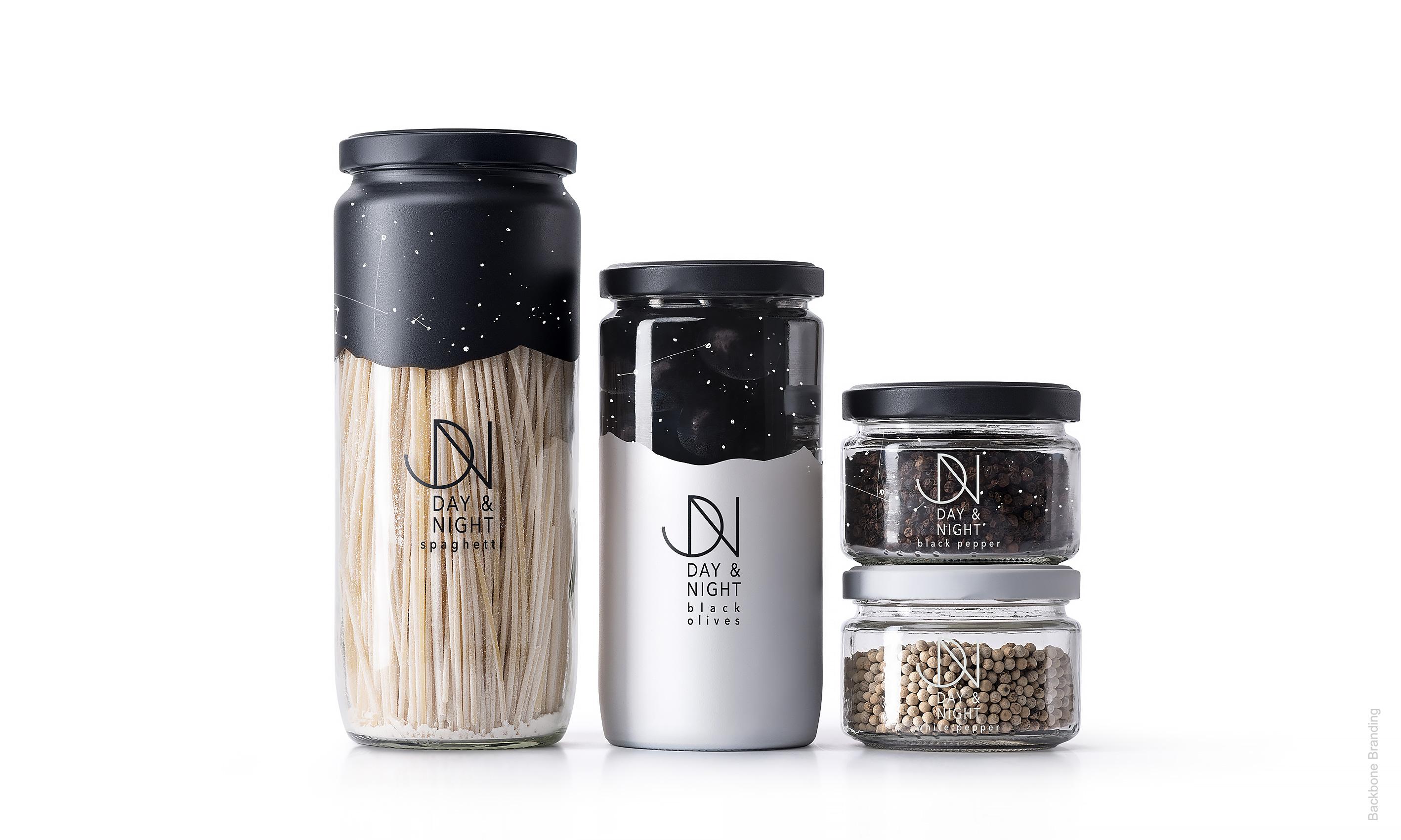
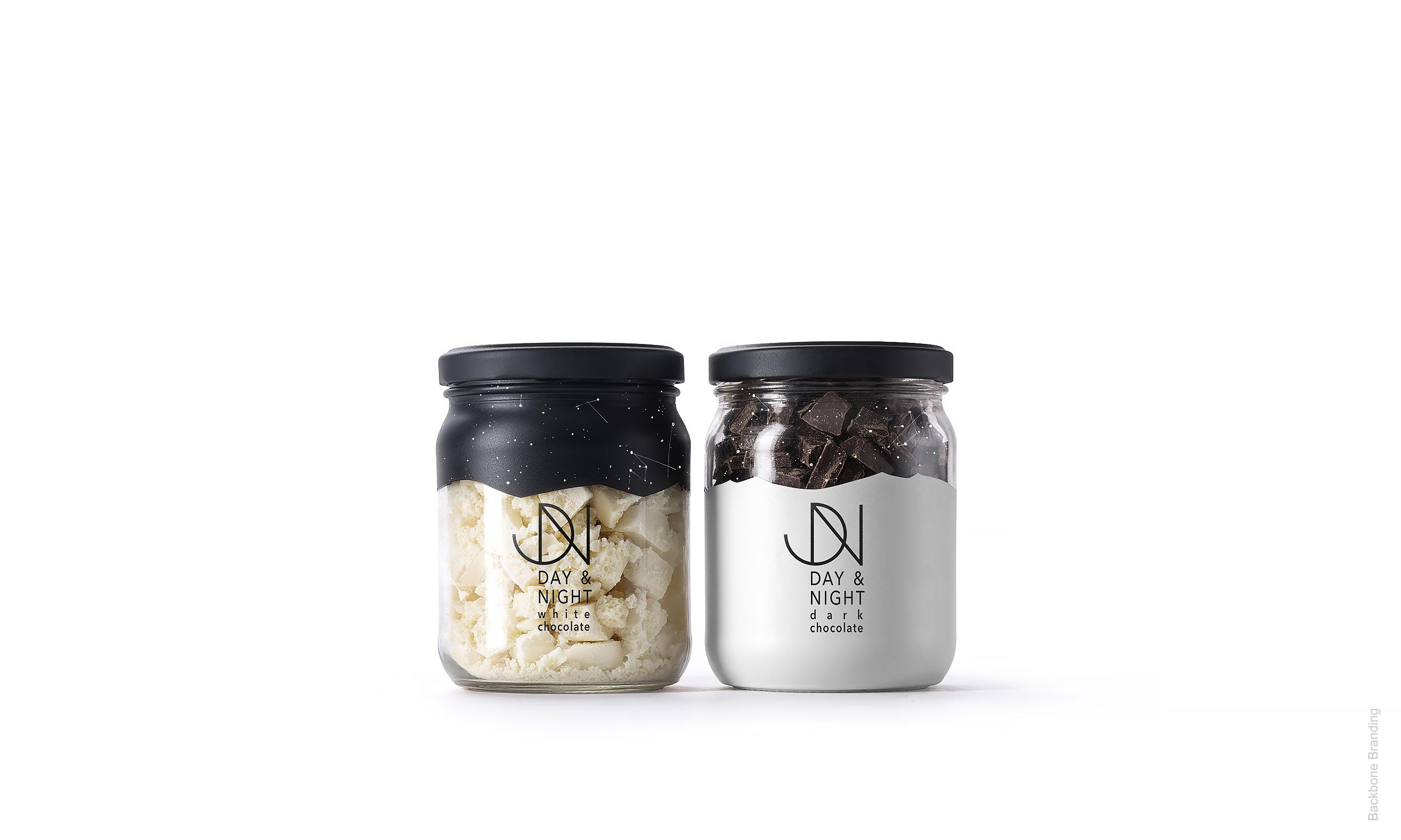
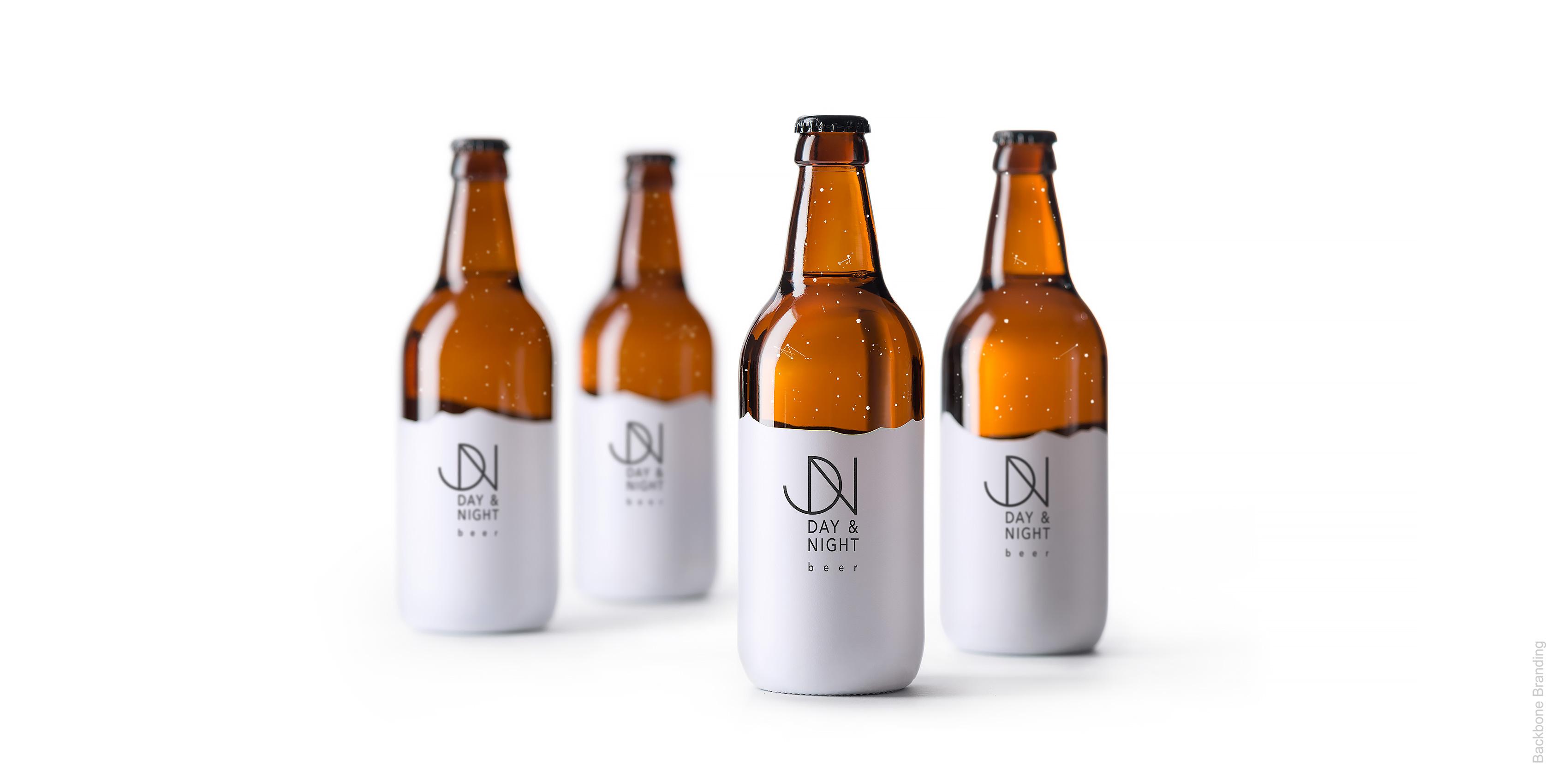
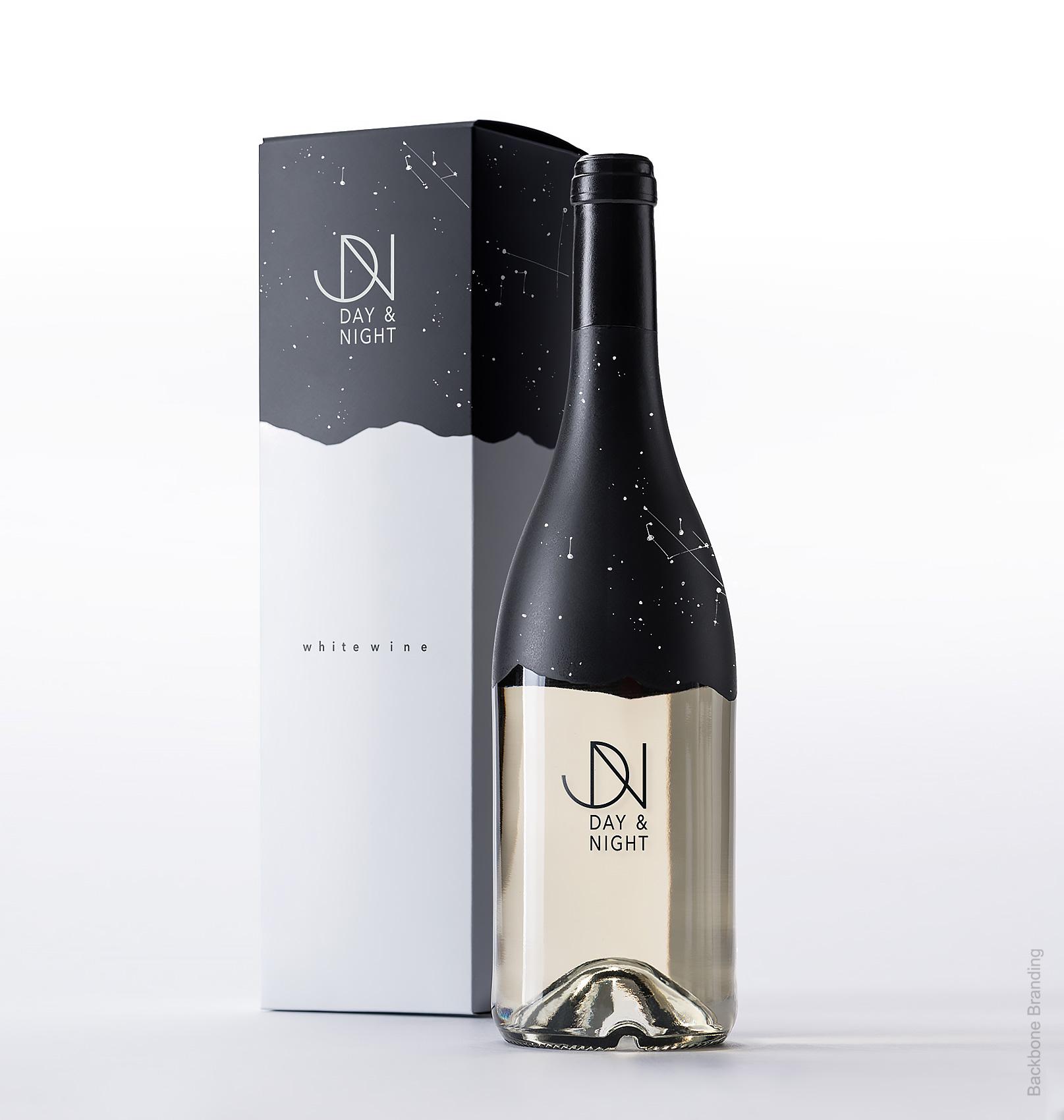
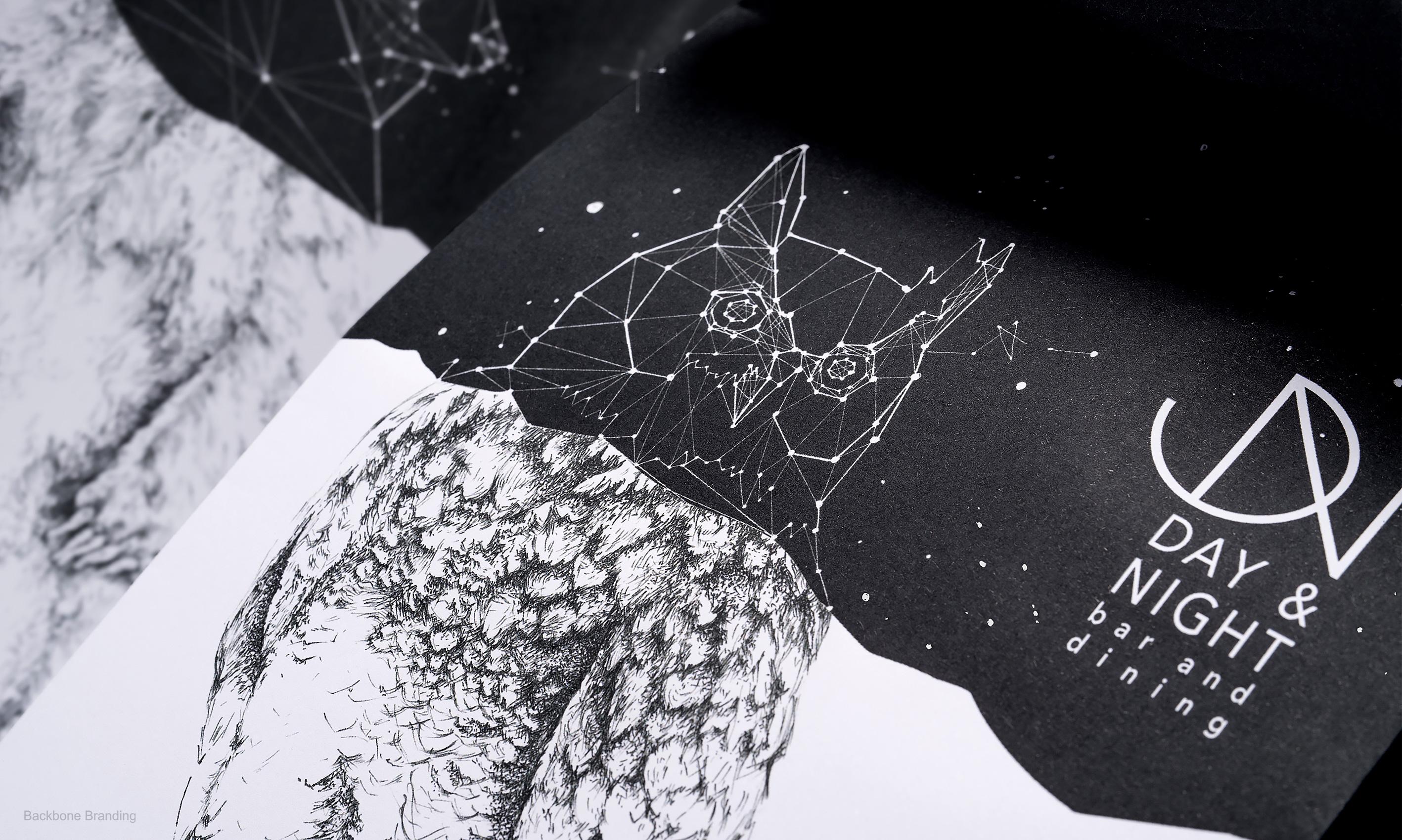
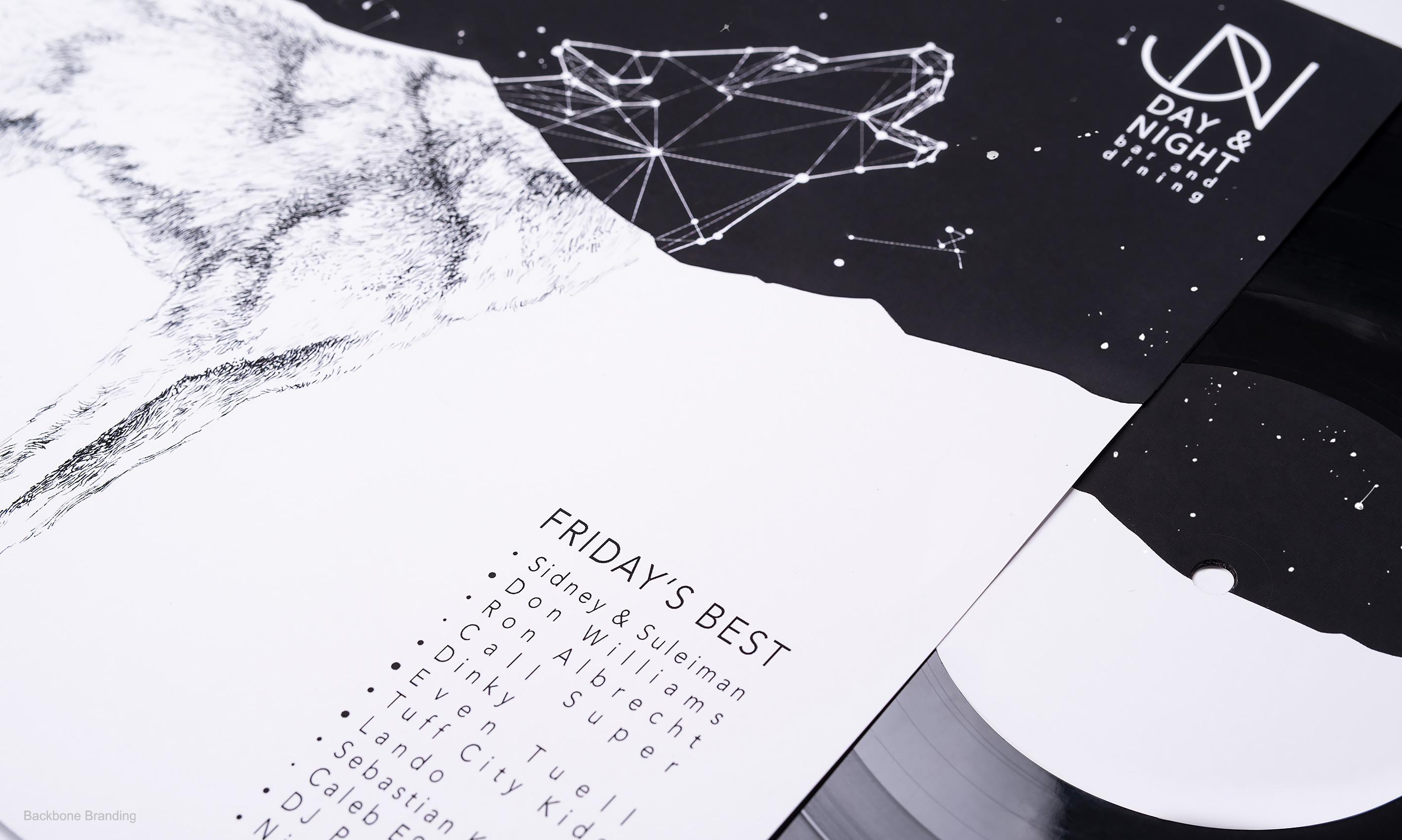
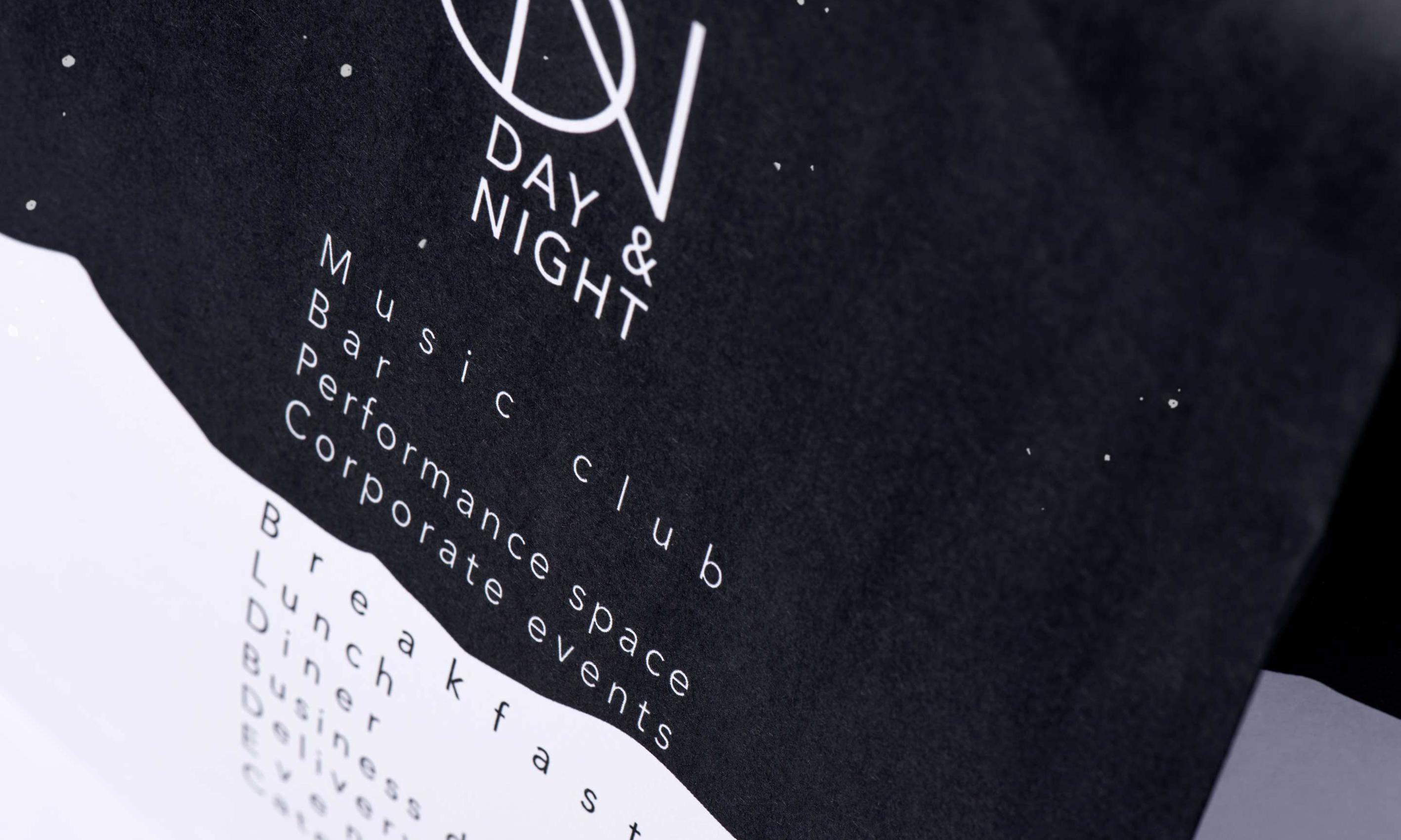
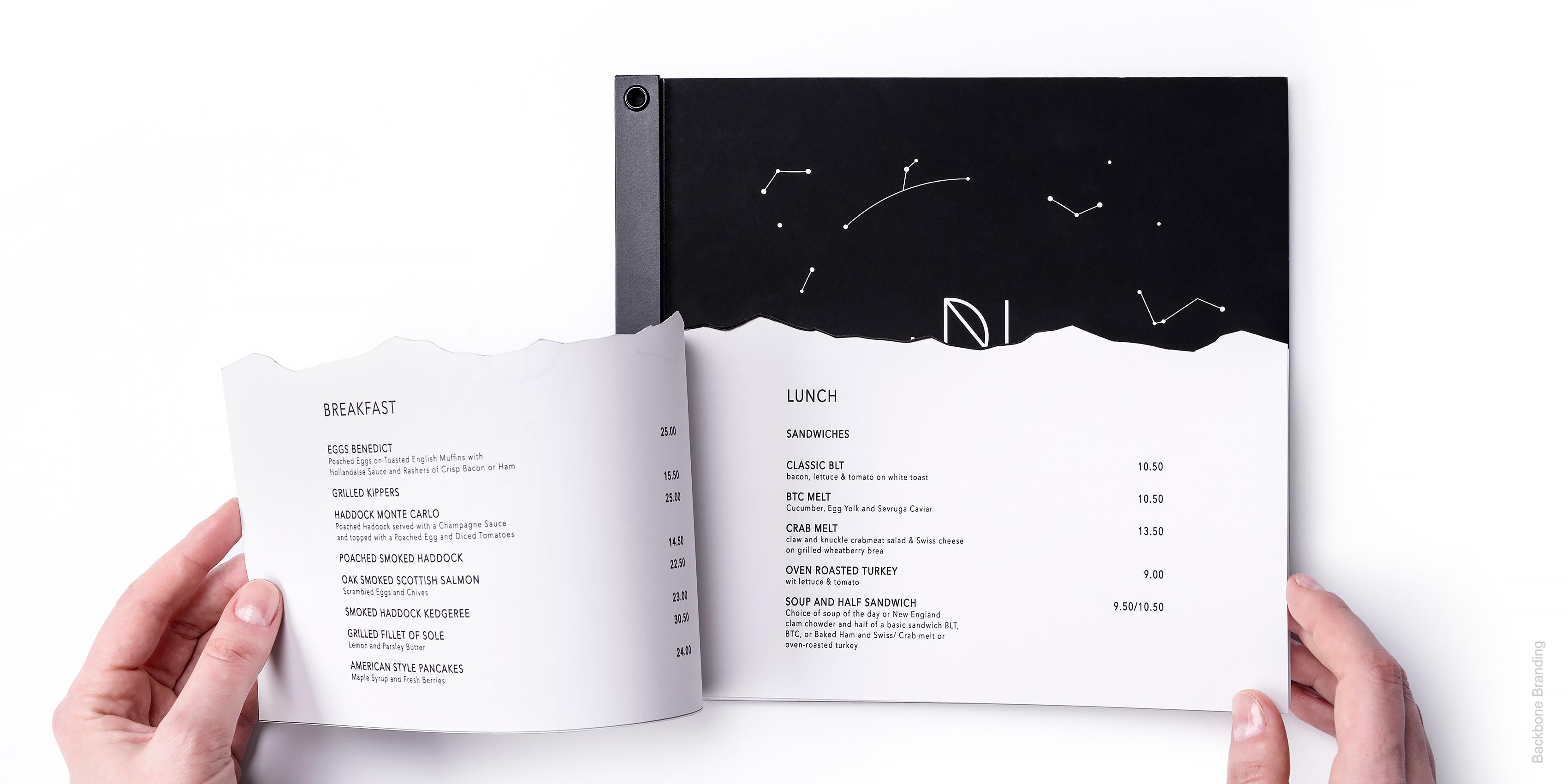
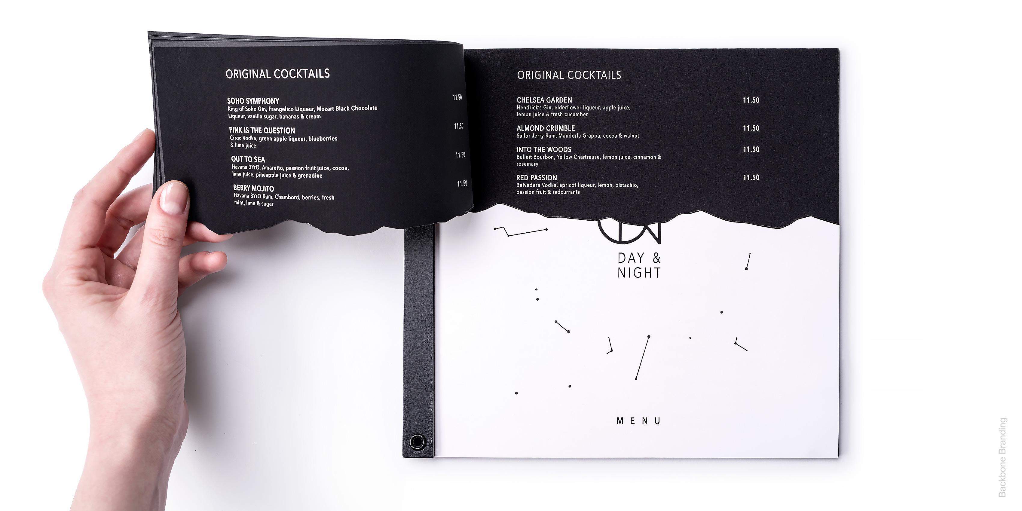
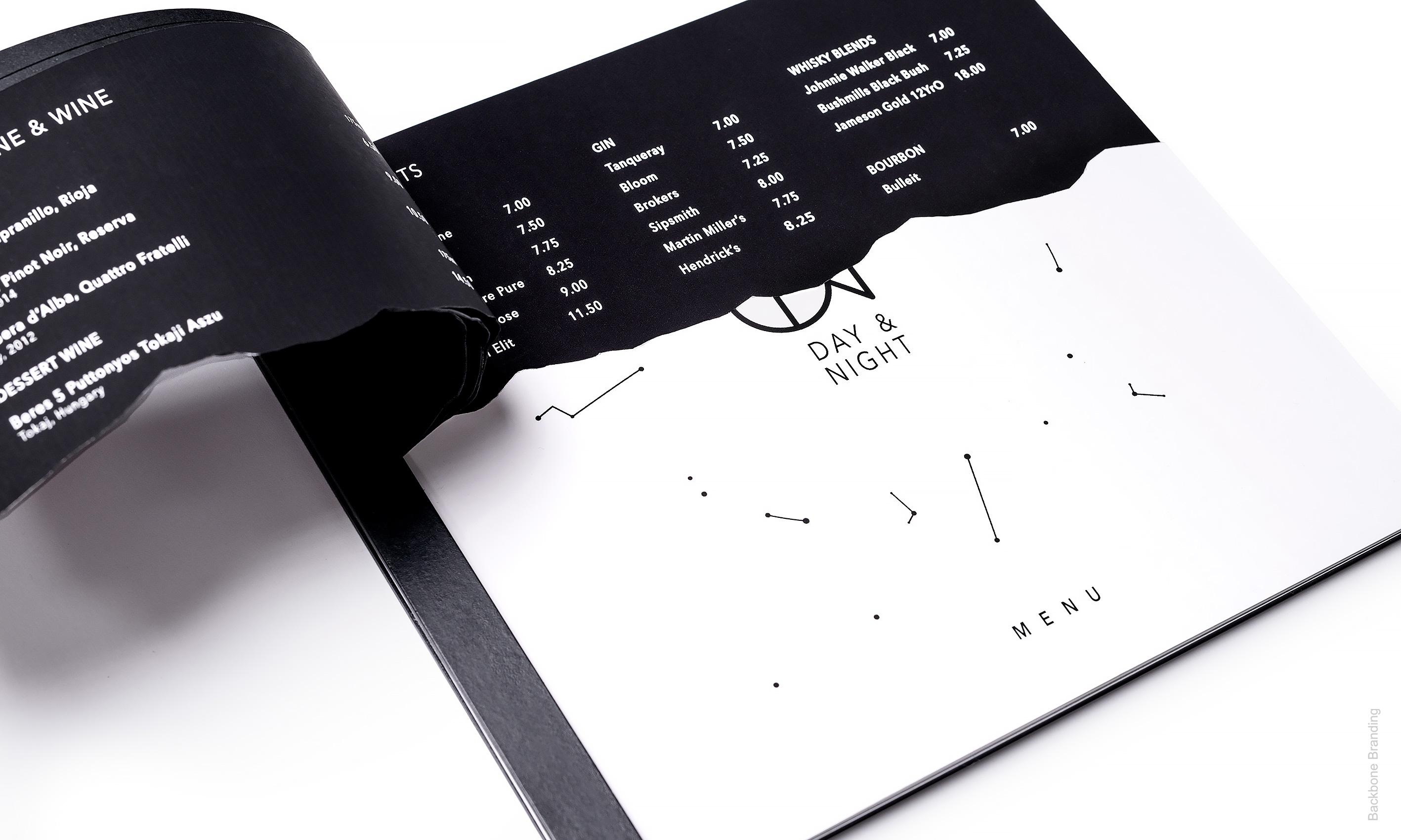
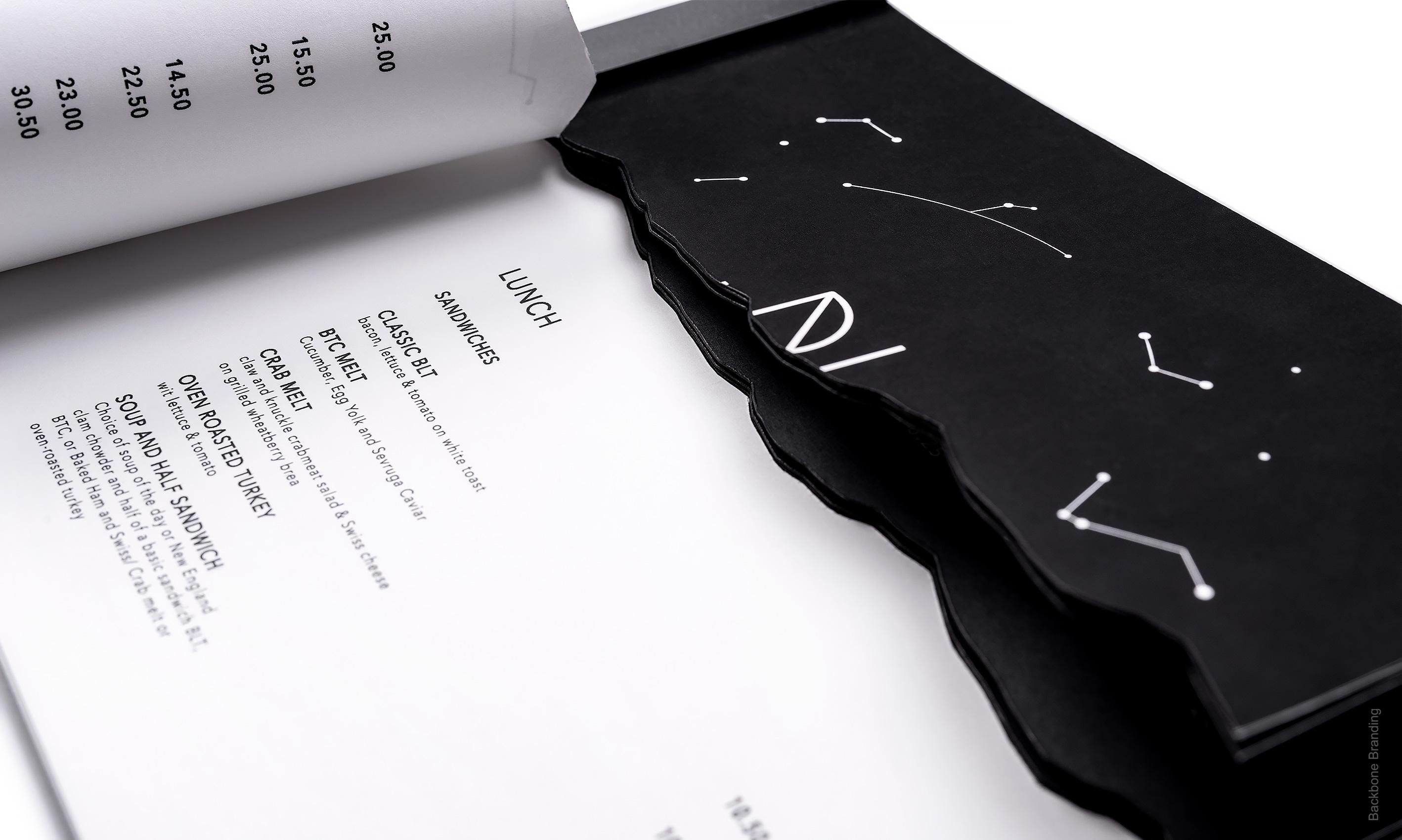
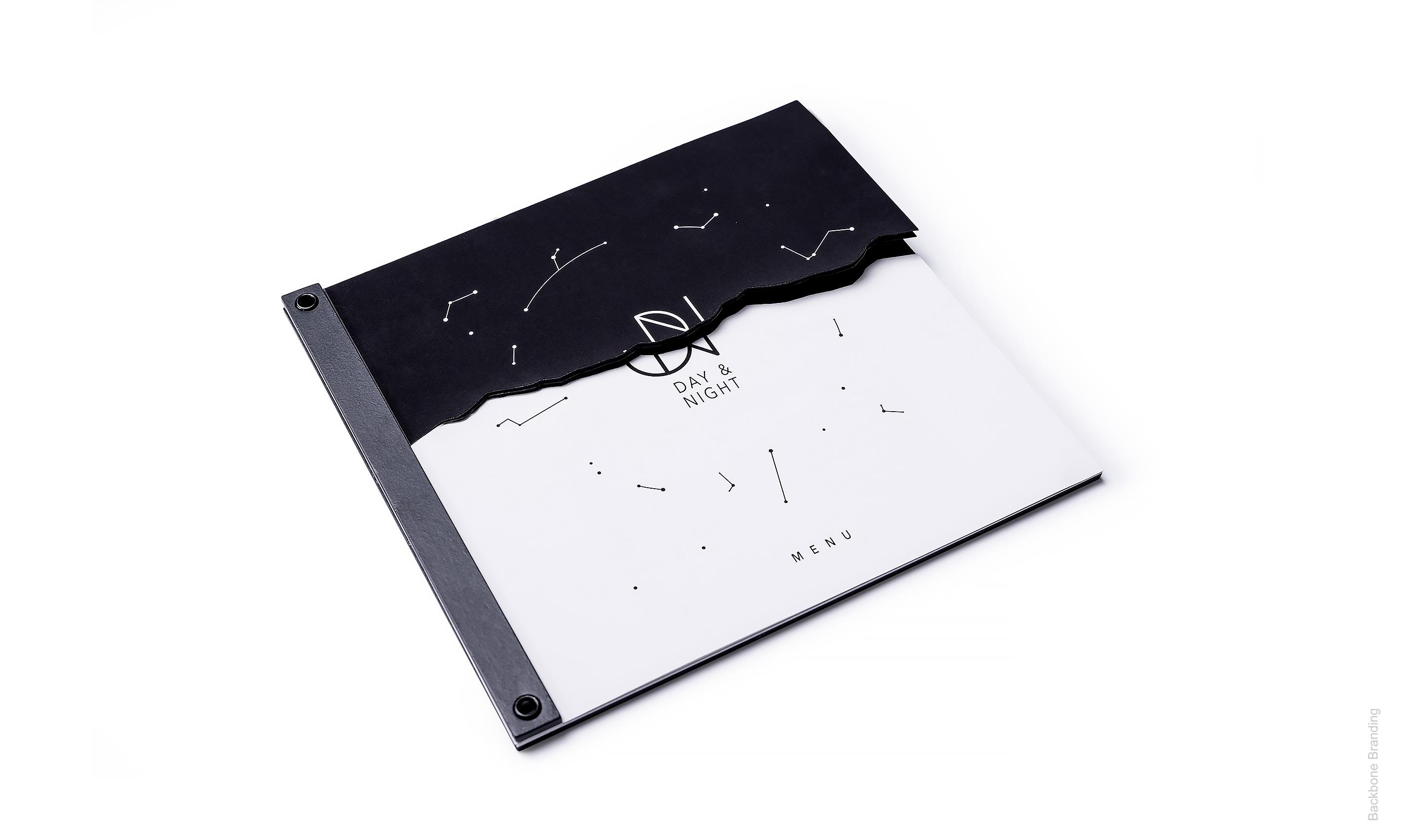
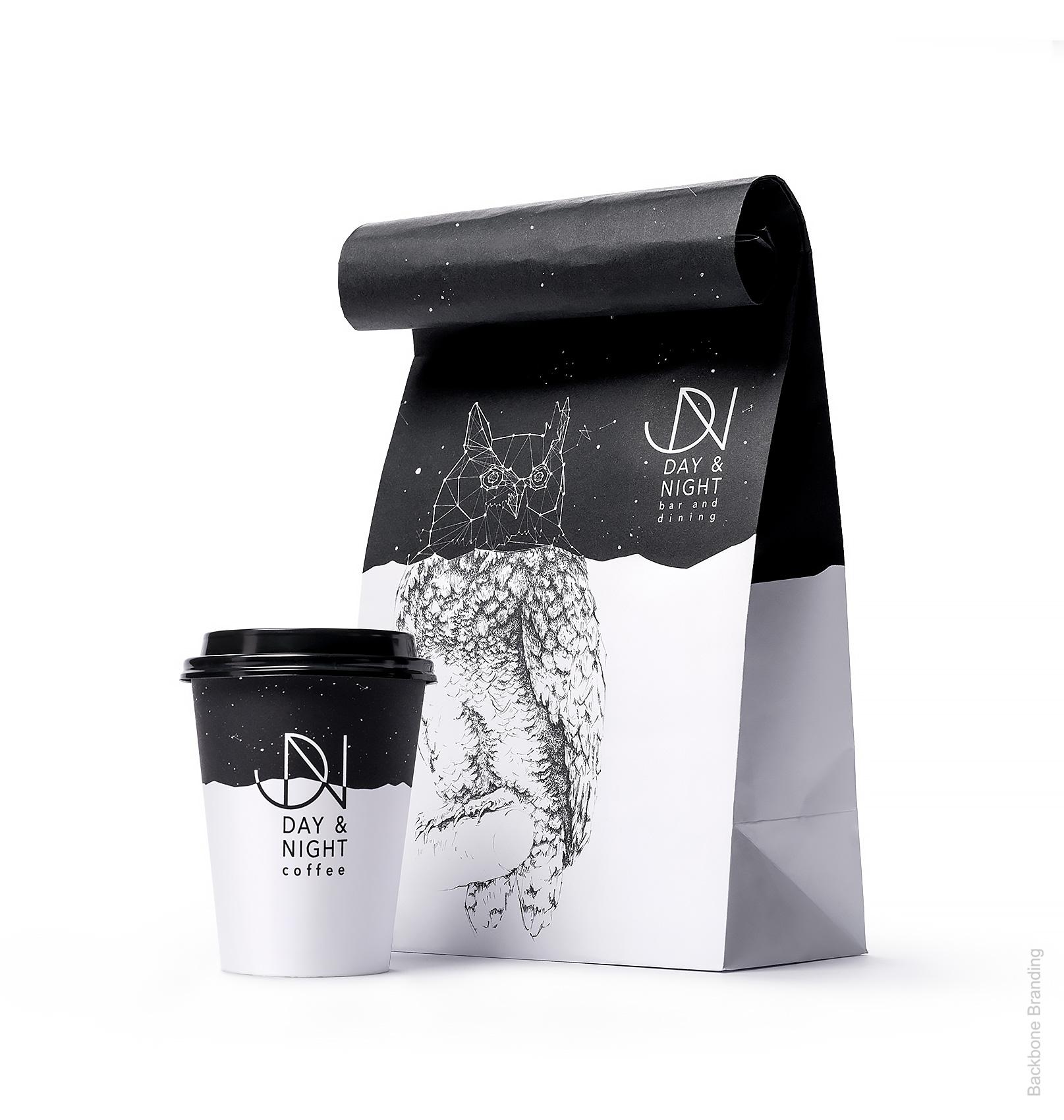
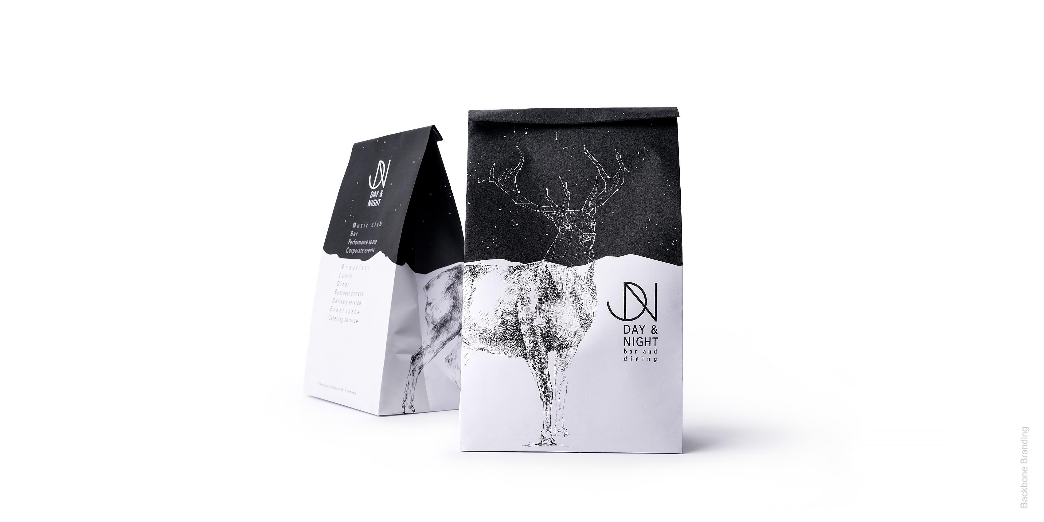
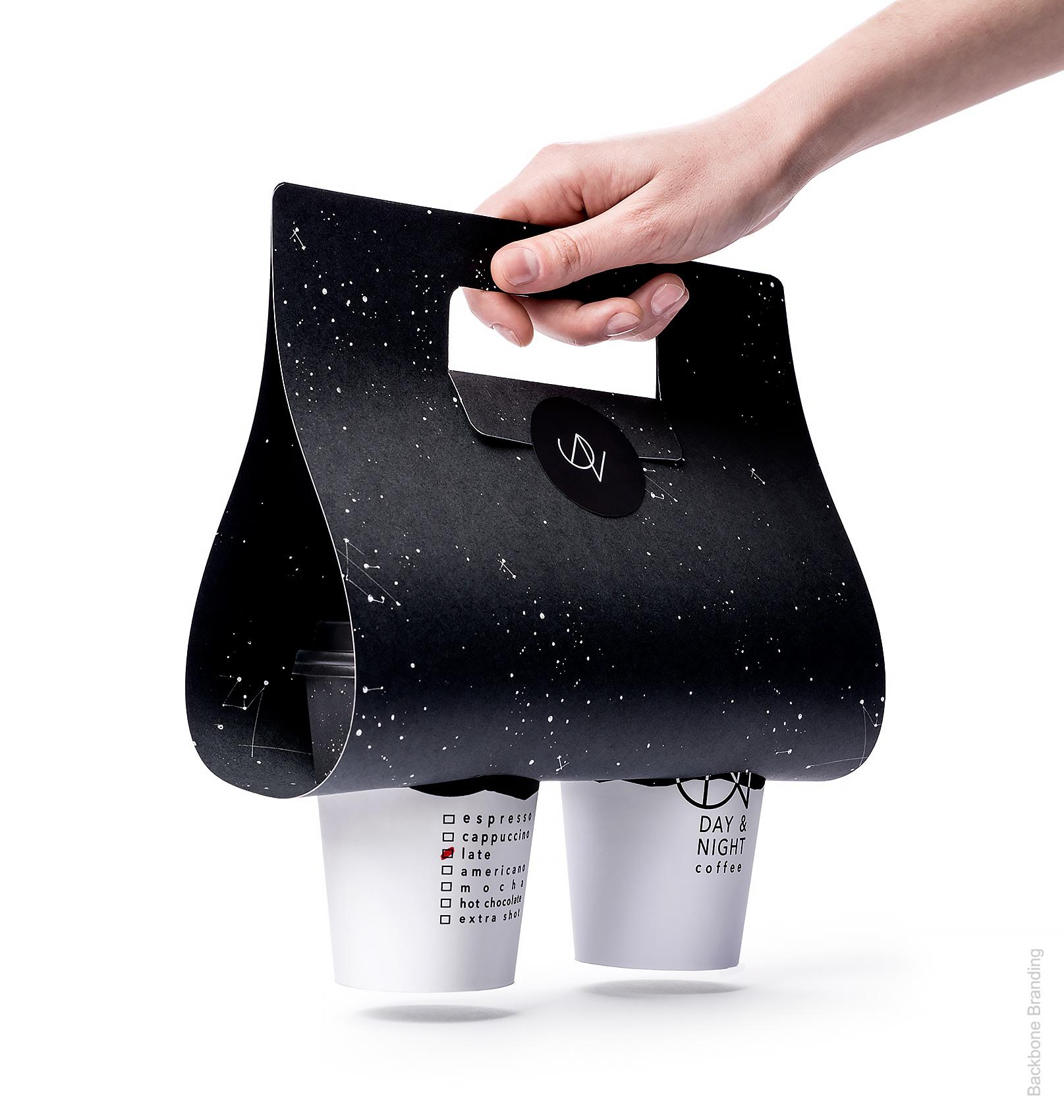
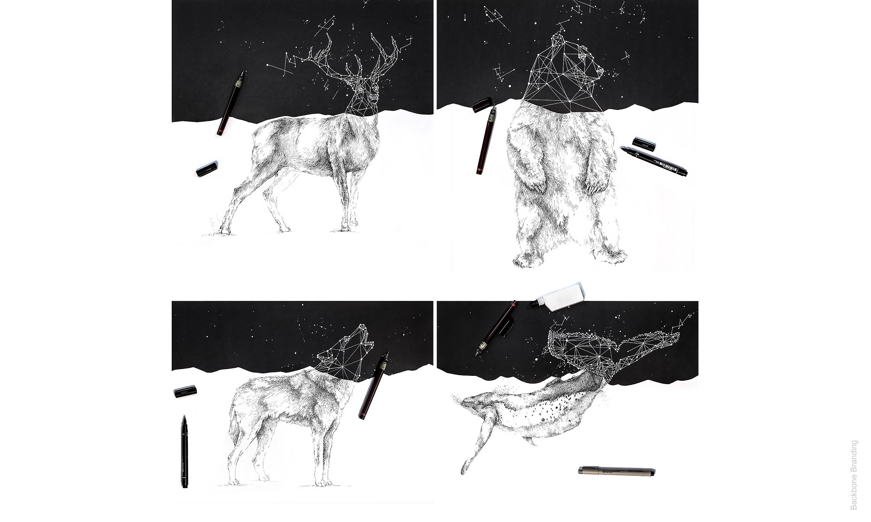
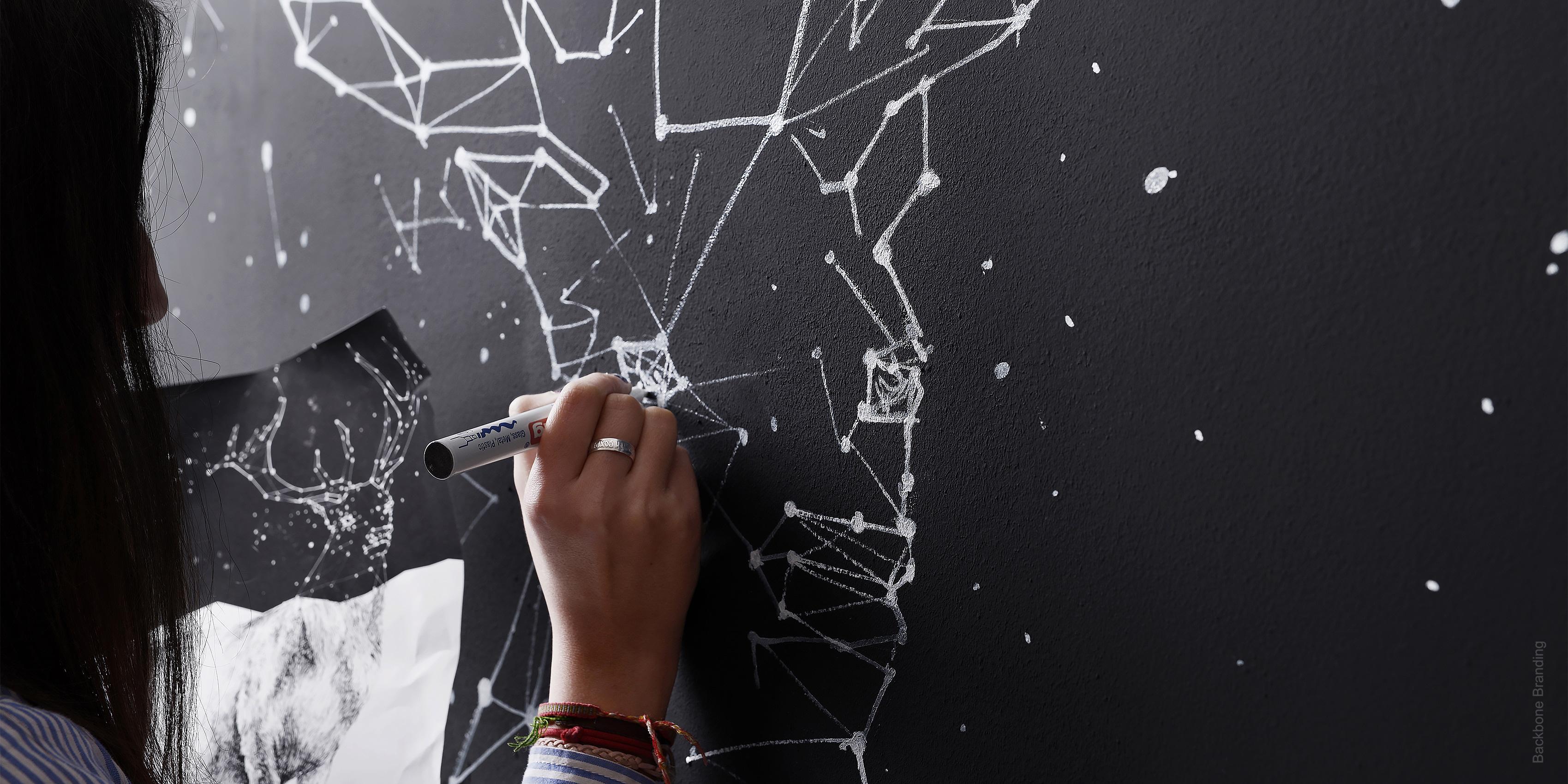
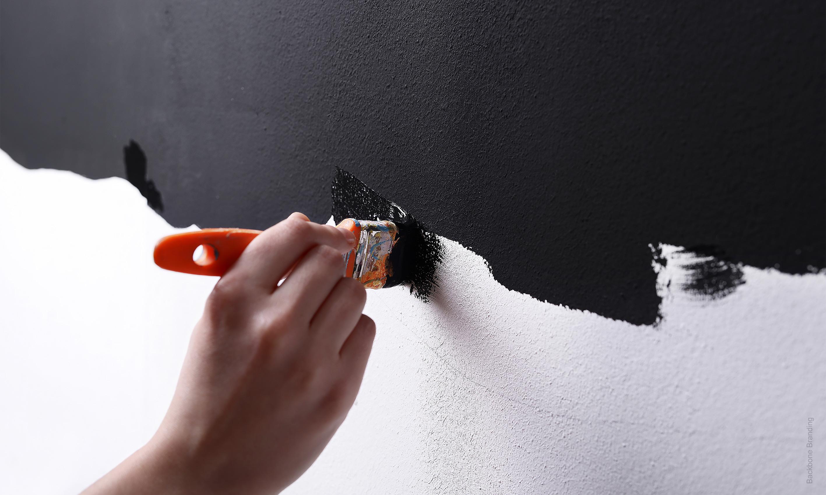
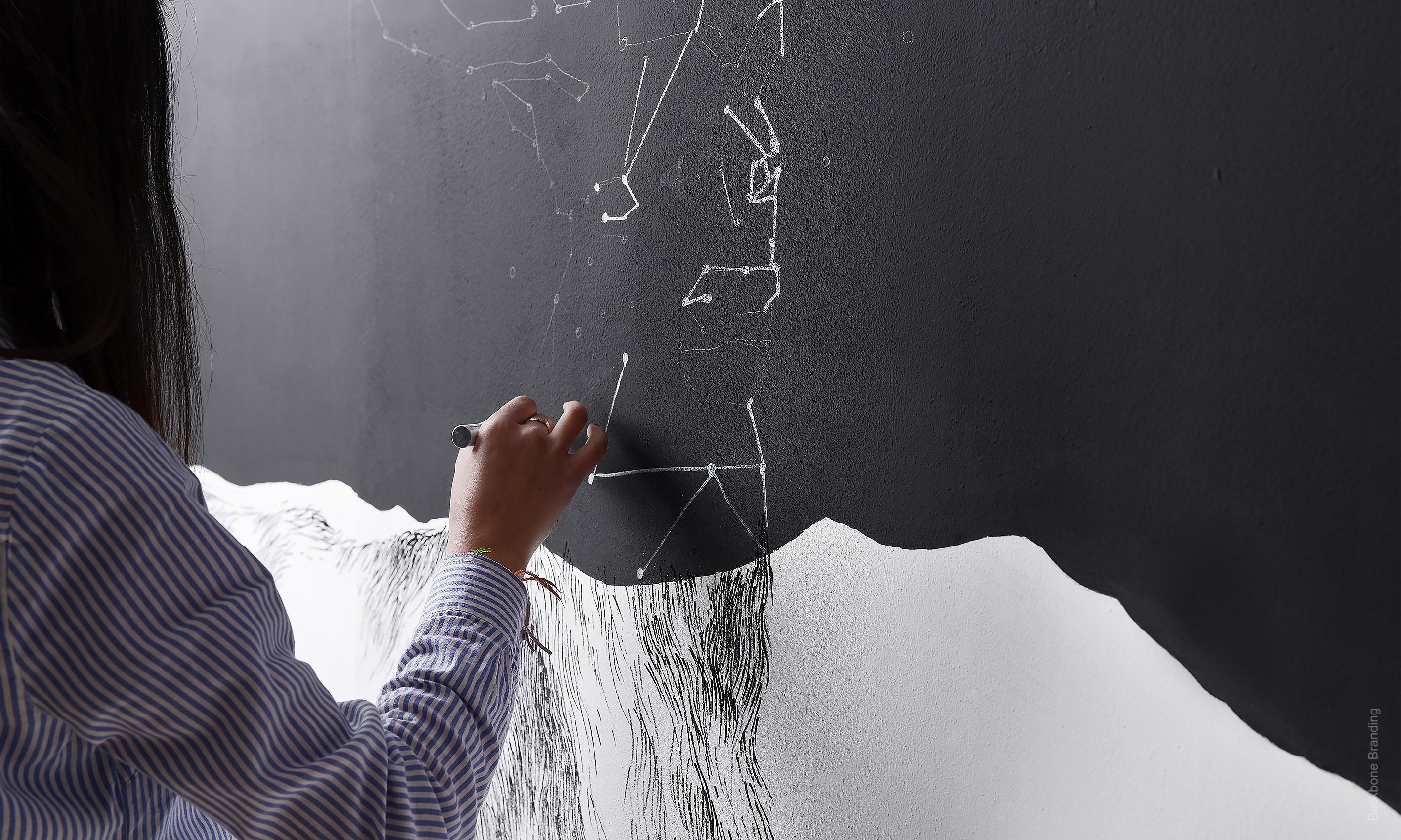
The concept expresses the restaurant type that serves its dining during the day and the bar that starts to act in the night. The idea is simple, each packaging is split in two, the top represents night and uses the dark clear night in its design. The bottom is day and it is all about bright white color.
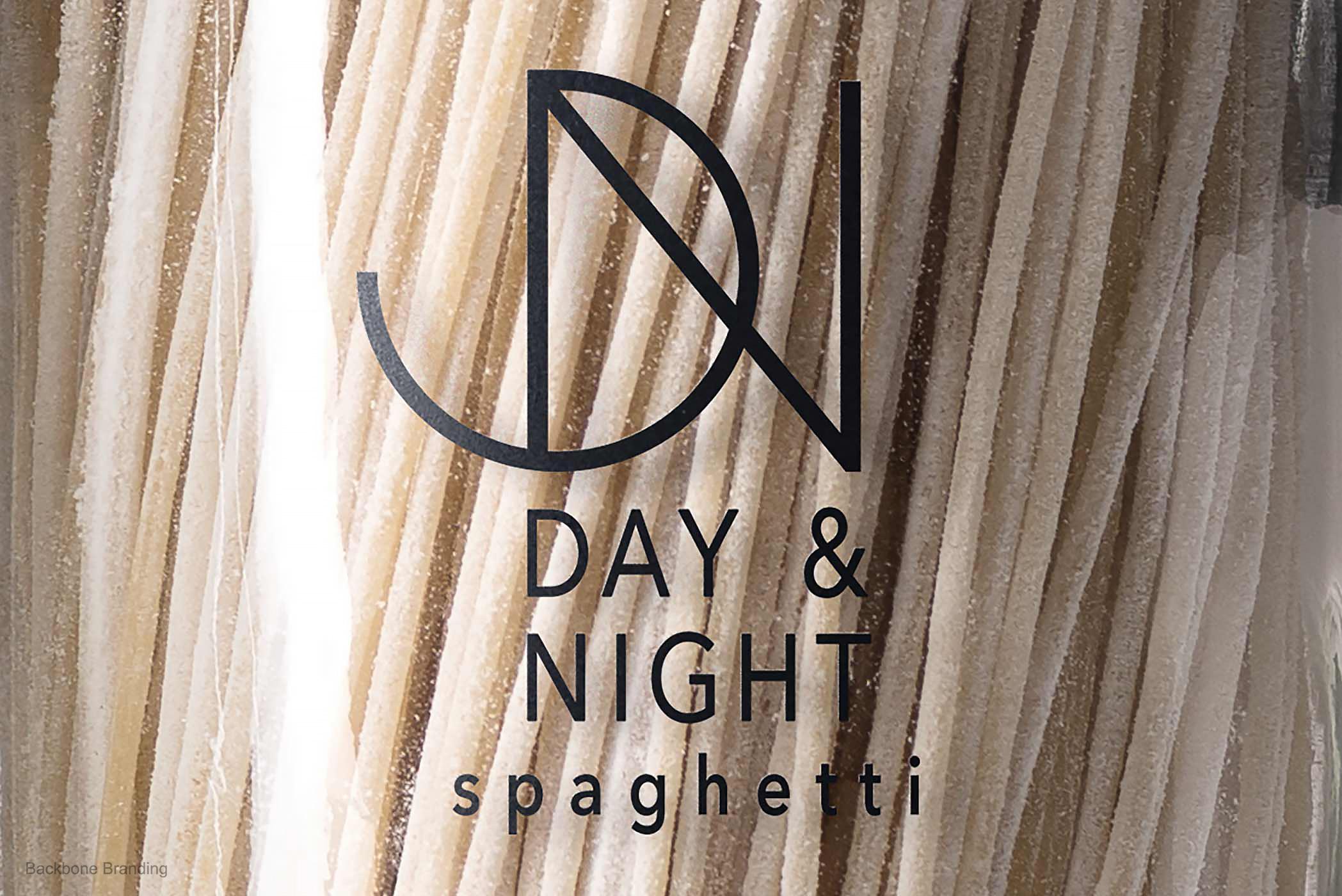
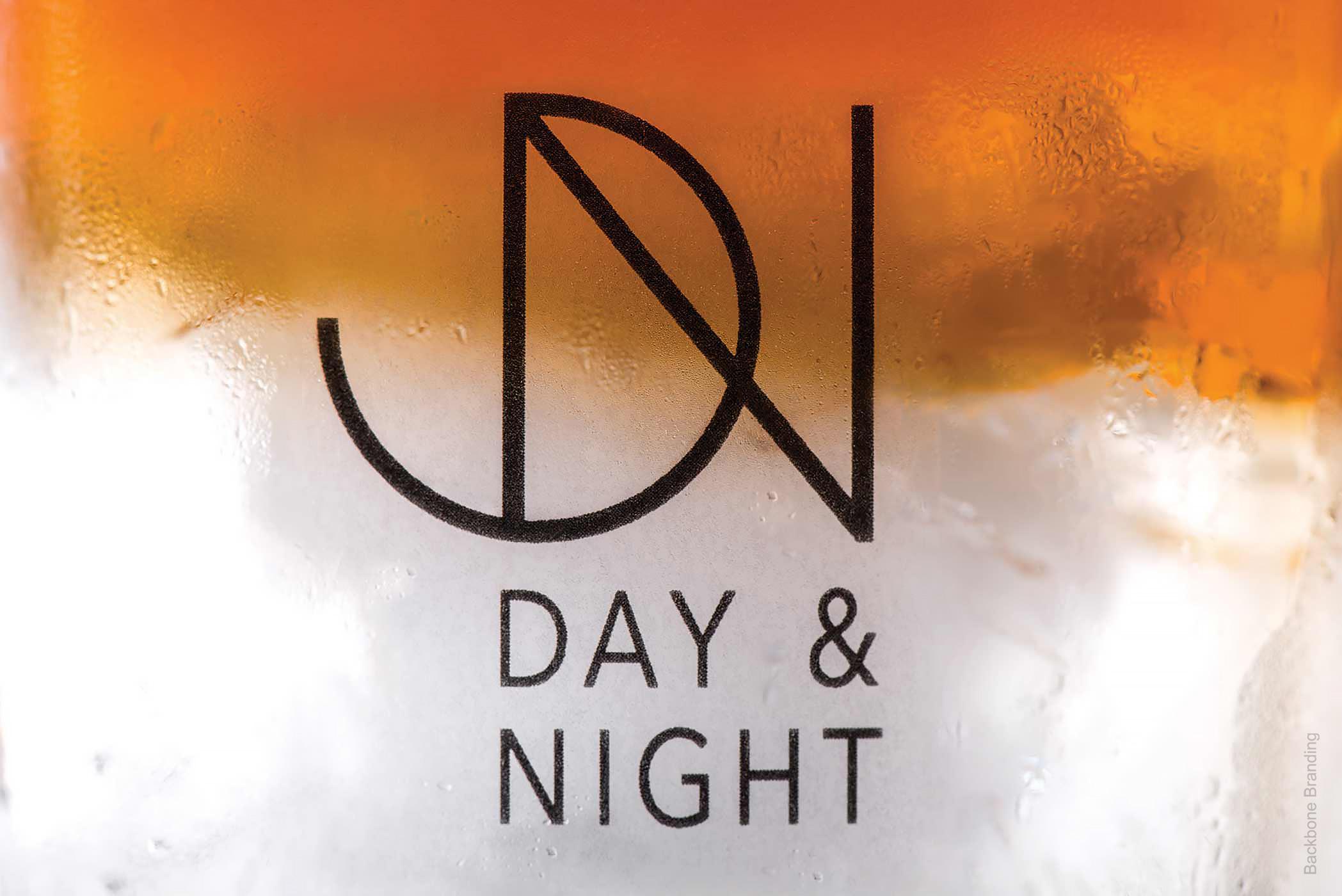
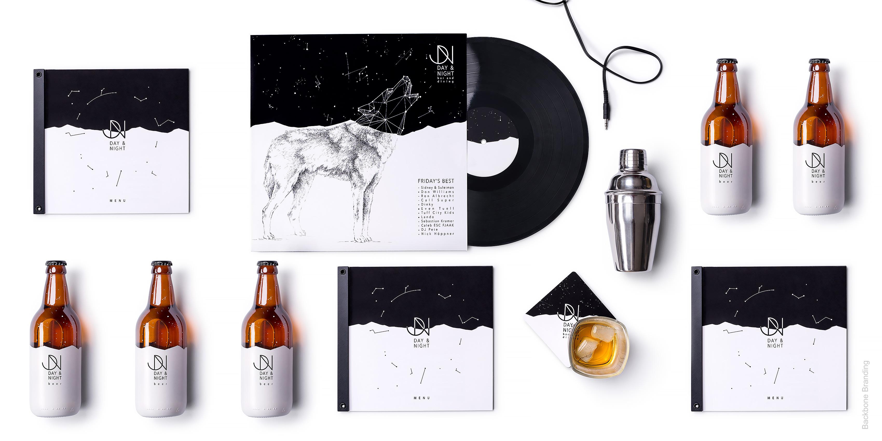
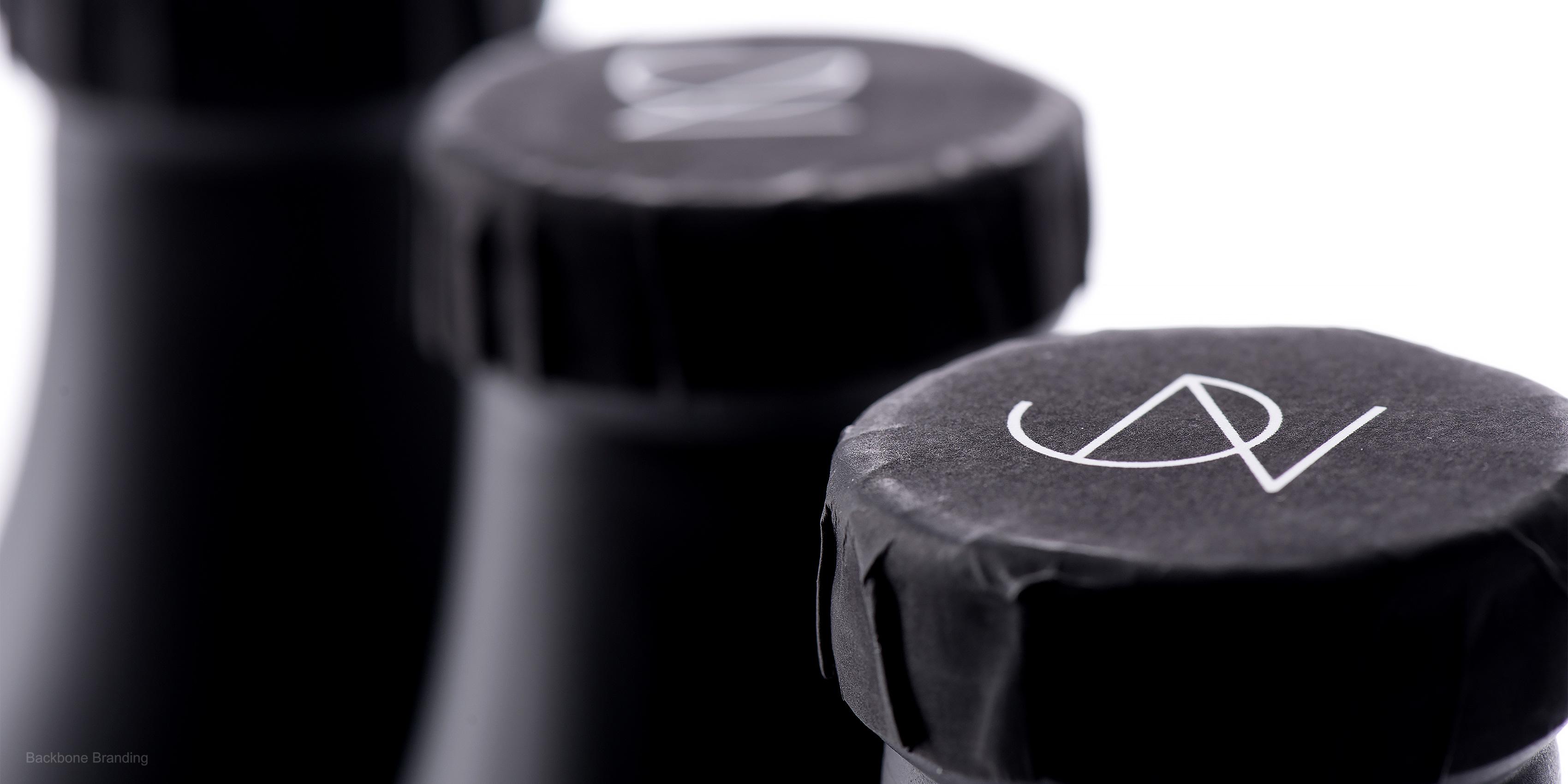
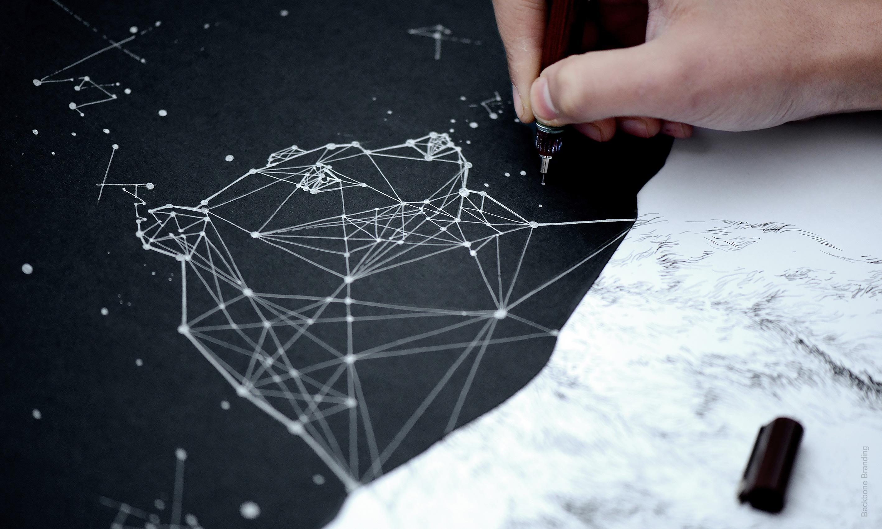
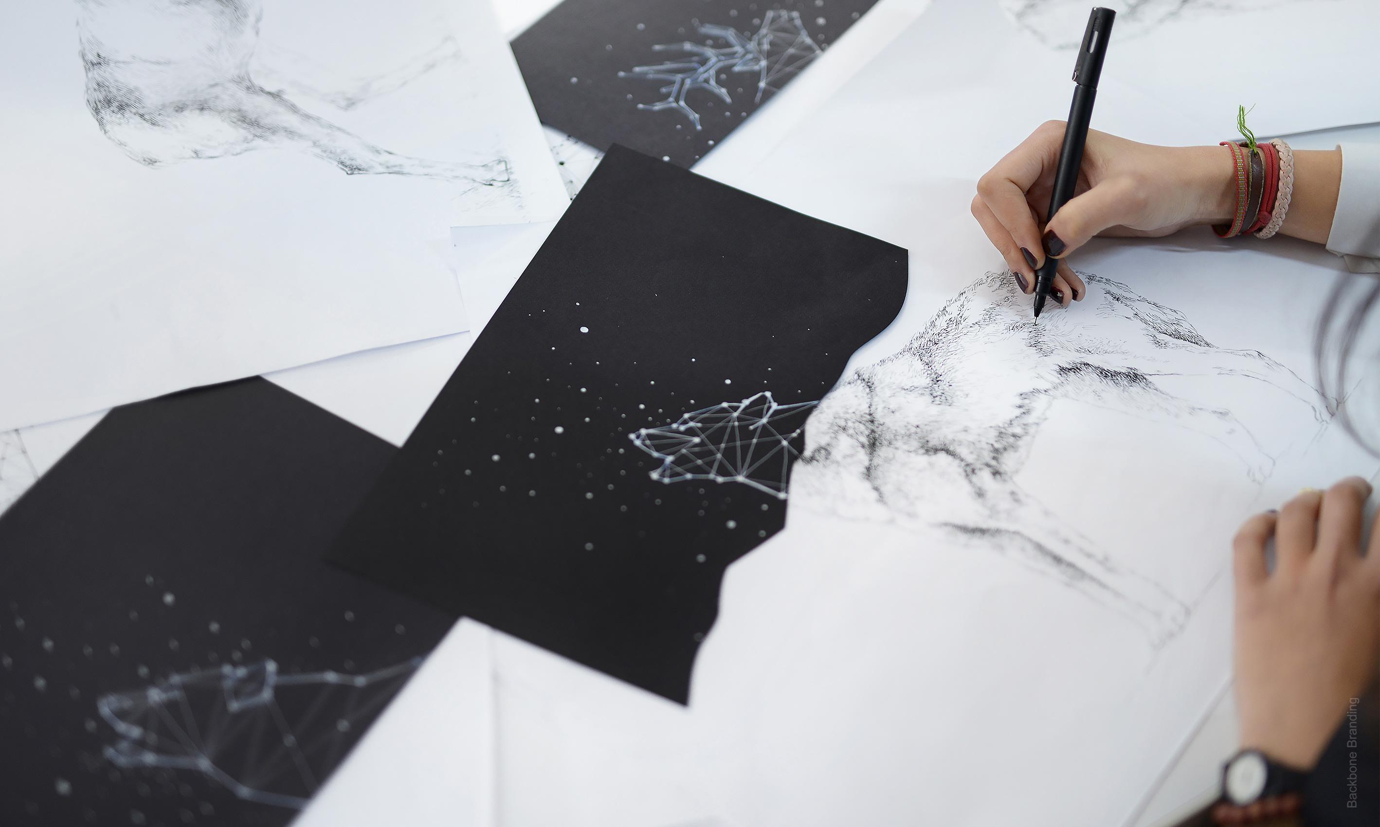
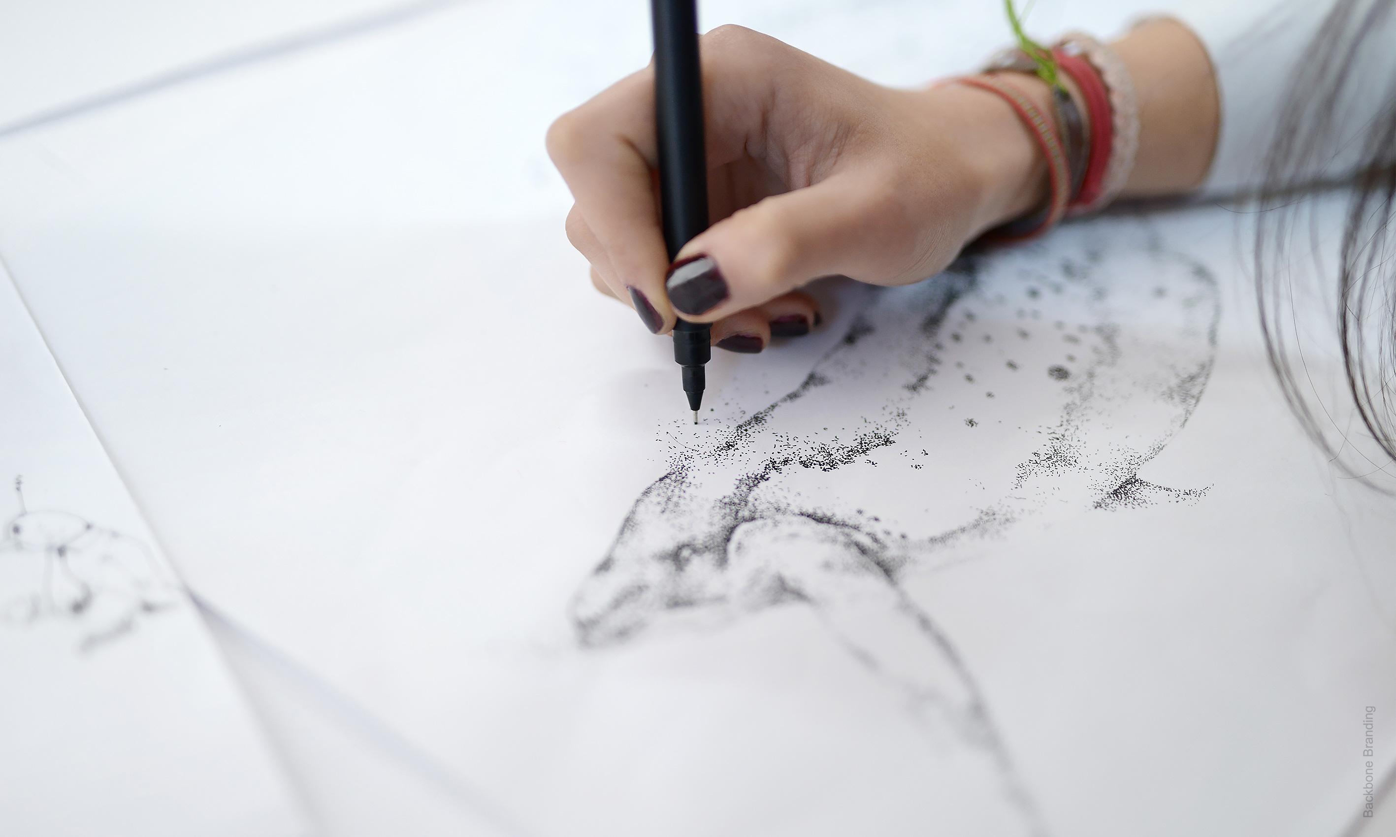
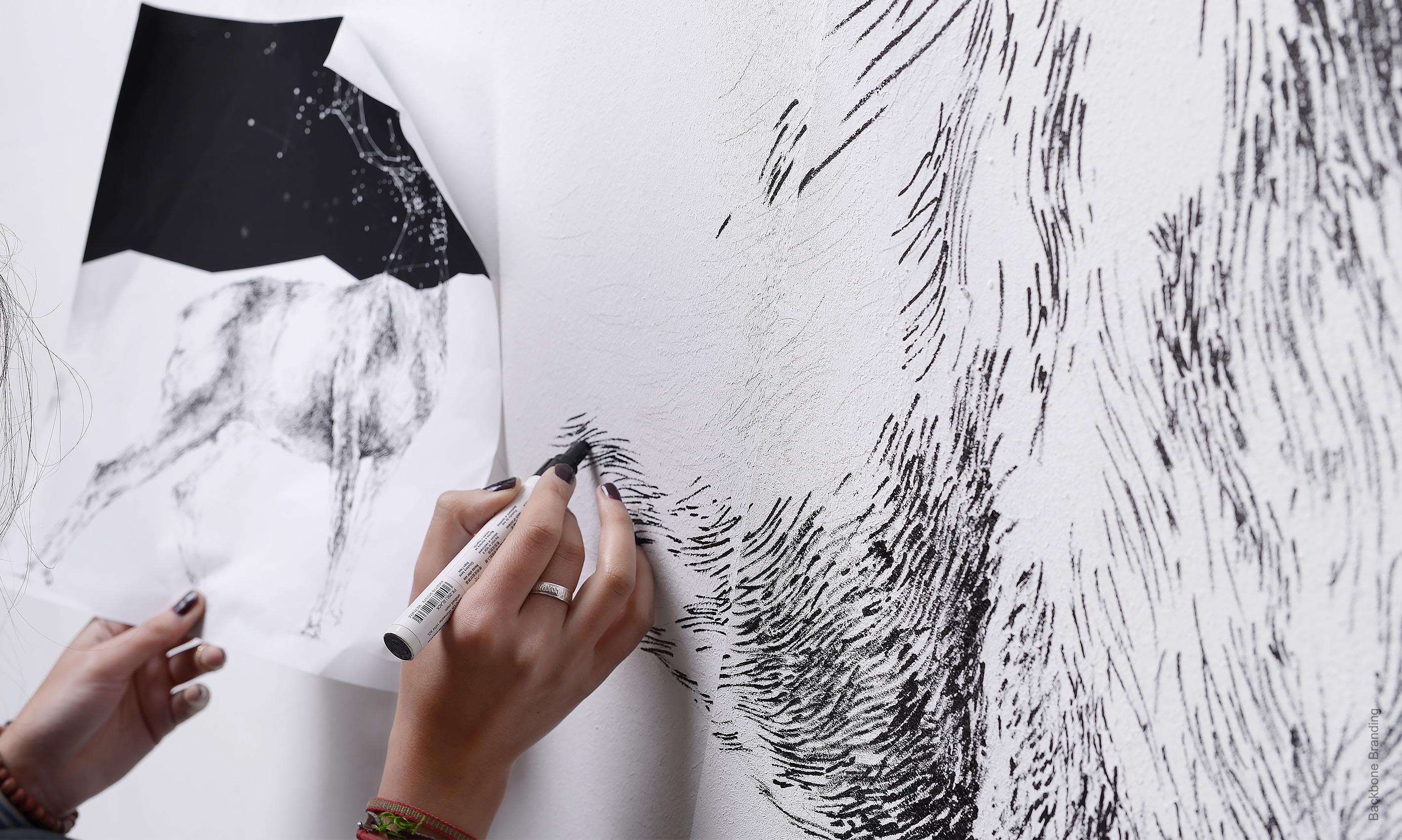
To complete the design there are animals illustrated that you can see parts of both in the night part of the design as well as the day. The logo is a simple merge between a D for day and a N for night. It expresses the earth’s rotation with its shape symbolizing the change from day to night.
Click for more
1
/
2
The idea is simple, each packaging is split in two, the top represents night and uses the dark clear night in its design. The bottom is day and it is all about bright white color.
1
/
4
1
/
3
To complete the design there are animals illustrated that you can see parts of both in the night part of the design as well as the day.
The concept expresses the restaurant type that serves its dining during the day and the bar that starts to act in the night.
Day & Night is a concept project with a bifacial nature that is injected in each of its design elements.
1
/
4
1
/
3
This time we decided to make a full restaurant branding project without a customer to receive it once it was done.
More works
