Haterk
Branding Services / Packaging design
industry
Food, Honey
client
Haterk Food
year
2022
awards


overview
“Haterk” is a village where many of the brand products were first produced - ecologically pure, fresh and far from industrial development.
challenge
We have had a creative task to portray a product of sentiment and adventure in an arrangement of designs, and to express the brand identity through various products. It was important to convey the brand’s promise of “a healthy and energetic life”, along with preserving its distinct character of following the paths to nature’s bounties.
solution
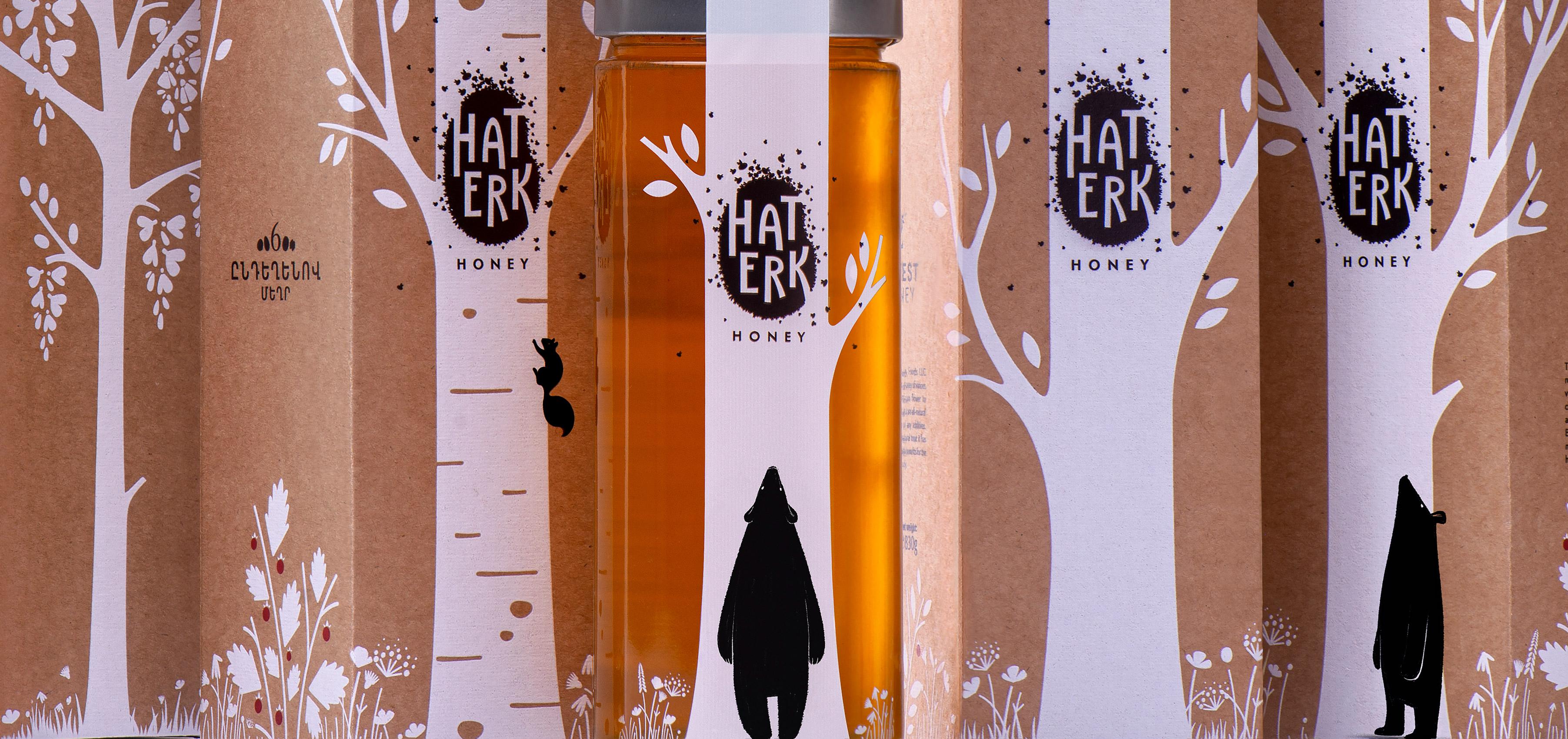
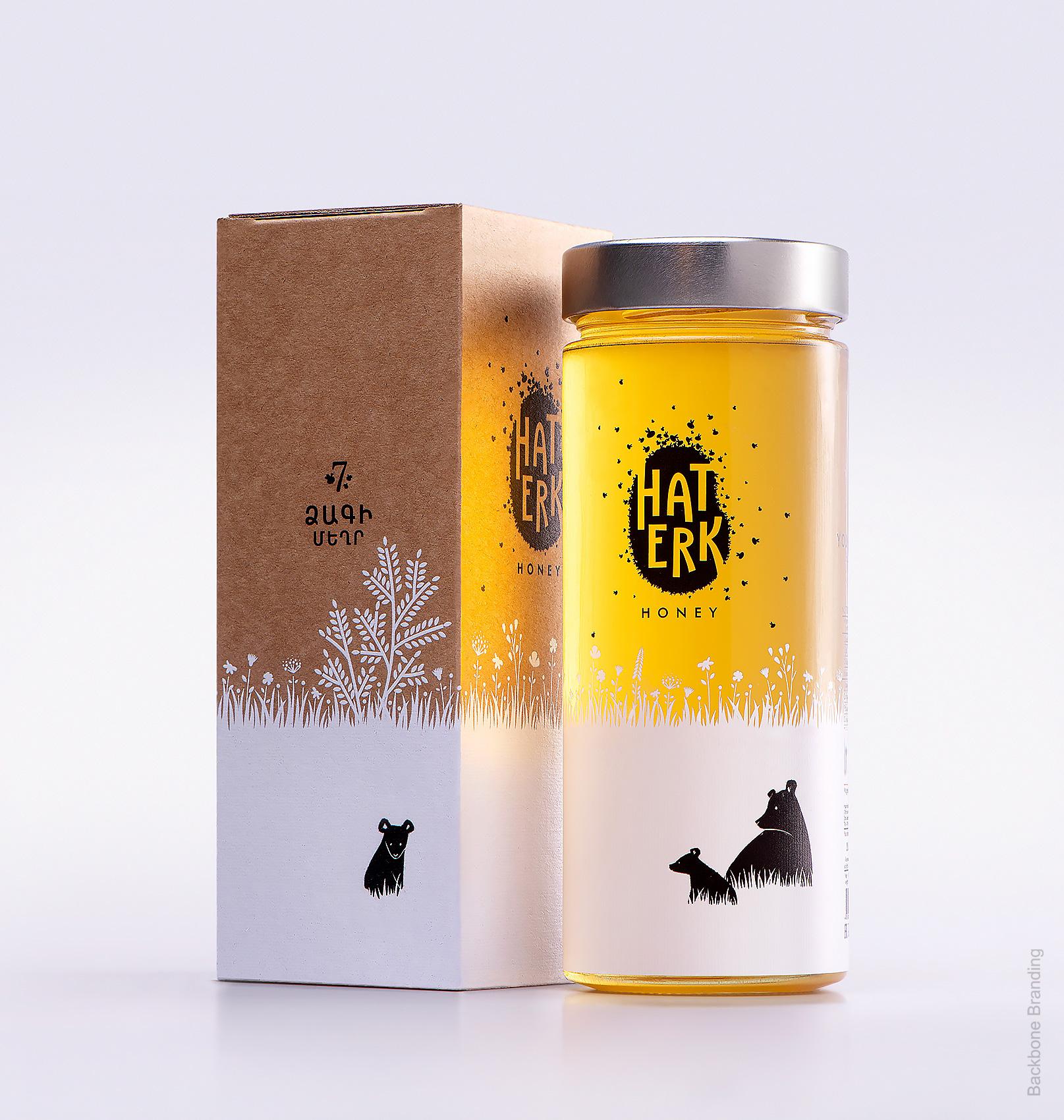
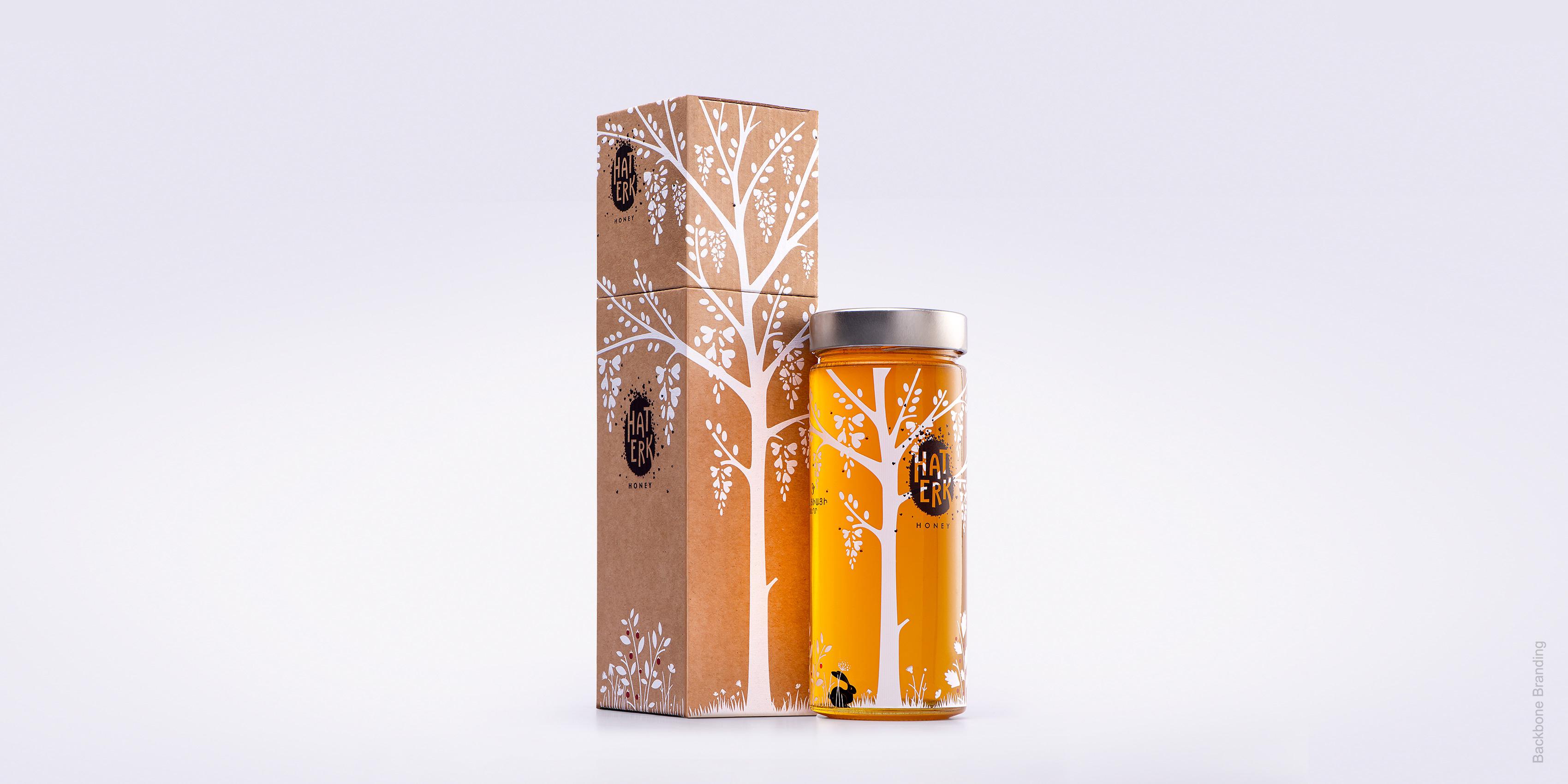
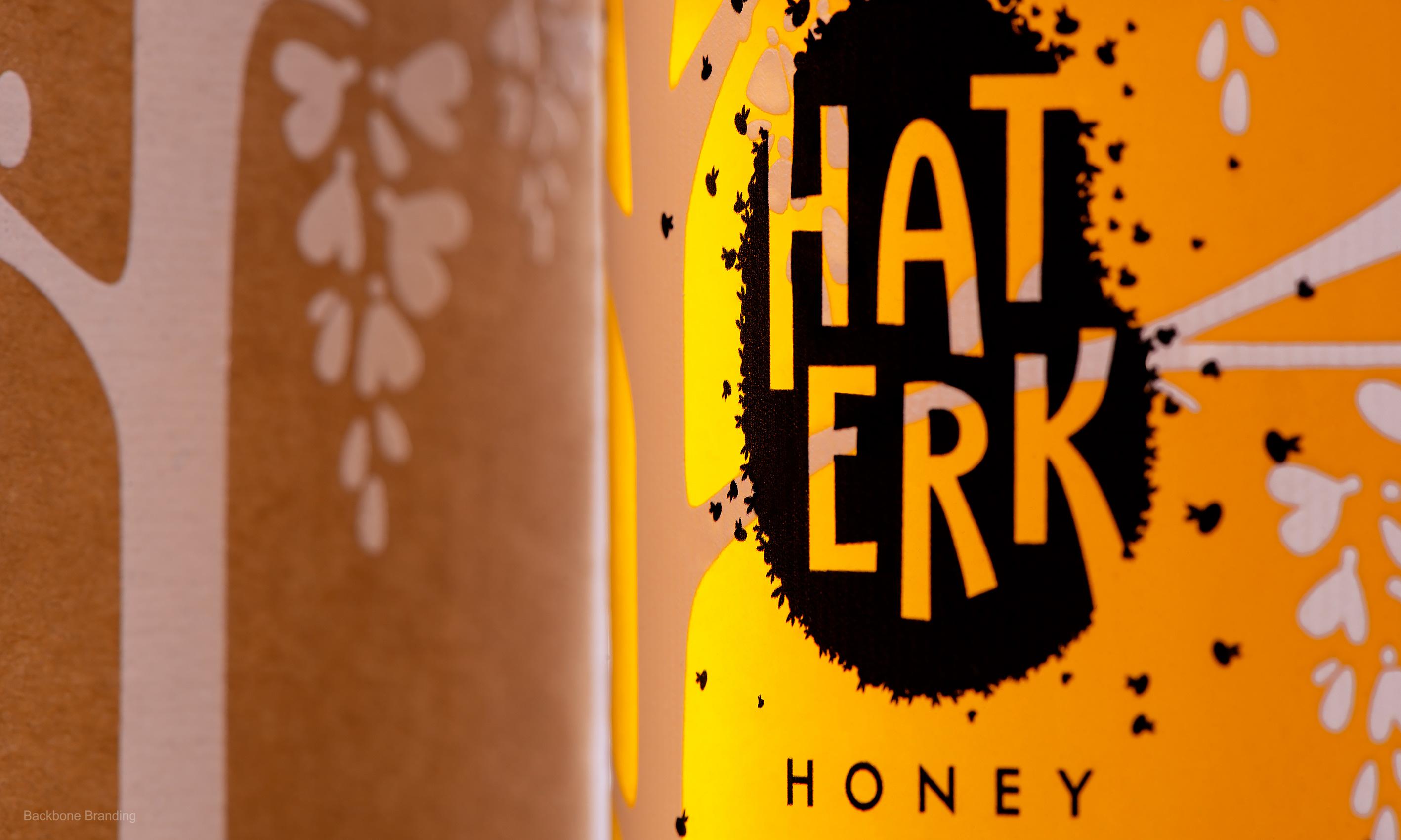
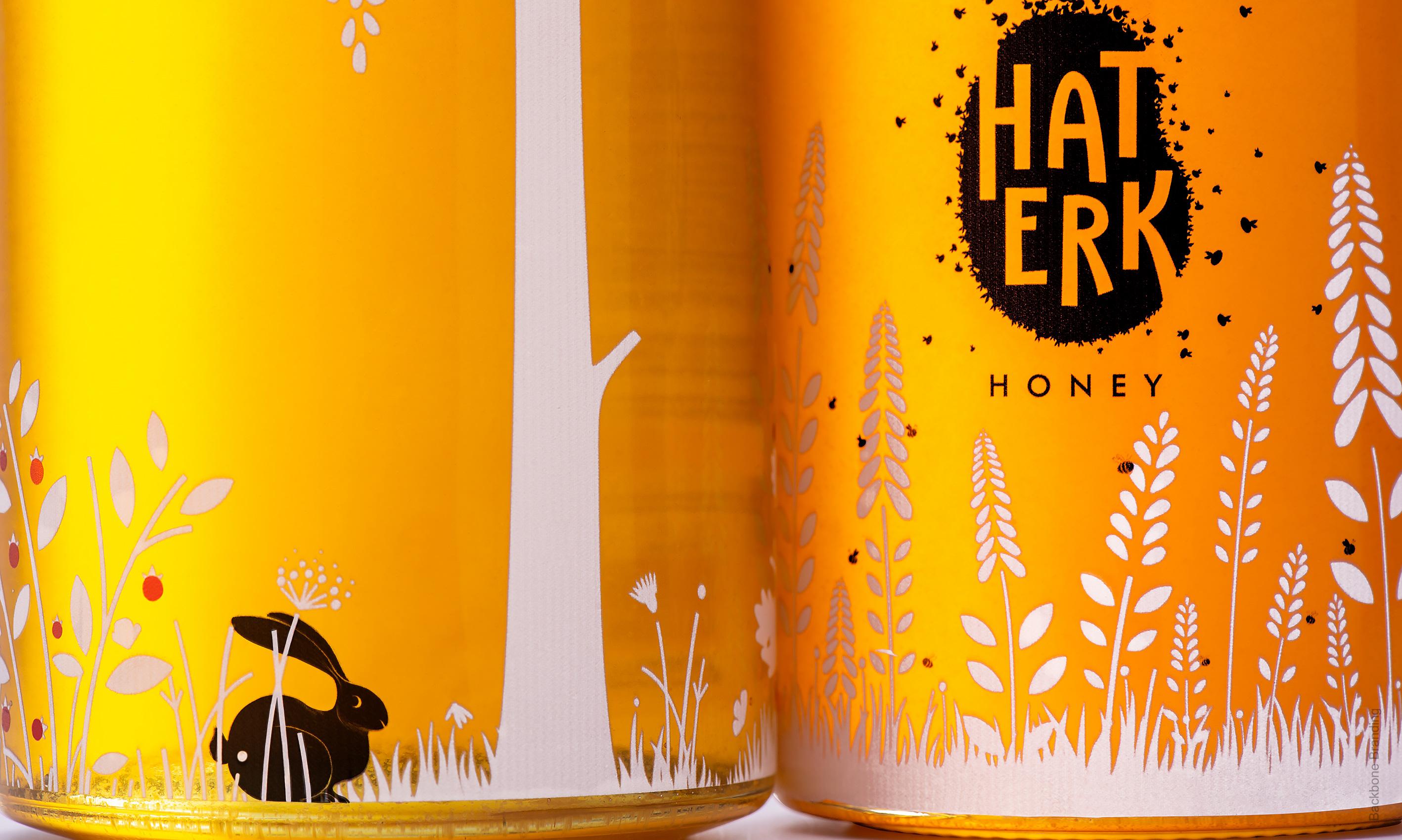
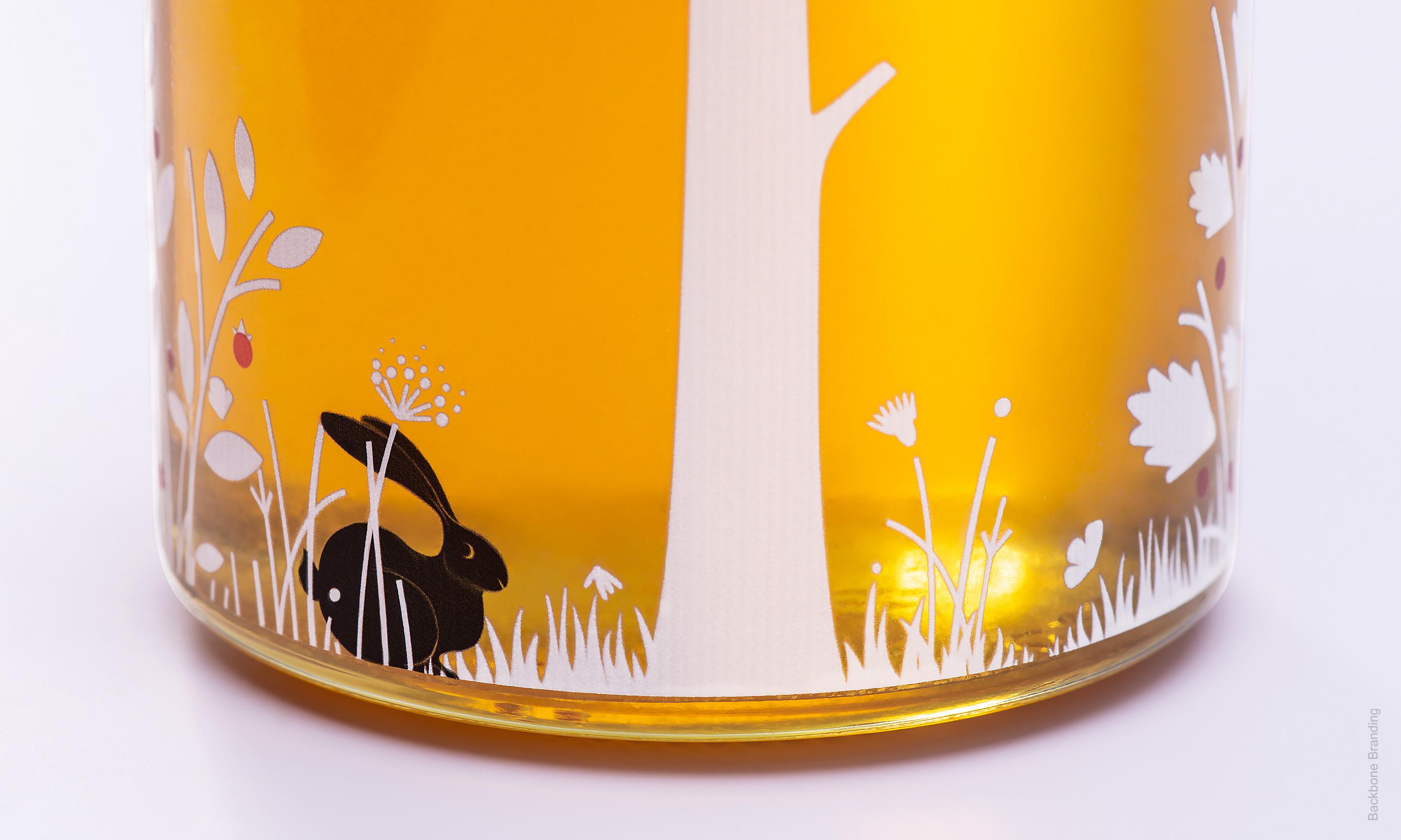
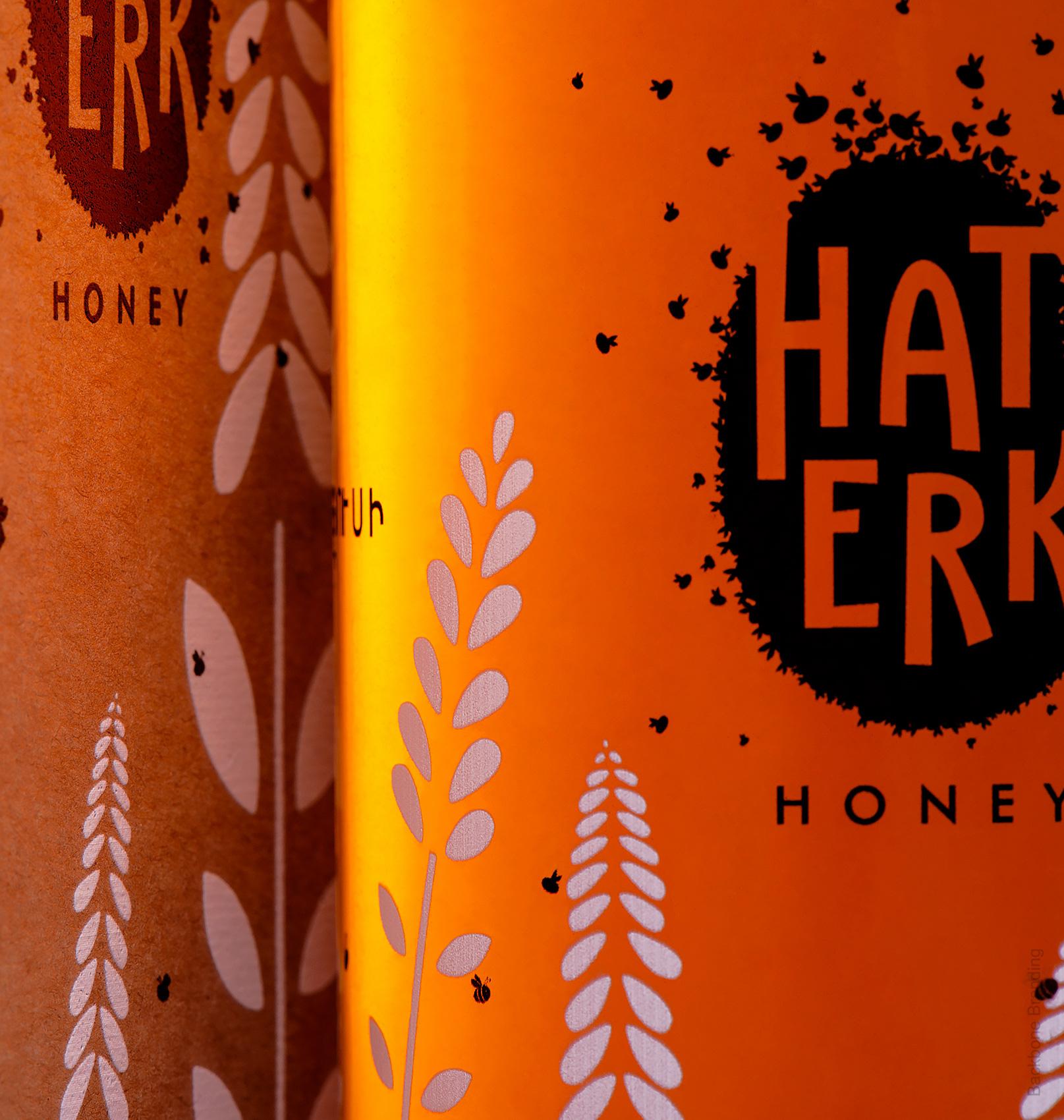
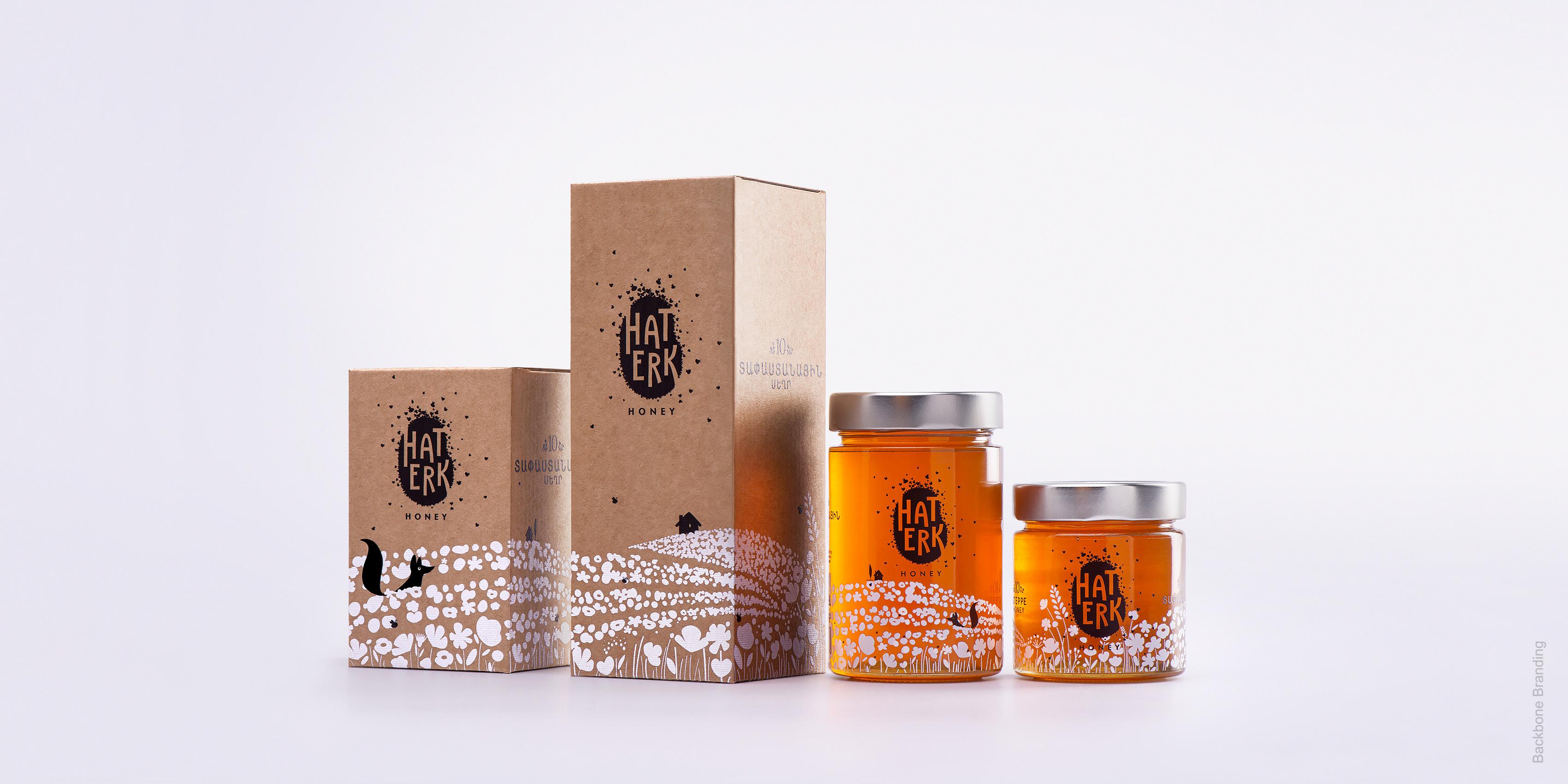
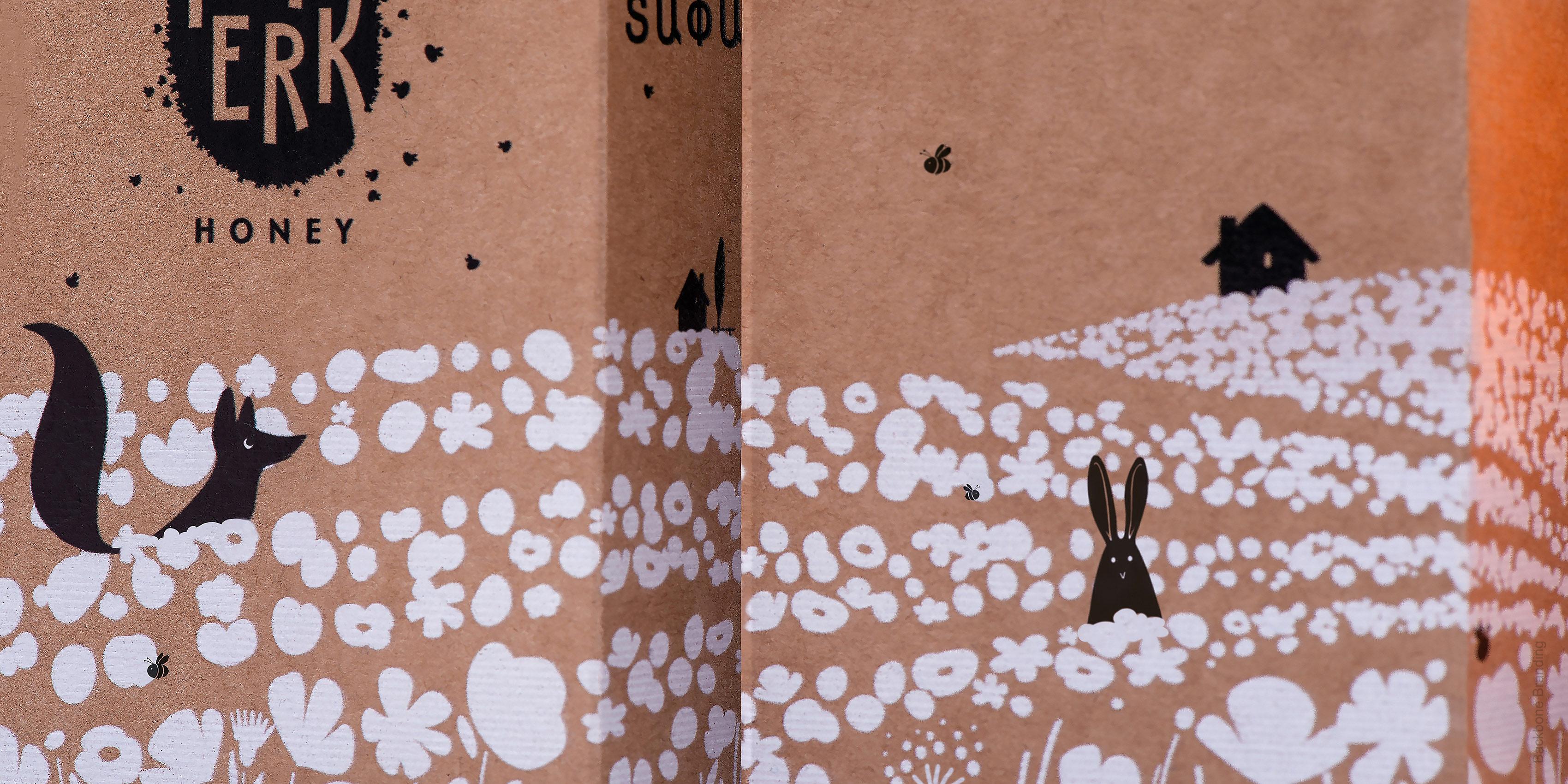
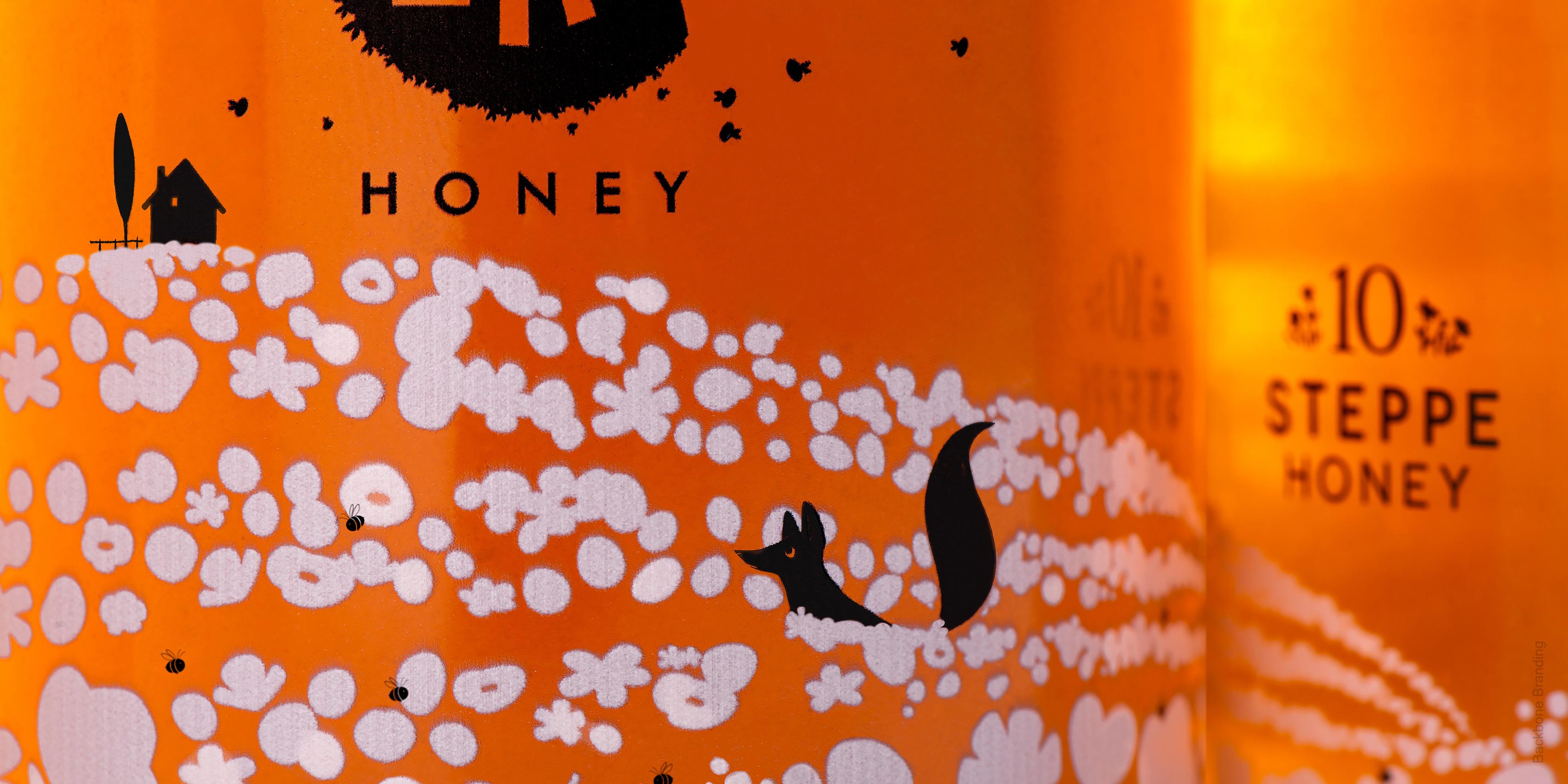
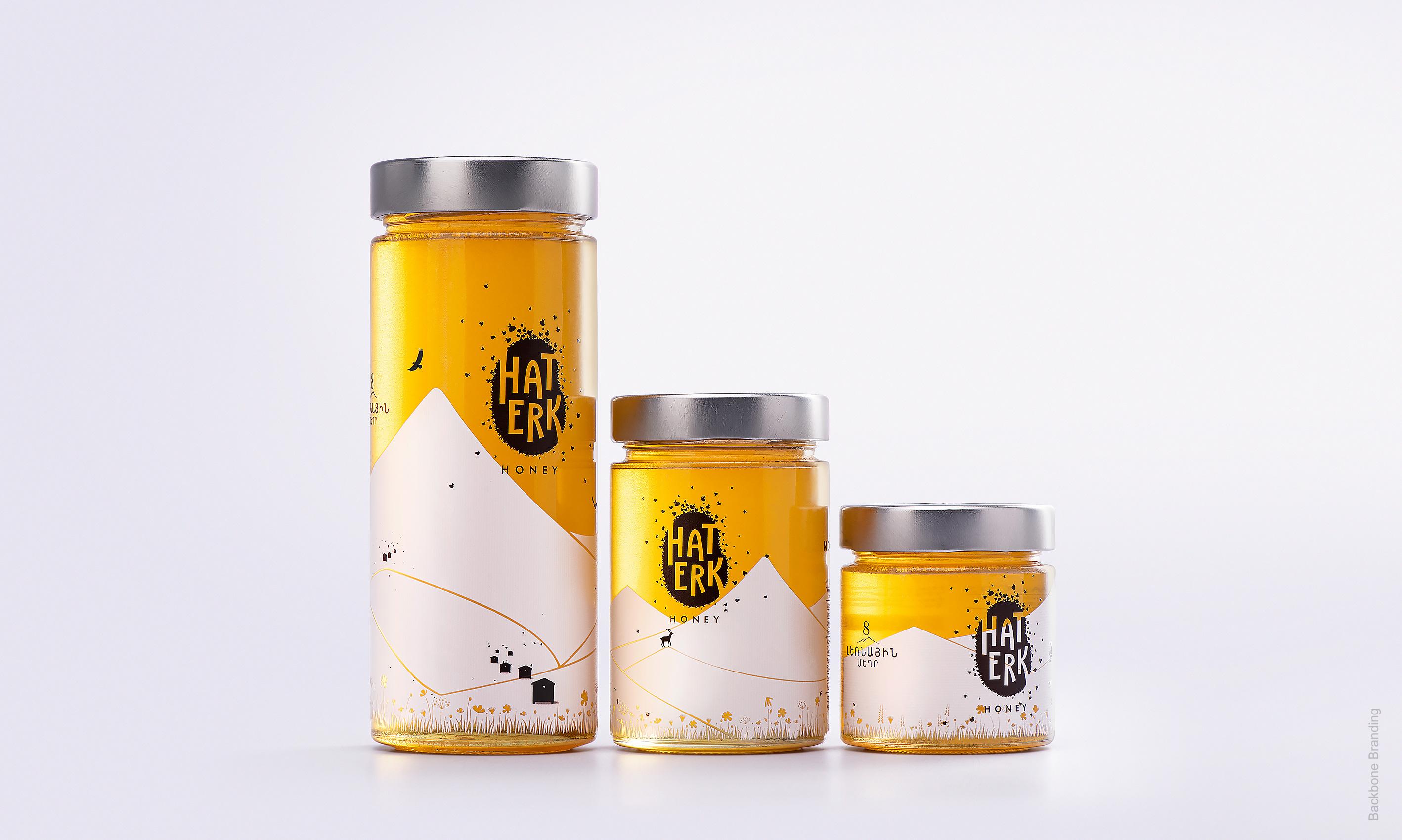
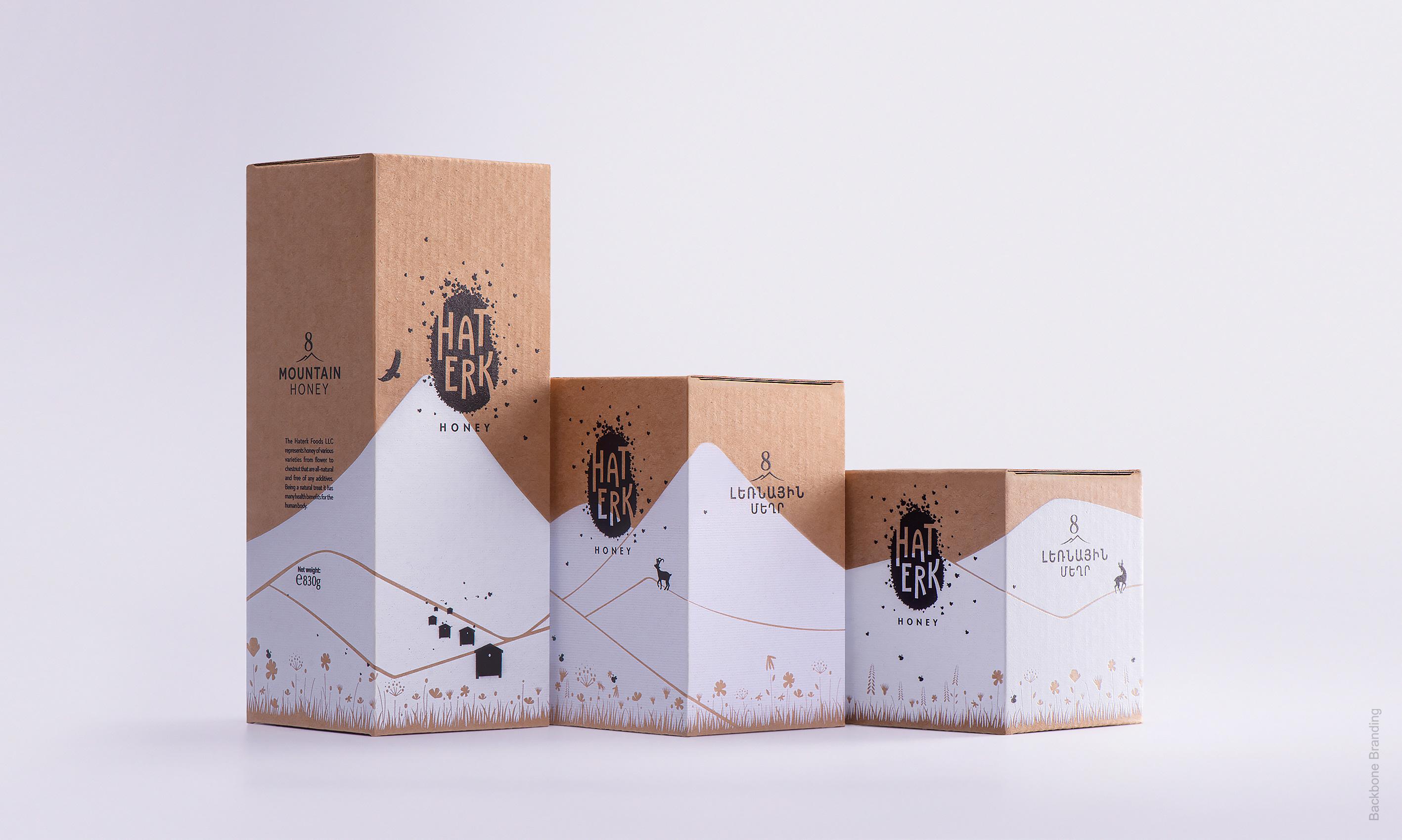
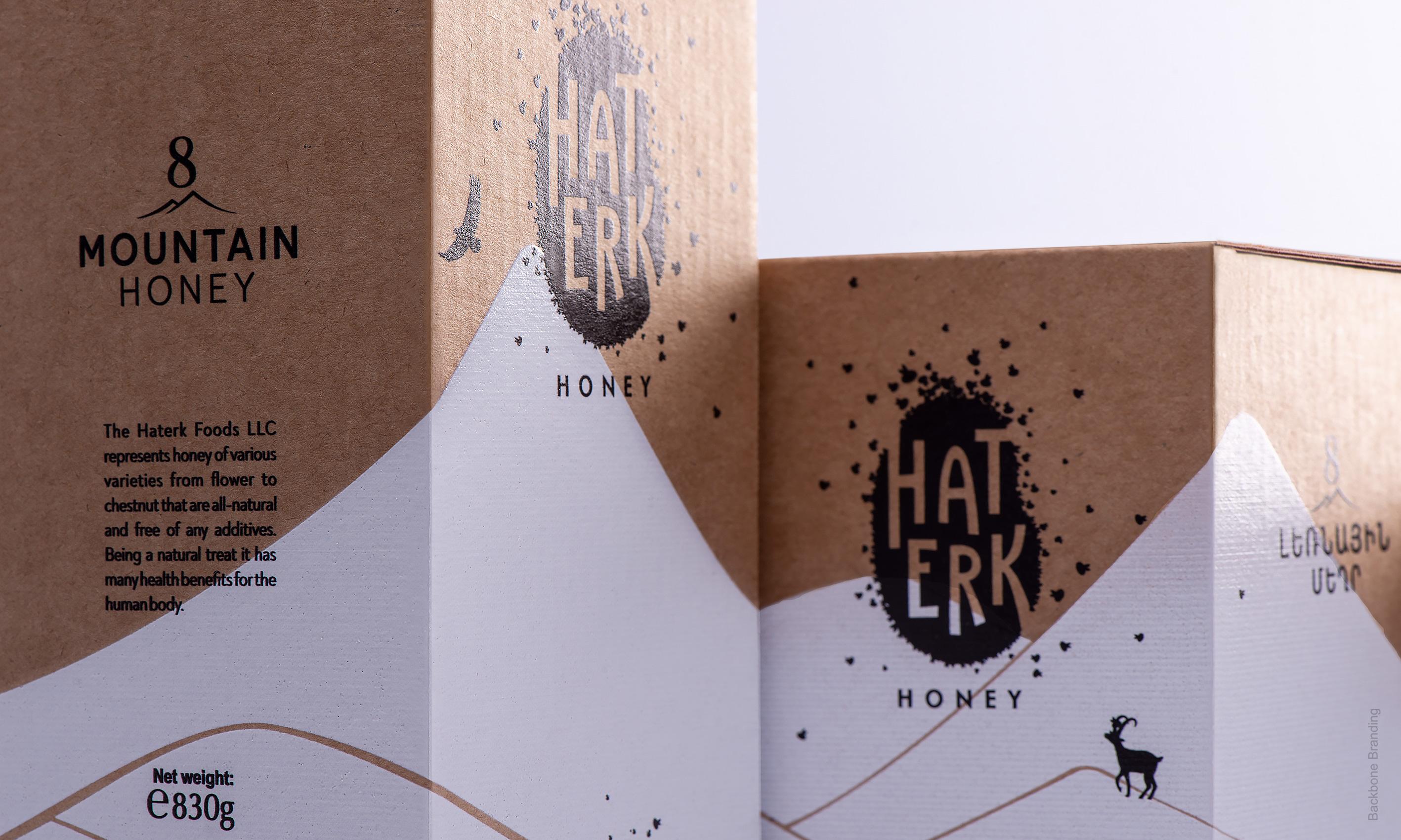
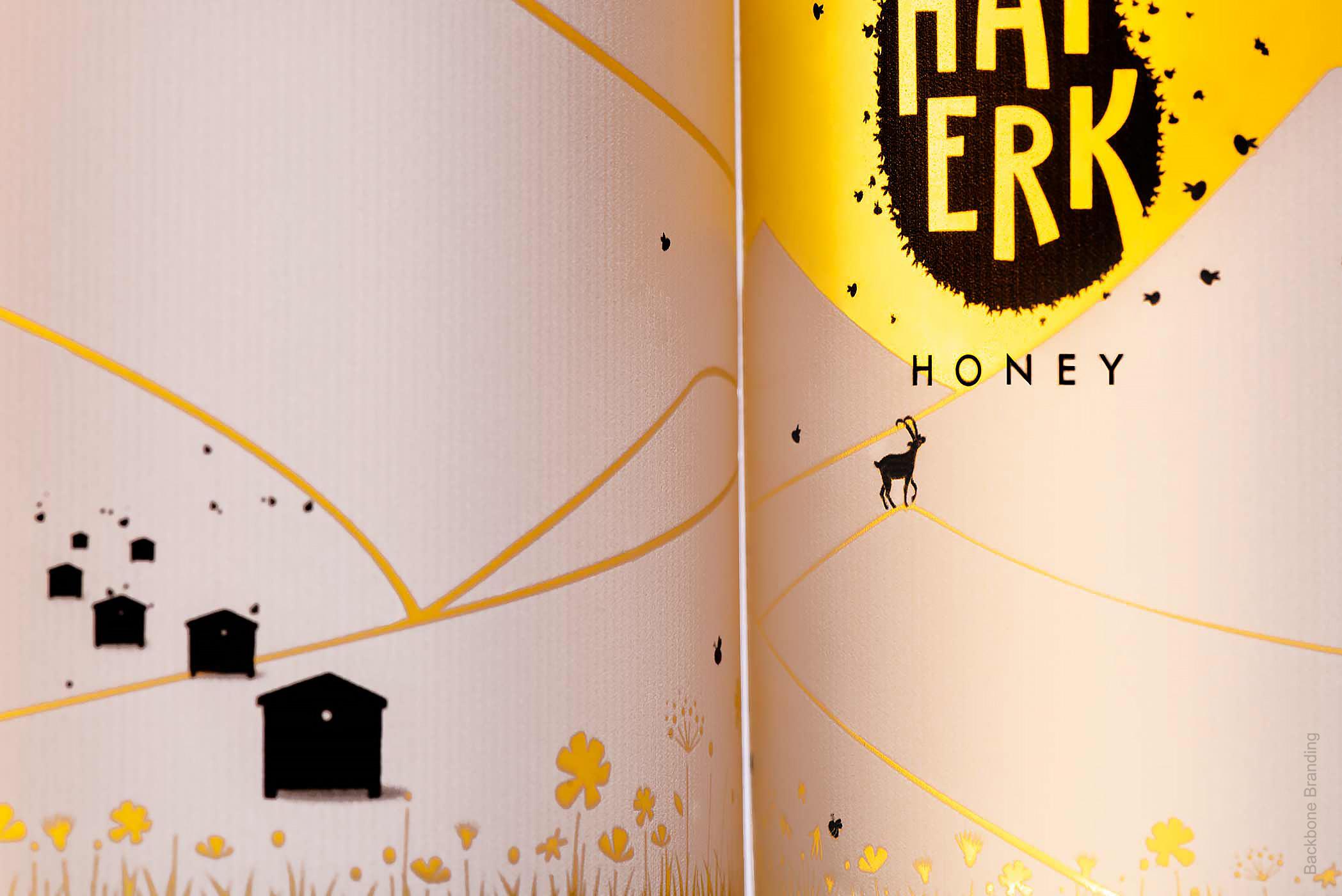
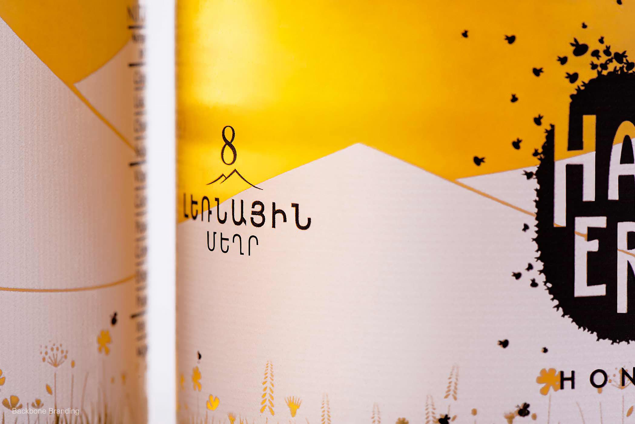
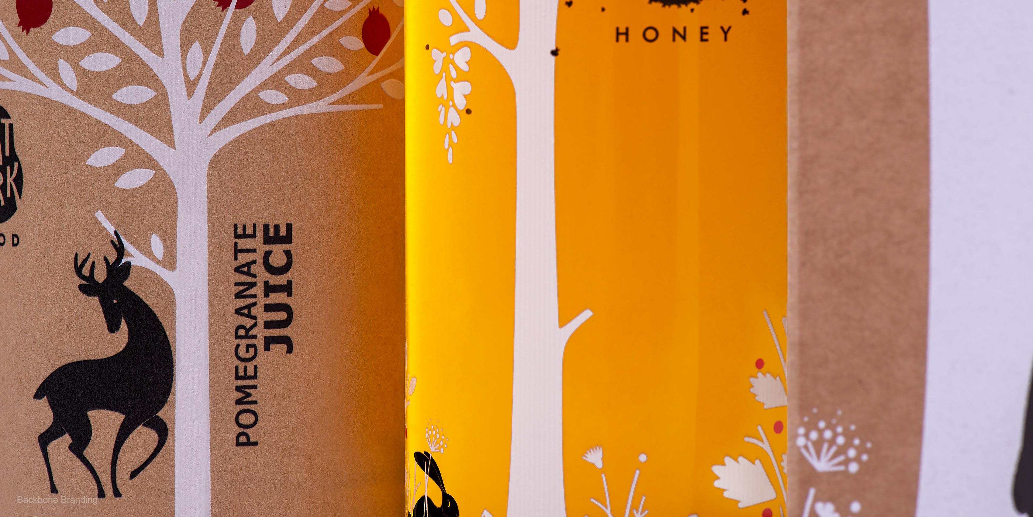
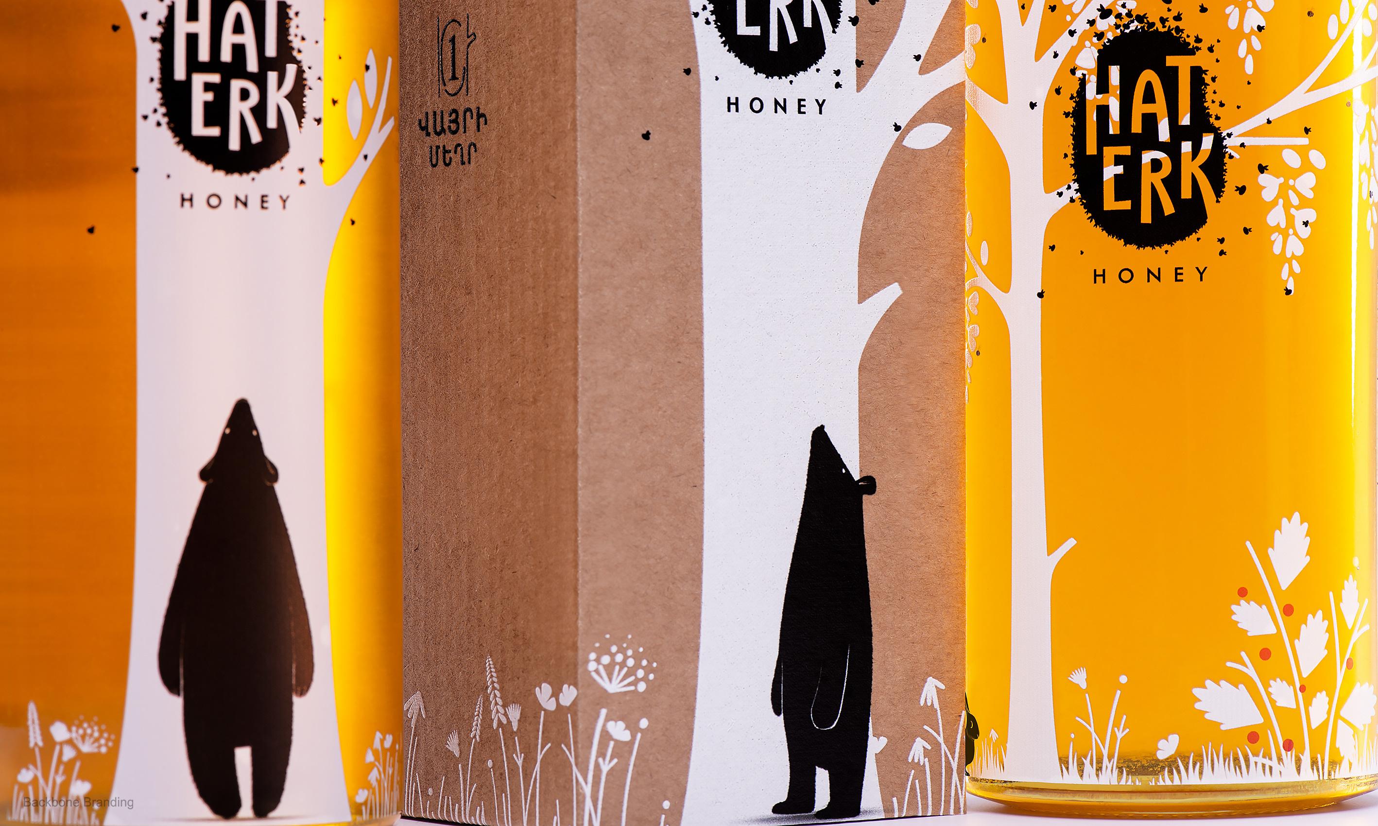
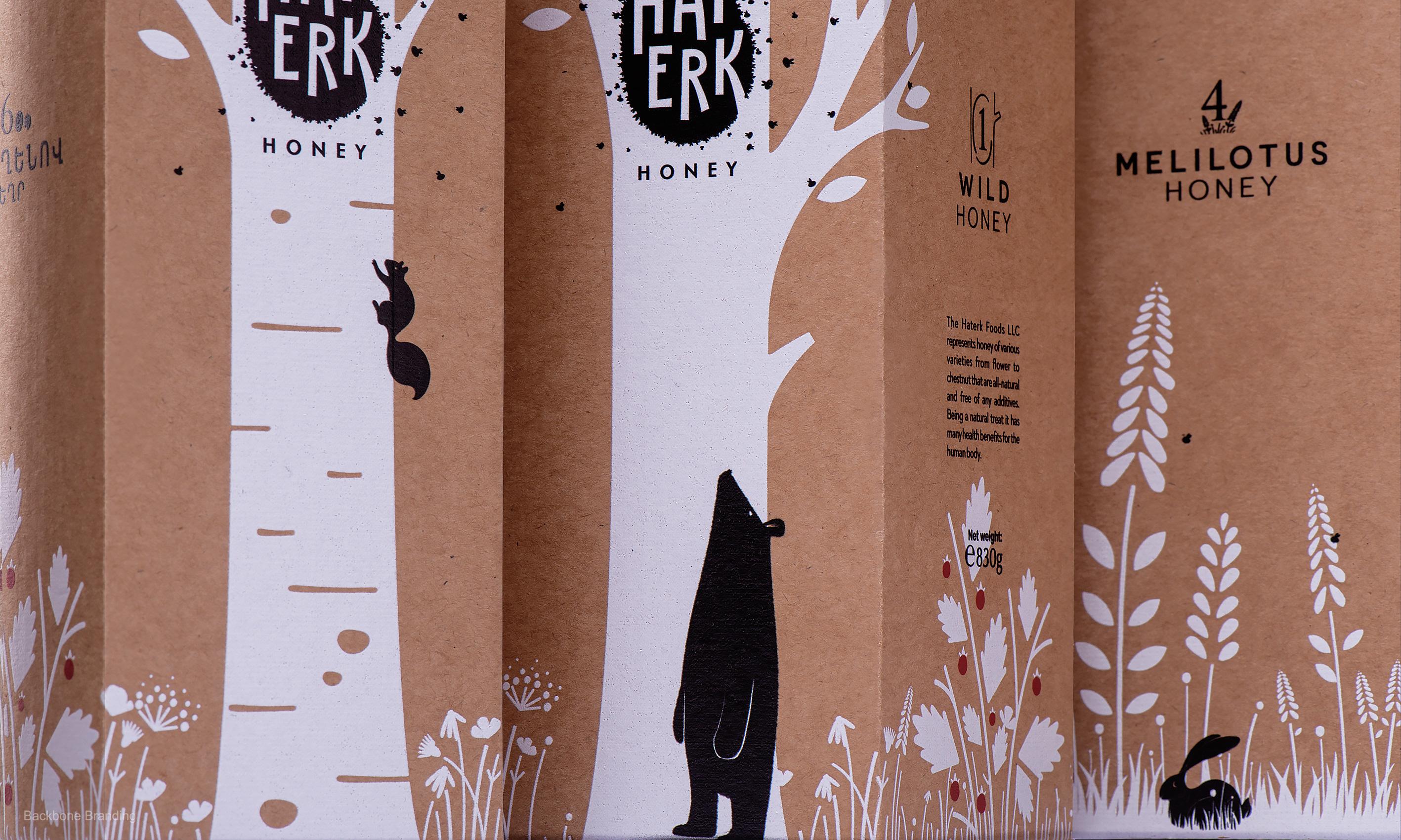
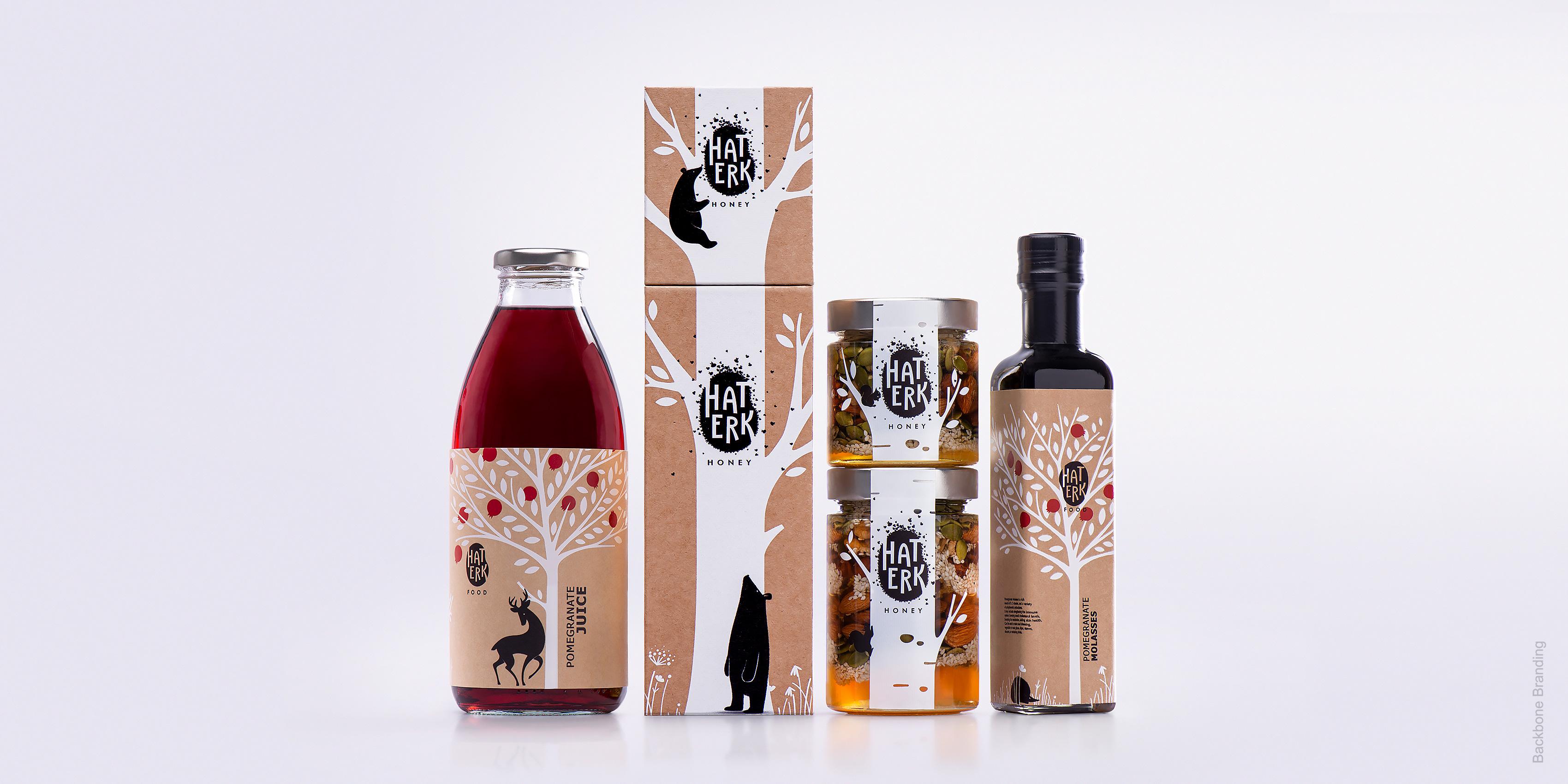
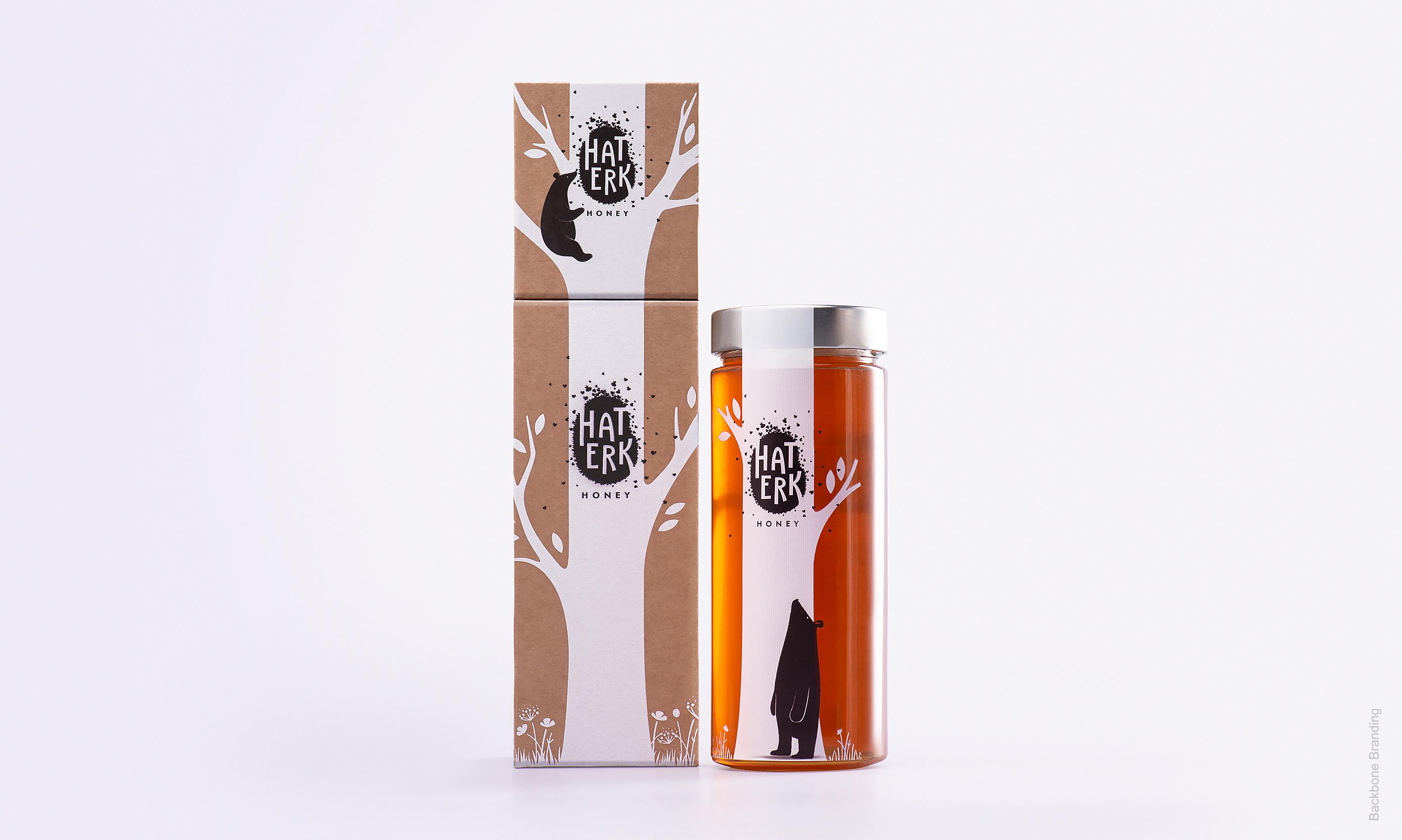
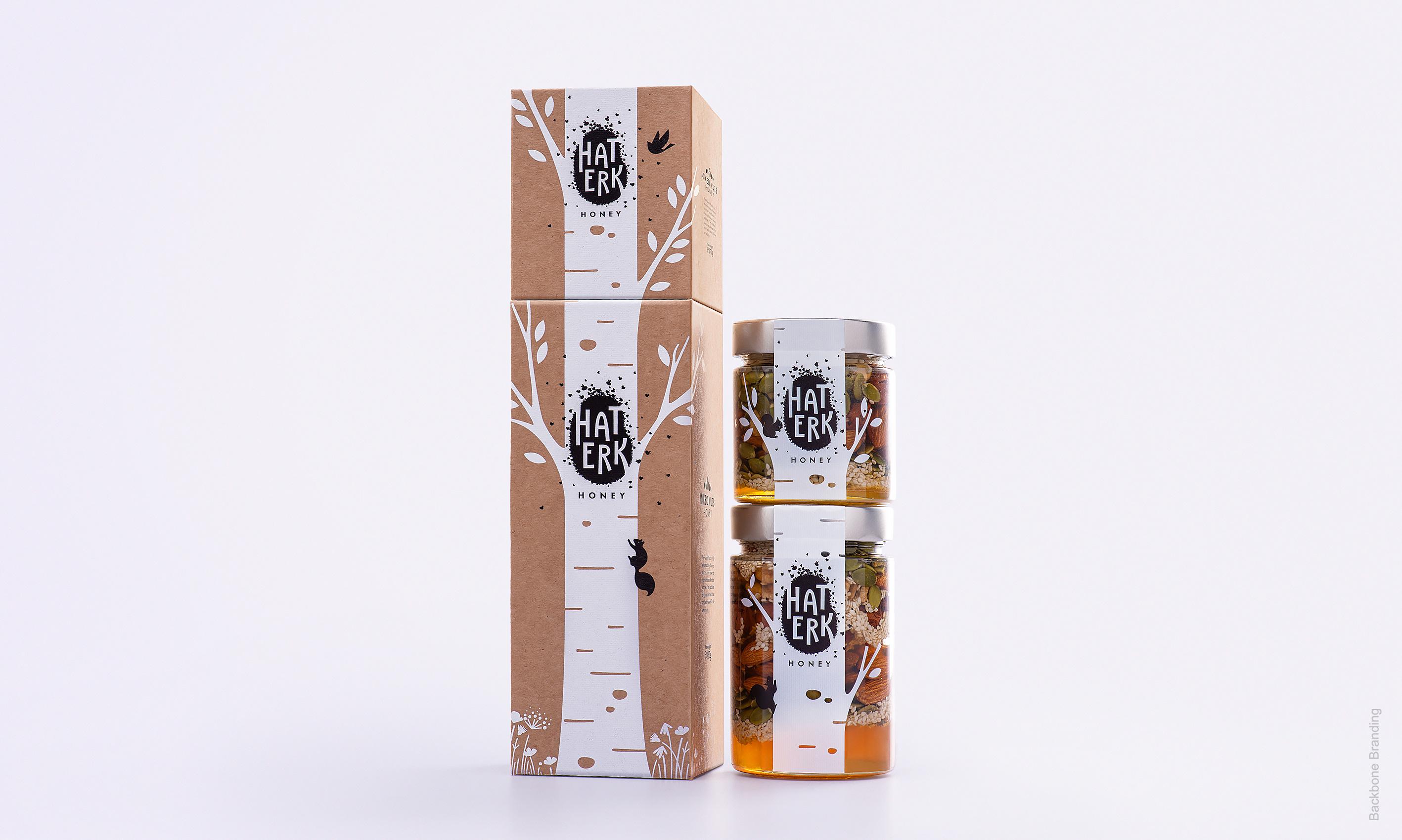
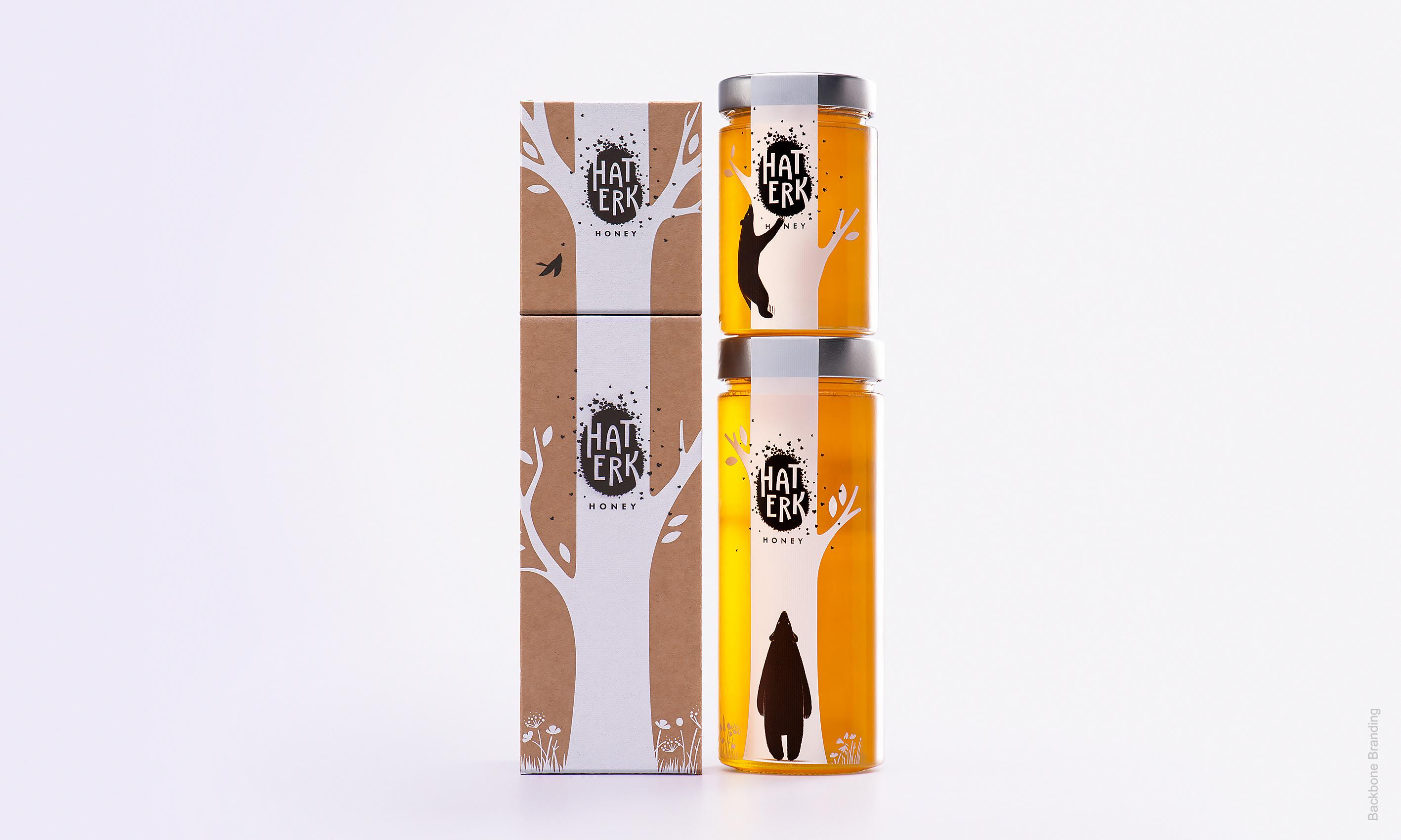
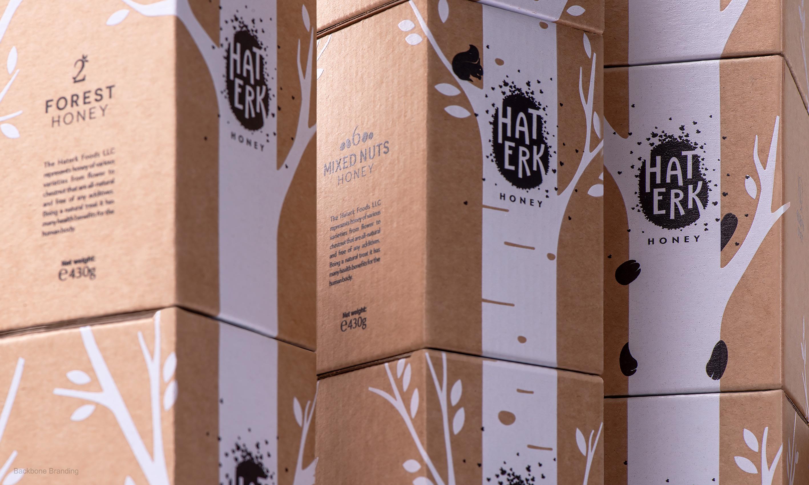
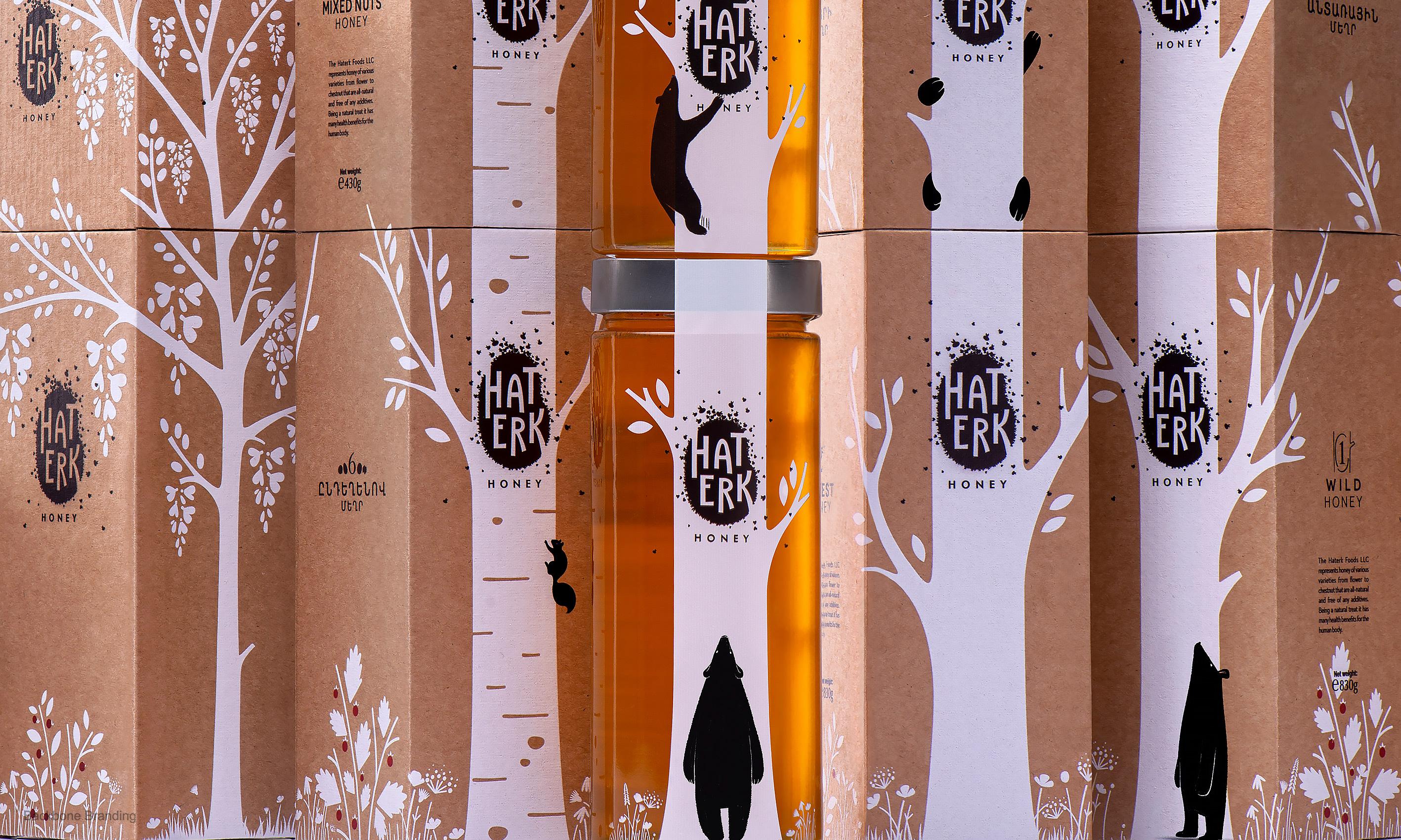
On each jar, we follow nature’s footsteps, sharing the discovery of her most generous gift to man. The simplistic white and black designs are silhouetted over the varying hues of honey shining through the clear glass jars. Lined up on the shelf or stacked on top of each other, a forest of trees grows, stretching out its branches as you add to your collection. We enjoyed going down the paths and learning about the stories of each type of honey product that we needed to visually introduce. And we are certain that buyers will also find the picture stories enchanting.
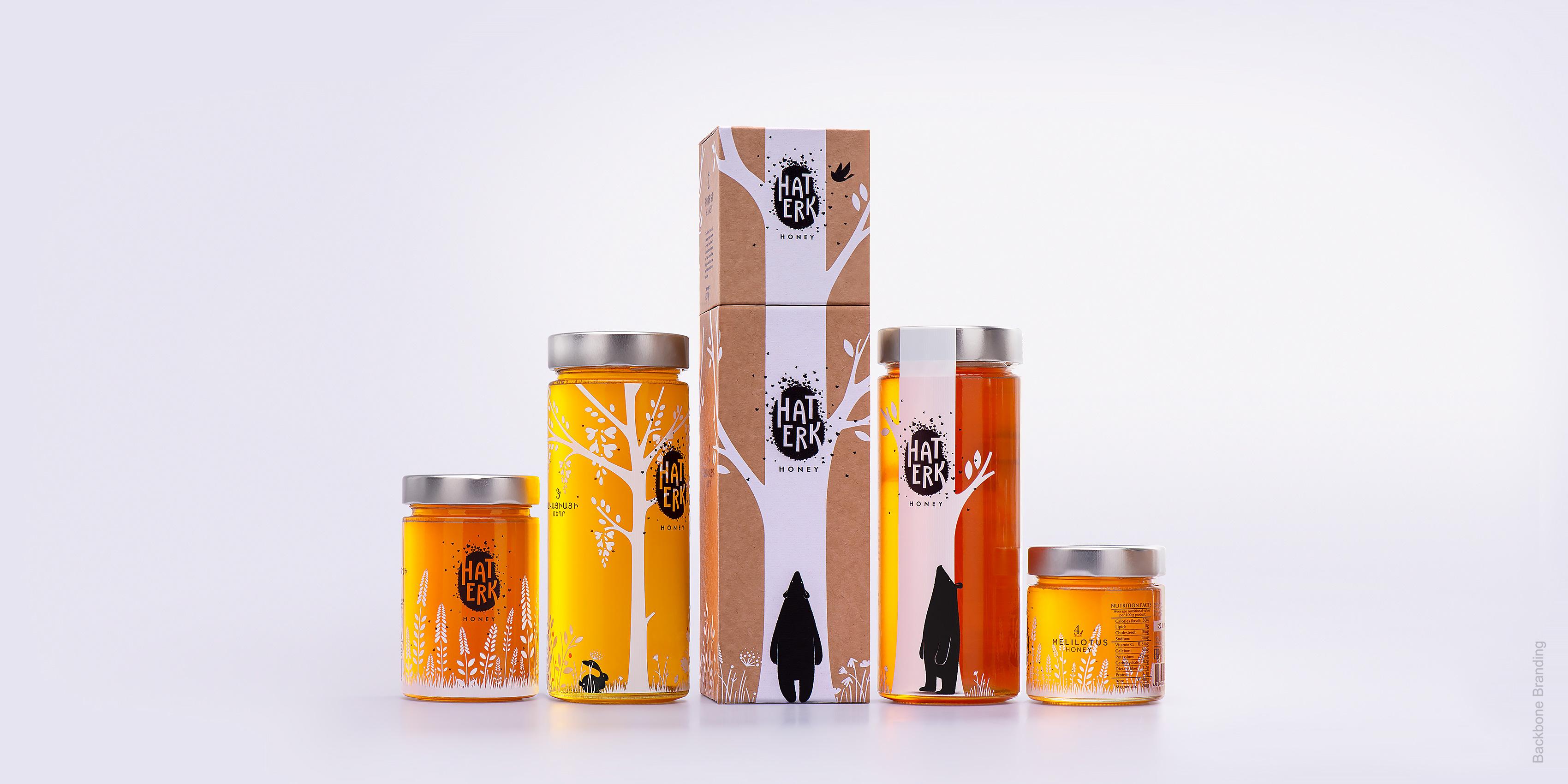
The simplistic white and black designs are silhouetted over the varying hues of honey shining through the clear glass jars.
1
/
3
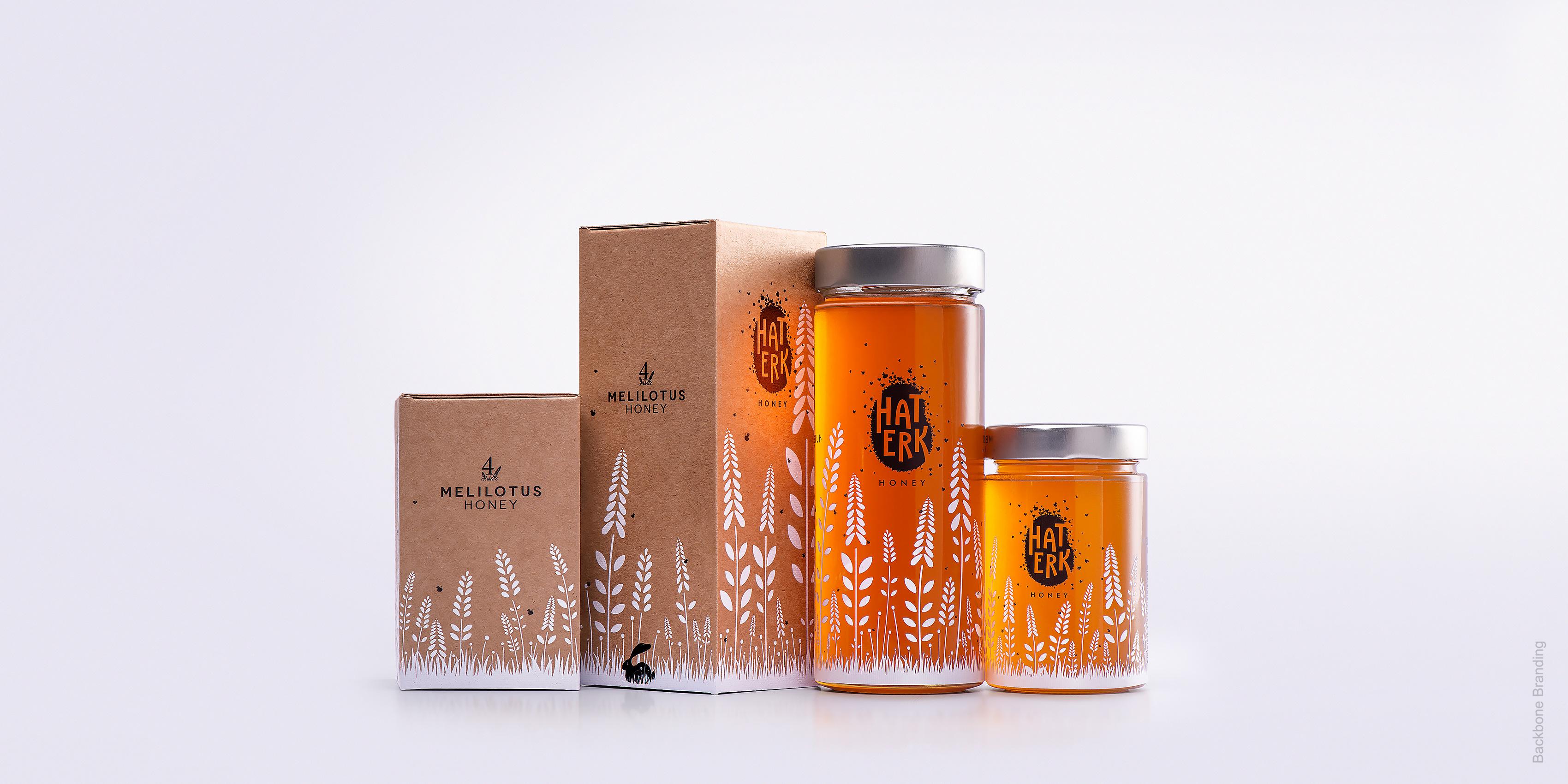
Following the paths to nature’s bounties...
1
/
3
1
/
2
1
/
3
The scenes of mountains that roll out into fields, forests and fruit trees, and flower-laden meadows.
1
/
2
More works