
KUM-KUM
Packaging design
industry
Beverages, Water
client
Ani Product
year
2020
awards


overview
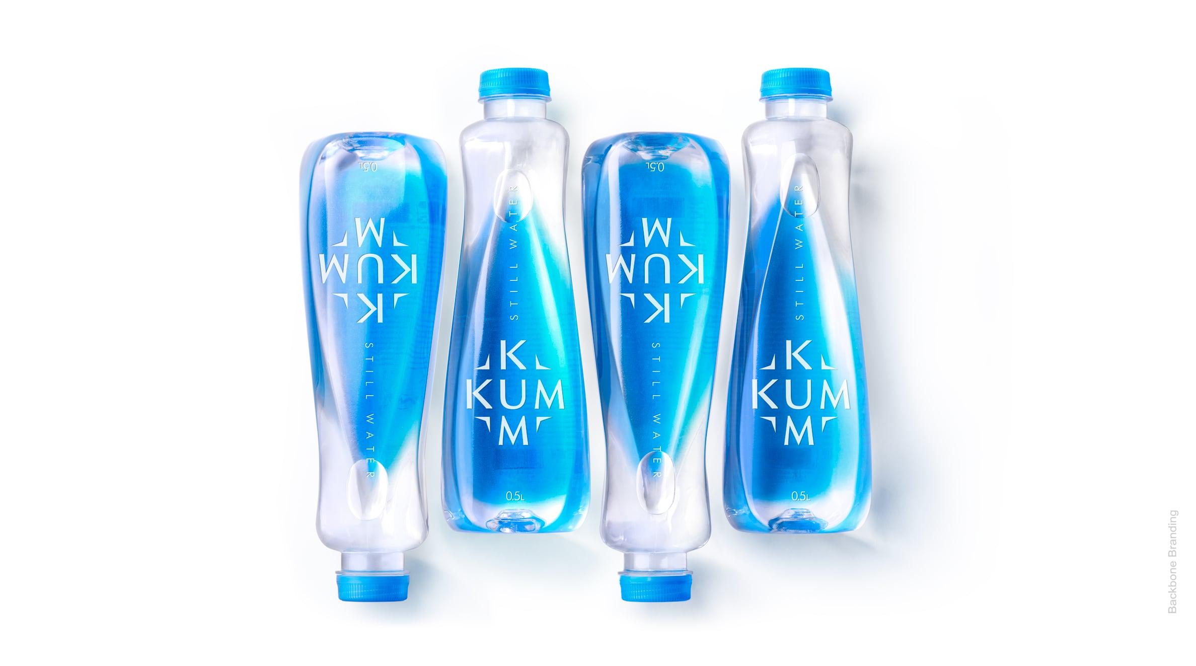
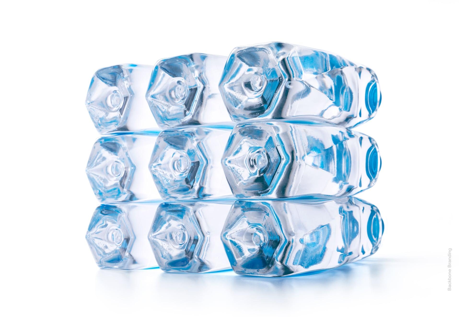
A water droplet captured in its dynamic state and immortalized as the structure of a bottle.
challenge
When we were approached to create the design for this brand, our goal was to showcase the characteristics of water and make them emerge through our design.
solution
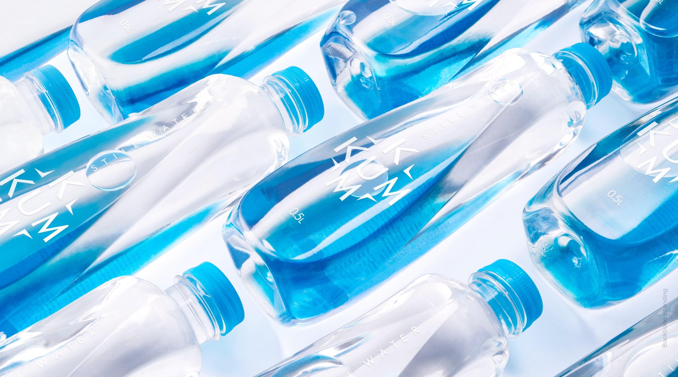
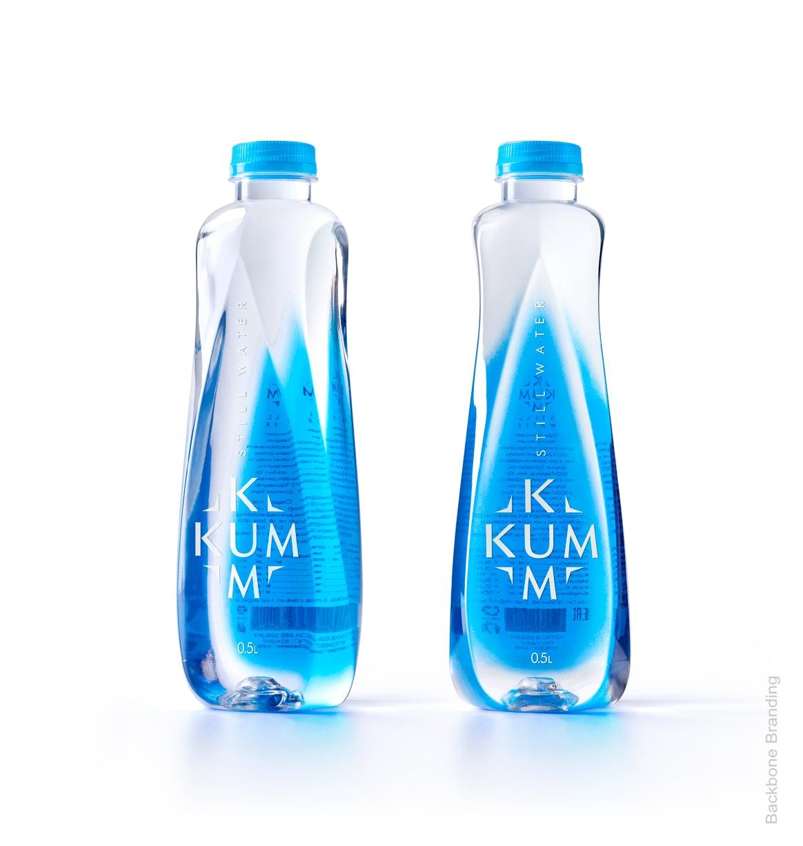
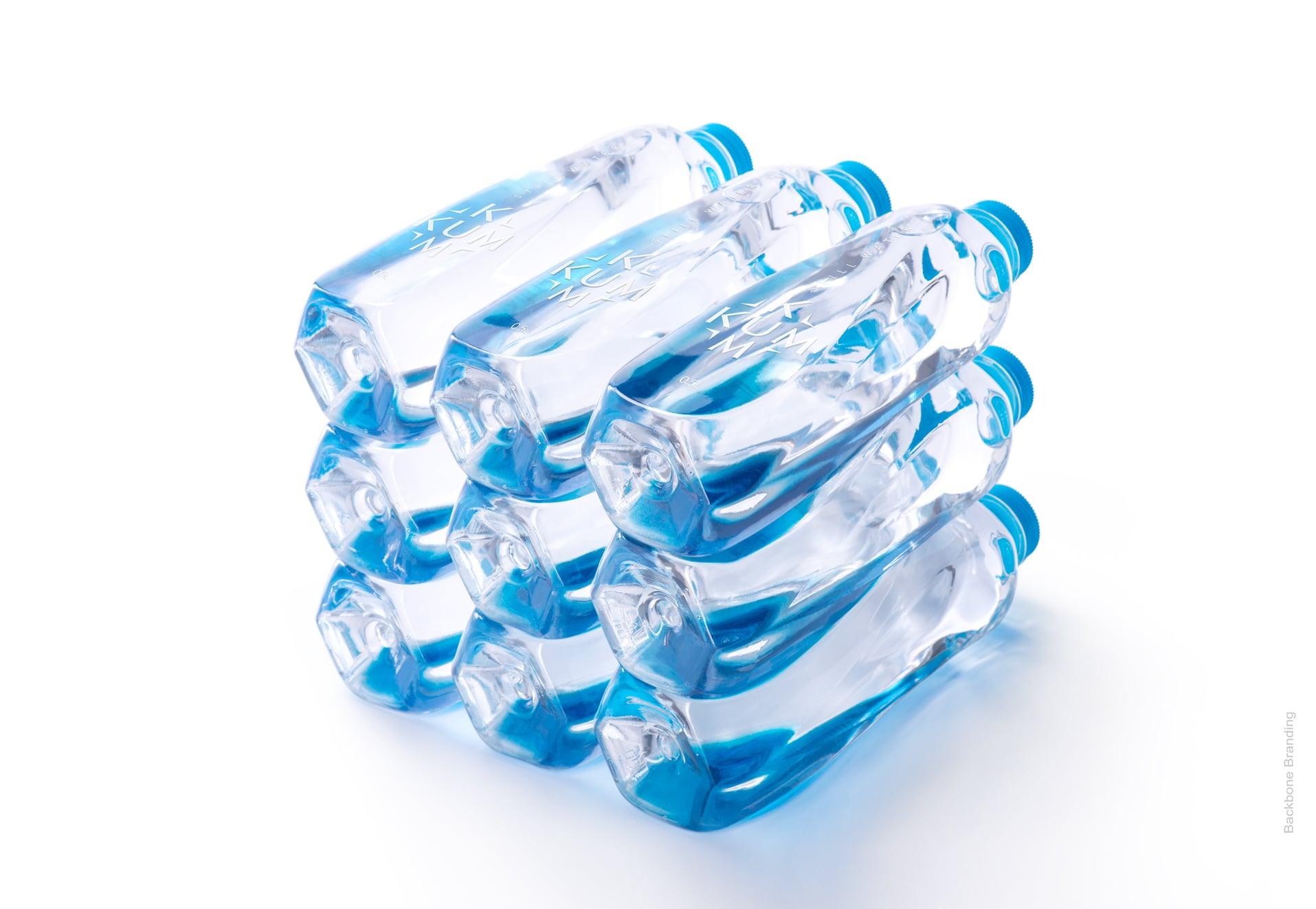
We have tried to solve this challenge by basing our approach on the minimal and transparent attributes of water. The name ‘KUM-KUM” reflects the idea of consuming water by little sips, which is the key to enjoying it. We have observed the water in its dynamic state. Per consequence, the movement that it has made became the structure of our bottle. When the bottle is rotated, this specific structure gives the impression that the water is in its dynamic state. The design is not only elegant and harmonious, but also comfortable and easy to hold.
The phenomenality of the project lies in the fact that it’s difficult to figure out where the structure of the bottle has started and where it has ended. The back label, the front label and the bottle structure are so harmonious that when you turn the bottle, the logo, thanks to the design solution, becomes sometimes visible and sometimes not, just like water itself.
Click for more
Not only elegant and harmonious, but also comfortable and easy to hold.
1
/
2

More works