MØS Gastronomic Smart & Casual
Branding Services / Packaging design
industry
Entertainment, Restaurant
client
Nordic
year
2015
awards

overview
MØS is a Nordic restaurant in Moscow presenting the Scandinavian cuisine.
challenge
Our challenge was to implement Nordic philosophy and traditions in the MØS brand.
solution
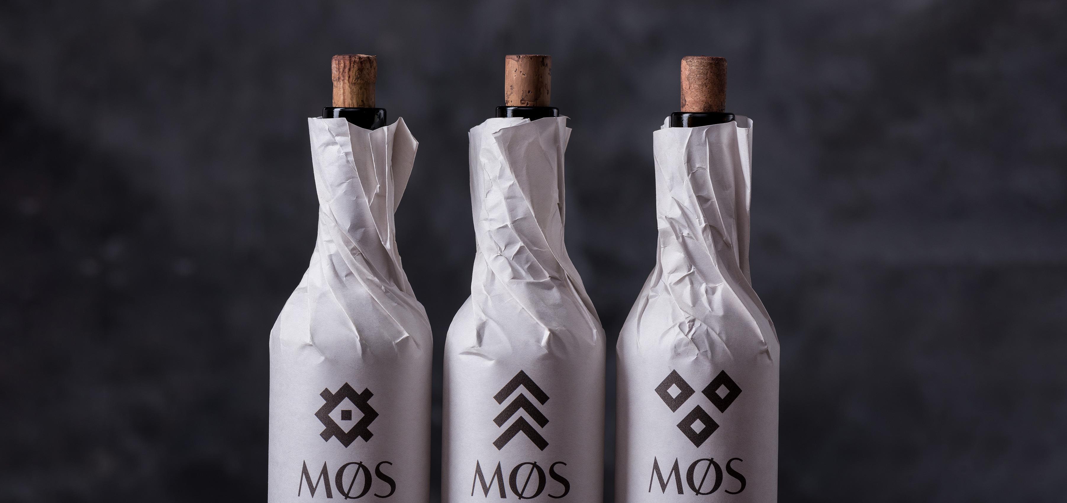
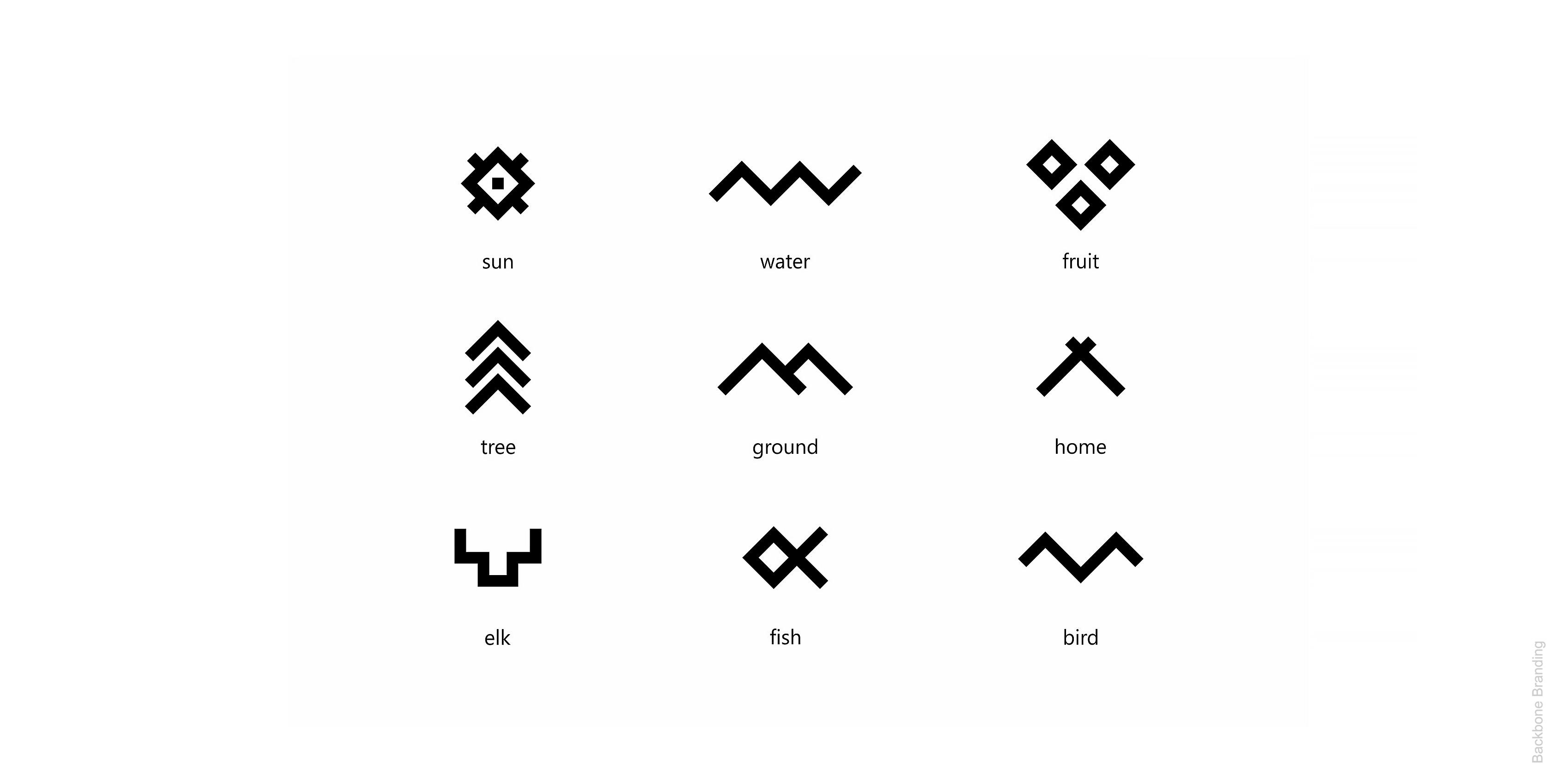
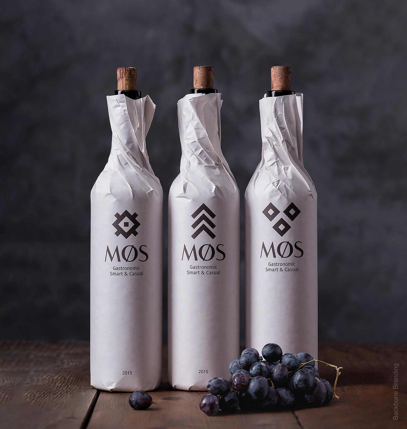
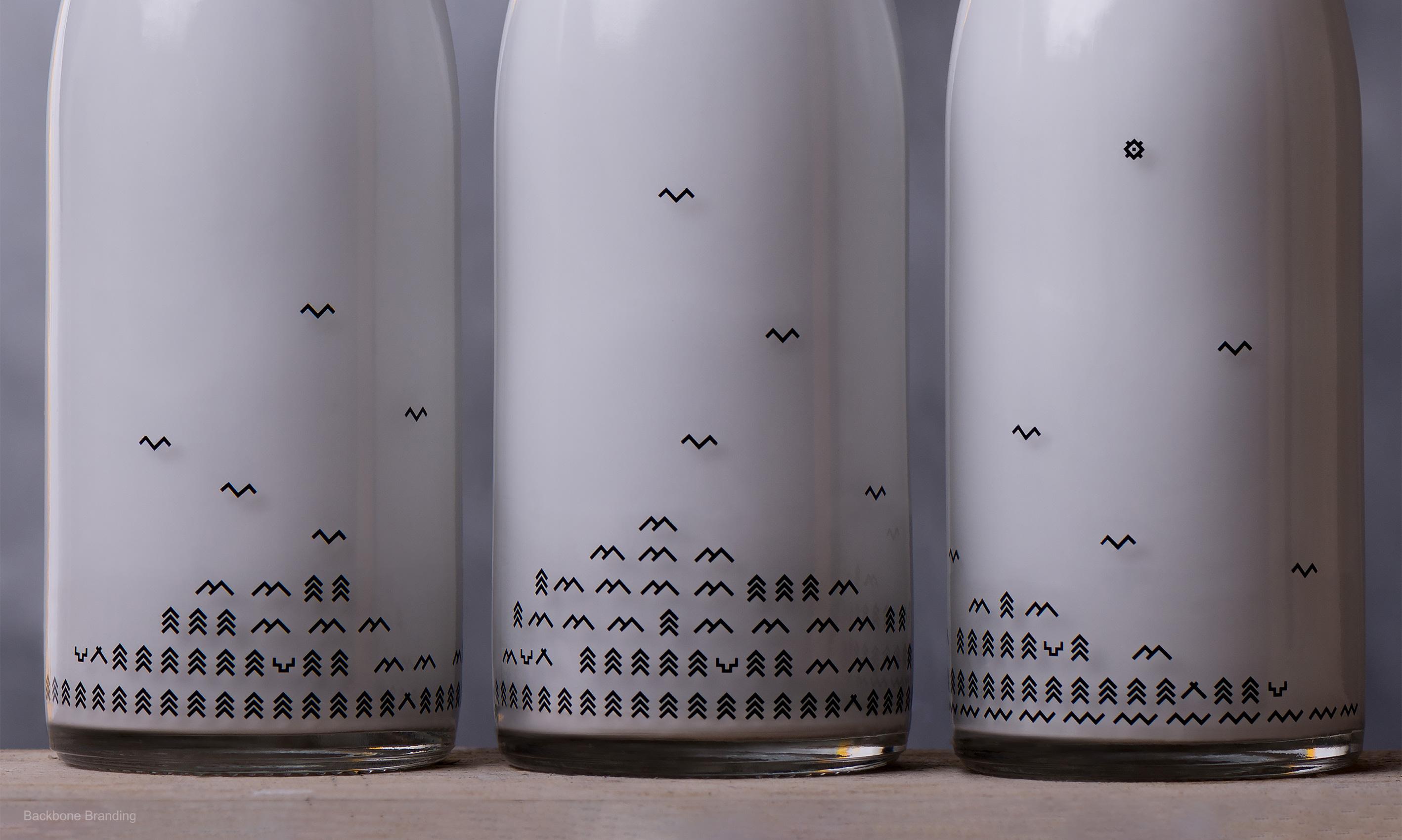
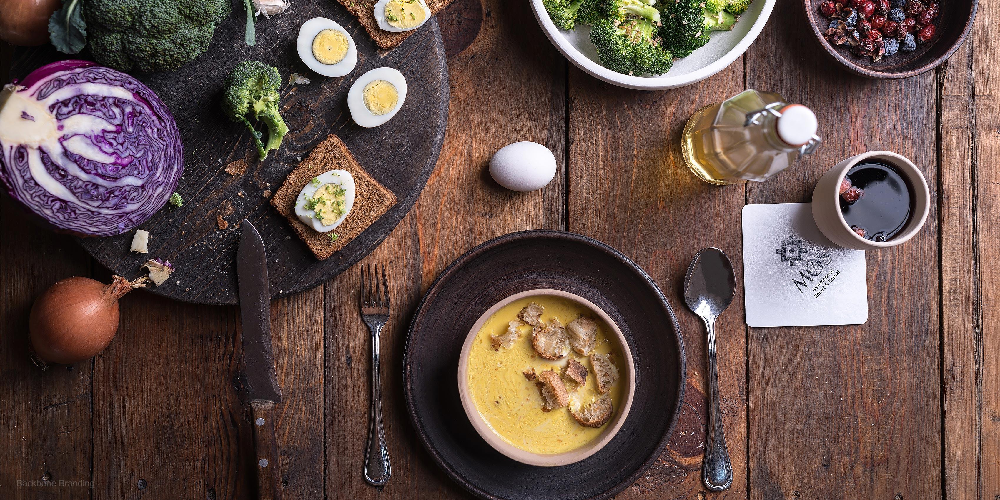
The main approach of Nordic is everything natural – expressed in wholesome food, light and cozy interior and a healthy lifestyle. So the composition in the brand identity is constructed of the elements taken from the nature itself. The deeper we immersed the most we caught the essential of the brand in Nordic direction – minimalism and the simplicity without any complications.
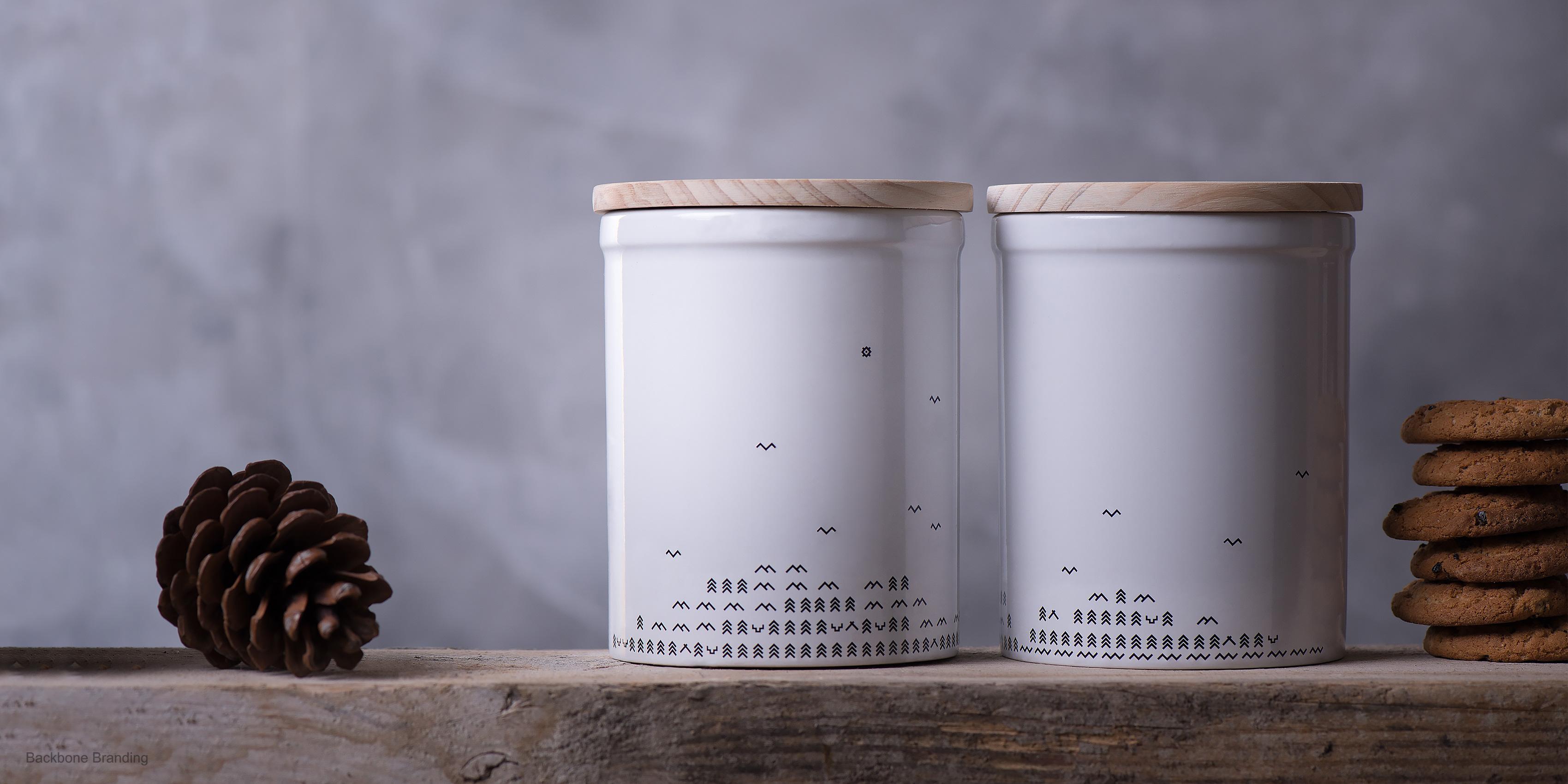
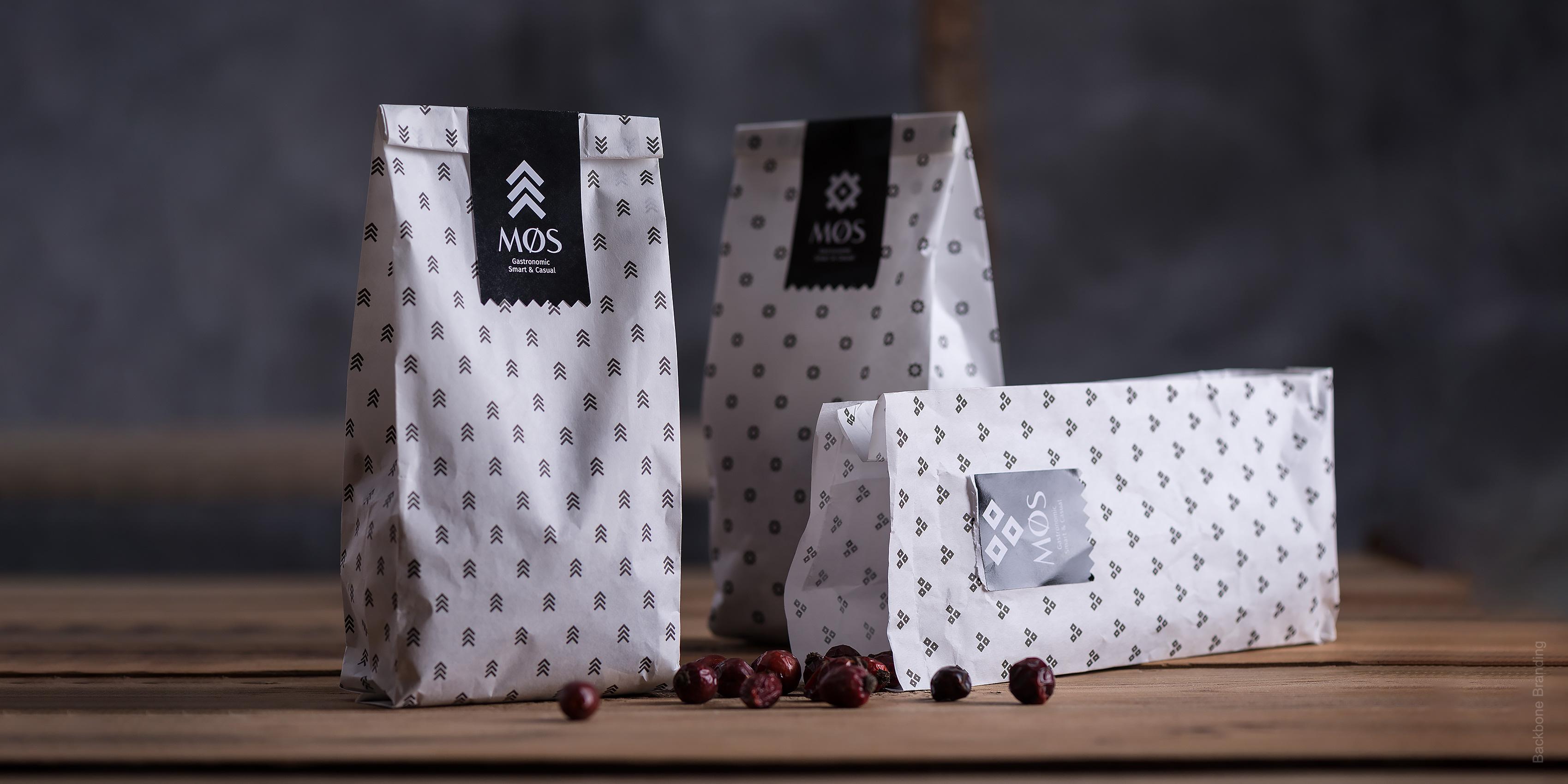
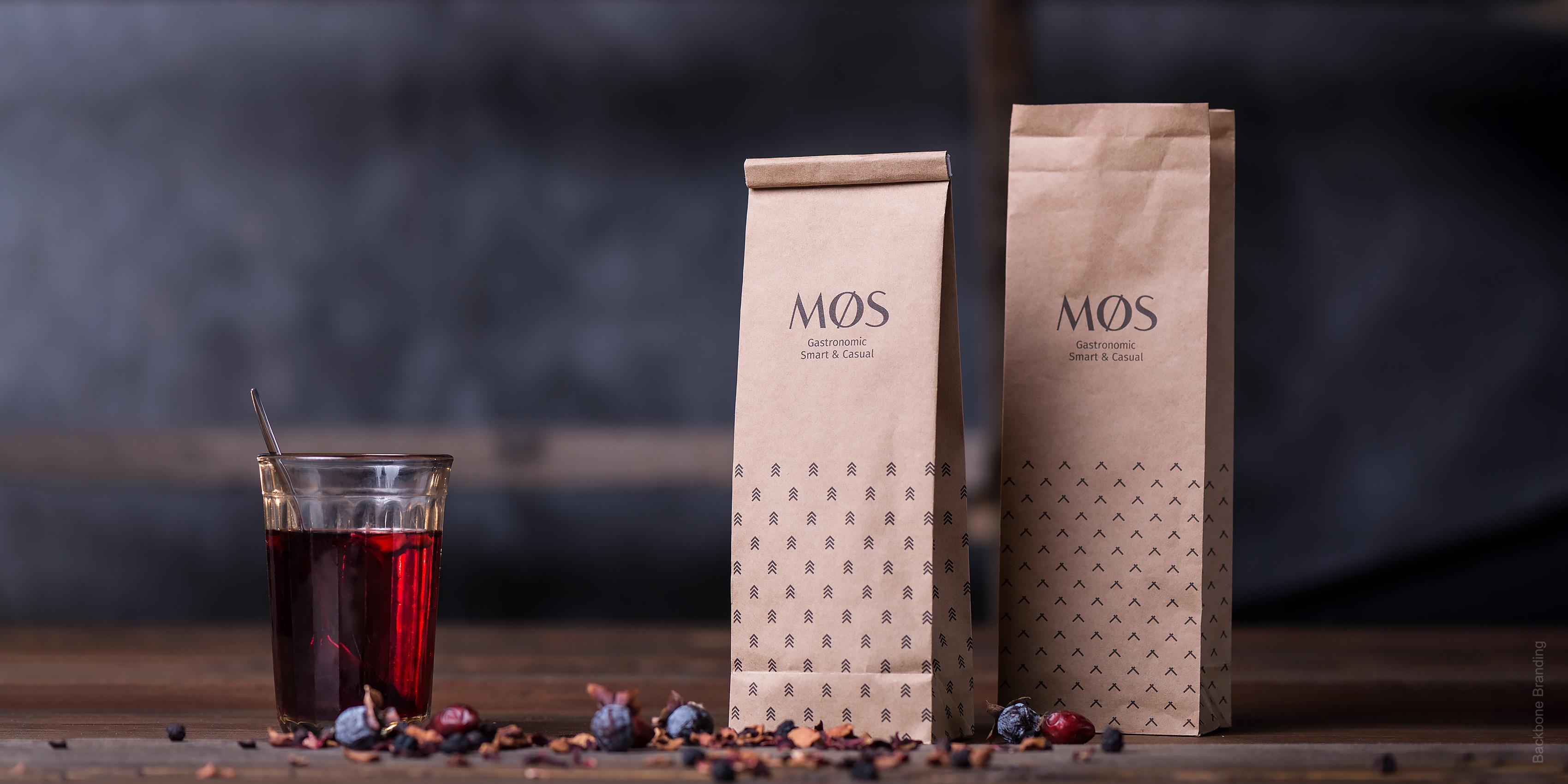
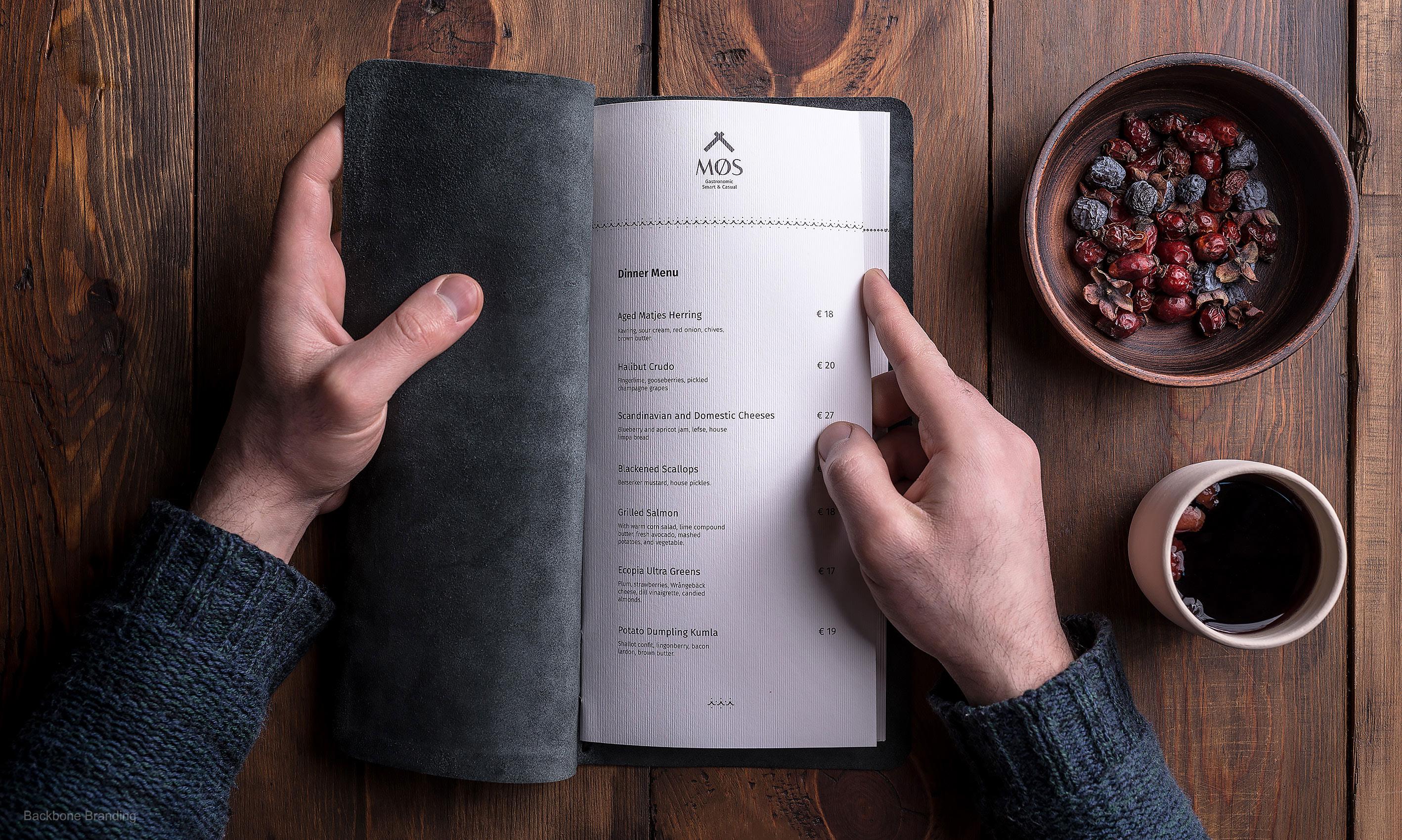
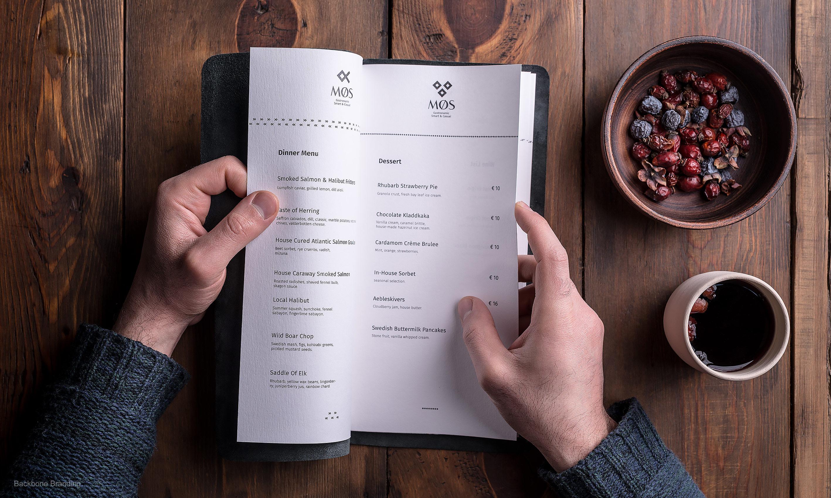
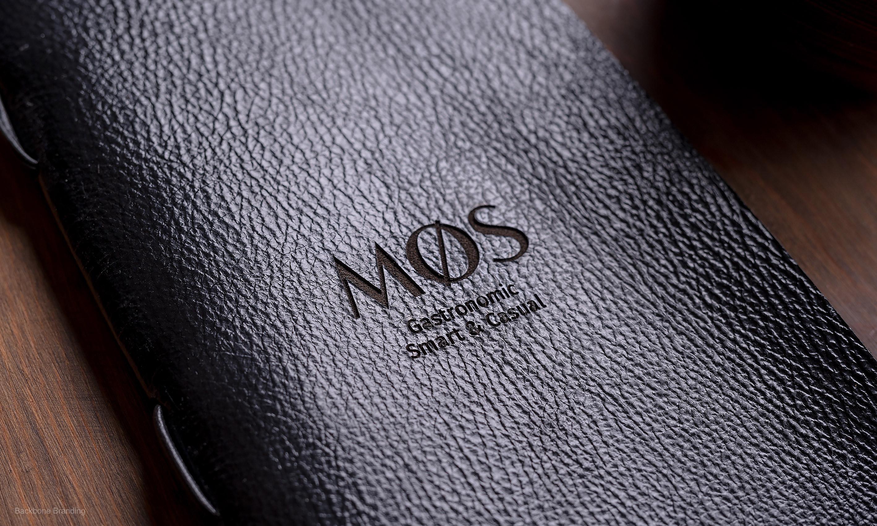
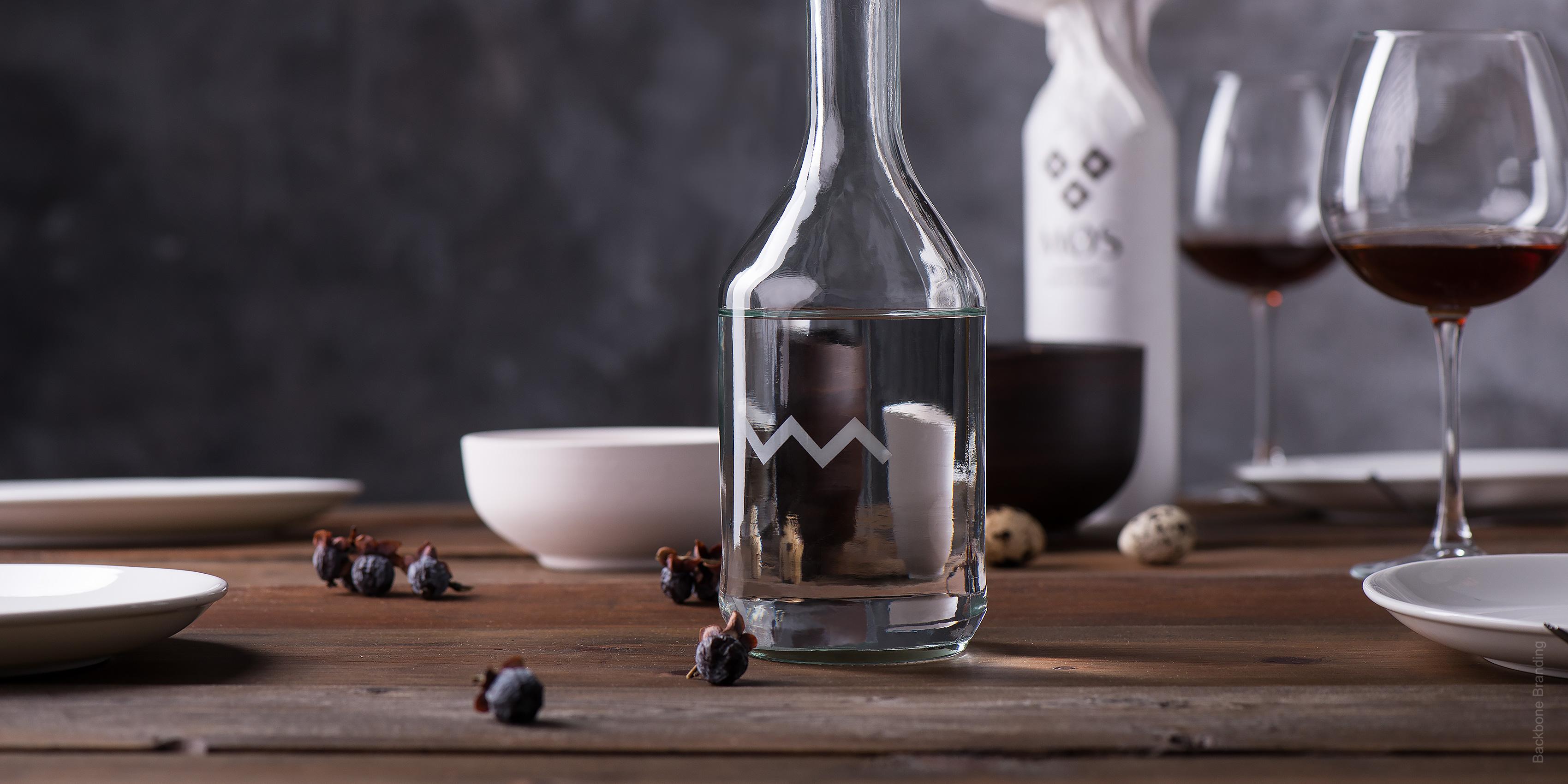
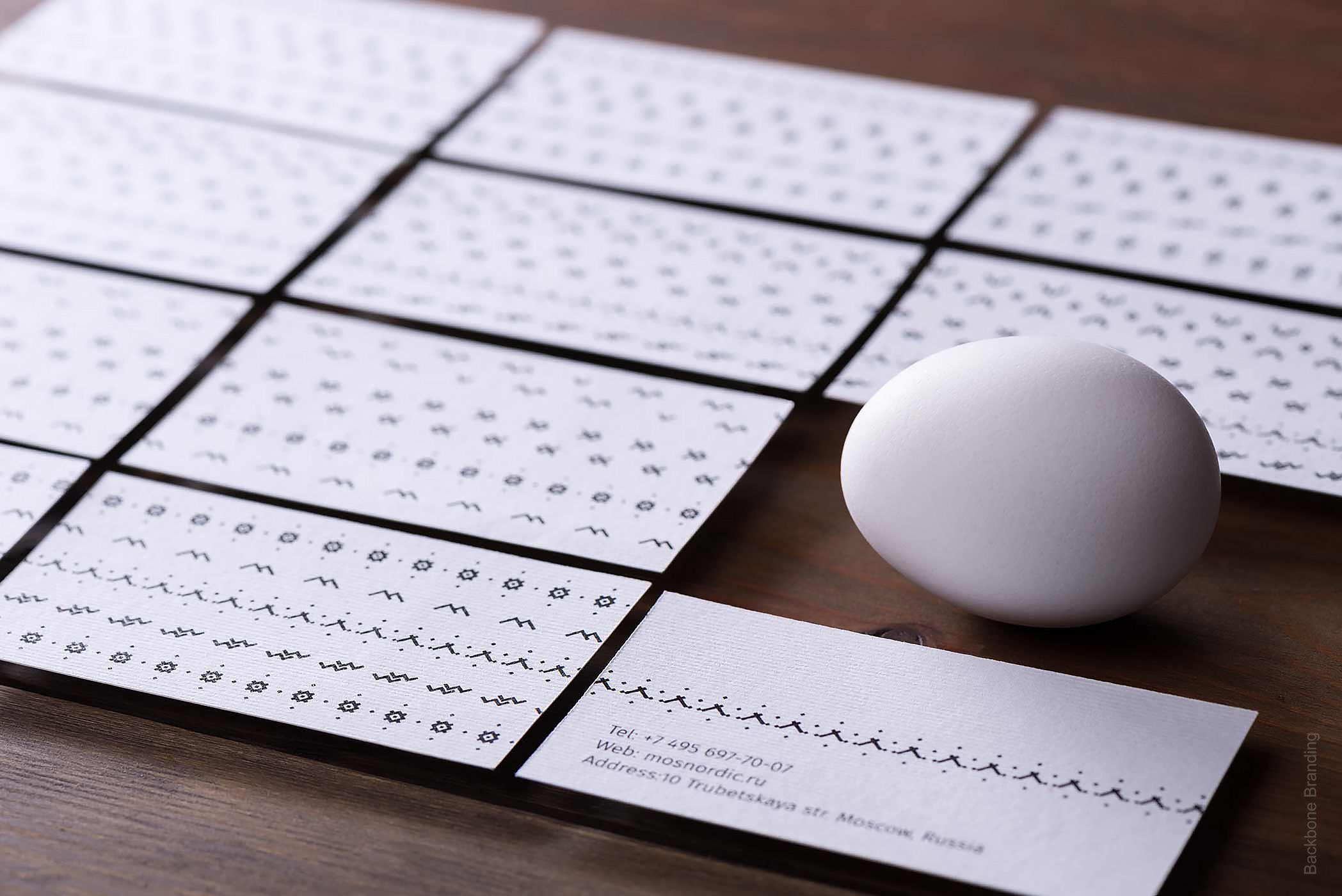
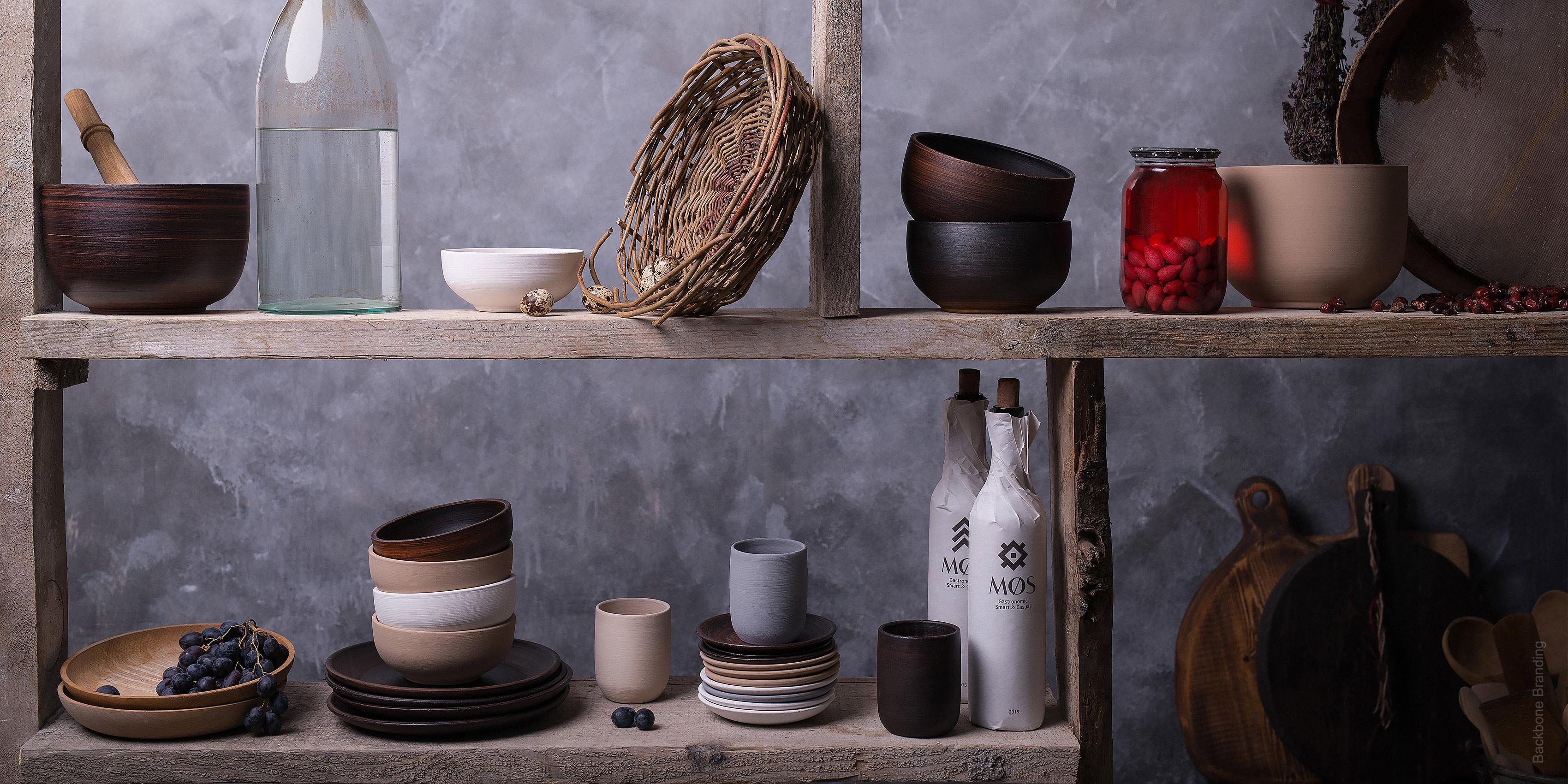
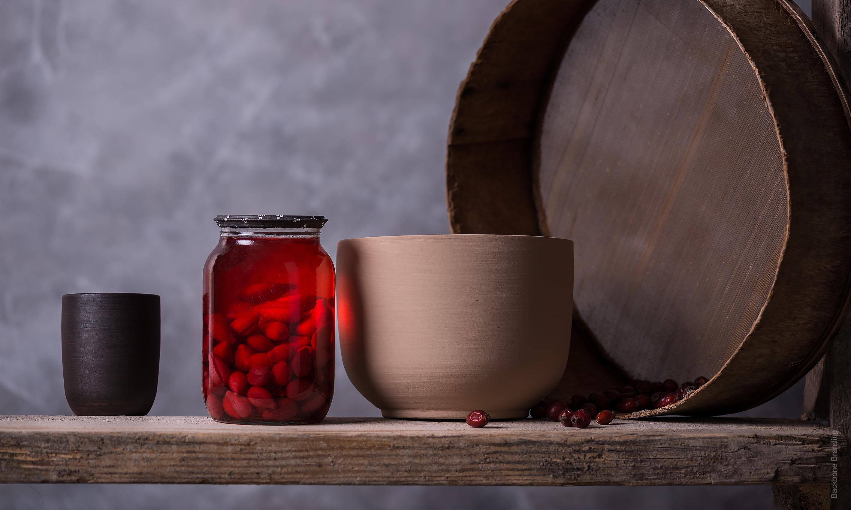
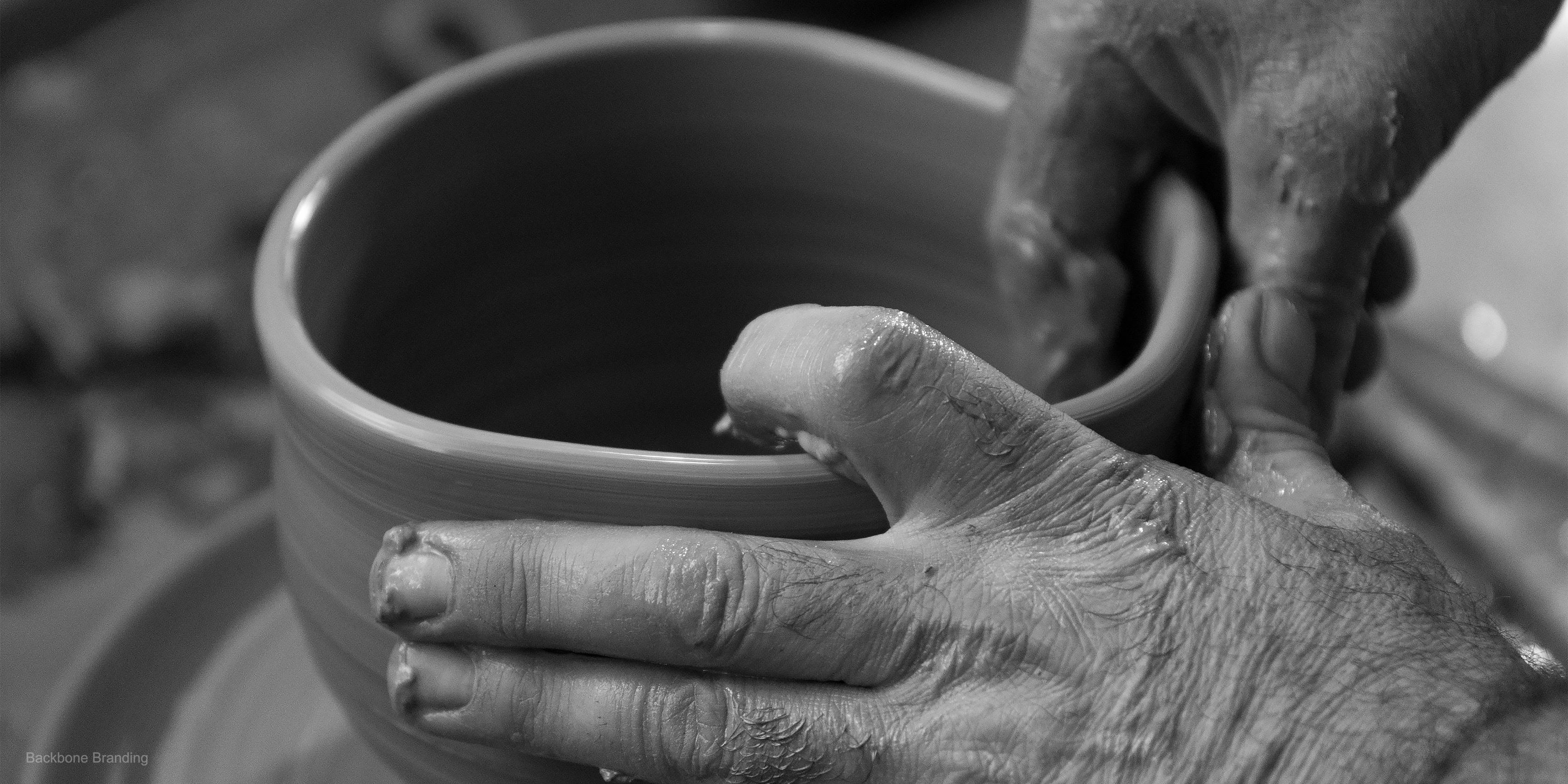
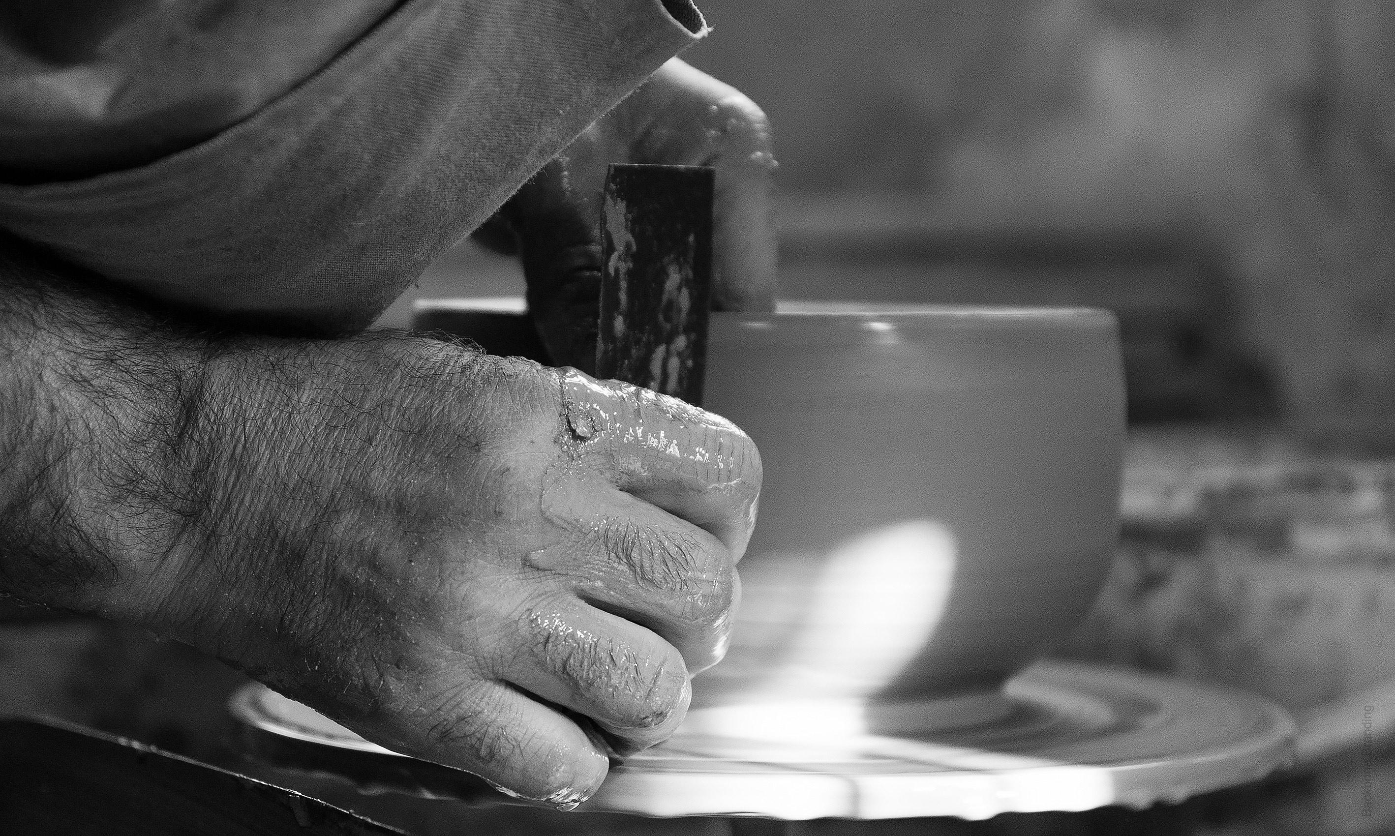
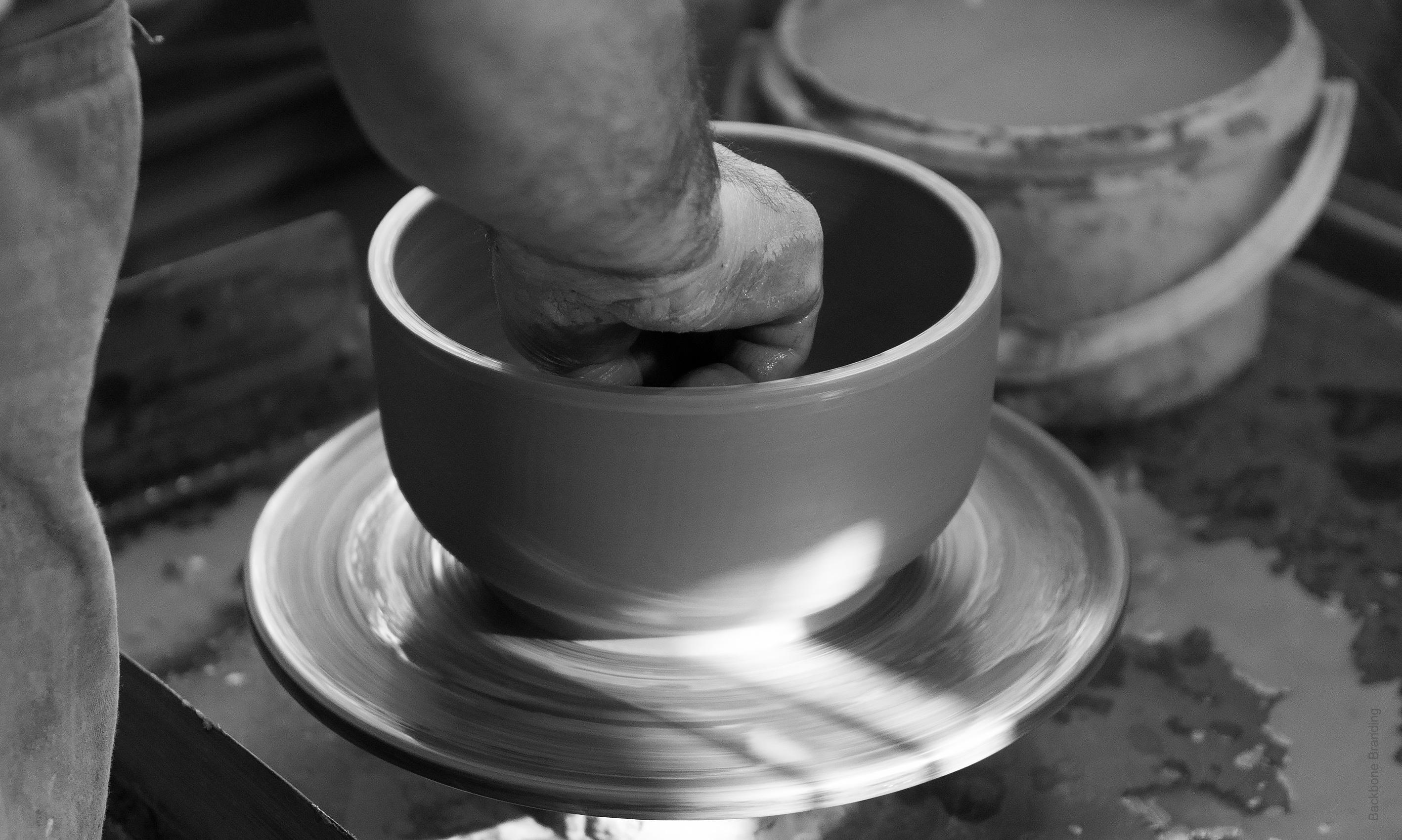
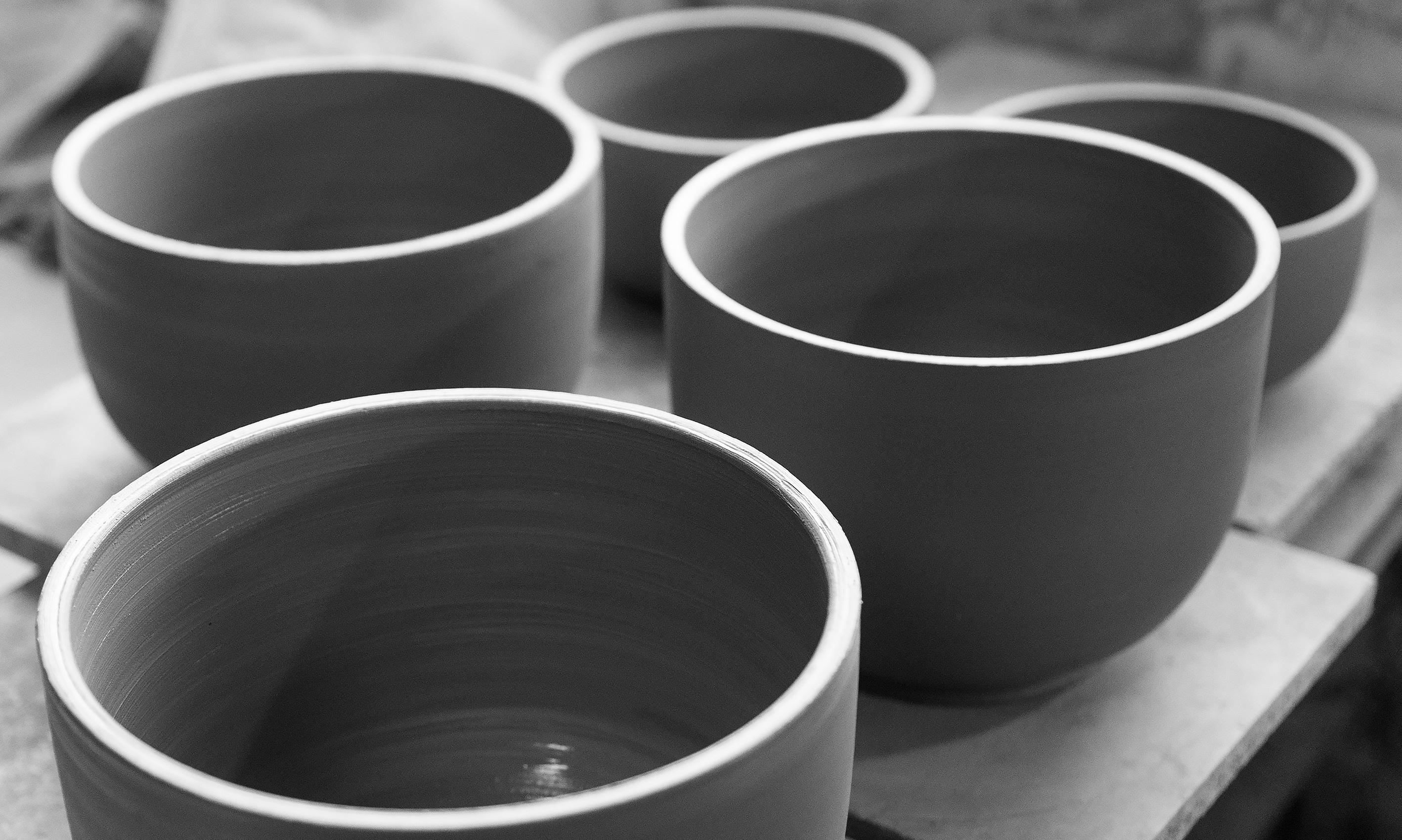
Stylizing the nature in the design, we got four main variations of using the brand identity: the belt, free composition, the pattern and the big simple element. Placing them on the brand medias in minimalistic way we played with the compositions, giving them different dispositions and keeping them maximally simplified. Technically, we have made the brand elements flexible and able to be used as a pattern or as a big fragment, wherein not violating the identity mood. One of the main identity elements are the black and white colors the whole brand is kept in. Keeping Nordic minimalism in each detail, even the crockery was specially designed for MØS brand. Generalizing all specifications, this brand operates successfully, being highlighted in lots of publications and has become a unique, memorable and beloved place for the guests. Celebrating the Nordic style, MØS restaurant became a strong character brand with its own traditions and simple in perception for people appreciating the value of nature and healthy lifestyle.
Click for more
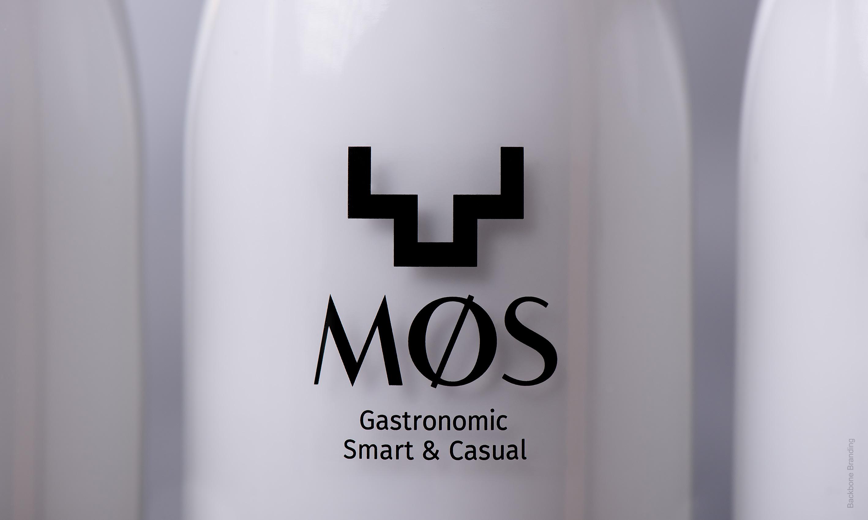
One of the main identity elements are the black and white colors.


1
/
4
We have made the brand elements flexible and able to be used as a pattern or as a big fragment.


1
/
4


Minimalism and the simplicity without any complications.


1
/
3
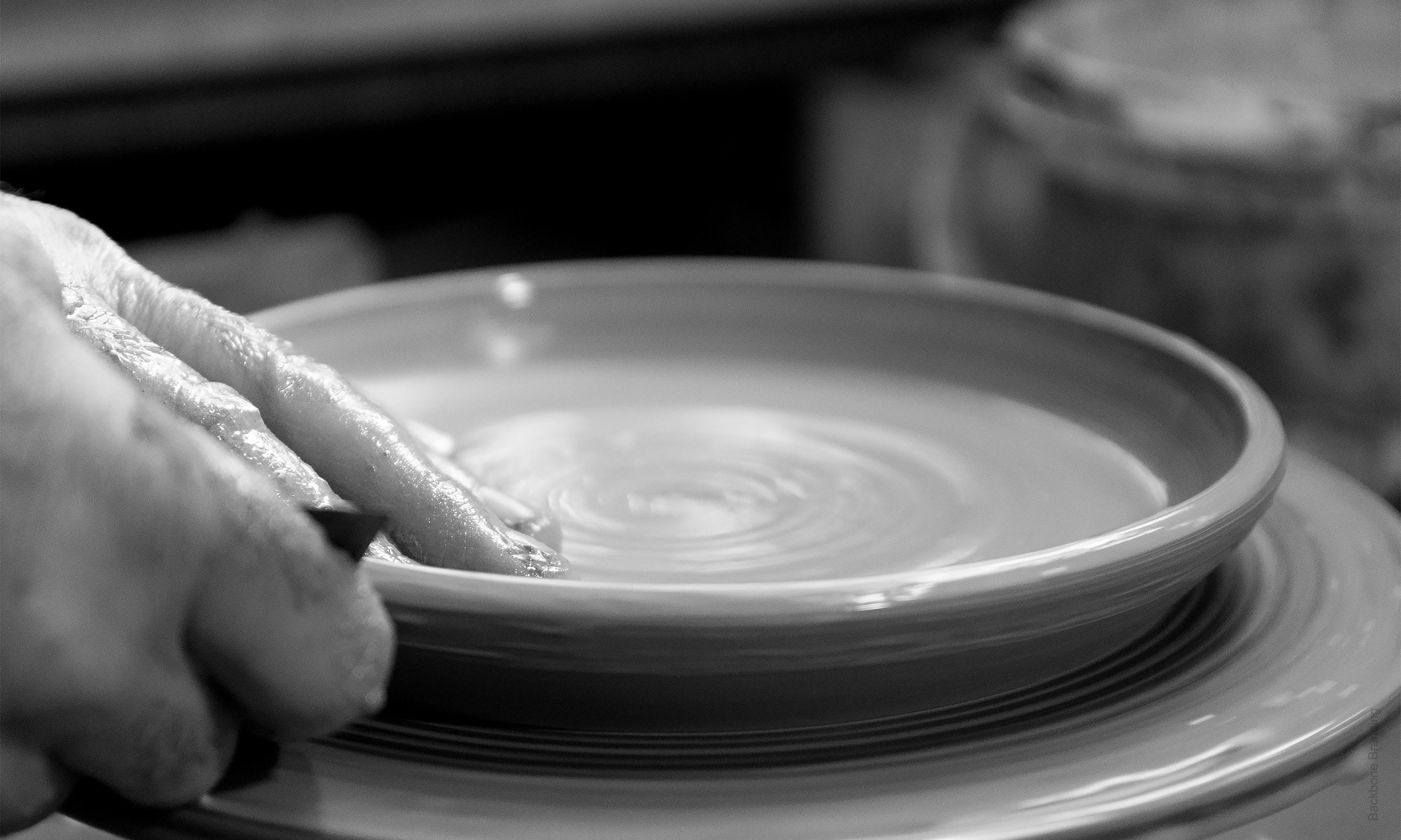
Keeping Nordic minimalism in each detail, even the crockery was specially designed for MØS brand.

1
/
5

More works