SERUND
Branding Services
industry
Alcoholic Beverages, Wine
client
Armenian National Agrarian University
year
2020
awards


overview
The wine for which we had to create a brand was unique because of the fact that it is produced with the active participation of students of the Armenian National Agrarian University, faculty of winemaking. Two types of wine are produced: an ordinary red dry wine and the reserve red dry wine.
challenge
The task was to create a brand that intended to successfully enter the wine market and be displayed in specialized wine shops.
solution
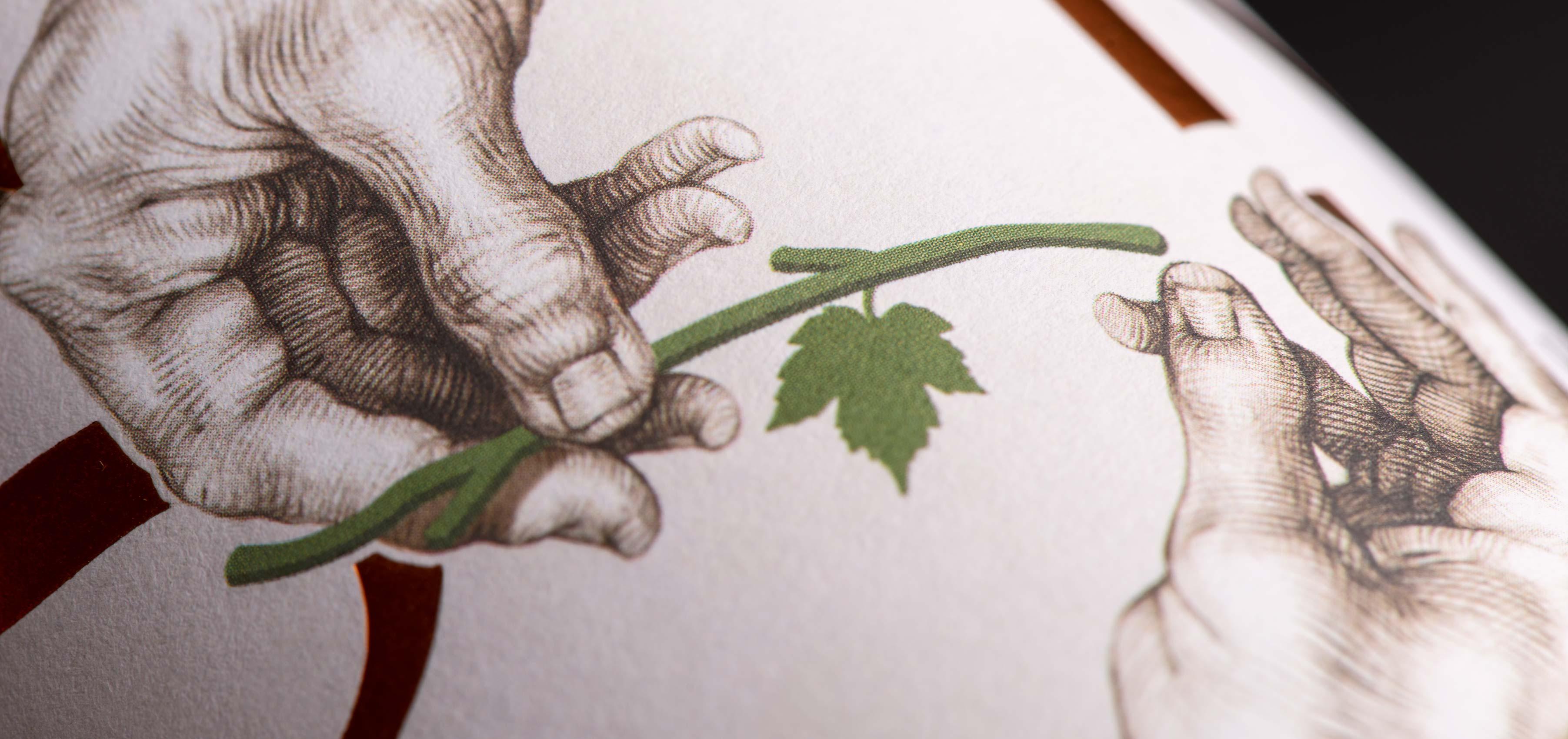
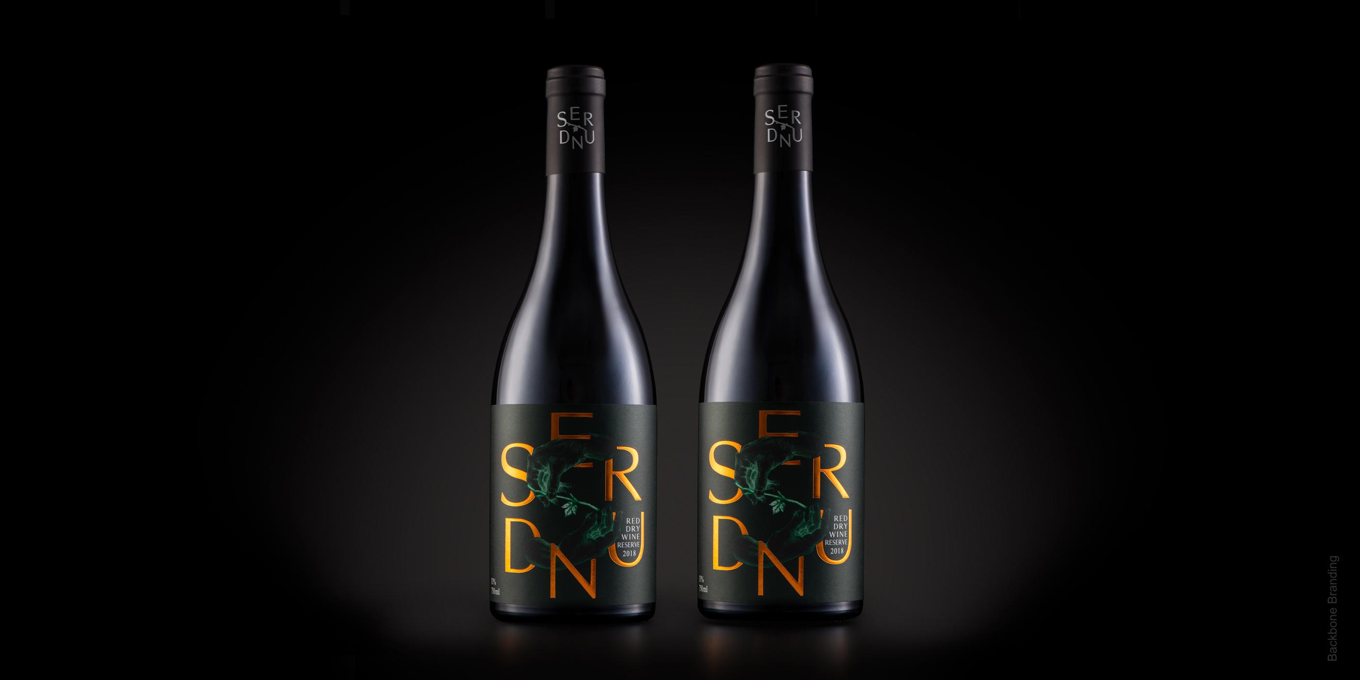
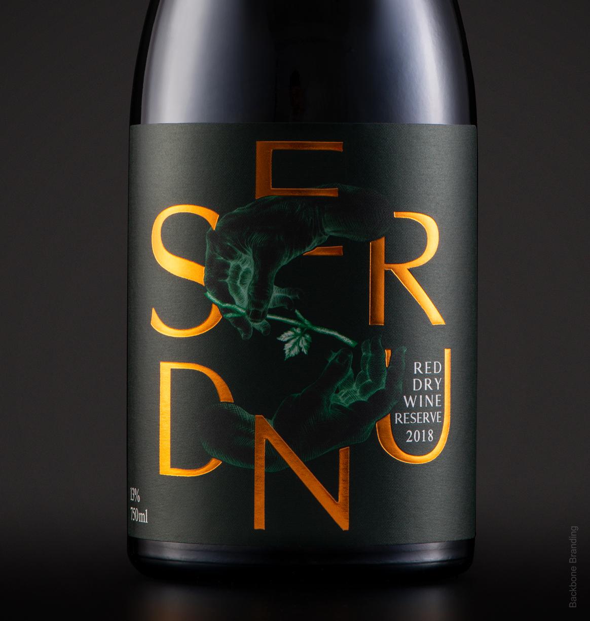
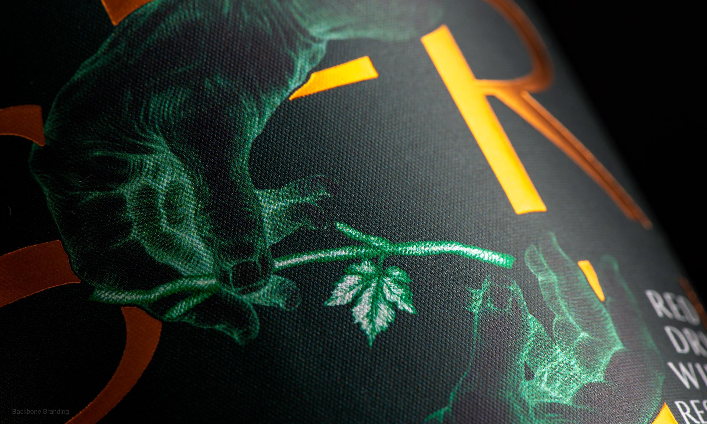
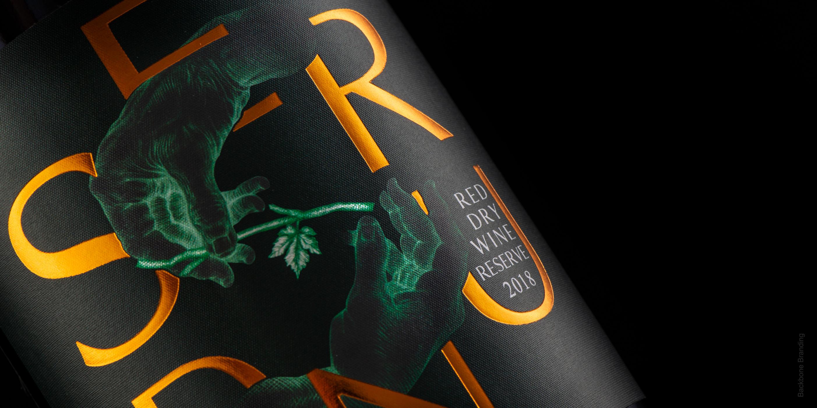
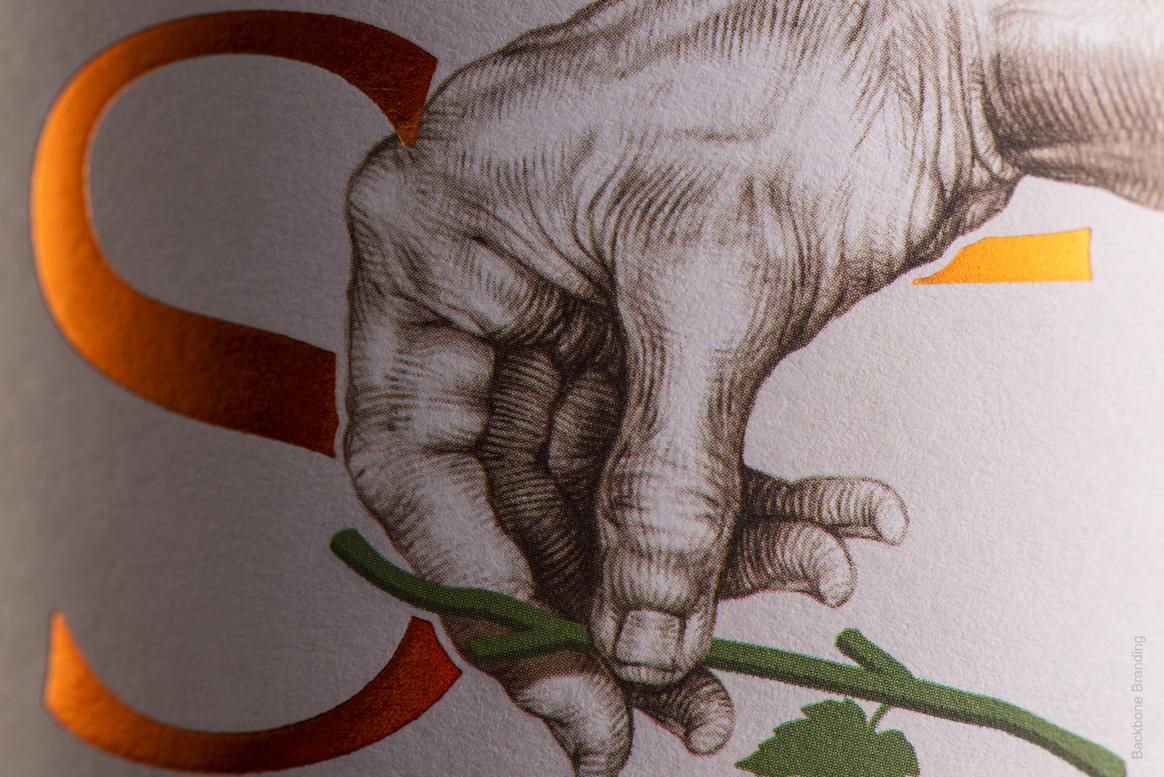
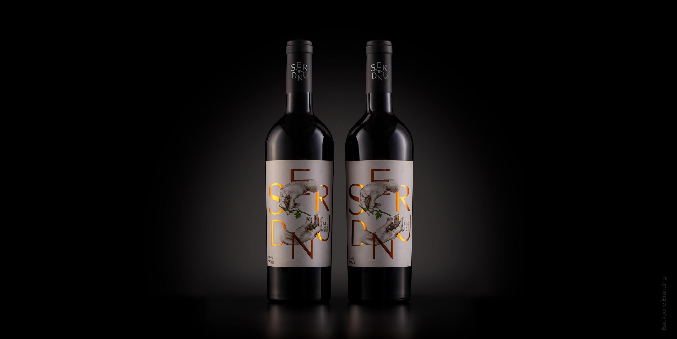
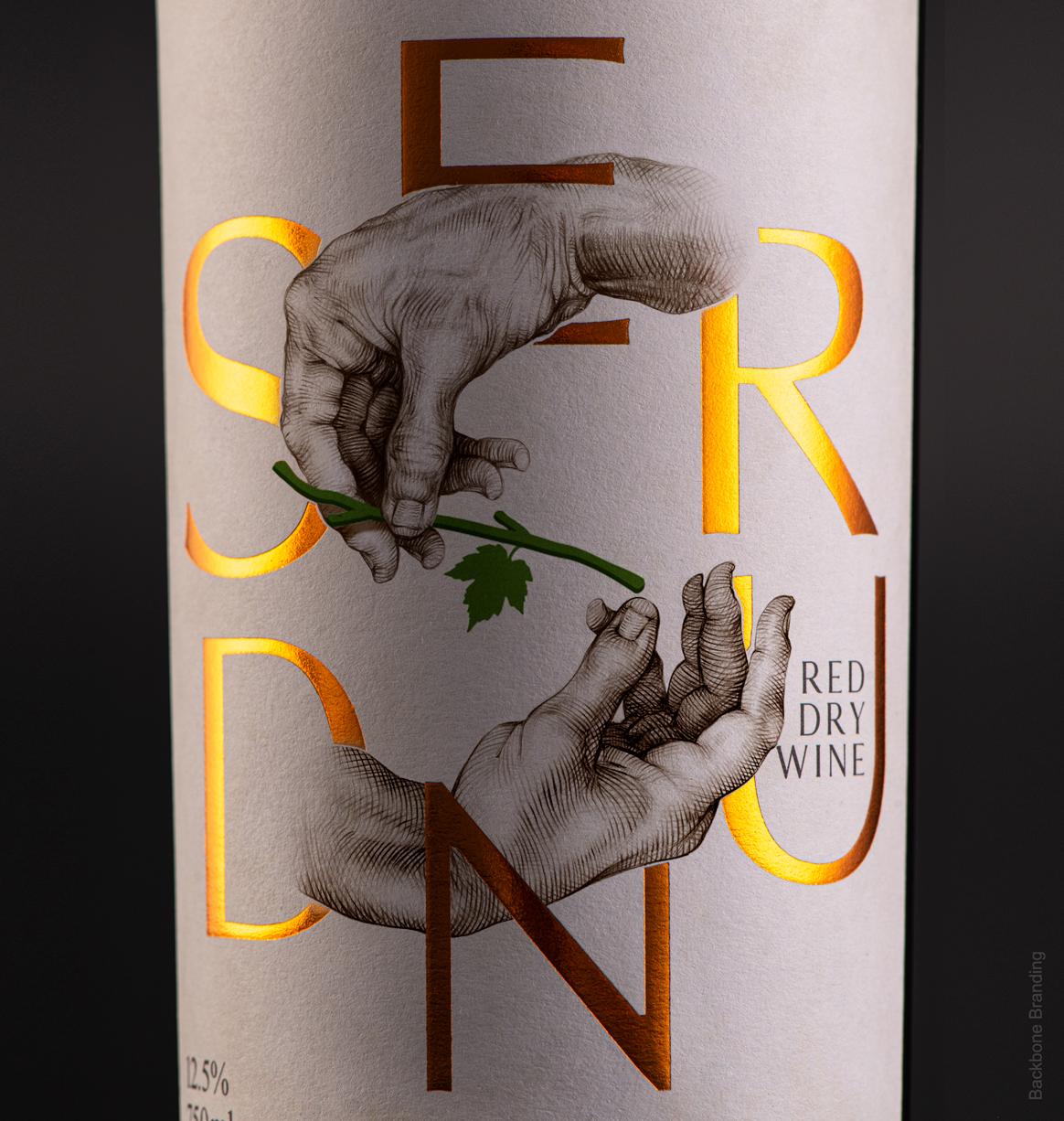
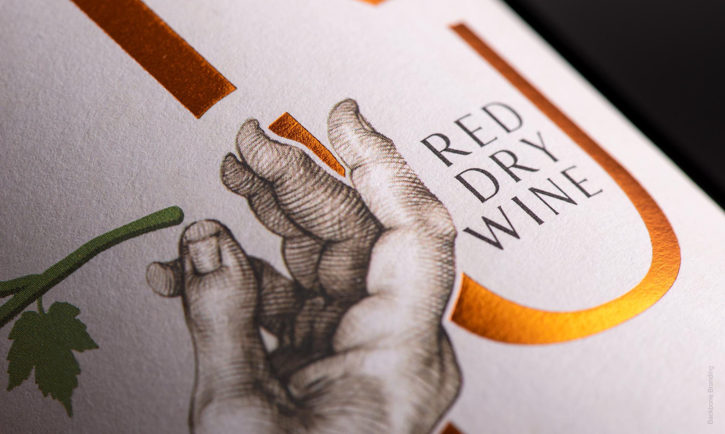
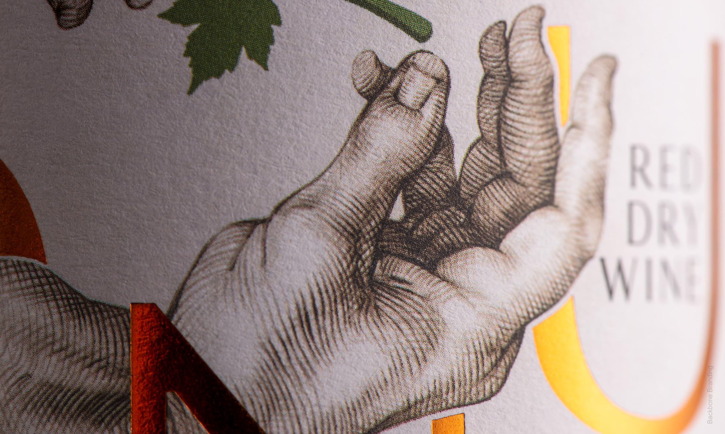
Тaking into account that the winemakers are students from different generations, we have based the brand concept on the idea of transmission, where the knowledge and skills are passed from one generation to another. Accordingly, the name “SERUND” was chosen which is translated “Generation” in Armenian. The inspiration for the design was Michelangelo’s “The Creation of Adam” fresco painting. According to the concept, we have selected three key elements: hands, a bunch of grapes, and a grape leaf. The illustration at the center of the label portrays the bunch and the leaf getting passed from one hand to another which symbolizes the knowledge and skills passed from generation to generation, from the expert to the apprentice, from the master to the knowledge seeker. The hand of the transmitter is the hand of an elderly person, and the recipient’s hand is the hand of a young man. We have surrounded this illustration with the letters that make up the word “SERUND” in a clockwise direction. The letters of the name, which are in continuous rotation, symbolize the cycle of life and the idea that transmission is a constant part of the mechanism of human existence. Moreover, the two illustrated hands passing the bunch form the visual shape of the letter “S” – the initial letter of “SERUND.”
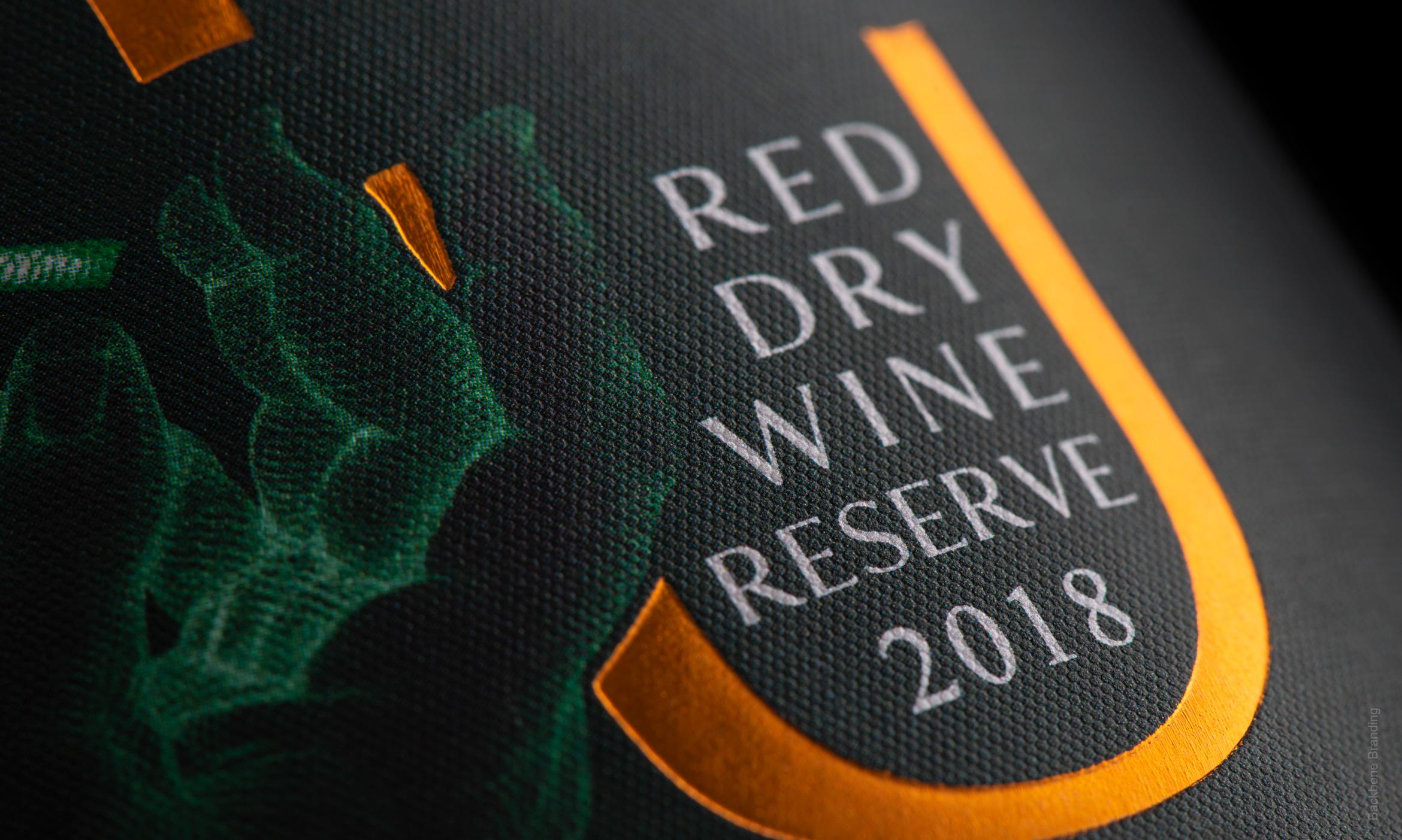
We chose a pure white-colored label for the ordinary wine and an elegant dark green colored label for the reserved wine line. The dark green label with its mystery conveys the oldness and high quality of the wine, and the copper-colored letters become more expressive in contrast with the dark green.
Click for more
The wine for which we had to create a brand was unique because of the fact that it is produced with the active participation of students of the Armenian National Agrarian University, faculty of winemaking.

1
/
3

Тaking into account that the winemakers are students from different generations, we have based the brand concept on the idea of transmission, where the knowledge and skills are passed from one generation to another.
The task was to create a brand that intended to successfully enter the wine market and be displayed in specialized wine shops.
1
/
2
More works